Best Practices
Beyond the Rectangle
A trio of design experts discusses the changing world of hotel signage.
A generation ago, cookie-cutter hotels were the norm. The interiors and exteriors of a typical hotel brand of that era were the same, whether in Portland, ME, or Portland, OR. That’s no longer the case. Today, high-profile lodging chains and independent boutiques alike are seeking to create immersive, hyper-local experiences.
“Millennials, in particular, aren’t as attracted as their parents to the larger hotel chains,” said Katie Sprague, a vice president specializing in graphic design for CallisonRTKL (Los Angeles), whose hotel clients include Hilton, Mandarin Oriental, Marriott and Shangri-La. “They’re looking for boutique destinations that are unique, small and unpretentious. To combat that, the mega-chains are responding by launching ‘soft brands,’ like Marriott’s Tribute Portfolio or Hilton’s Curio Collection, which are unique properties that offer the chains’ back-of-the-house operating systems and loyalty programs.”
All those developments mean hotel signage requires more creative approaches than in the past, Sprague said. “Today’s designs often look much more ‘bespoke’ and connected to a particular place. Some of the bigger brands are even relaxing their signage standards to allow for more flexibility and less uniformity. Our recent work for one of the major flags in Florida [shown on opposite page] is a great example of a less-corporate look. In terms of signage, we were encouraged to think ‘beyond the rectangle.’”
Following is more from Sprague as well as two other design experts in the field on specific ways that hospitality signage is evolving.
Katie Sprague, vice president, CallisonRTKL

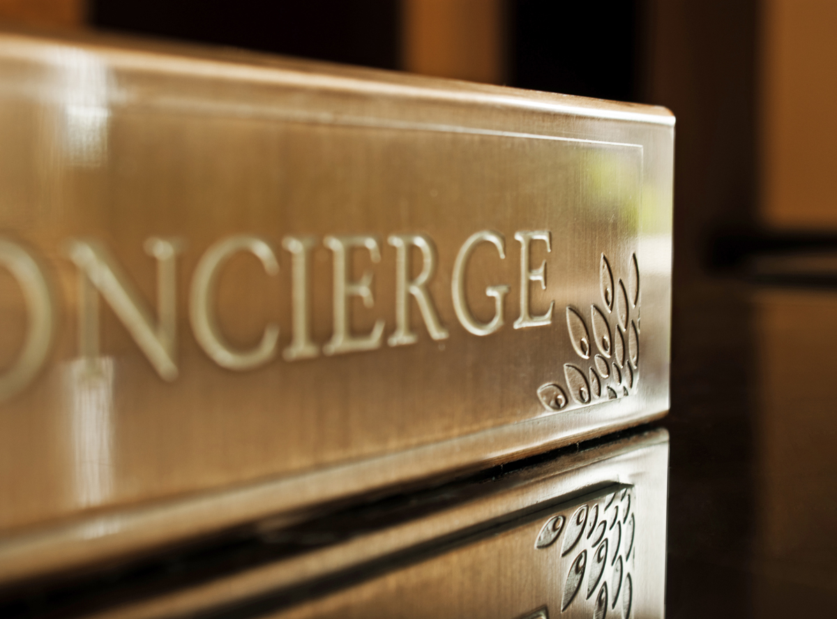
Broader materials range: In addition to the usual metal or acrylic panels, designers are working with natural, repurposed or reclaimed materials. These lend a sense of authenticity, history or even storytelling. Some boutique hotels treat signage like artwork, with a return to hand-crafted styles. Explore the use of simple materials used in clever ways – where smart design outperforms expensive design.
AdvertisementFonts and/or lettering: Due to its simplicity and readability, sans serif is still king, but hand-lettering is also popping up, especially in smaller hotels. This trend has moved from social media to print media to signage, reflecting a “maker’s quality” that’s popular today.
Technology: Cut through visual clutter with creative content. “Digital content can be shown as projection, or on a multi-touch display, or even on a phone,” Sprague said. “Additionally, Bluetooth beacons are being integrated into signage to provide additional content and personalization. Hotels are seeking to know more about who is staying with them, so they can cater specifically to their tastes.”
Wayfinding: State-of-the-art wayfinding offers the opportunity to be part of a larger narrative, helping to craft a unique guest experience for each property. Also growing in popularity are environmental graphics – murals, public art, décor – that help tell a story.
Gustavo Neri, visual identity art director, HBA dna

With 27 offices across the globe and $132 million in design fees for 2018, Hirsch Bedner Associates (HBA; Santa Monica, CA) is the largest hospitality design firm in the world, according to Interior Design magazine’s list of “Design Giants.” Last June it launched HBA dna, which the firm describes as an “experiential branding division charged with creating new brands for the next generation of travelers.” Neri sees the following trends impacting the studio’s signage packages for its hotel clients:
Architectural integration: Signage is becoming a part of the design, rather than an afterthought that’s placed atop a design. A good signage package will speak the same architectural language as its location and follow the brand’s overall guidelines to create a seamless identification and directional design.
AdvertisementHalo-lit lettering: More sign designs are moving away from the fully lit standard and incorporating halo lighting. This style is visually more sophisticated, giving a property a more boutique, chic aesthetic that feels both elegant and elevated. Both interior and exterior signage are experiencing this trend.
Custom lettering: The industry is shying away from stock, bold letterforms and turning to creating a more signature look by using custom typography. Custom lettering (i.e., a handwritten look) helps blur the lines between a bespoke sign and one that is machine-made on a mass scale.
Different directionals: Designers are moving away from harsh, big-box/corporate-looking directionals like those made of acrylic. “By incorporating more pin-sign directionals, a space immediately softens, creating a more minimalist look,” said Neri. “Using custom symbols, such as arrows and placards that are slimmer and better-designed, adds to an overall welcoming vibe.”
Raw materials: Again distancing themselves from the corporate feel, designers are sourcing oxidized metal, organic wood forms – all adding texture and letting the materiality speak for itself. The result is a more honest, genuine product that reinforces a boutique-like feel, Neri said.
Kelli Fellers, vice president, graphic design, NELSON Worldwide

Custom signage isn’t just for luxury hotel brands or independents– it’s also increasingly important in so-called select-service or mid-tier brands, such as Hilton Garden Inn (HGI).
AdvertisementAs Fellers of NELSON Worldwide (Minneapolis) explained, “We’ve seen a focus on enhancing environmental branding and signage systems, inspired by how retailers incorporate seasonal messaging or how coffee houses add a layer of localization into their space.”
A good example of this trend is the signage package for HGI’s lobby shops, Fellers said. “The brand recently rolled out a system-wide update to their on-property retail outlet, now called The Shop. That installation is a bit like a retail shop-in-shop – it retains some of the original brand language, but has an additional layer of personality that helps it stand out from other zones within the public space.”
She said the HGI package also showcases three other emerging trends in hotel signage:
Typefaces: From the parent brand, The Shop retains a clean, sans-serif font, but to add a bit of expressiveness and hierarchy to the messages, an italicized typeface (Bree Serif), was added. This style of typeface is starting to show up more in both the retail and food-and-beverage sectors.
Color: The new HGI prototypical public space is a mix of bright colors with fixture, furniture and equipment elements in a bold palette. The Shop is a sharp contrast to this space, using neutral colors that help to make the type highly legible and act as a support role allowing the product to pop.
Materiality: Flexibility for graphics is key in The Shop, but maintaining that trait across 700-plus HGI locales can be a challenge. “That’s where the materiality of the signs comes into play,” Fellers said. “For The Shop, that translated into the use of a material called Visual Magnetics. In this system, a magnetic backer is installed or built into a sign holder and graphics are printed on a separate skin layer. This material is easy to print on and flexible, which makes it easy to drop ship to the hotel’s many locations. This, in turn, allows the brand to act more like a retailer and change out the graphics for seasonal or promotional messages, keeping the space fresh all year round.”
Introducing the Sign Industry Podcast
The Sign Industry Podcast is a platform for every sign person out there — from the old-timers who bent neon and hand-lettered boats to those venturing into new technologies — we want to get their stories out for everyone to hear. Come join us and listen to stories, learn tricks or techniques, and get insights of what’s to come. We are the world’s second oldest profession. The folks who started the world’s oldest profession needed a sign.


American Sign Museum Names New Executive Director

3 Things Print Pros Must Do to Build Stronger Relationships in the Interiors Market

Graphics Turn an Eyesore Cooler Into a Showpiece Promo in Historic Plaza


Bulletins
Get the most important news and business ideas from Signs of the Times magazine's news bulletin.
-

 Tip Sheet1 week ago
Always Brand Yourself and Wear Fewer Hats — Two of April’s Sign Tips
-

 Ask Signs of the Times3 days ago
Why Are Signs from Canva so Overloaded and Similar?
-

 Photo Gallery1 day ago
30 Snapshots of the 2024 ISA Sign Expo
-

 Real Deal1 week ago
A Woman Sign Company Owner Confronts a Sexist Wholesaler
-

 Benchmarks6 days ago
6 Sports Venue Signs Deserving a Standing Ovation
-

 Editor's Note2 weeks ago
Why We Still Need the Women in Signs Award
-

 Women in Signs1 week ago
2024 Women in Signs: Megan Bradley
-

 Photo Gallery1 week ago
21 Larry Albright Plasma Globes, Crackle Tubes and More