3 Lavish Hospitality Sign Projects and How They Were Made
Signmakers explain how they branded a modern casino and a pair of boutique hotels.
WHAT IS LAVISH hospitality signage? An elaborate over-the-top hotel logo beckoning overnight guests? Or a simpler design using quality materials and displaying expert craftsmanship? Perhaps a combination of both, here are three extraordinary examples of high-end hospitality signage.
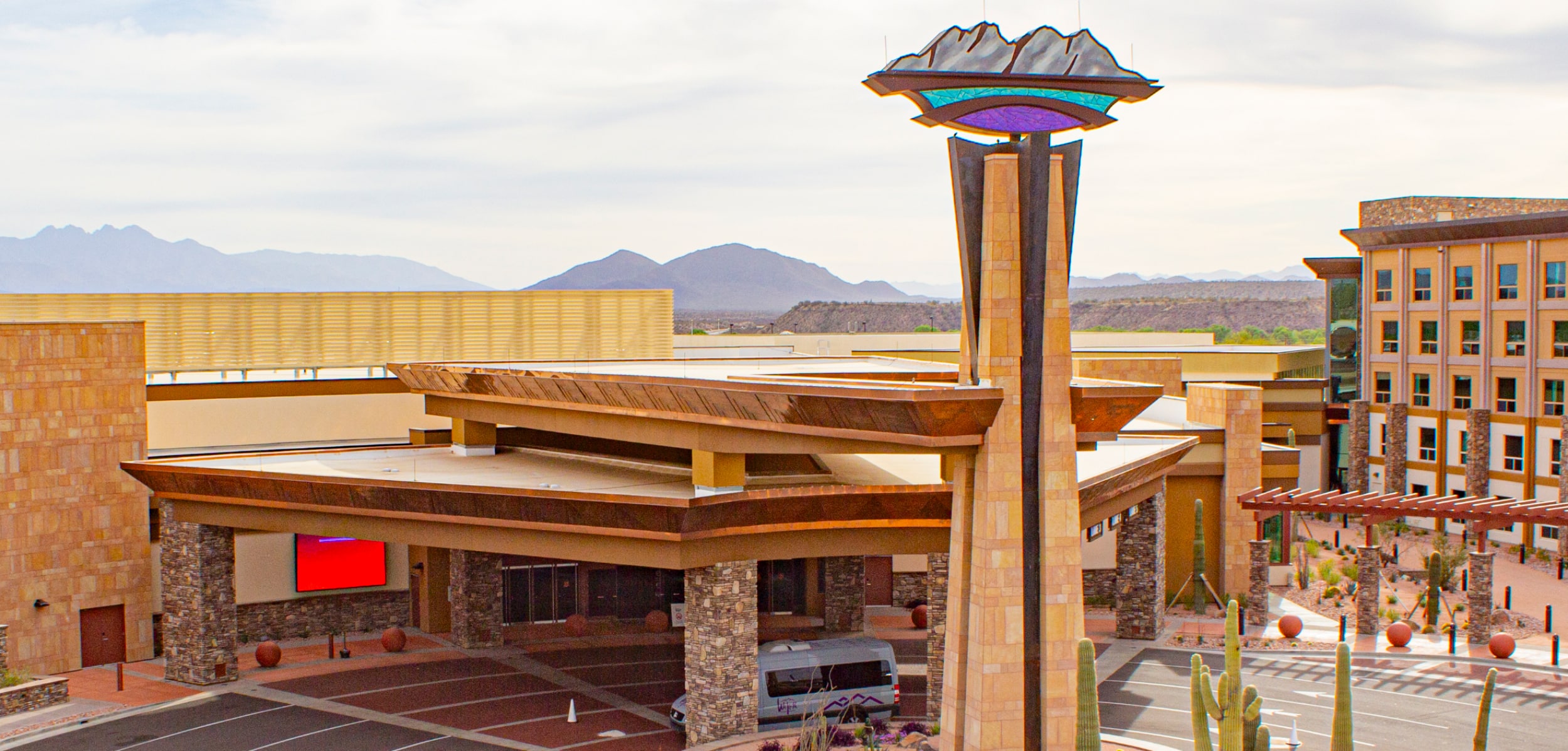
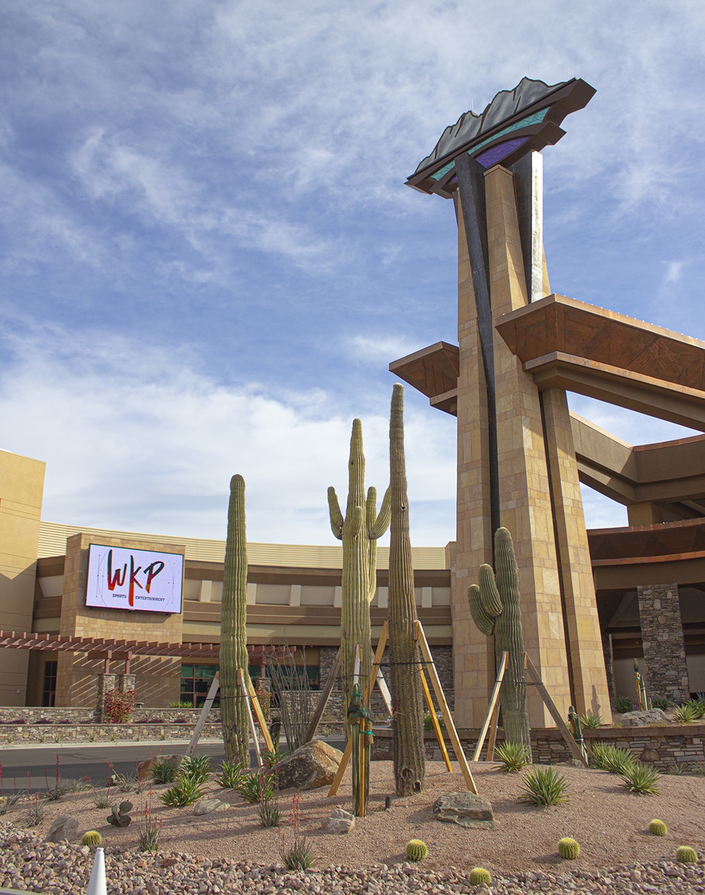
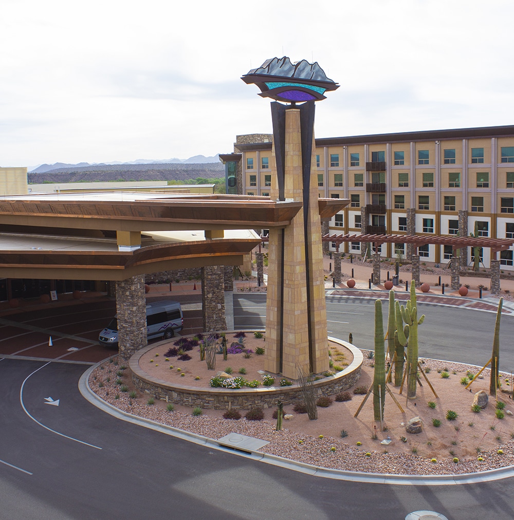
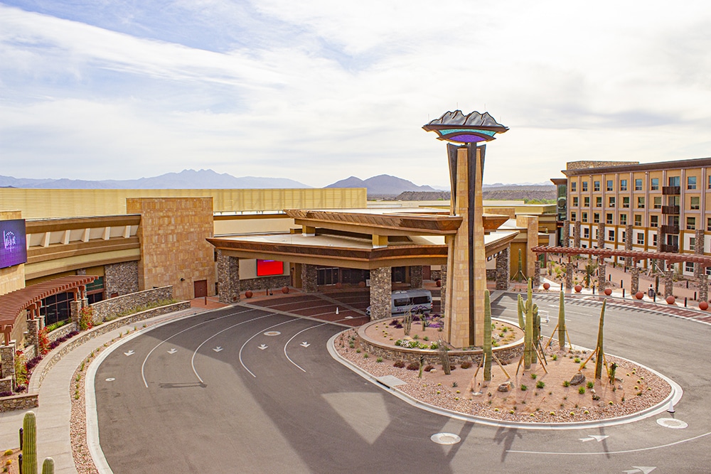
 📷: The elaborate top of this casino monument sign topped off a major rebranding effort.
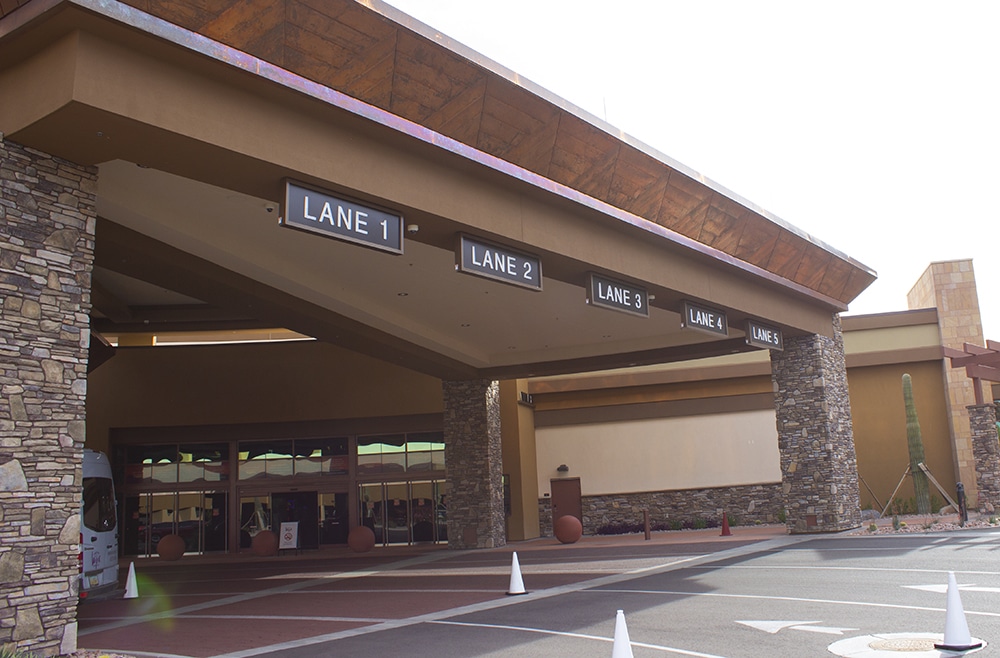
TOP THIS
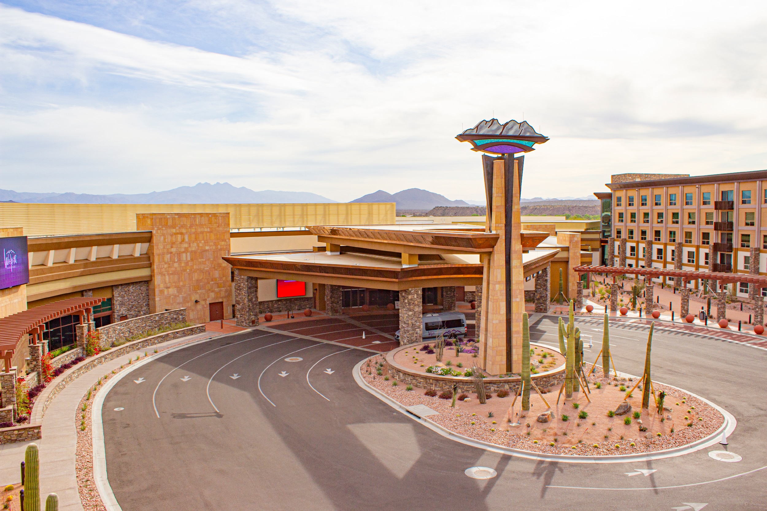
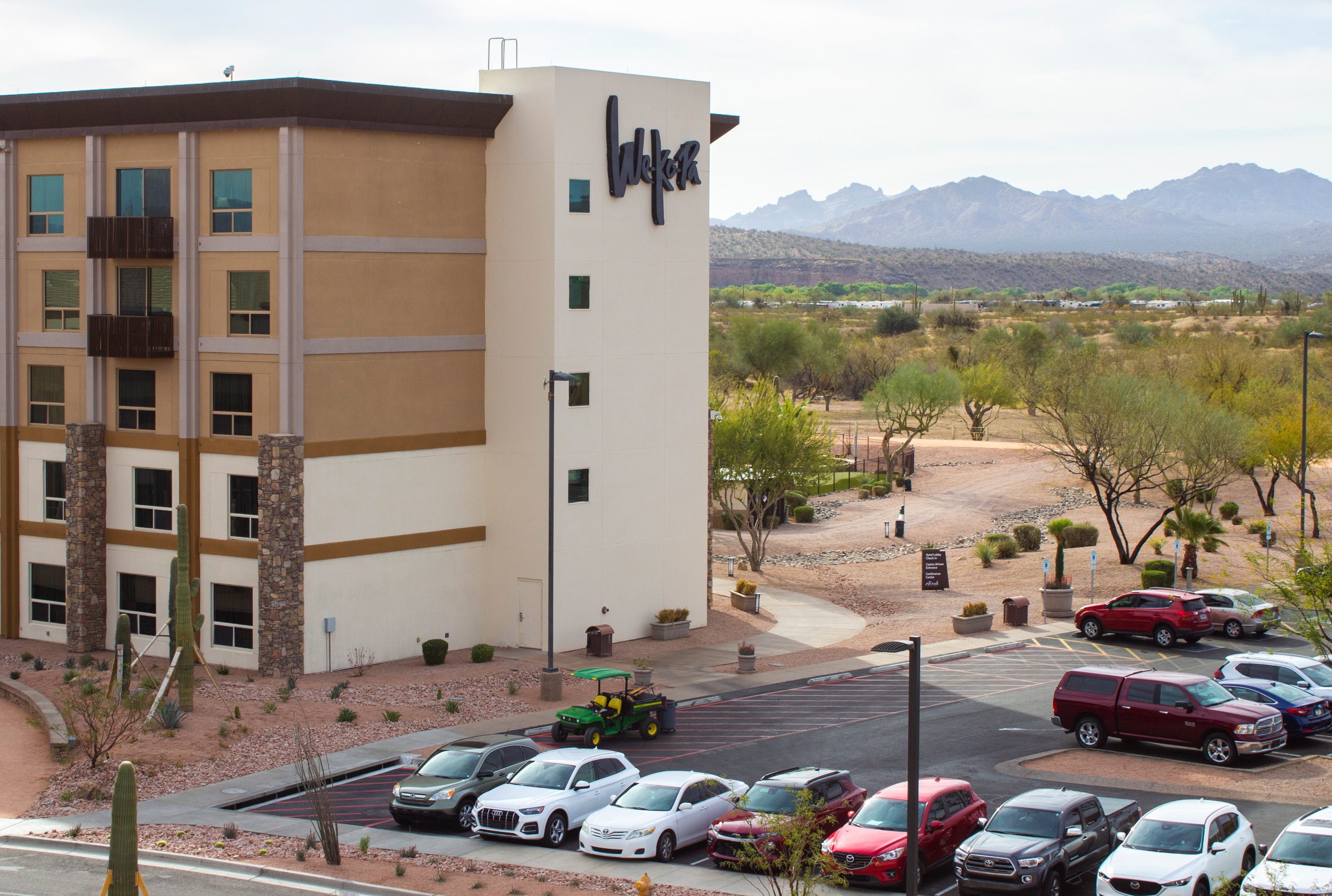
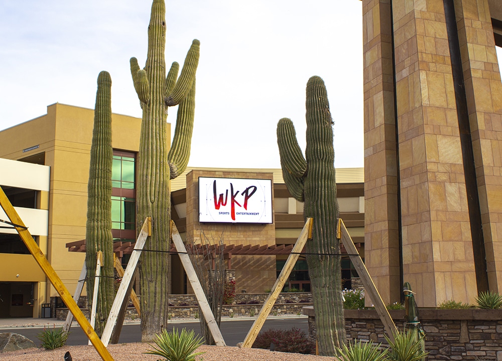
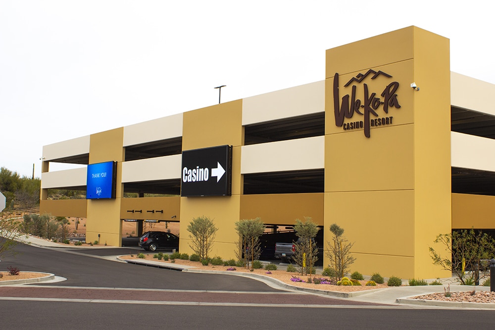
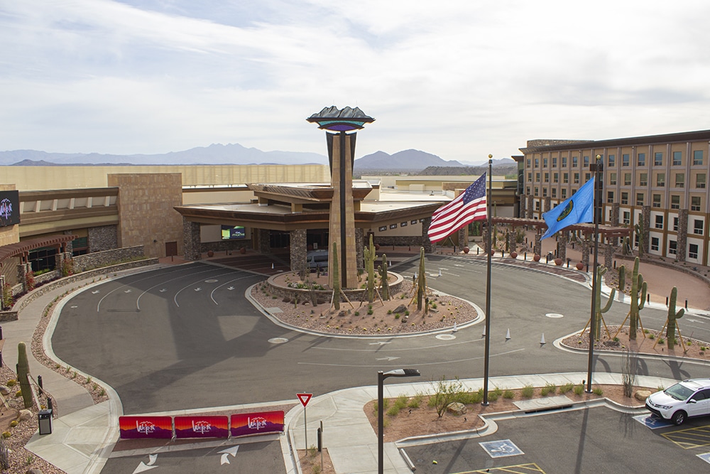
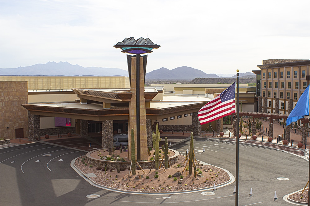
When the large spire sign topper was placed atop the We-Ko-Pa casino outside of Phoenix, the newest gaming destination in Arizona was finally open to the public. Situated 30 miles northeast, on land owned by the Fort McDowell Yavapai Nation, this over-the-top production took SmithCraft Signs (Phoenix) about 18 months to complete.
The project began during the pandemic when the 166,341-sq.-ft. casino resort wanted to reinvent itself, update its outdated look and add a new much larger, modern casino to the existing hotel. The goal was to reimagine the casino as an elevated 100% smoke-free experience for vacationers, using décor with appropriate nods to the tribe’s heritage.
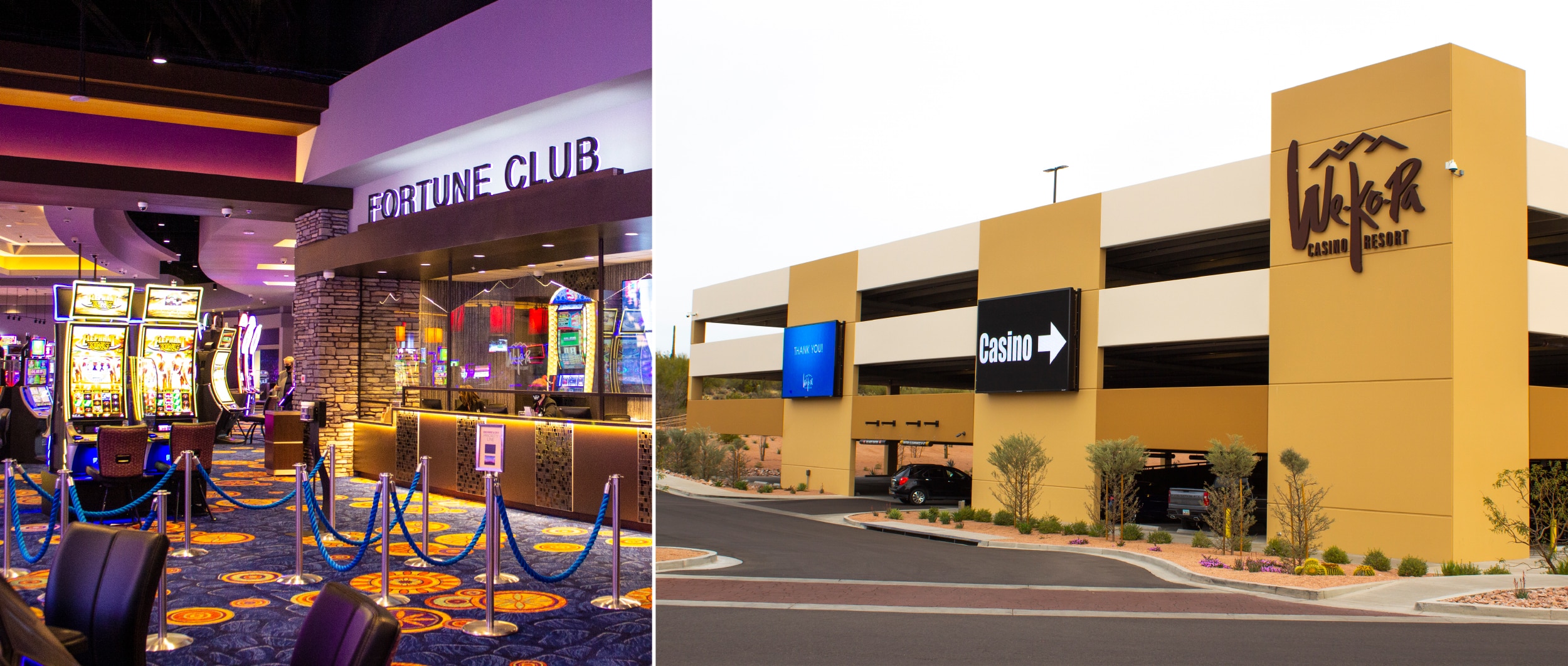
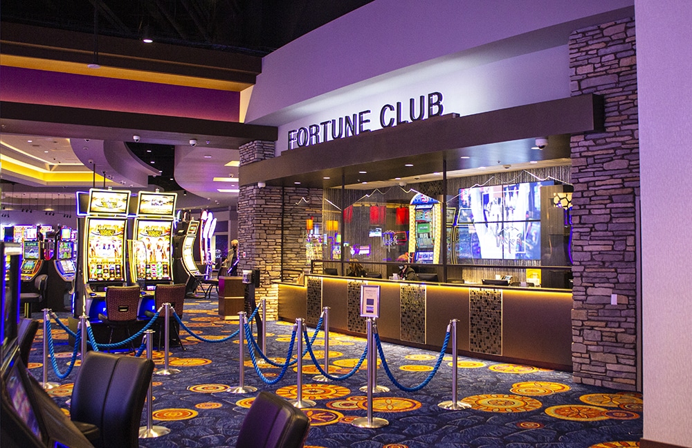
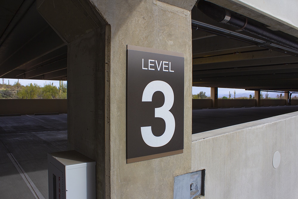
SmithCraft, which counts 10-20% of its work for the hospitality industry, was tasked with producing lavish signage for the interior and exterior of the new casino by the property’s general contractor Kitchell Corp. — a local, long-time partner.
To unify the hotel and casino into a more cohesive brand and operate more efficiently, SmithCraft’s team met with Kitchell and the client over six to eight weeks to discuss colors, high-end materials and design aesthetics. SmithCraft assembled all of the casino signs in its graphic and metal fabrication departments, with many of the acrylic and aluminum parts and all of the exterior signage being cut on the company’s MultiCam computerized router systems.
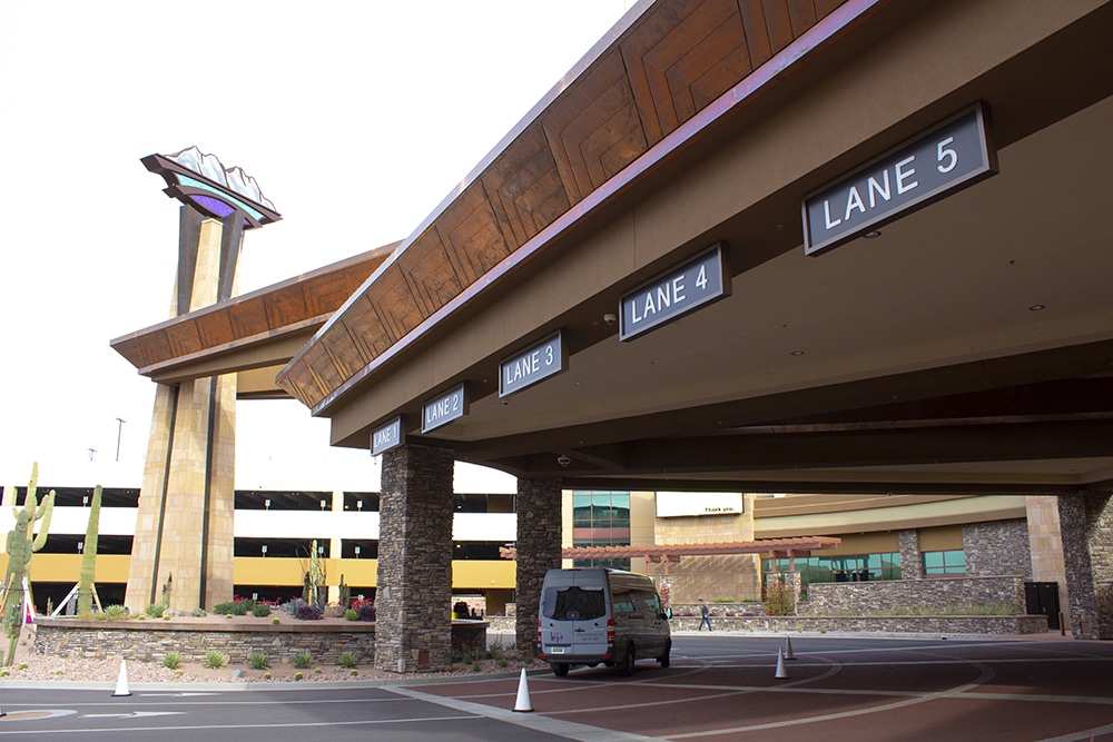
 📷: High-end materials and designs helped to upgrade the hotel-casino experience.
SmithCraft’s illuminated signs, most of which were hung from the ceiling, complement the casino’s LED flashboards. This became a challenge for the team, recalls Kent Grantham, SmithCraft’s senior project manager, as the signs had to have structure and cabling installed above the ceiling before the grid ceiling was put in place, calling for a 30-ft. reach scissor lift. The signs were attached to cabling that dropped below the ceiling gridline. Braille and tactile copy were printed on the plaques using a DCS (Direct Color Systems) 1800BG printer.
The casino’s exterior signage proved equally demanding due to the huge 58-ft.-spire sign topper and distinctive emblem at the casino’s main entrance. SmithCraft outsourced the digital graphics for the spire topper to Northern Arizona Signs (Flagstaff, AZ), which used an Epson SureColor S80600 10-color 64-in., printing on 3M IJ180 Controltac Graphic Film then laminated with 3M Scotchcal Matte Overlaminate 8520. It took a SmithCraft crane truck to lift the spire topper into place for maximum visibility.
Advertisement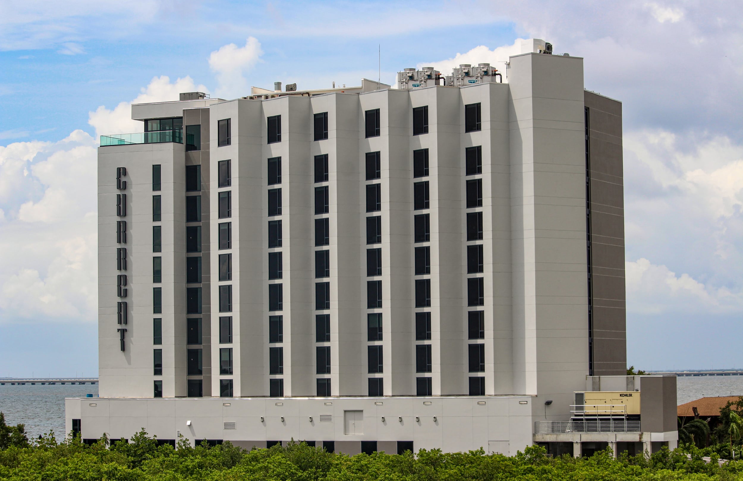
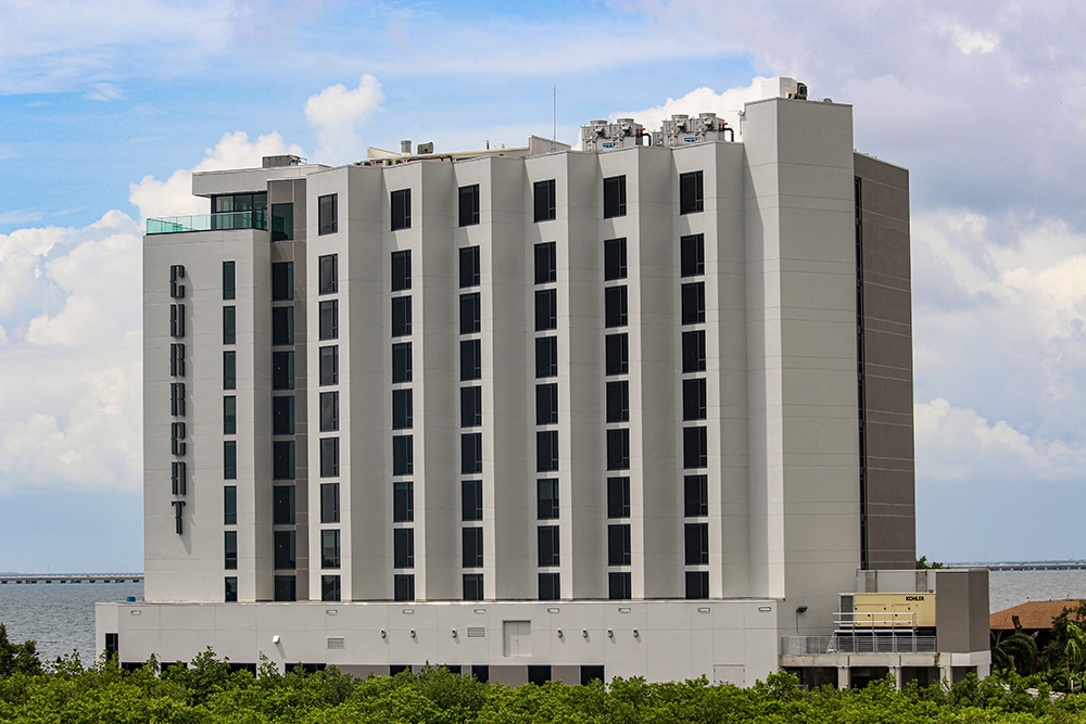
BAY VIEW
When the contemporary Current Hotel was being developed by Rocky Point Holdings as part of Marriott’s Autograph Collection of independent properties, Creative Sign Designs (CSD; Tampa, FL) was called upon to provide comprehensive upscale interior and exterior signs — all on a tight budget. The aim was to create signage that played off the boutique’s tranquil yet cosmopolitan atmosphere, incorporating its extensive panoramic views of the calming waters of Tampa Bay and its bustling namesake city.
The project was twofold, explains Adam Wold, CSDs director of design. For the exterior signage, the hotel’s location — on the far end of a peninsula with extremely limited visibility from the main thoroughfare — provided a significant challenge. To determine sight lines and the best use of its exterior signage square footage, CSD produced a visibility study for the client, which pointed to the need for several sets of illuminated channel letters for building identification, an illuminated monument sign and parking garage signage.
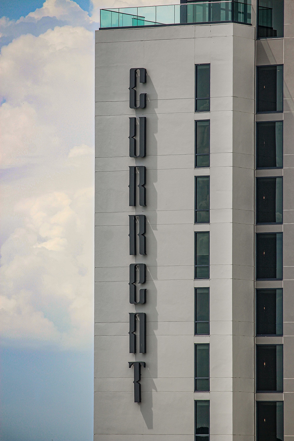
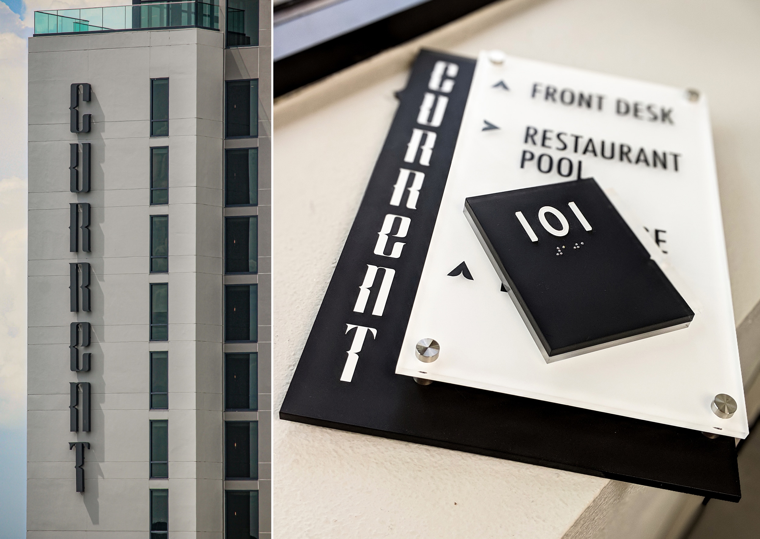 📷: Trimless channel letters are often the choice for a more understated appeal.
The illuminated trimless channel letters were placed vertically along the side of the hotel to emphasize its nine-floor structure. Creative Sign Design also fabricated trimless illuminated front-lit channel letters to decorate the landscape architect’s monument structure. Low-profile, illuminated halo edge-lit channel letters adorn the porte-cochère. Each LED letter was individually mounted, and is remotely driven.
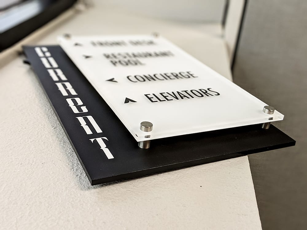
For the hotel’s more straightforward interior signage, Wold says, CSD accented all of the pieces with signature branding efforts, including the room IDs, wayfinding and amenity signage. A matte finish for the black and white interior signs mimics the simplistic and modern ambiance of the hotel. The amenity signs, like the room ID signs, continue the black and white matte finish theme, branded with the hotel name. The letters “CURRENT” were arranged vertically along the side to echo the exterior’s vertical channel letters.
Taking six weeks from the start of fabrication to installation, Creative Sign Design used its Vision 2550 engraver for Braille, Graphtec FC8600 vinyl cutter plotter and other equipment to produce the hotel signage. The ADA signs were fabricated using vinyl for the directionals (cut on the Trotec Speedy 400 laser engraver), ¼-in. black P95 acrylic backer, ¼-in. clear P95 painted second surface white, and MBS standoffs. The CSD team used a MultiCam 3000 series CNC router, SDS Automation SuperChannel bender and Miller Electric welder to fabricate the front-lit logo, using a trimless style fabricated with a routed ½-in. acrylic face. The vertical set includes perforation on the faces. Reverse lit signs display an aluminum face with welded returns and polycarb backs.
One of the most difficult parts of the project was the heavy exterior signage installation. Wold and a helper needed to carry each 6-ft. 9-in. letter around the building to a 1,000-lb. winch and a handmade hoist, where the letters were lifted to their installation area. After the two installers put up the pattern, drilled the holes and put up 3 x 3-in. mounting clips with ⅜-in. anchors, one man held the letter in place while the other pushed the low-volt wire though the power holes, inserted pass throughs (wall busters), and put bolts through the 90 clips.
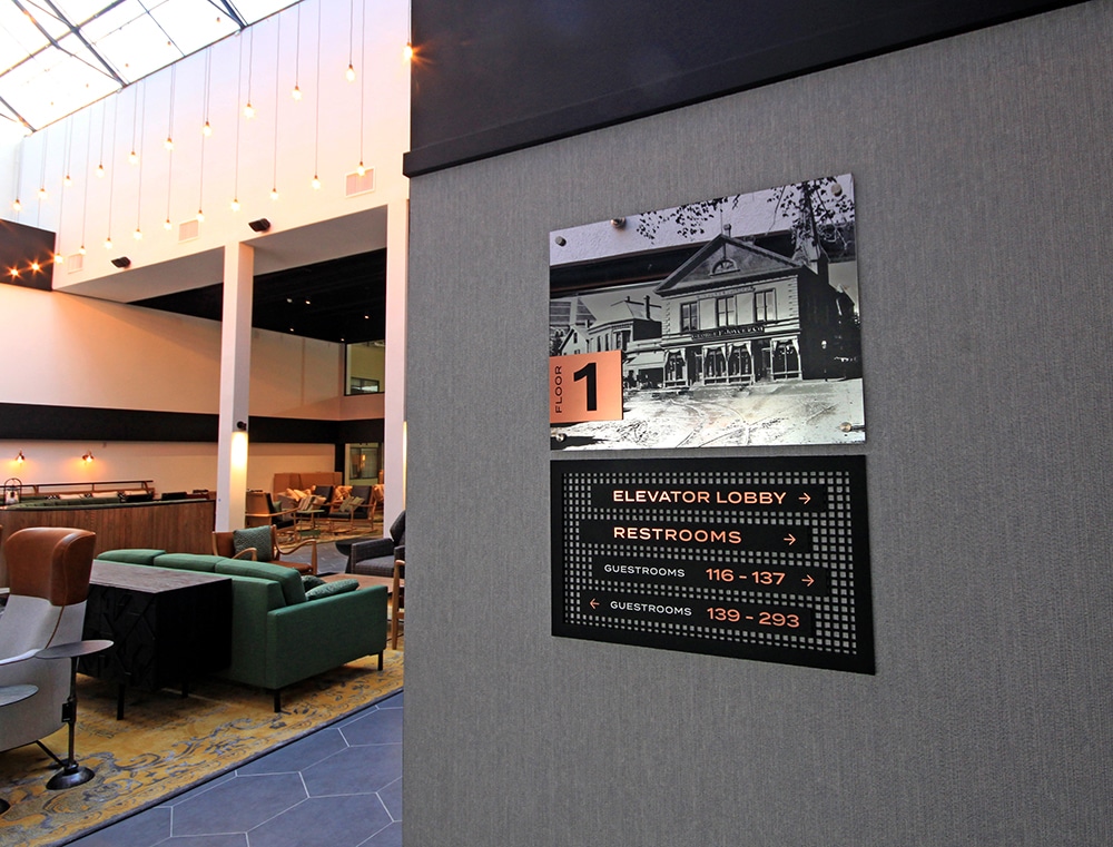
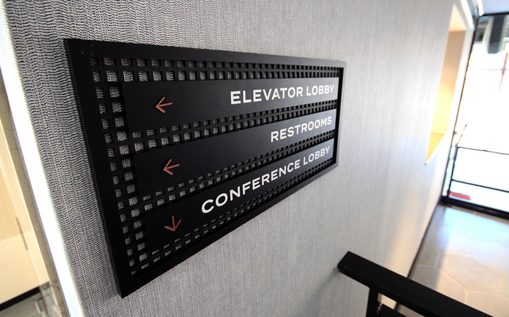
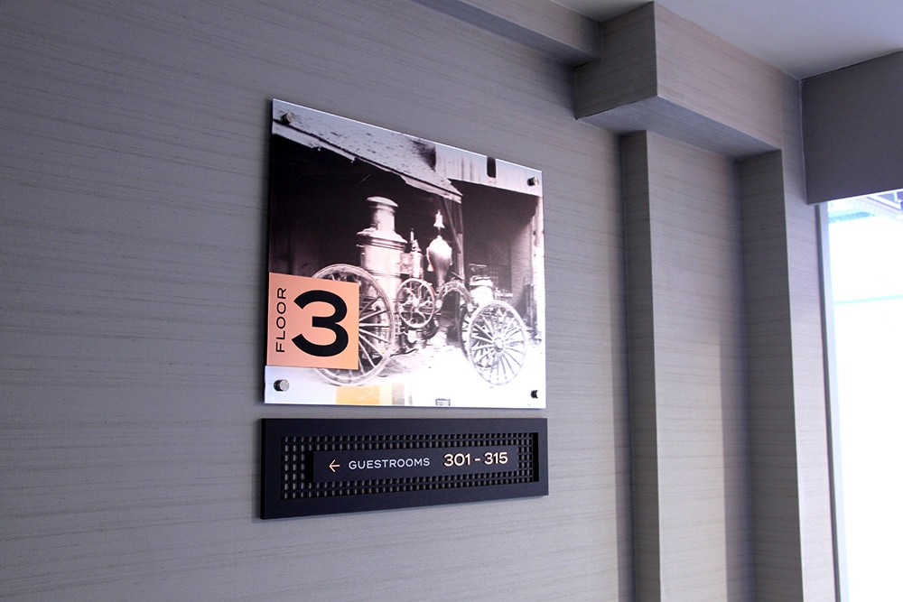
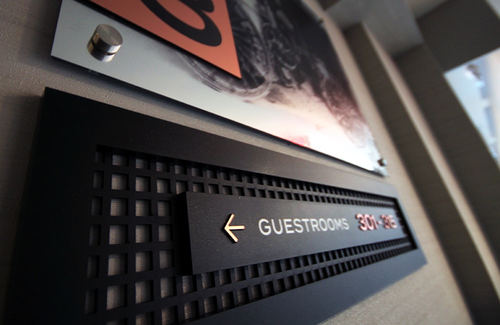
 📷: Historic photos and rose gold finishes recall the past.
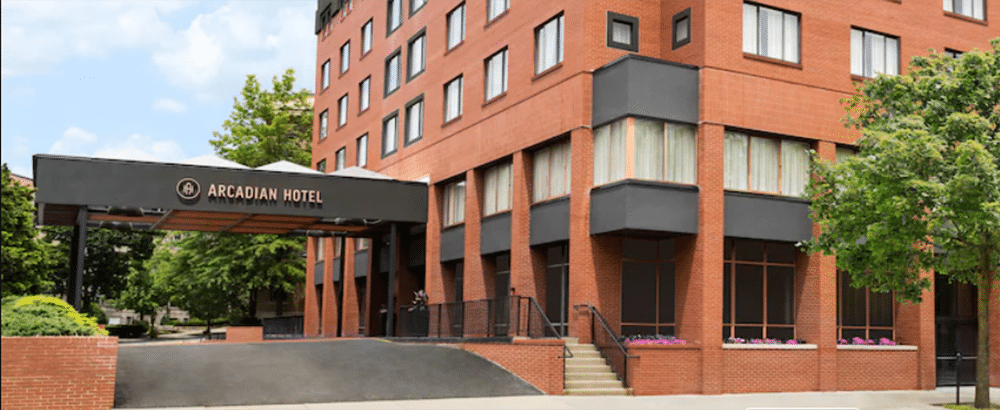
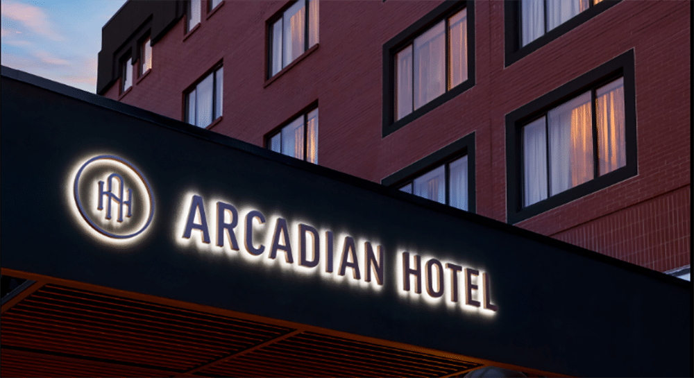
HERE IN ARCADIA
One of Boston’s most desirable neighborhoods is Brookline, an attractive residential section with a rich history dating back to 1638, and known for its wealth, elegant residences and beautiful architecture — all in a compact 6.8 miles. Within the confines of historic tree-lined streets is the boutique Arcadian Hotel, completed in 2021.
After previously serving as a Holiday Inn, the property’s goal was to attract upscale clientele to this new stylish accommodation tucked into a vibrant neighborhood. Metro Signs and Awning (Tewksbury, MA) won the bid to create brand-friendly signage and a wayfinding package that would enhance the building’s interior design and architecture, and have the look of very high-end signage, while still meeting the client’s budget expectations.
Metro’s team went to work using the building’s interior flourishes and its history as creative inspiration. “We have seen clients move from utilitarian signs to fancier signs that not only match the color, but borrow other interior décor features such as various metals, wood products or graphic patterns,” says Tom Dunn, Metro’s vice president of sales and marketing.
“In this case, the hotel building was filled with all types of beautiful matte black mesh metals and rose gold finishes. We used these as inspiration to produce hatch pattern cuts out of acrylic, different sign shapes, layering the acrylic logo, and using upscale copper graphics with the Rowmark laminate.”

To honor the area’s past, the team used historic single-tone black and white photographic images printed on clear film and mounted to mirrored Rowmark backgrounds as a thought-provoking way to reinforce the brand story for wayfinding signage on each floor.
During the four-week fabrication process, Metro used its lasers and engraver for the signage backers, composed of two layers of acrylic. The ⅛-in. hatch pattern with a solid ¼-in. overlay was selected to create the border and logo piece. Both were cut on the firm’s 4 x 8-ft. MultiCam Magnus 300-watt laser router.
The tactile letters were cut on its 2 x 4-ft. Vytek FX3 75-watt laser. Braille for the ADA signs was added at the end of the process on the company’s Vision Engraver. Metro turned to a variety of substrates for the signage: black acrylic with a matte finish, mirrored Rowmark and Chemetal rose gold aluminum. Interior signage was installed primarily using 3M VHB double-sided tape and silicone.
“Over the years, we’ve found that our hospitality clients like to make their signage interesting … The Arcadian clients were super interested in making their signage work with the architecture, the brand and the interior design,” says Colin Middleton, Metro’s project designer. “The passion they brought to the table really made working with them fun, and as a result, that made the signage design end up looking very cool and functioning well.”
PHOTO GALLERY (32 IMAGES)


Introducing the Sign Industry Podcast
The Sign Industry Podcast is a platform for every sign person out there — from the old-timers who bent neon and hand-lettered boats to those venturing into new technologies — we want to get their stories out for everyone to hear. Come join us and listen to stories, learn tricks or techniques, and get insights of what’s to come. We are the world’s second oldest profession. The folks who started the world’s oldest profession needed a sign.


American Sign Museum Names New Executive Director

3 Things Print Pros Must Do to Build Stronger Relationships in the Interiors Market

Graphics Turn an Eyesore Cooler Into a Showpiece Promo in Historic Plaza


Bulletins
Get the most important news and business ideas from Signs of the Times magazine's news bulletin.
-

 Tip Sheet1 week ago
Always Brand Yourself and Wear Fewer Hats — Two of April’s Sign Tips
-

 Photo Gallery2 days ago
30 Snapshots of the 2024 ISA Sign Expo
-

 Ask Signs of the Times4 days ago
Why Are Signs from Canva so Overloaded and Similar?
-

 Real Deal1 week ago
A Woman Sign Company Owner Confronts a Sexist Wholesaler
-

 Benchmarks6 days ago
6 Sports Venue Signs Deserving a Standing Ovation
-

 Editor's Note2 weeks ago
Why We Still Need the Women in Signs Award
-

 Women in Signs1 week ago
2024 Women in Signs: Megan Bradley
-

 Photo Gallery1 week ago
21 Larry Albright Plasma Globes, Crackle Tubes and More