Out in Space
These three shops are creating dimensional signage with standout techniques.
BEFORE DANNY ELFMAN was a go-to composer for directors like Tim Burton, he wrote the music for and performed in a bizarre musical film called Forbidden Zone. Based on the stage performances of Los Angeles theater troupe turned new wave band Oingo Boingo and originally released in black and white, the absurdist (and controversial) movie takes place within an alternate universe “in the sixth dimension.” Ironically, much of the backdrop appears 2D thanks to cheap cardboard cutouts, but clever layering and the incorporation of oversized 3D objects like dice help the surrealist set design pop.
Though I saw it over a decade ago, this trippy low-budget movie and its catchy theme song came to mind as this story on dimensional signage came together. The first piece steps into the “forbidden zone” beyond channel letters with a new take on multi-angle readability. The second project is crafted by a fledgling signmaking duo whose highly detailed carvings have started to attract a cult following. And the third sign helps a high school mascot stand tall with a larger-than-life sculpture. While each varies greatly in material and technique, it’s safe to say none of these designs falls flat.
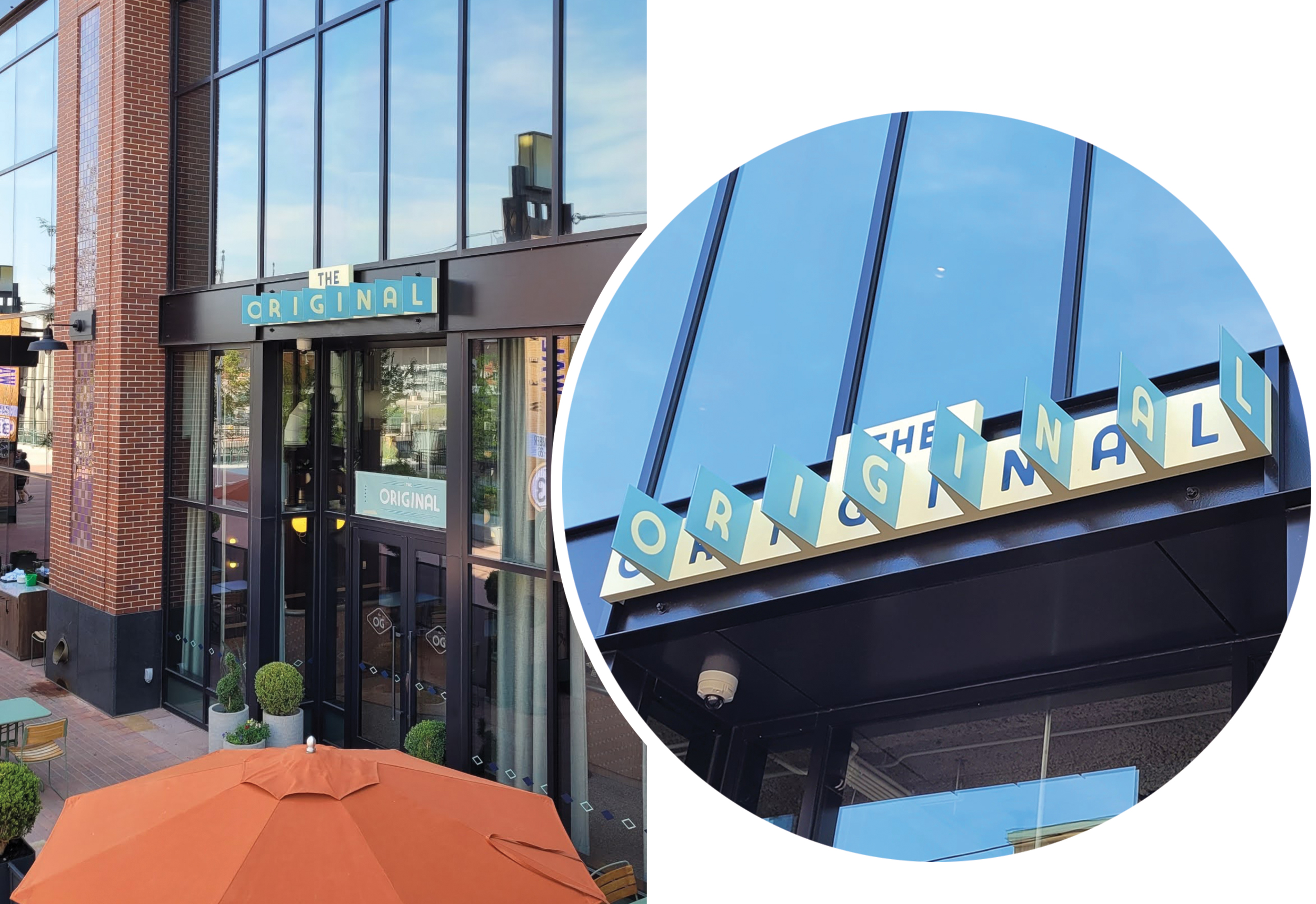
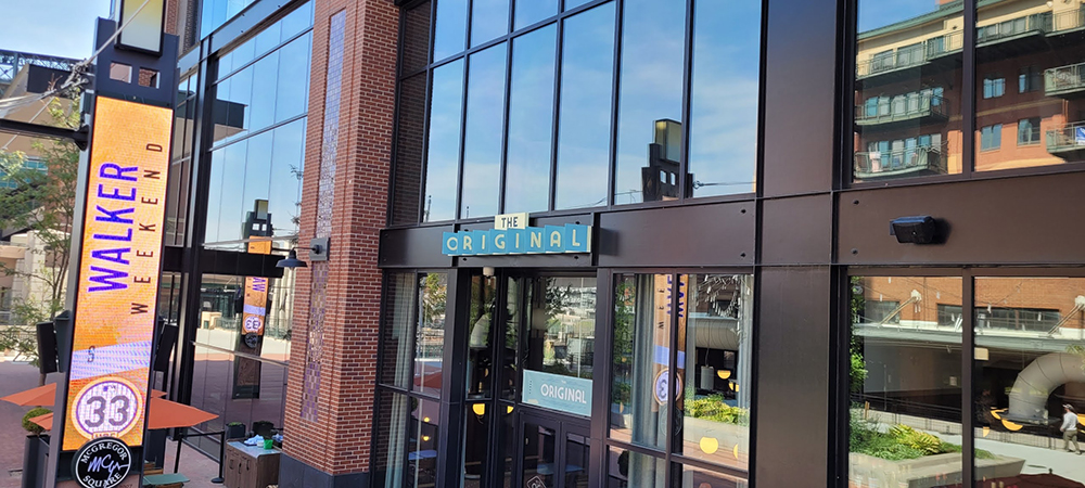
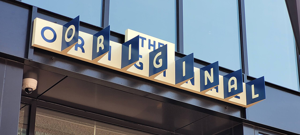
The best laid plans … include desired signage placement. The city of Denver rejected the spot the client originally requested for this piece because the location wasn’t on their CSP — so it was installed here instead.
EASY READER
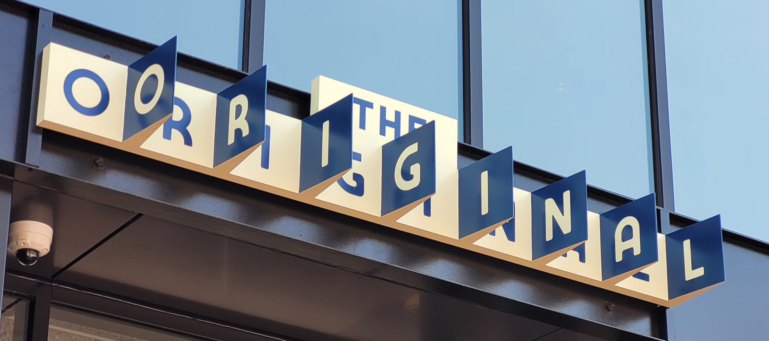
A one-of-a-kind idea doesn’t need to be complicated. In RiNo Sign Works’ (Lakewood, CO) most recent project for Denver-based hotel and restaurant development company Sage Hospitality Group, a simple design formed by bent aluminum serves up a refreshing alternative to blade signs and channel letters without sacrificing dimensionality.
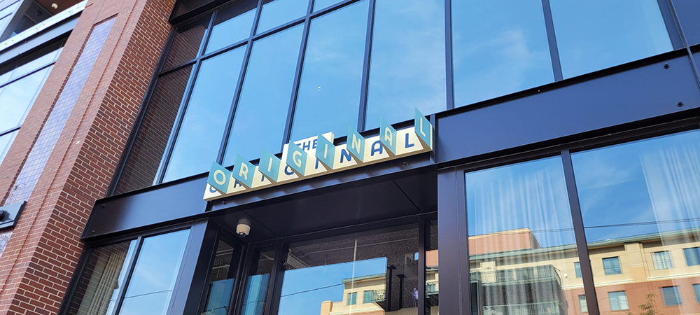
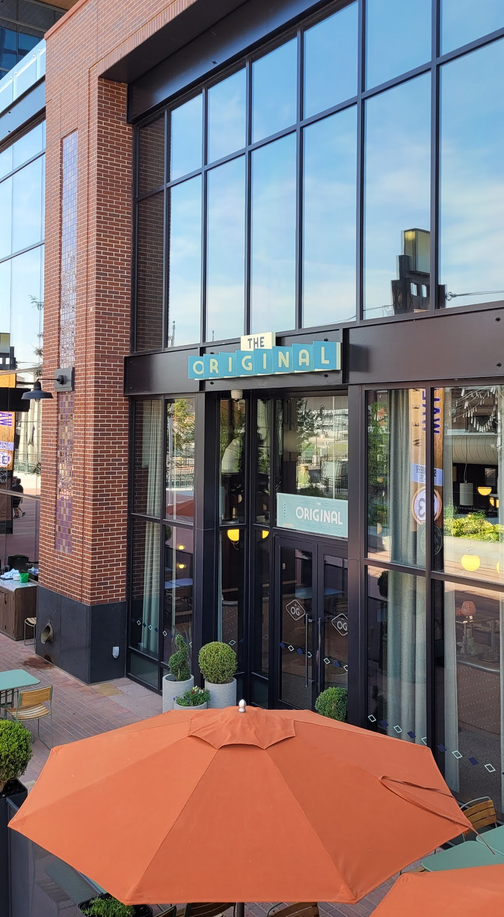
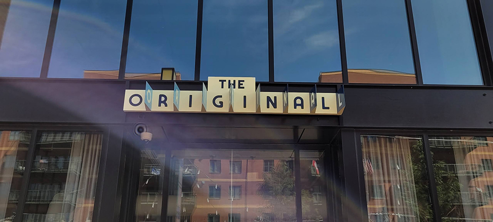
Created for the client’s Americana-inspired restaurant, The Original, in downtown Denver’s McGregor Square, the sign was originally conceived by local multidisciplinary design firm Wunder Werkz to be easily read from several angles. “It was our responsibility to take their aesthetic direction and make that into a physical reality,” says Willis Wood, partner at RiNo.
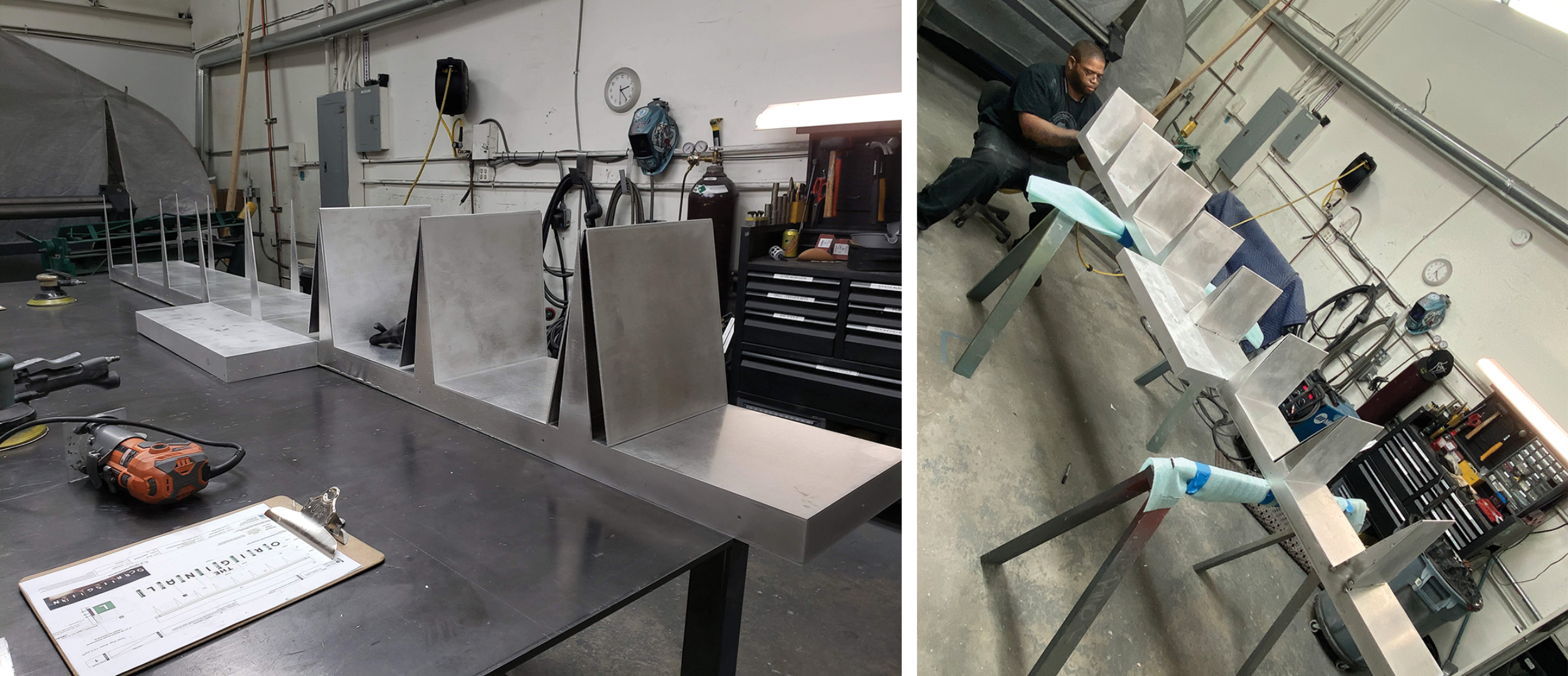
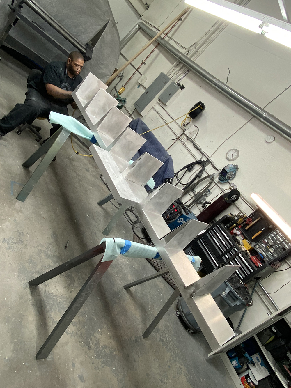
To make that happen, the signshop first built the cabinet using ⅛-in. bent aluminum face with .080-in. backer and returns. “We selected this material to make it as rigid as possible without adding unnecessary weight,” explains Wood. All of the aluminum pieces were cut with the company’s MutiCam CNC router, then the team welded the rear cabinet’s panels together using its Miller Spool Gun.
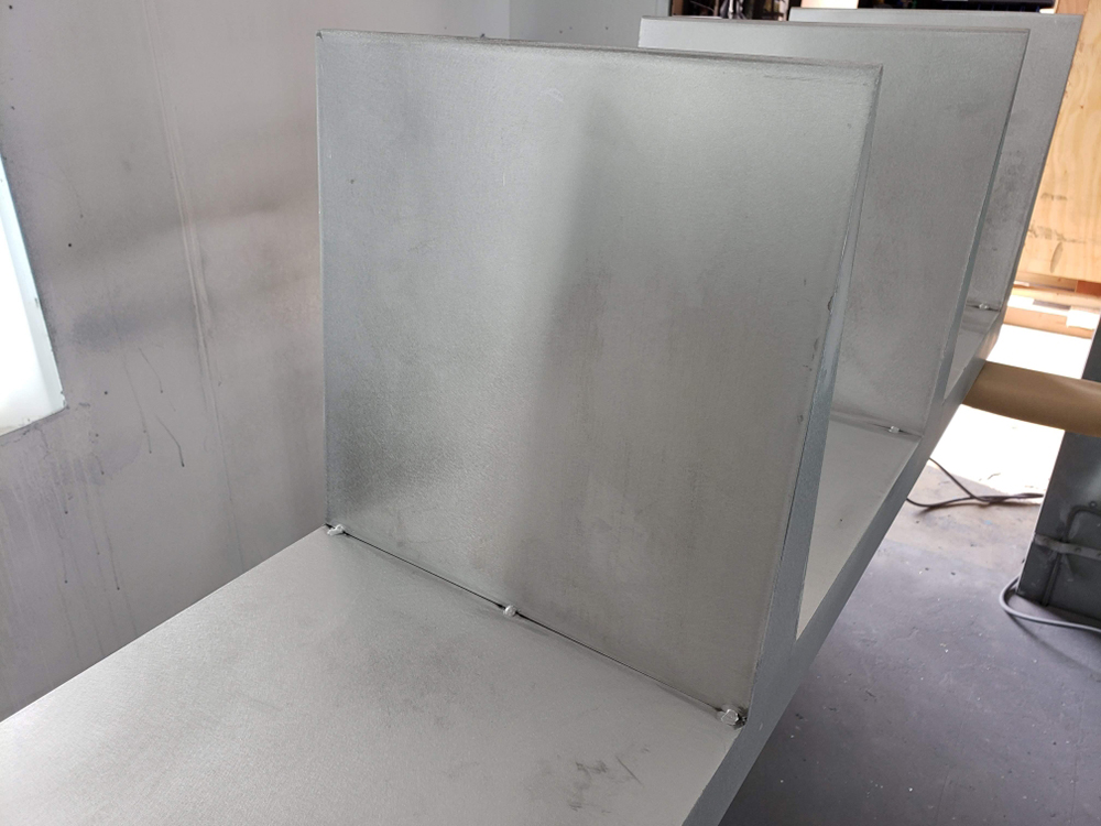
RiNo welded the bent aluminum “fins” below onto the sign’s rear cabinet so the logo could be read from many directions.
“After the rear cabinet was welded together, we bent the ‘fin’ pieces and then placed all the fins onto the cabinet to double check dimensions and placement,” says Wood. “Then the fins were welded onto the cabinet to create the standout letters that you see on the sign. This allows the logo to be read from all directions.”
Following the cabinet’s fabrication, RiNo sanded and prepped the sign for paint. “We used stencil vinyl and multiple trips into the paint booth,” recalls Wood, adding that all of the company’s signs are painted in-house with “super-durable” AkzoNobel sign-grade paint.
Installing the 105-in.-wide, 18.5-in.-tall sign was pretty straightforward: RiNo sent a two-person crew and scissor lift to get the job done. Employing Milwaukee drills and various hand tools, the install team drilled and tapped holes on the I-beam above the restaurant’s door to attach the backer panel.
But the project was not without its hurdles. During permitting, the city of Denver rejected the location the client originally requested because it wasn’t on their comprehensive sign plan (CSP), and Wood’s team was forced to break the news. “We had to [tell the client] the sign must be located where the CSP allows,” he says. “There was no other option for placement. We moved the sign to a location that was on the CSP and resubmitted [for] the approval we needed to get the sign installed.”
Overall, permitting took four weeks, fabrication took four weeks and the installation was completed in one day. The result is a long-lasting, standout sign — one made with durable materials and a practical-yet-timeless style that will weather many trends to come.
Advertisement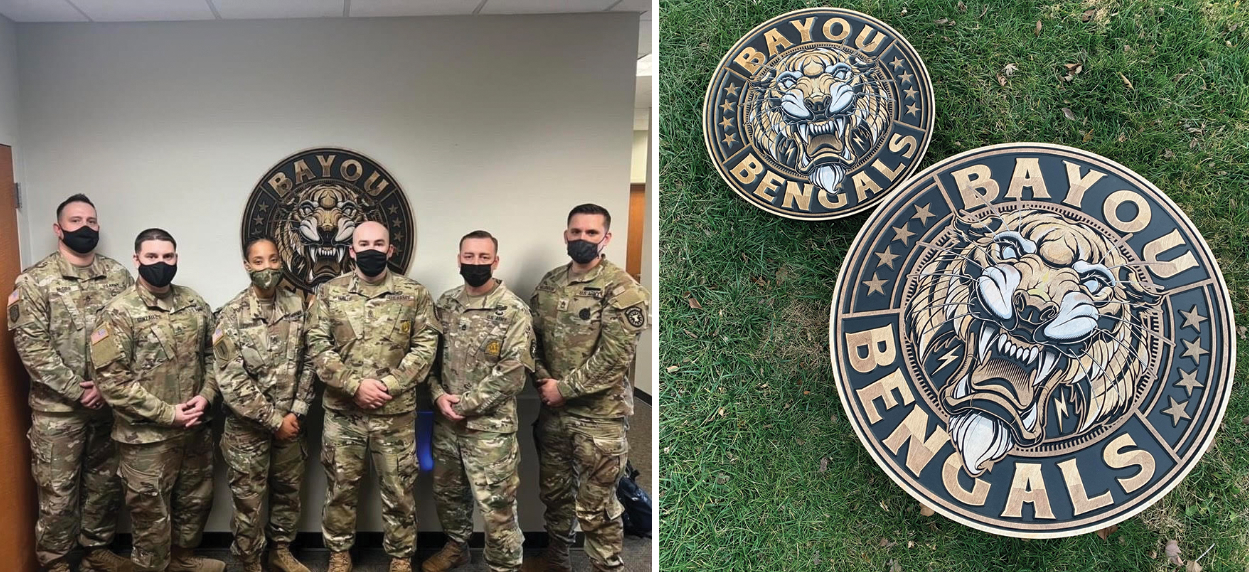
MICRO INFLUENCERS
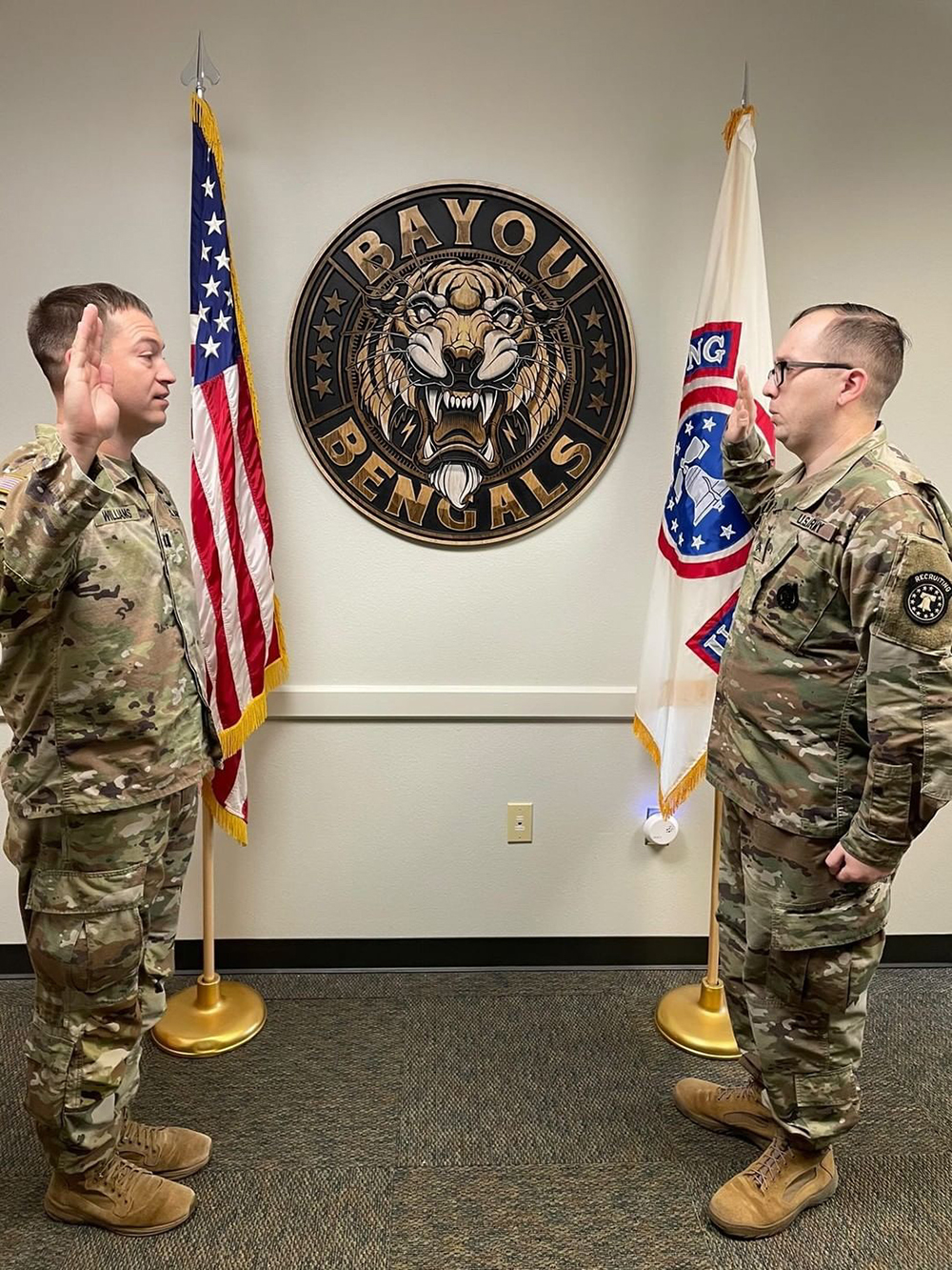
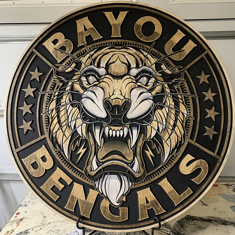
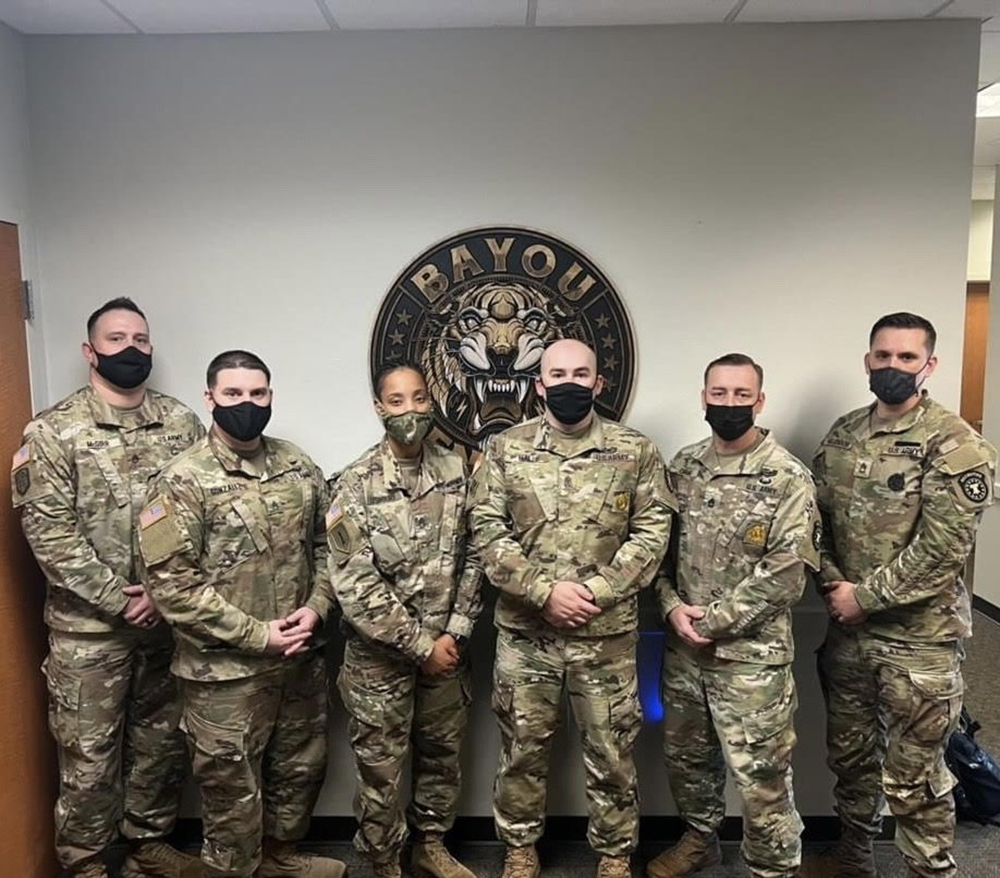
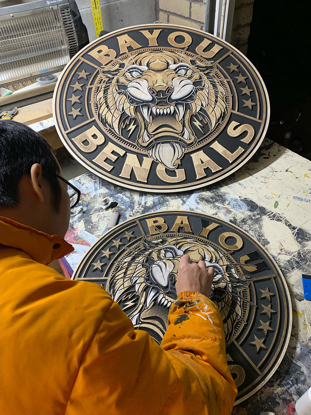
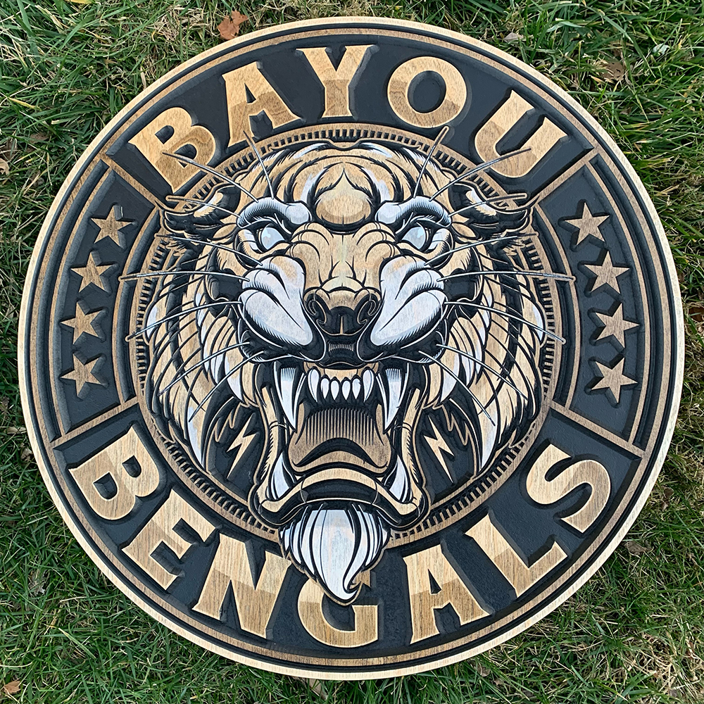
It doesn’t always take deep space to create a dimensional look. A quarter inch can go a long way toward crafting a jump-out effect when paired with the right finish. Han Dinh, founder, Cornbread Customs (Omaha, NE), is extremely discerning when it comes to substrates and stains, and takes a methodical approach to painting in order to create high-impact pieces at a small scale, like these signs for the US Army Recruiting Co., Baton Rouge (LA).
Using a vector file created by graphic designer Jared Mirabile (Ocoee, FL) for the recruiting company as a starting point, Dinh and his business partner Tony Bergstrom first did some edits in Adobe Illustrator, then opened the .eps file in Vectric Aspire, selected the black areas of the design, and VCarved it out.
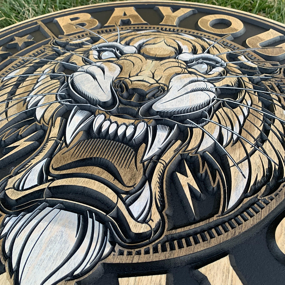
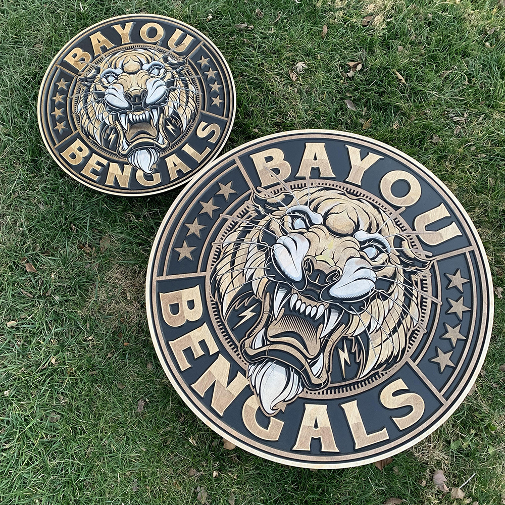
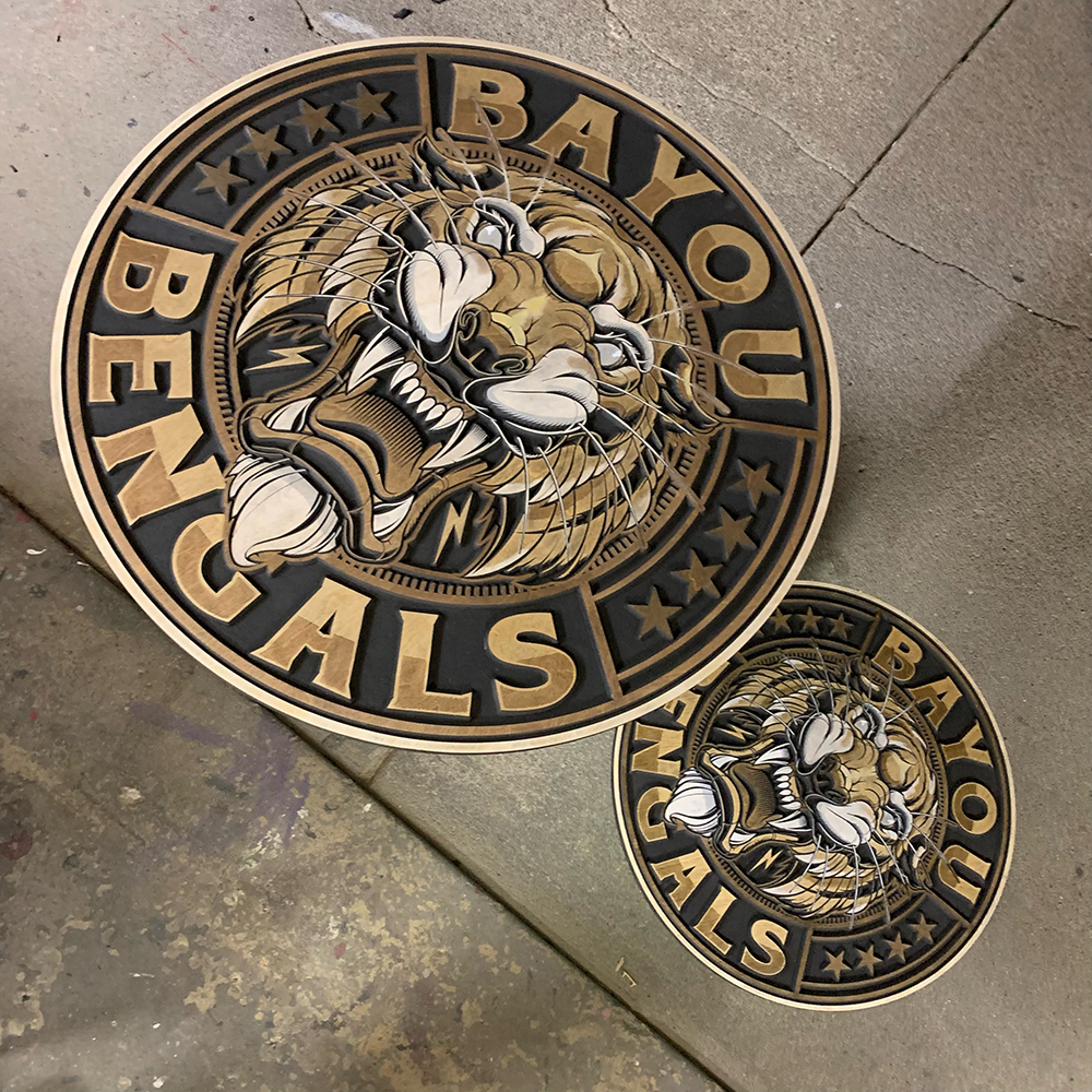
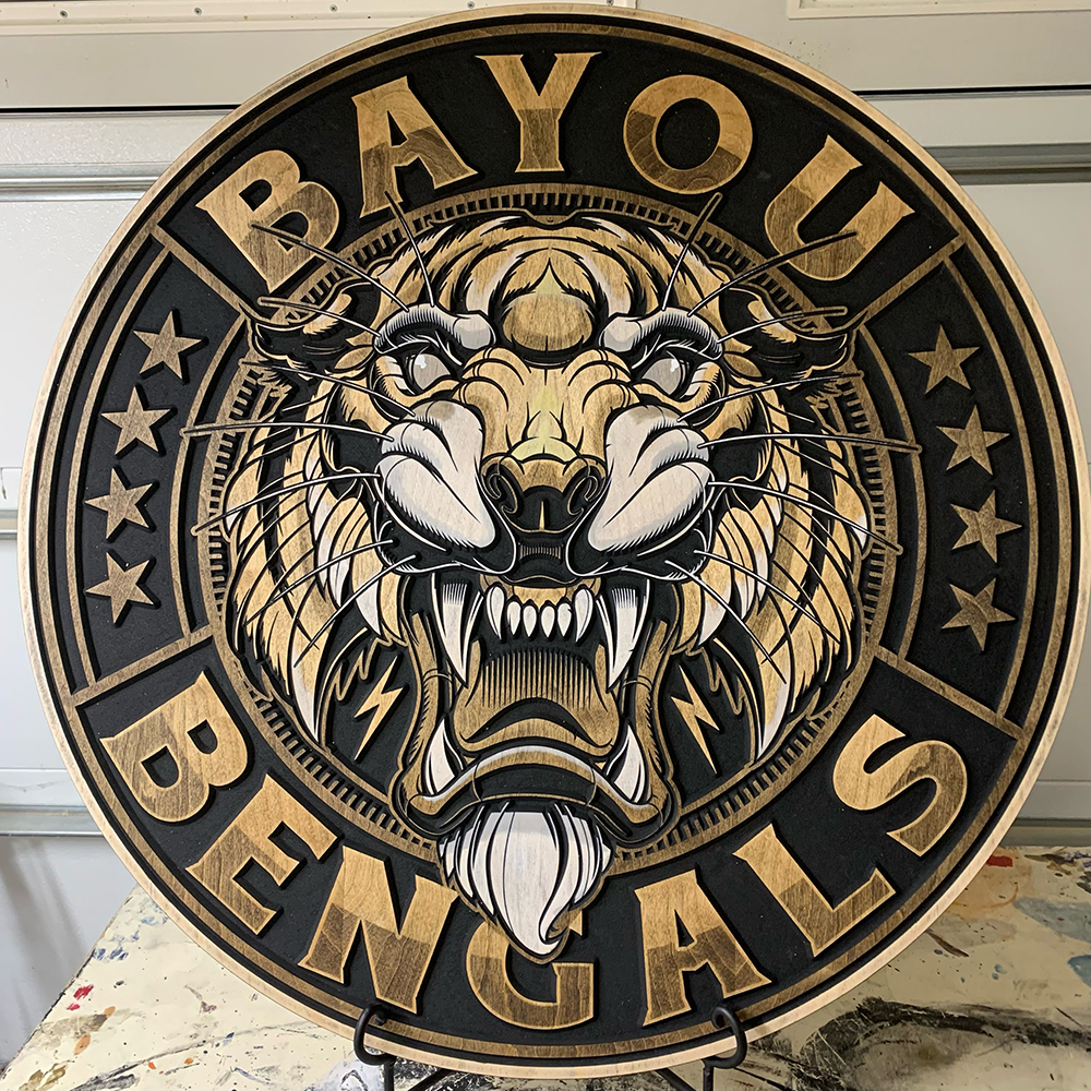
Measuring 24 and 36 in. in diameter, the two circular interior signs are made of an engineered wood from Roseburg. “It took us a long time to source the material, and it took many samples from our wood suppliers to finally find something that we like,” recalls Dinh. He says Cornbread uses mostly white birch because it absorbs stains better than maple — and it’s a lot cheaper. “We like to use full-face veneer so there are no binding lines …” Dinh adds. “We only use sapwood with no knots because it’s the whitest part of the tree. Using white wood [makes] the colors pop.”
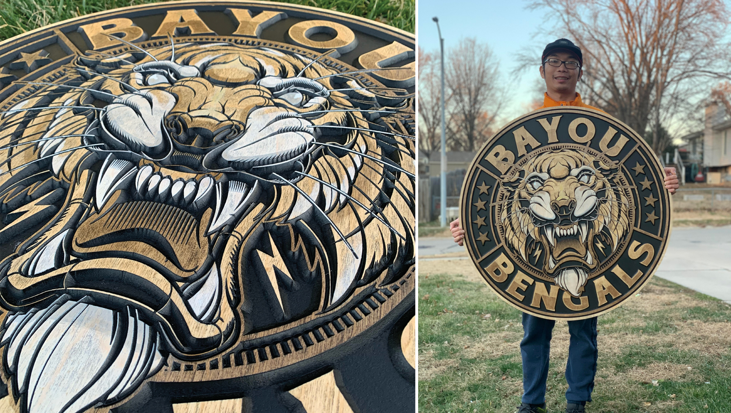
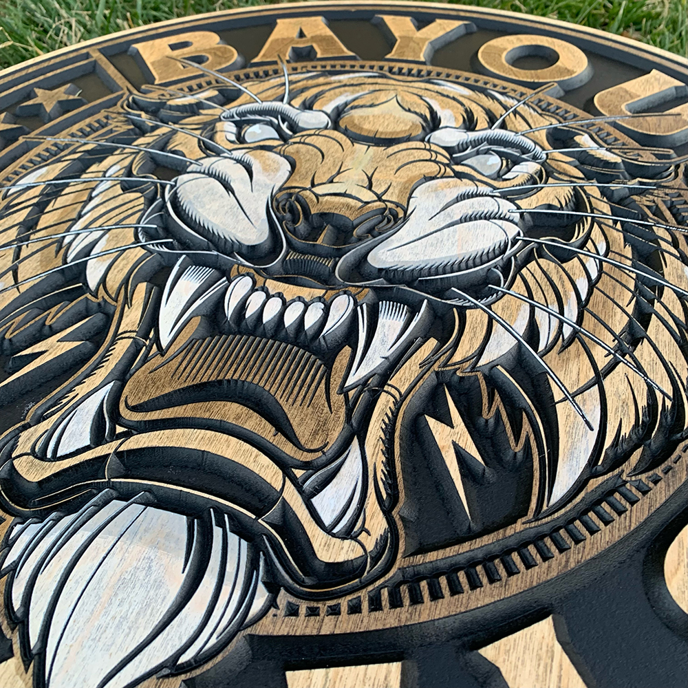
Layer it on. To enhance this carving’s dimensional look, Dinh added different walnut stains, working his way from lighter to darker tones before adding a final touch of white.
Also giving the sign a degree of dimensionality, the duo used a drag knife made specifically for CNC spindles to carve out the tiger face’s details at ¼-in. deep. For the masking, Dinh cut the profiles with three tabs to accommodate the circular design. “I also cut the profile a little bit deep into the table, so when I need to mask something I can put it back using the profile mark on the CNC table,” he says.
In terms of tools, Cornbread used an Avid CNC and an Amana Tool 90-degree V bit the company ordered from ToolsToday for the V carve, while the pockets were routed out with a ⅜-in. Amana Tool down-cut, which Dinh says leaves the least marks and makes it easier for sanding.
“For this sign, I was confident enough to paint the tiger’s face by hand and only cut out masking [for] the letters,” explains Dinh. He selected Dark Walnut, Special Walnut, Jacobean, Natural and Simply White penetrating stains from Minwax to preserve the highlight of the wood grain. “Many products claim to be a ‘stain’ but they are basically a paint or glazing,” says Dinh. “Those will hide the woodgrain.”
To give the Bayou Bengal and surrounding text their ready-to-pounce look, Dinh incorporated different shades of the walnut stain, working his way from light to darker tones before adding the white shade last. “I apply the stain very dry for more control,” says Dinh. “You can only do the fading with a dry rag. To achieve the consistency, you need to first soak your rag in stain and then rub it out on a piece of scrap wood until your rag is dry enough, and [use it to] stain like a big marker.”
While this sign doesn’t show off any vibrant colors, Dinh notes that a challenge his shop faces on a daily basis is matching them. “There is no single product out there that gives the wood-popping colors and preserves the woodgrain,” he explains, adding that the lack of color range is also a factor and that his team is left custom mixing most of the colors for its projects. (Manufacturers, are you listening?)
The small signs did not require professional installation, but Cornbread provided hanging cables held up by two wood screws so each could be hung much like a framed picture. Most importantly, the client was happy with how it turned out and is ordering three more.
Overall, Dinh says the project, which took about a week to complete, was easier than many of the signs he and Bergstrom make because they had the vector file from the designer. It’s clear the company thrives on that kind of collaboration. Overseen by Bergstrom, its Instagram account, @Cornbread_Custom_Signs, has become a showcase for the duo’s craft, driving 90% of the shop’s sales and attracting attention from graphic designers across the web — including Mirabile (@Sweyda on IG). “He hired us to do his logo and was nice enough to share our works on his page, which has 125K followers,” says Dinh. “He exposed us to his audience. Many of his clients asked us to do signs; this was one of them.”
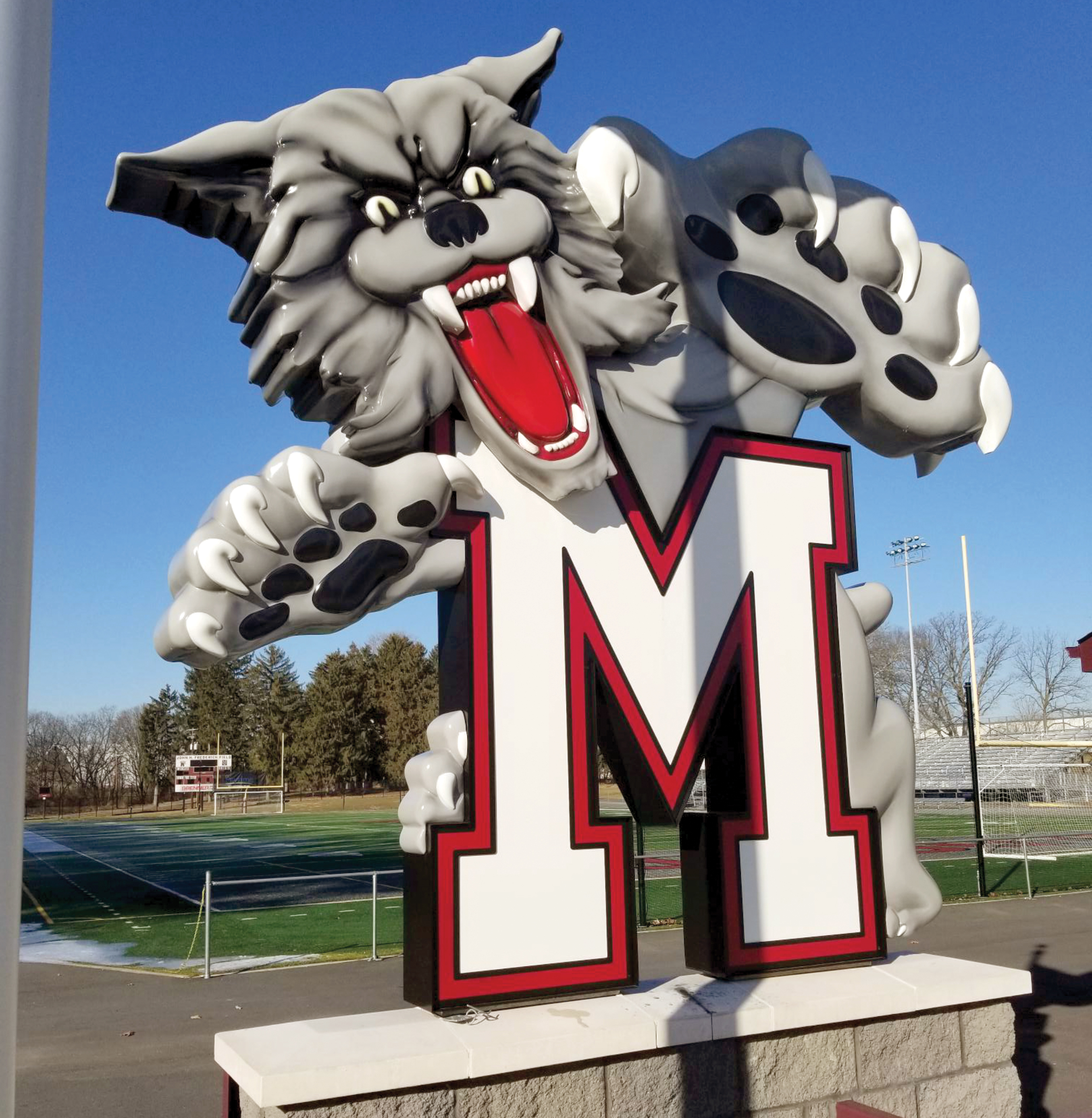
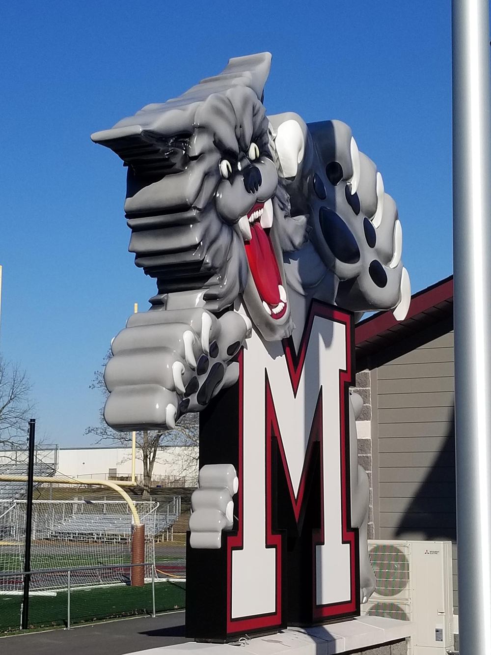
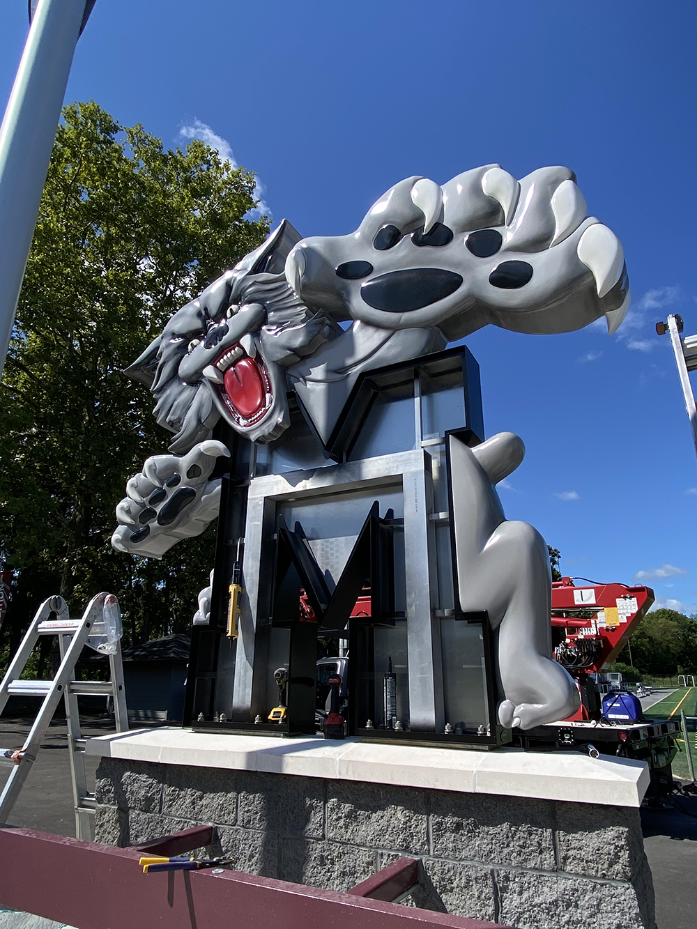
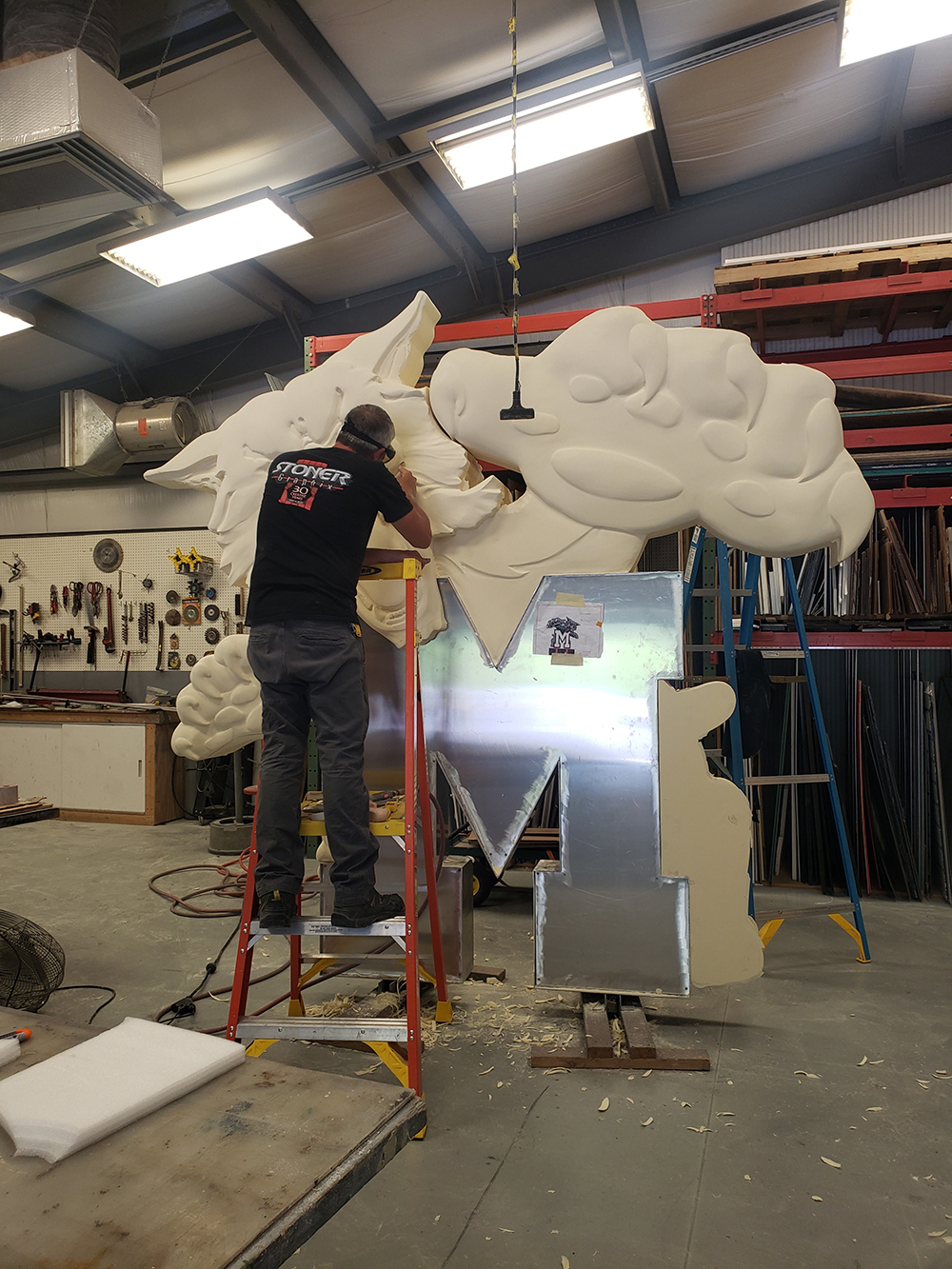
Give me an aluminum “M”! The letter structure bolts into a masonry base and is protected by clear-coat paint.
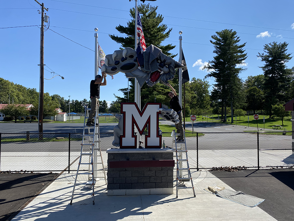
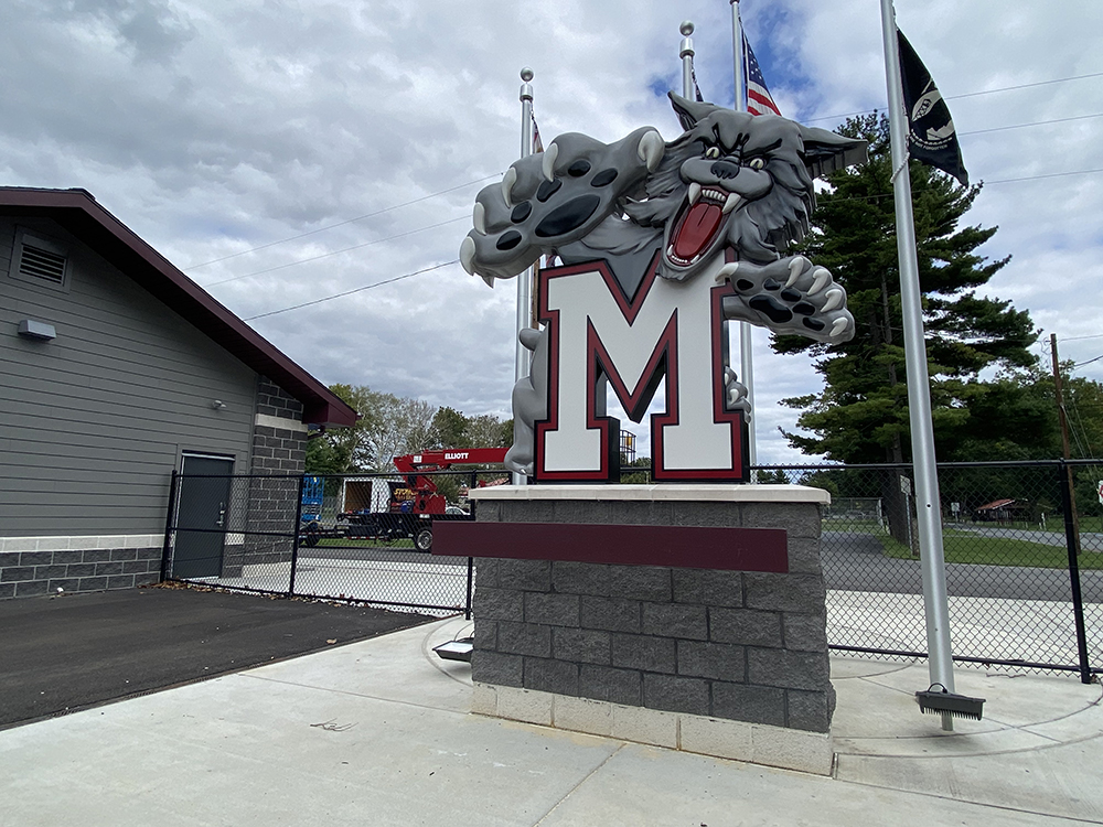
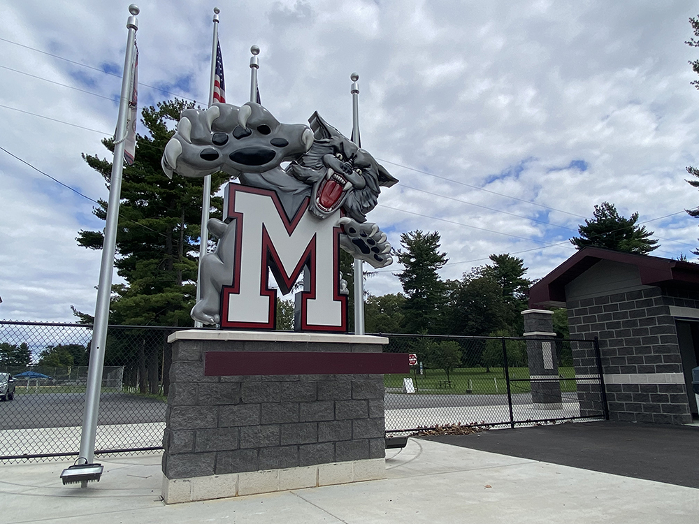
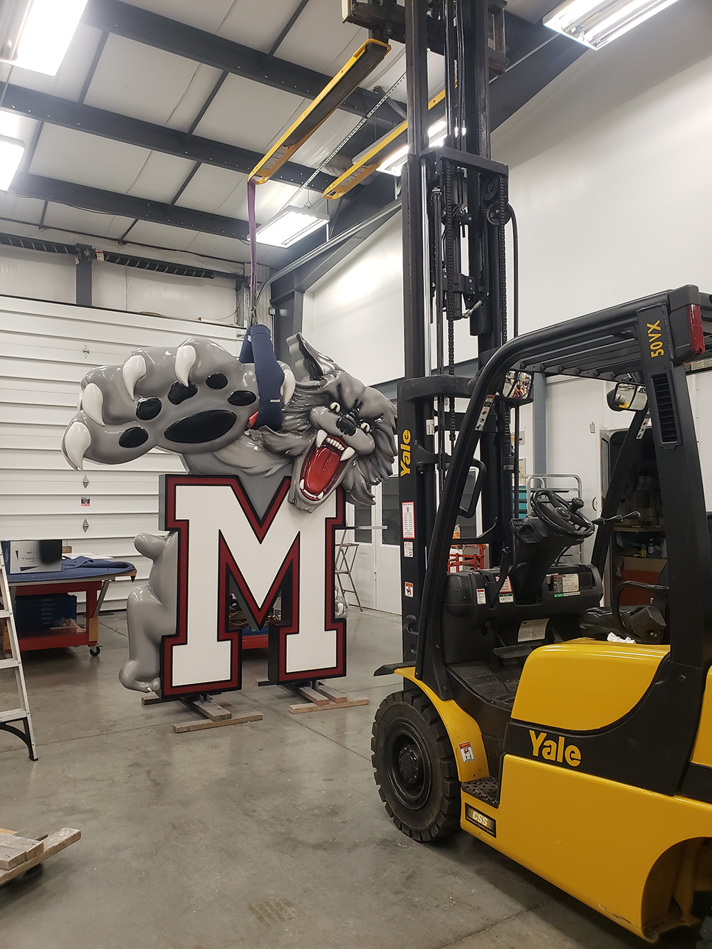
TALL ORDER
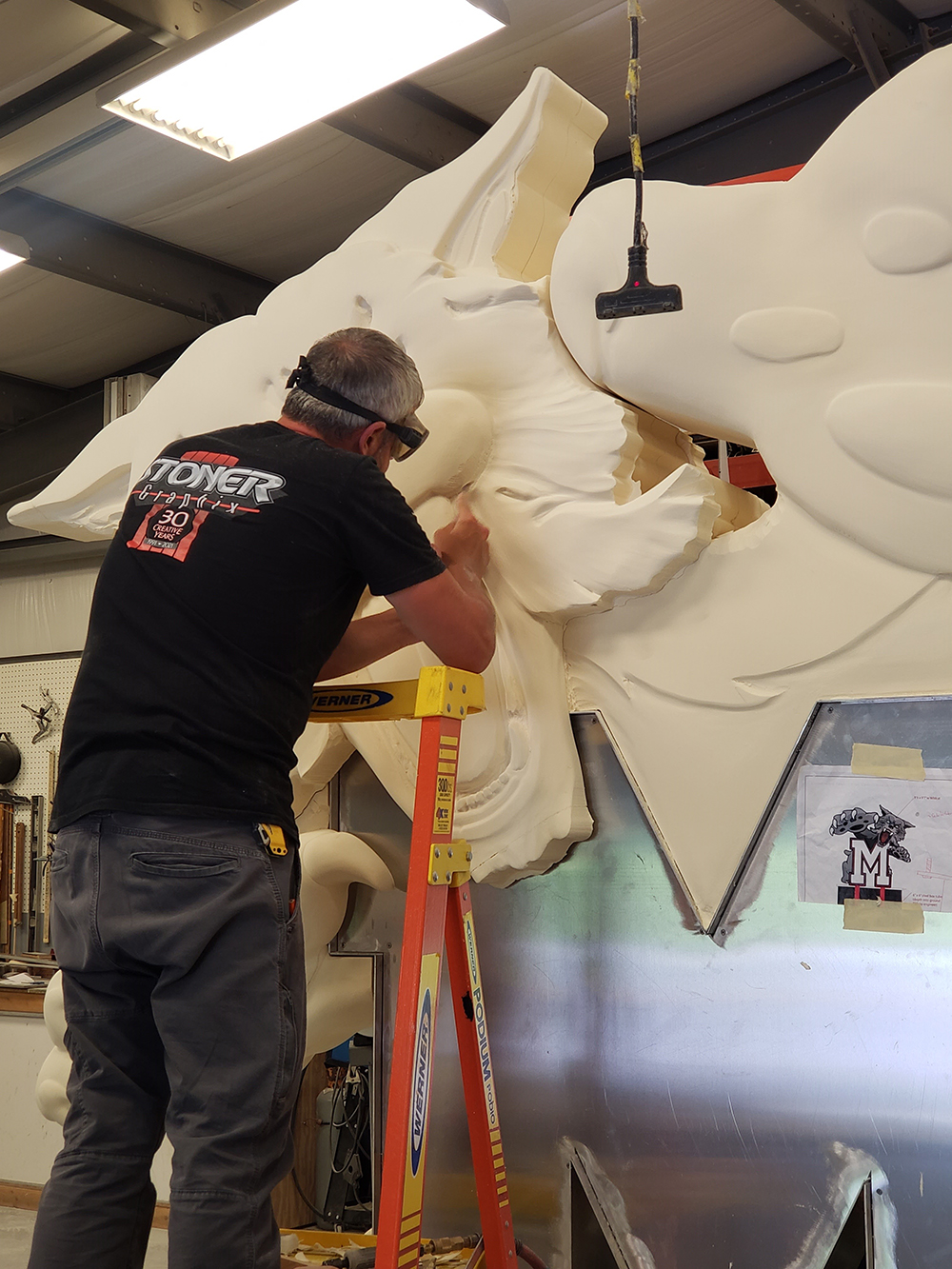
While Cornbread’s rendition of the Bayou Bengal packed a big punch in a small frame, Stoner Graphix’s (Hummelstown, PA) wildcat creation leverages massive size and 3D modeling to make a major impact. Commissioned by the Wildcat Foundation alumni association for Mechanicsburg Area Senior High School (Mechanicsburg, PA), Stoner Graphix landed the project thanks to a referral from local architect Brian Haines of Crabtree Rohrbaugh & Associates, who they’d previously worked with on a new football complex.
“We were given the school’s logo and refined it into what you see on the finished product,” says Kurt Stoner, president, Stoner Graphix. “The original version was a little dated and hand drawn a little rough; our design team redrew and cleaned up the face and attributes of the cat to modernize and freshen up the look.”
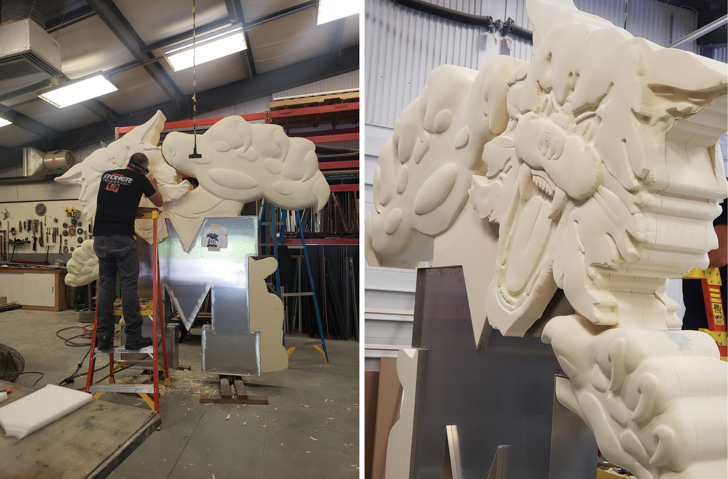
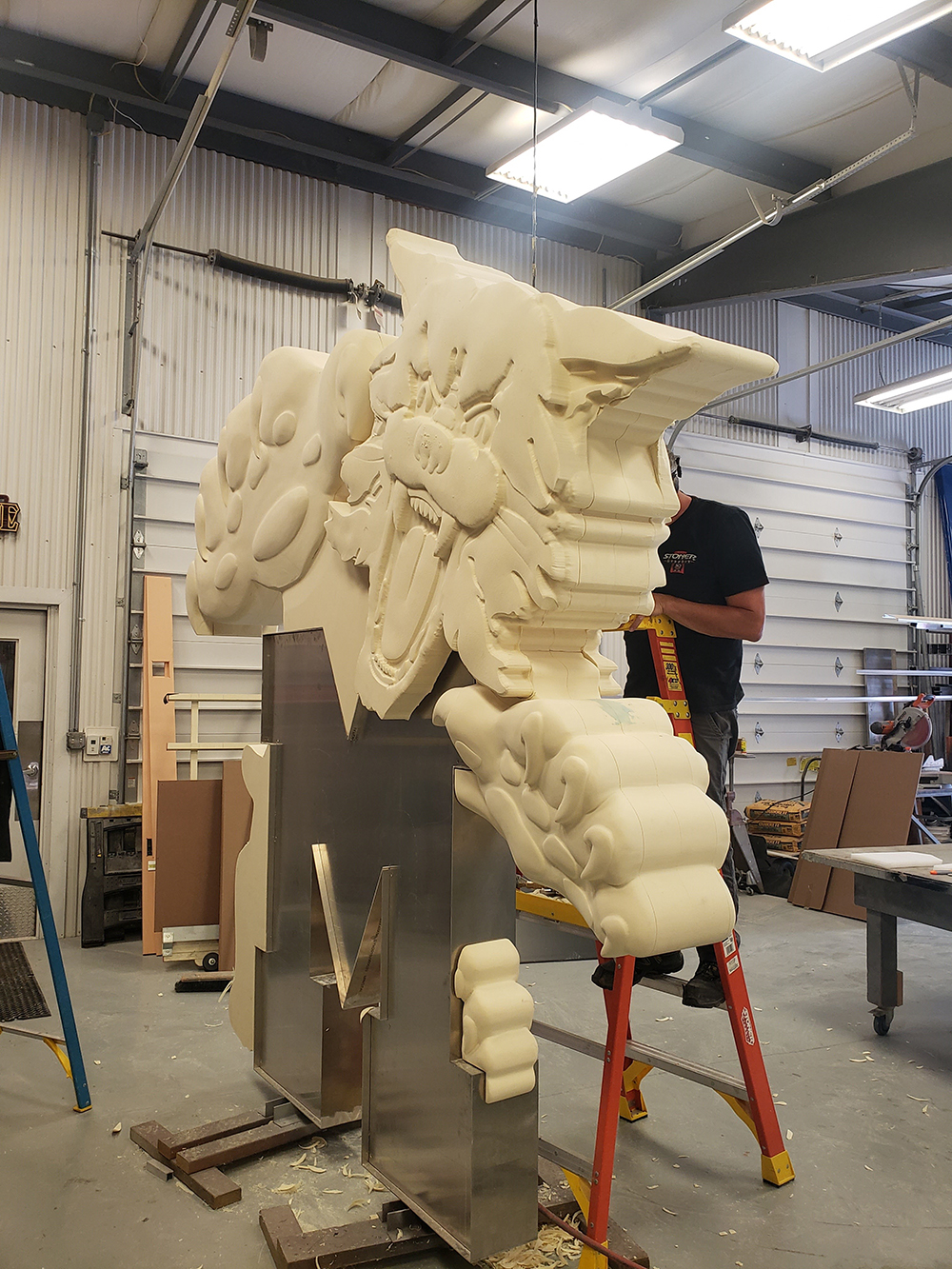
Check out this primed number. The HDU here received multiple coats of Evercoat polyester high-build primer, then was hand sanded several times.
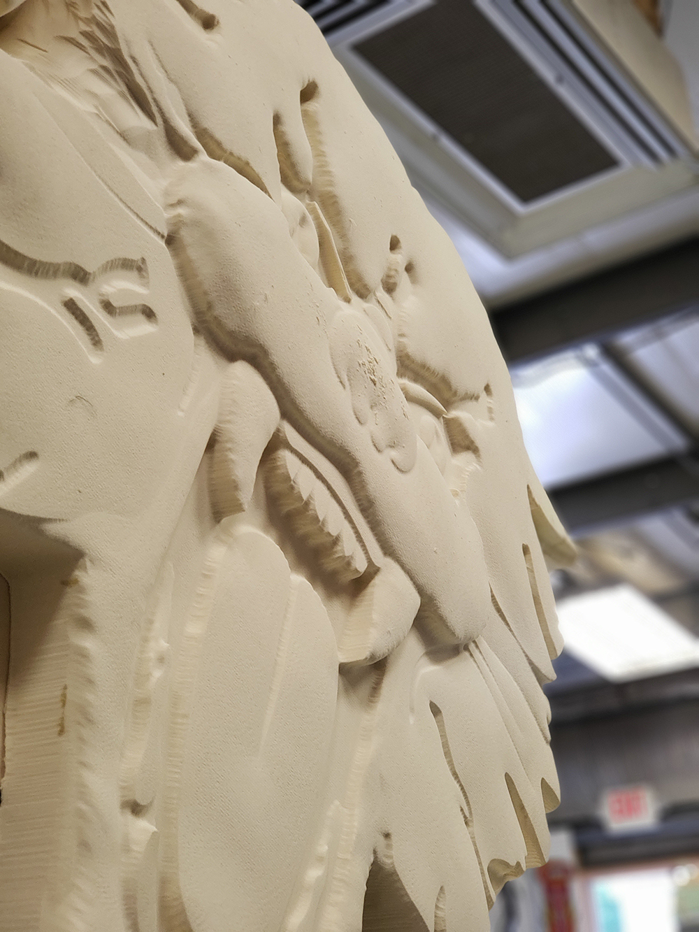
Fabricating a sculpture that extends more than a story high was a major undertaking. Standing 10 ft. tall and stretching 10 ft. wide, the 16-in.-thick mascot is made from 4-in.-thick sheets of DUNA-USA CORAFOAM 4-lb. HDU and perched on a 5-ft.-tall stone base. Stoner says the biggest challenge was designing an internal skeleton that would adequately support the design without interfering with the desired look. “One of our initial main concerns was the fact that the client wanted it to be two-sided,” he adds. “We weren’t sure how to transition the edges or sides of the paws and parts of the design in order [for it] to not look strange as you walk around the sculpture.” So his team created a small model (using a one foot to one inch conversion) to show the client their concerns and figure out a solution.
“Our craftsmen used our MultiCam 3000 router and EnRoute 3D software to [turn] the 2D design from Adobe Illustrator into a 3D model to break apart and machine in layers,” explains Stoner. “After gluing the entire structure around an aluminum skeleton, many hours of hand sculpting went into refining the final look. The ‘M’ is an aluminum structure that bolts into the masonry base.”
To bring the mascot to life, pump up the dimension and protect the sign from the elements, the HDU was primed with several coats of Evercoat polyester high-build primer, then hand sanded several times. “Three coats of primer later, we finished the decoration with AkzoNobel Grip-Guard Basecoat clear-coat paint,” says Stoner. “The same paint was used on the aluminum ‘M’ as well.”
Advertisement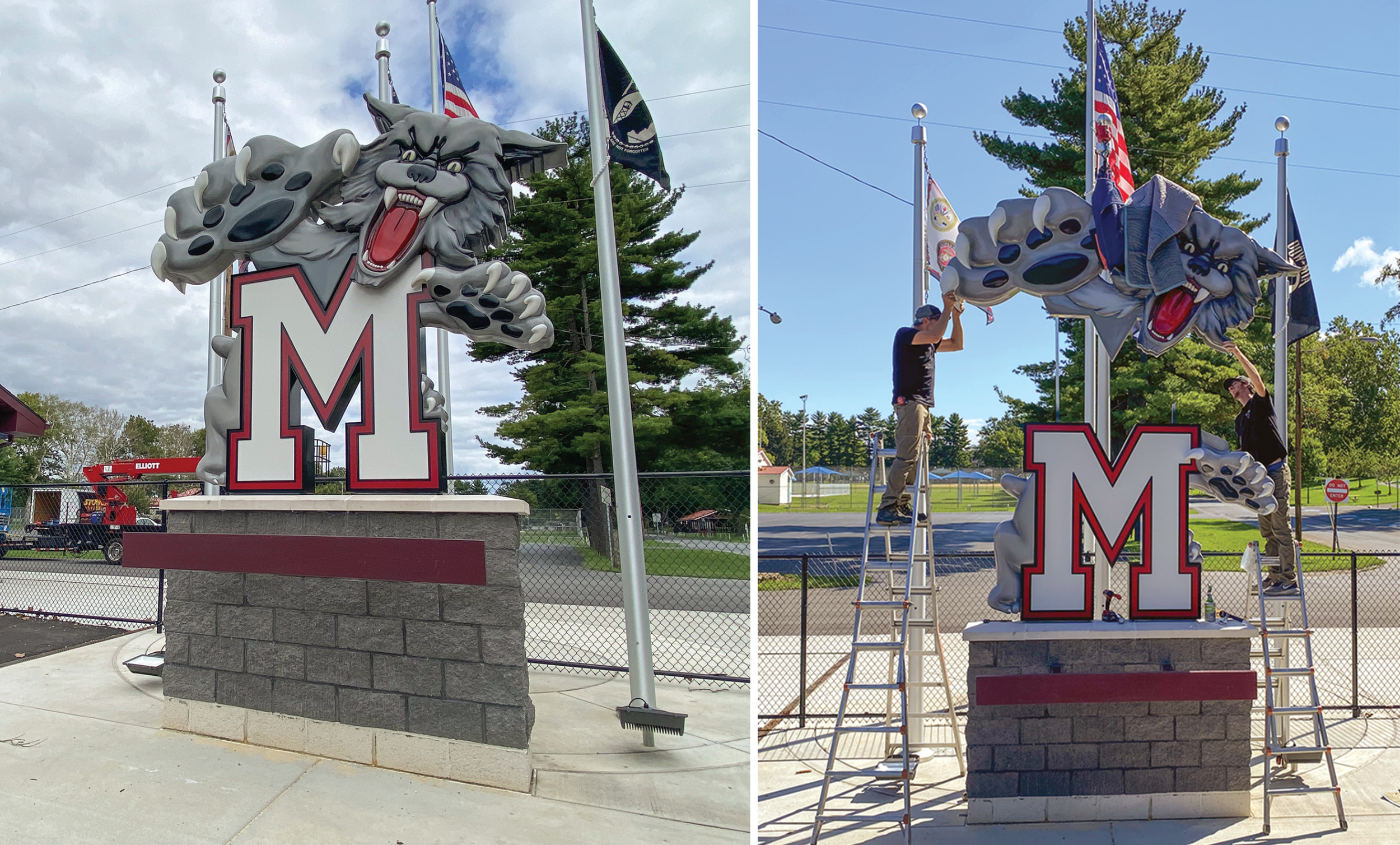
Two of Stoner Graphix’s expert craftsmen installed the sign, which was lowered onto the masonry base with the company’s Elliott M43 aerial boom truck with a jib. The carefully planned install went smoothly, only taking about half a day.
Despite the easy install, Stoner estimates the sign took around 300 person-hours total to complete — and because the scope of work was started after the pandemic and shutdowns began — the entire project spanned a year. But the end game was worth it. “The great response from the Wildcat alumni association that never took on an endeavor as big as this never gets old,” says Stoner. “Getting paid is truly a bonus.”
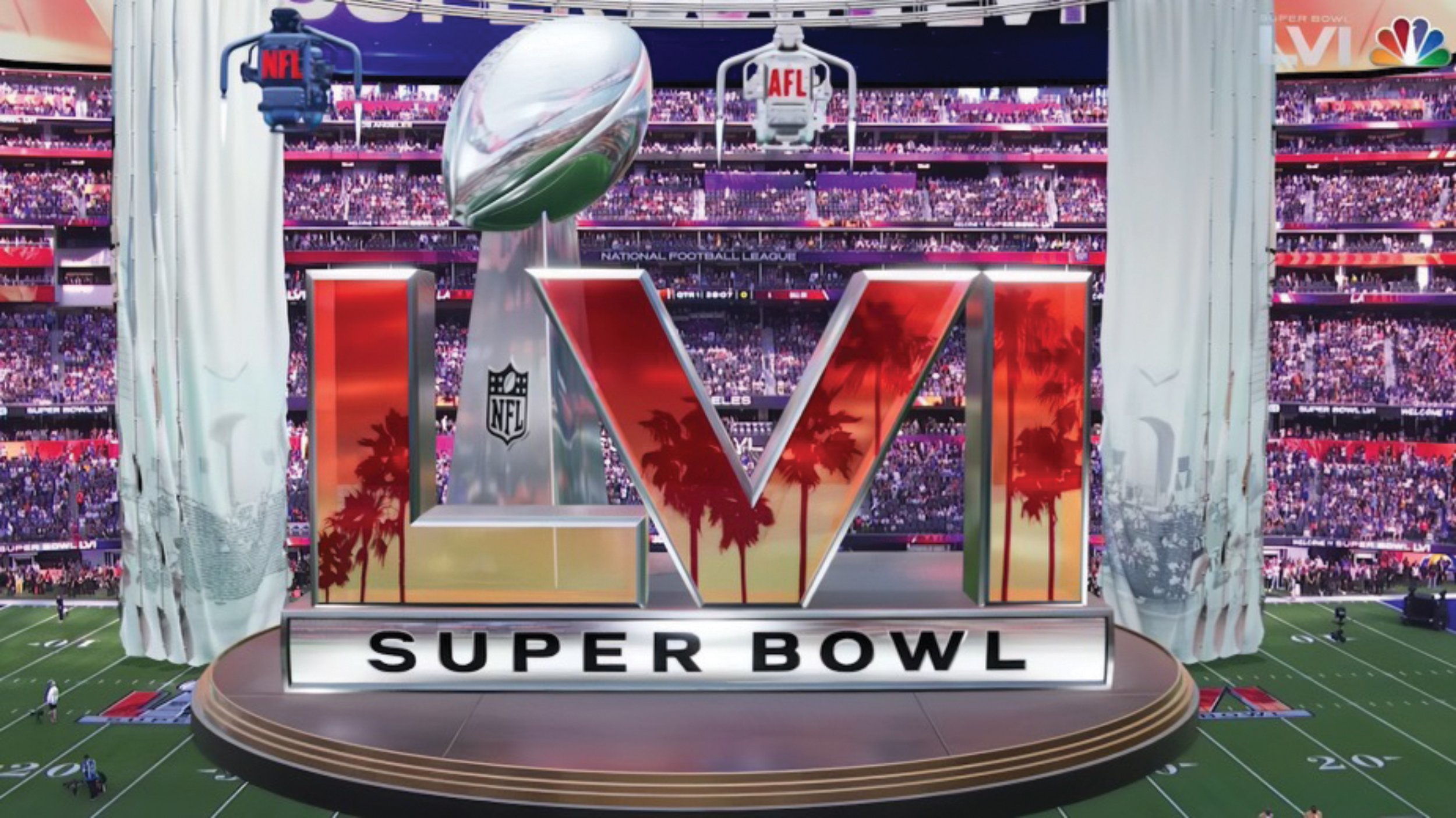
SUPER EFFECTS
How do you create a dynamic, dimensional look on-demand? Fan-experience company The Famous Group (Culver City, CA) is known for wowing NFL enthusiasts with their mixed-reality Baltimore Ravens, Carolina Panthers and Houston Texans mascots — plus the supremely sick virtual Nickelodeon Slime Monster that debuted during the 2022 Wild Card weekend.
According to the group, mixed-reality combines tracked broadcast camera feeds and real-time generated content to create experiences that seem to interact with and affect the environment. “It’s the combination of a video game and real life, and by putting those things together, you can’t tell what is real and what is not,” Jon Slusser, founder, The Famous Group told Spectrum News 1 (Los Angeles).
This lifelike technology has endless applications, ranging from digital 3D billboards to animated virtual characters positioned within the real-world space over 3D real-time set extensions. So this year for the NFL’s biggest game, the group paid tribute to Super Bowl I with a two-tracked camera, mixed-reality production featuring a nod to the LA Coliseum and the original jetpacks.
The Famous Group collaborated with the league; the NBC broadcast team; and technology partners Epic Games, Unreal Engine, Quince Imaging, SMT (SportsMEDIA Technology), Pixotope, The Liveyard, Firebird Sound, TruePoint Laser Scanning and NEP Group on what marked its 17th consecutive Super Bowl project. “[We put] that all together with a huge mixed-reality activation and our Vixi software, which has been rebuilt to have iconic pieces of Hollywood on it,” Famous executive vice president Andrew Isaacson told Spectrum 1. “So fans [could] see themselves on the board this year.”
PHOTO GALLERY (34 IMAGES)


Introducing the Sign Industry Podcast
The Sign Industry Podcast is a platform for every sign person out there — from the old-timers who bent neon and hand-lettered boats to those venturing into new technologies — we want to get their stories out for everyone to hear. Come join us and listen to stories, learn tricks or techniques, and get insights of what’s to come. We are the world’s second oldest profession. The folks who started the world’s oldest profession needed a sign.


INX Promotes Three to Vice President

6 Sports Venue Signs Deserving a Standing Ovation

Hiring Practices and Roles for Women in Sign Companies


Bulletins
Get the most important news and business ideas from Signs of the Times magazine's news bulletin.
-

 Tip Sheet4 days ago
Always Brand Yourself and Wear Fewer Hats — Two of April’s Sign Tips
-

 Business Management2 weeks ago
When Should Sign Companies Hire Salespeople or Fire Customers?
-

 Women in Signs2 weeks ago
2024 Women in Signs Award Winners Excel in Diverse Roles
-

 Real Deal5 days ago
A Woman Sign Company Owner Confronts a Sexist Wholesaler
-
 Benchmarks22 hours ago
6 Sports Venue Signs Deserving a Standing Ovation
-

 Editor's Note1 week ago
Why We Still Need the Women in Signs Award
-

 Line Time2 weeks ago
One Less Thing to Do for Sign Customers
-

 Product Buying + Technology1 week ago
ADA Signs and More Uses for Engraving Machines