True Grit
Six projects show how this artisanal technique adds texture, depth and character.
GO AGAINST THE GRAIN. Or in this case, work with it. Whether capturing the curves of a fish’s scales, the rustic vibe of a southwest tavern or the brushstrokes of a renowned artist, sandblasting is a versatile way to add dimension to a range of signs. When well executed, the results are details that pop, a natural-looking finish and increased readability that blast a client’s branding to the next level.
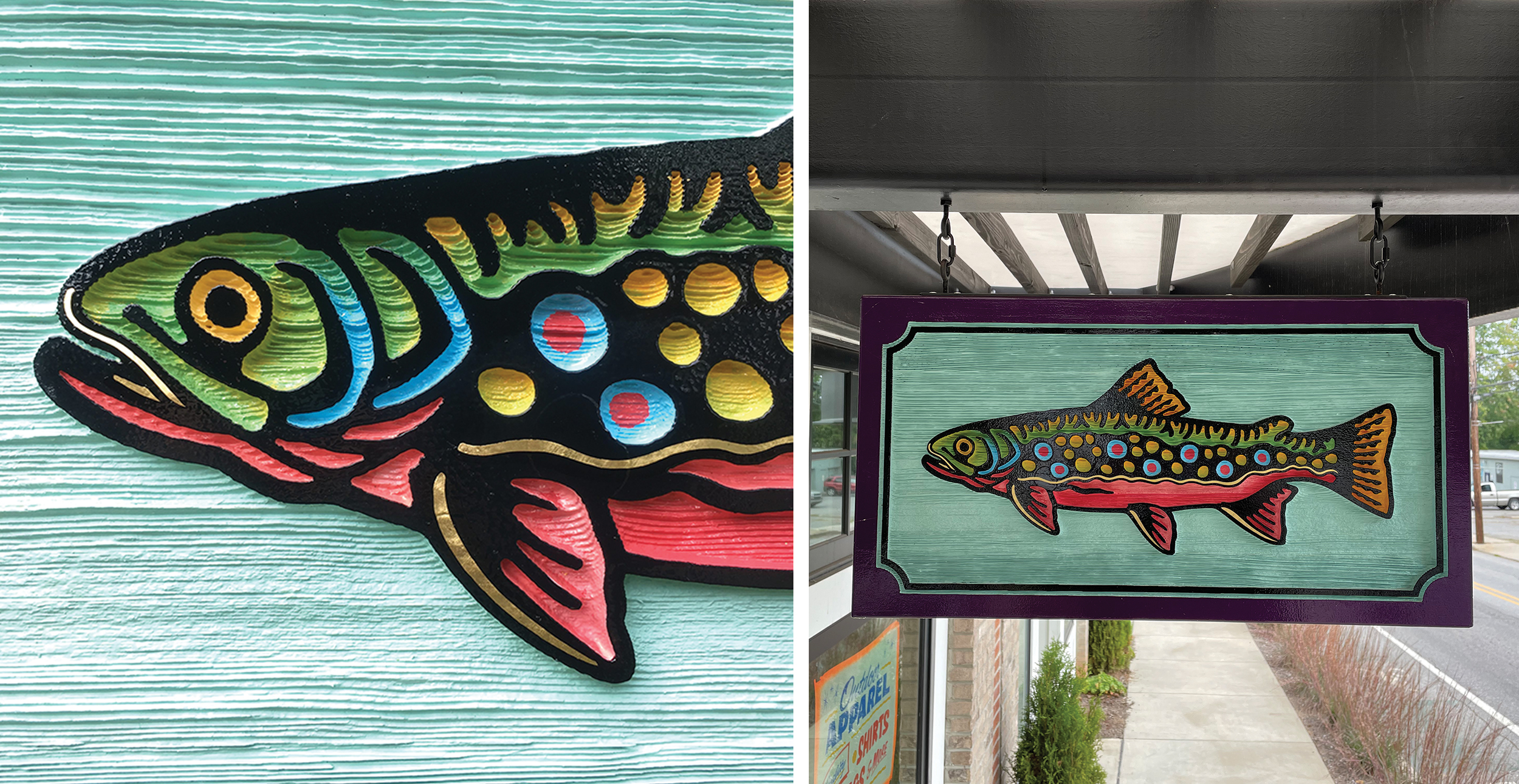
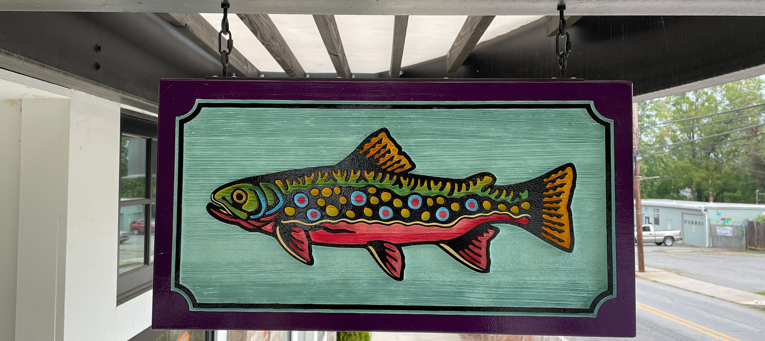
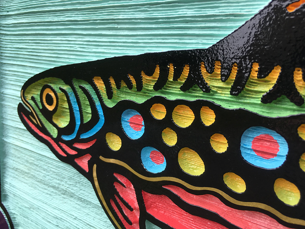
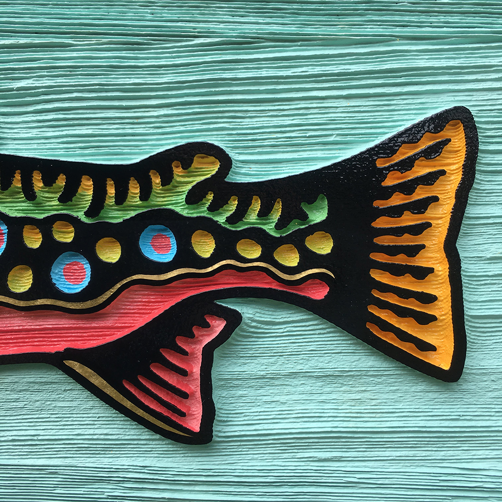
Float On
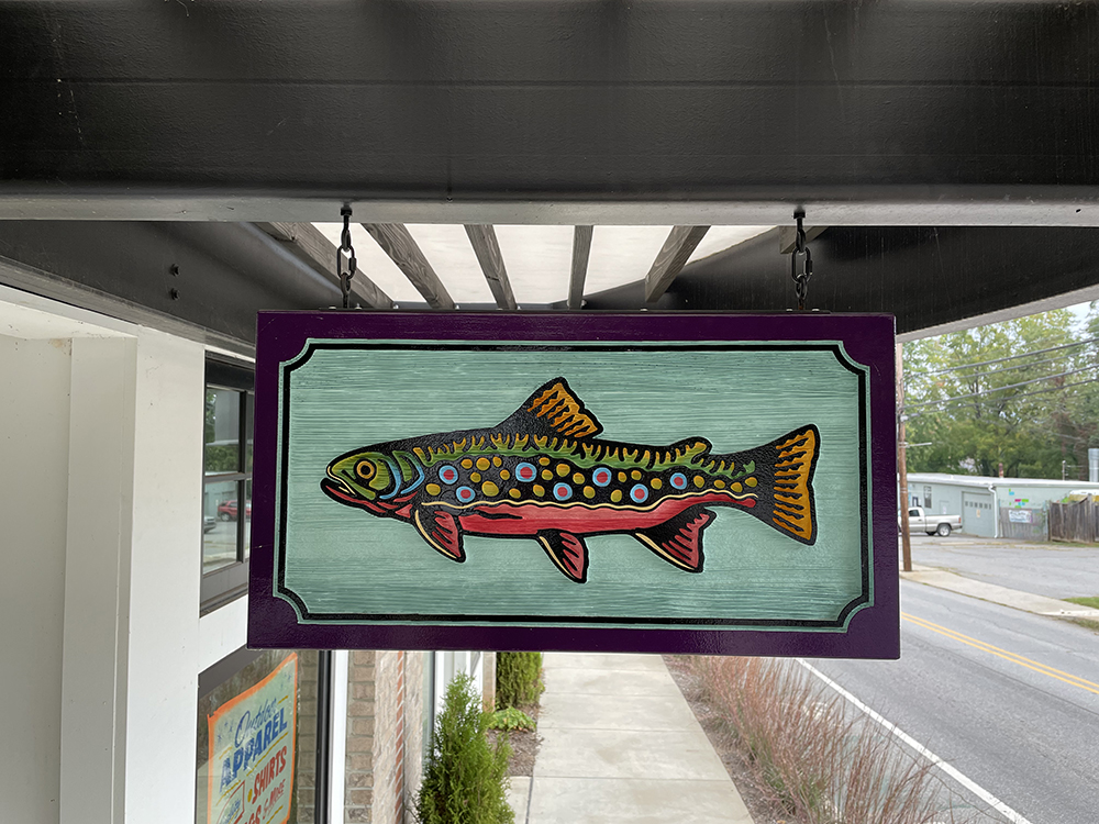
Collaborations can go swimmingly. Just ask Timothy Maddox of Mighty Fine Signs (St. Louis). When hired by tattoo artist (and repeat customer) Danny Reed to create a piece for his fly-fishing shop Crooked Creek Holler (Asheville, NC), Maddox channeled the client’s watercolor painting of a brook trout into a vector drawing. The placement called for a 24 x 12-in. double-sided sign with big impact. So Maddox tapped The Woodcarver’s Clifford Bryson (Vancouver, WA) to add dimension by cutting ORAFOL’S ORAMASK 831 on a plotter and blasting the redwood panel with beach sand. “I used chisels and an X-ACTO knife to clean up the tight spots, deepening the blast and accentuating the grain,” said Maddox. He added a water-based primer and coated the background with SharkSkin solid stain from Rodda Paints before hand painting the rest of the sign with 1-Shot lettering enamel in vibrant colors. A final touch of W&B 23k gold leaf spun with velvet gives the fish a sense of shimmering movement while reflecting the store’s high-quality offerings.
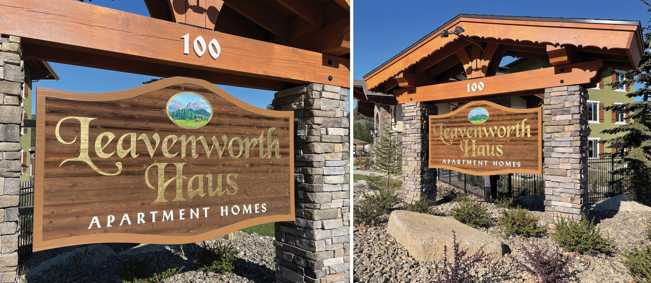
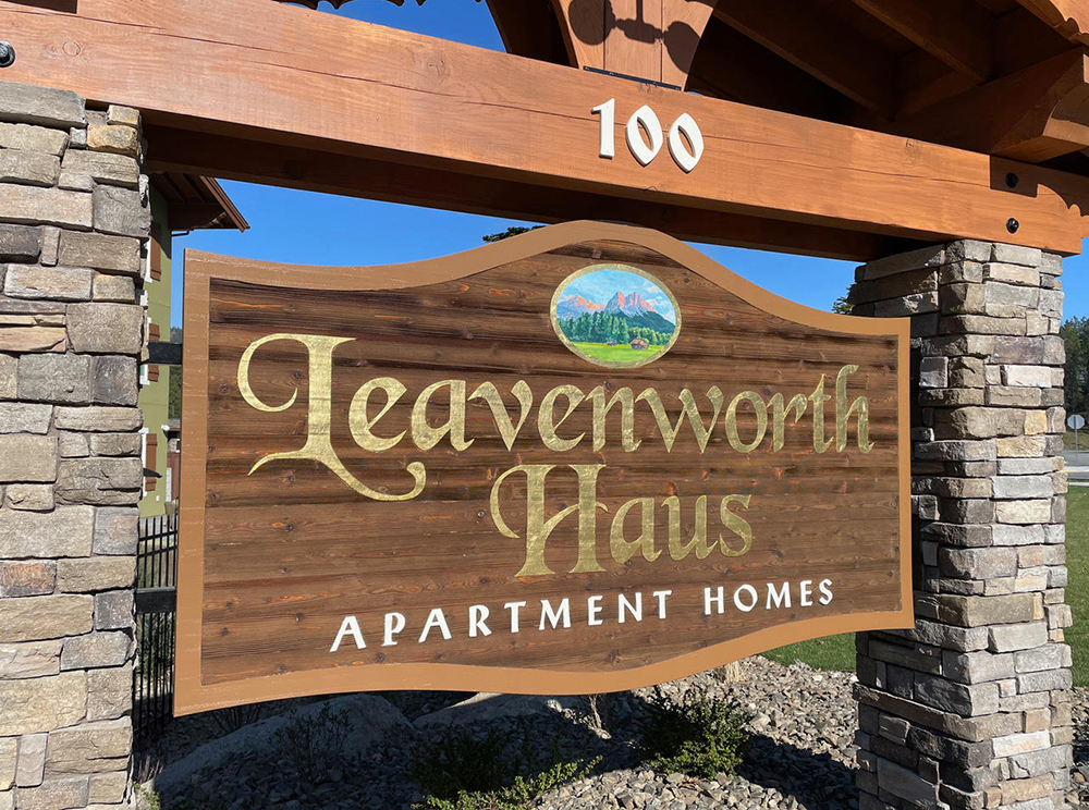
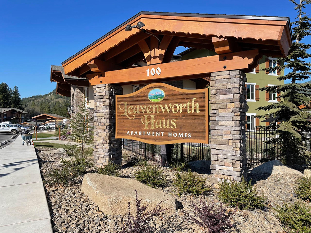
A Sketchy Client
Some customers provide inspiration; others create it. Luckily, local client Leavenworth Haus Apartment Homes presented what Gibbs Graphics (Leavenworth, WA) co-owner Rusty Gibbs described as “some surprisingly nice sketches” that his team could redesign in Adobe Illustrator. The signmaker chose western red cedar for its grain and ability to withstand moisture and opted for an Anchor high-tack mask, while M&E Memorial Markers (Wenatchee, WA) — which has handled all of Gibbs’ sandblasting for the past 15 years — did a shallow blast to give the sign its subtle texture. “Leavenworth is a Bavarian-themed town and much of the design, including the fonts, were based on some fairly strict sign code,” explained Gibbs. A hand-painted pictorial by Amanda Gibbs, lettering gilded with 23k gold leaf and an architectural roof structure enhance the German feel.
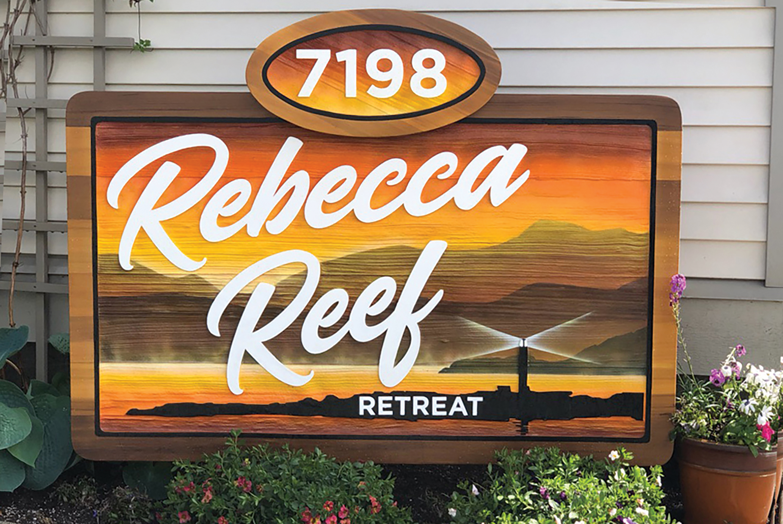
Escape Tactics
When creating a sign for Vancouver Island’s Rebecca Reef Retreat, sandblasting a red-cedar base felt like a natural fit for the oceanside Airbnb’s location in a small, cottage-style city. “Powell River, BC is … surrounded by the lumber/timber industry,” explained Geoff Orlick, owner, Quality Designs Ltd. (Campbell River, BC, Canada). “It was important to represent that feel.” Orlick created the file, cut out the mask material on the company’s Summa DL120RL, applied the Anchor sandblast-stencil mask to the panel and sent the sign to local Redman’s Sandblasting to be blasted. The design pairs a black silhouette of the Rebecca Spit with laser-cut, ⅛-in. white acrylic text in an easy-to-read, script-style font, which Orlick said reflects “the customer’s [and property host’s] gracious attitude.” Local artist Jeff King airbrushed the sign’s background to create the dreamy sunset effect.
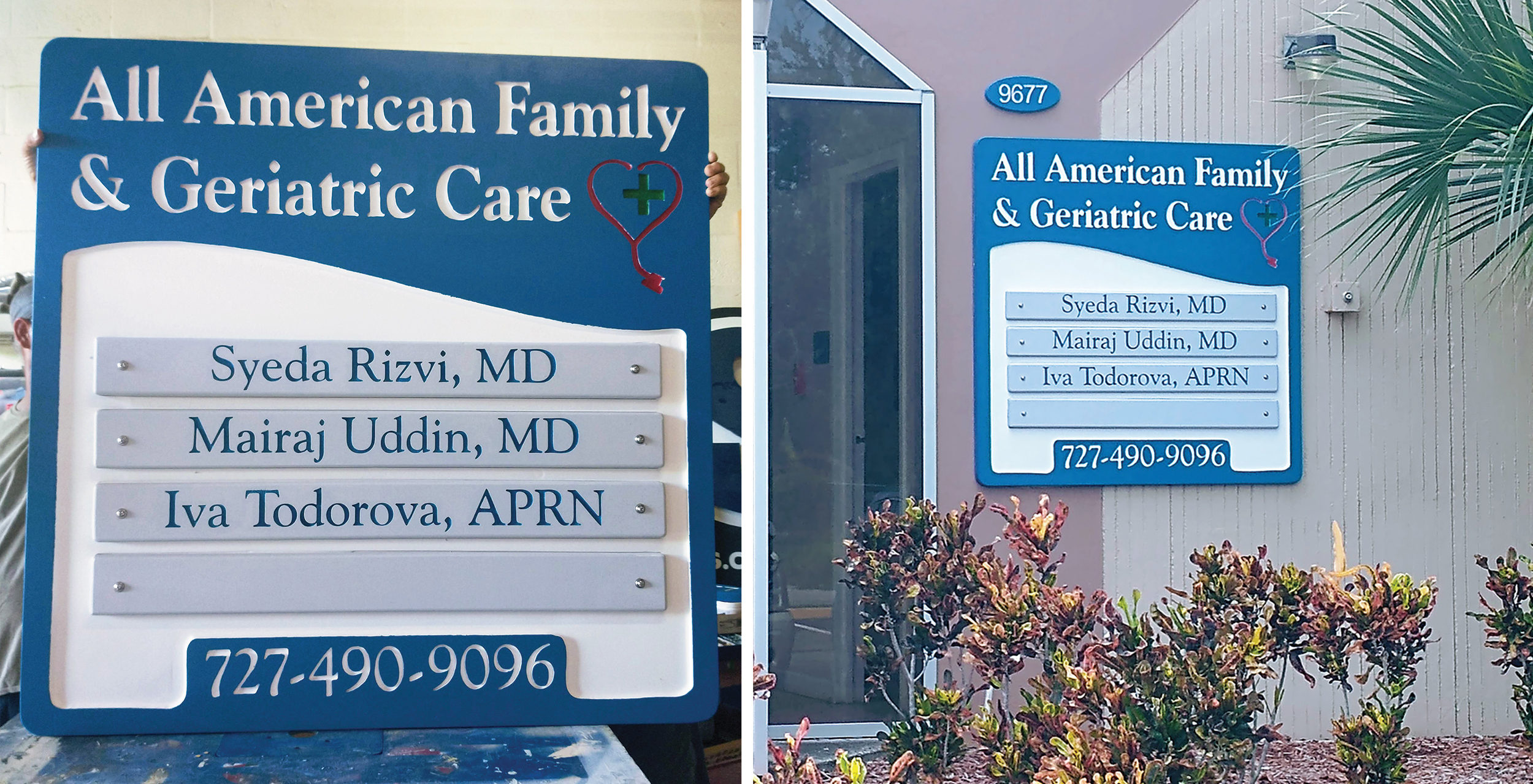
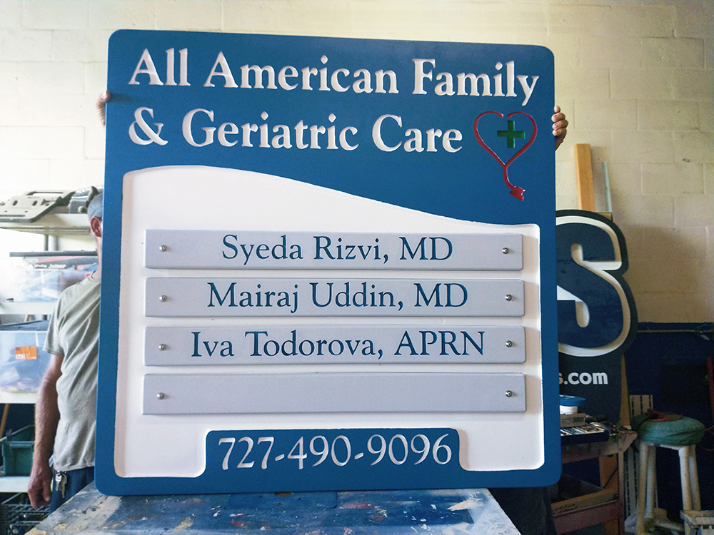
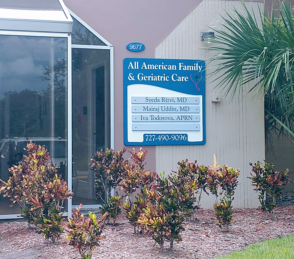
Doctors’ Order
Physicians’ offices need to be accommodating — and so does their signage. That’s why Cross Signs (Clearwater, FL) owner Jeffrey Cross likes to use an easy-to-read Goudy font for sandblasted signs, and recommends adding doctor names on adjustable, removable panels for convenient updates. For client All American Family & Geriatric Care (Seminole, FL), the signmaker placed a Hartco HGS930S mask on 15# Sign•Foam design board. “This was a 4 x 4 sign … too big for my sandblast cabinet,” recalled the 36-year sign veteran. “So I subbed this out to local [contractor Milo Tejic who] does a great job.” While the stethoscope with the cross was already part of the office’s letterhead, the curve in the top of the white section was Cross’s idea. “It just seemed to fit well…” Cross said.
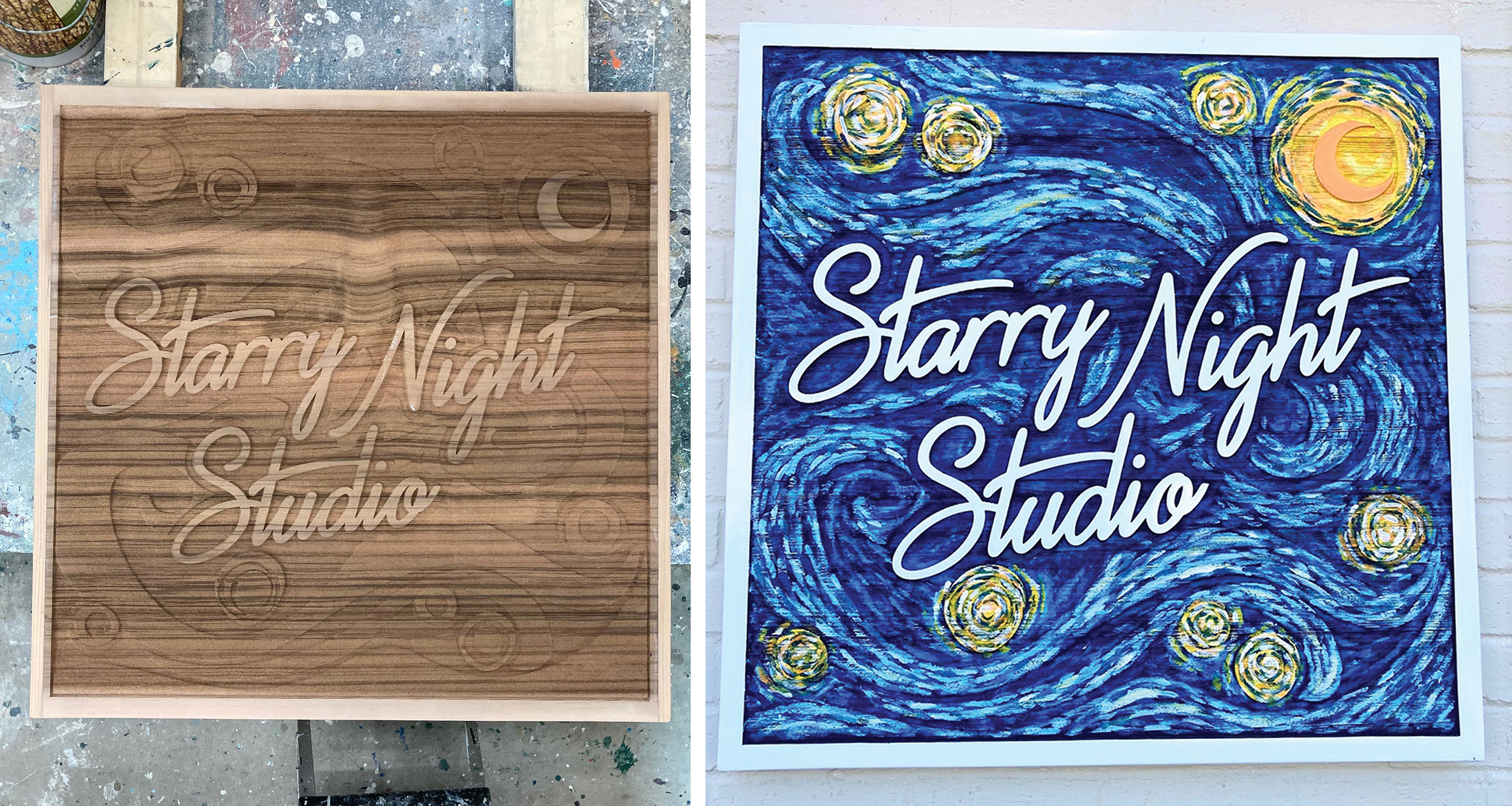
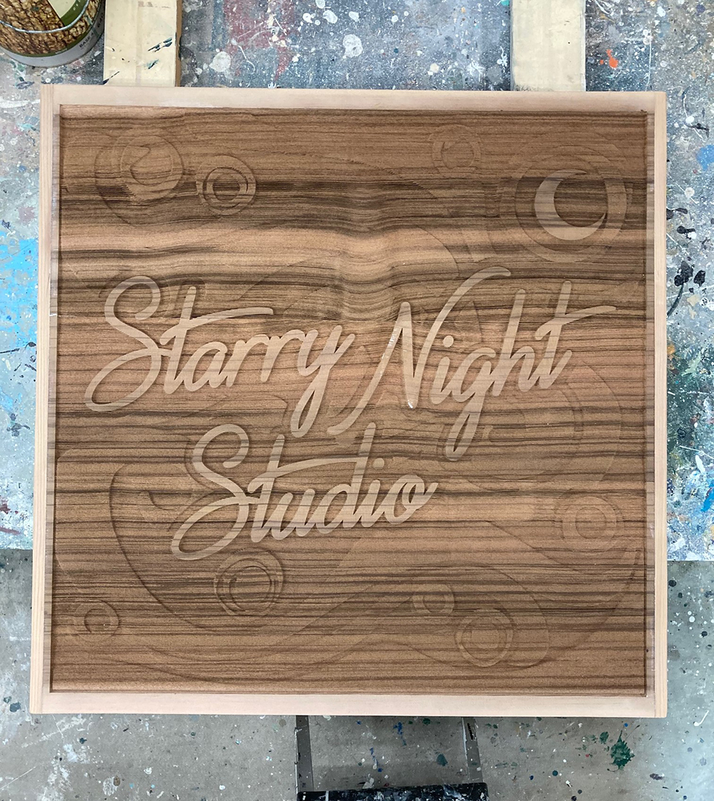
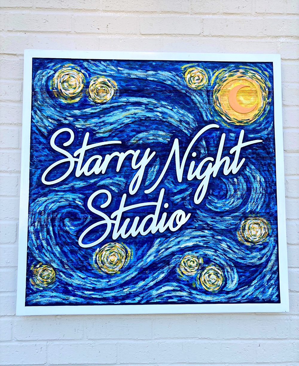
Starry Bright
It’s not every day you have the chance to recreate one of the most widely recognized impressionist artworks in the world. Unless your client is Starry Night Studio (Mount Olive, NC). Ruth Arnold, owner of RAGS Signs & Graphics (Wilmington, NC), said her shop used sandblasting as a way to create depth and texture that mimic the thick brushstrokes of the studio’s namesake Vincent Van Gogh painting. “We use western red cedar for most of our sandblasted signs,” said Arnold. “It’s an ideal substrate because of its beauty, durability for exterior applications and ability to be repaired if damaged — important around here since we’re in a hurricane-prone area!” RAGS masked the substrate with Anchor #116 stencil, then blasted the sign with finely crushed recycled glass using a hose and ceramic nozzle connected to a 10-hp air compressor. “For this sign we sandblasted the wood in multiple stages to give more levels of dimension and flow to the artwork,” explained Arnold.
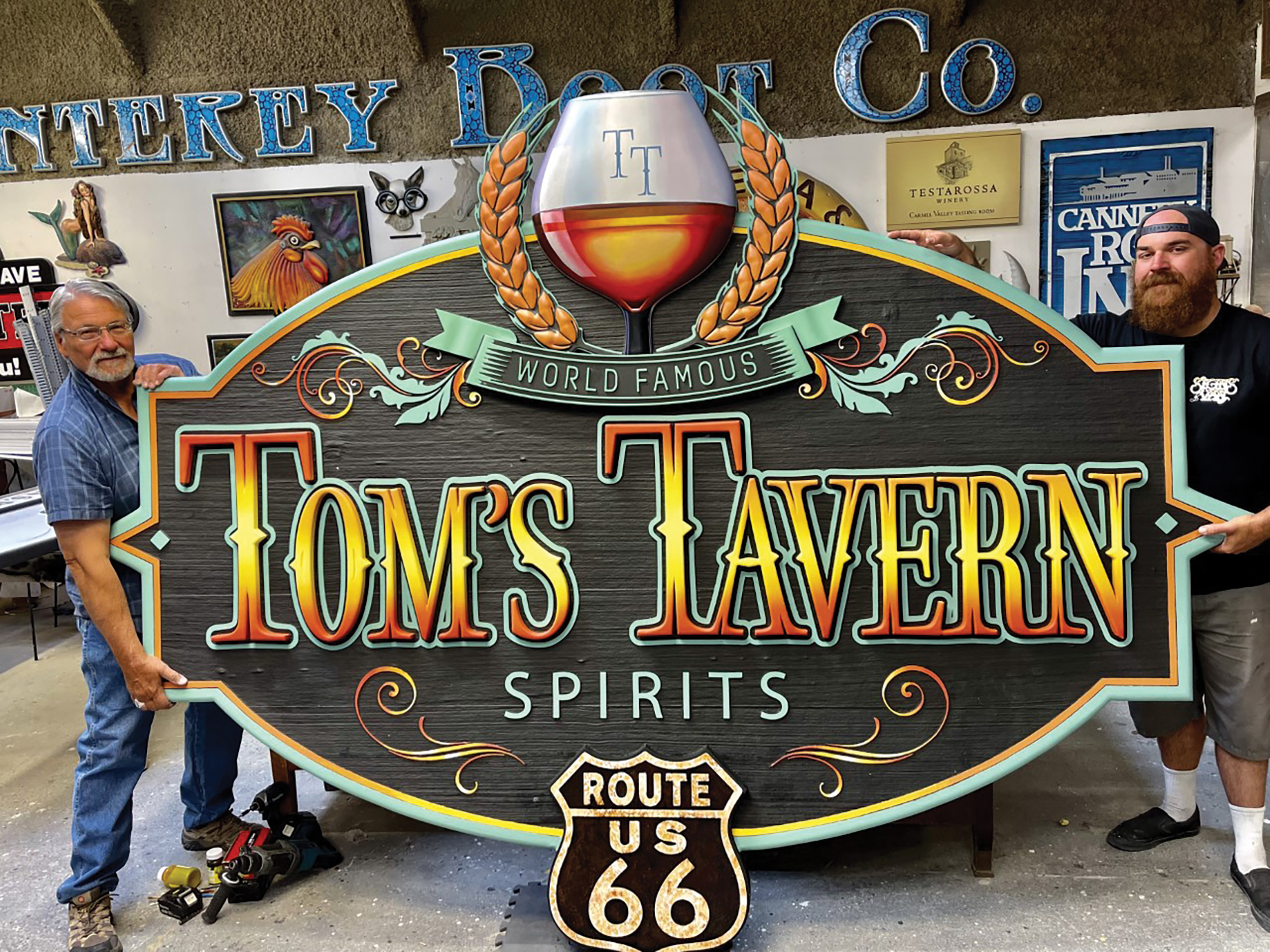
In Spirit
A new tavern within an old adobe building in an Arizona town once made famous by an Eagles song calls for iconic branding. That’s why Tom’s Tavern (Winslow, AZ) commissioned logo designer Heart & Skull Graphics (Phoenix) and signmaker Signs by Van (Salinas, CA) to bring its Southwest-meets-Old English vision to life. “Sandblasted cedar was a perfect fit for what the client was going for,” said Signs by Van owner Jeremy Vanderkraats. His team used a vector logo file generated in Adobe Illustrator by Heart & Skull’s Jane Butler. Then they employed a Hartco S930 stencil, a Sullair air compressor and a 25-plus-year-old pot to sandblast the western red cedar base before embellishing the sign with DUNA-USA’s 15-Ib. CORAFOAM HDU details that punch up the dimension. Letters in a Nutcracker font, a branded brandy glass and a Route 66 shield reinforce the sense of place, while custom paint work by local artists Austin Helwig and Dong Sun Kim (aka Mr. Kim) make the details pop.
PHOTO GALLERY (18 IMAGES)


Introducing the Sign Industry Podcast
The Sign Industry Podcast is a platform for every sign person out there — from the old-timers who bent neon and hand-lettered boats to those venturing into new technologies — we want to get their stories out for everyone to hear. Come join us and listen to stories, learn tricks or techniques, and get insights of what’s to come. We are the world’s second oldest profession. The folks who started the world’s oldest profession needed a sign.


INX Promotes Three to Vice President

6 Sports Venue Signs Deserving a Standing Ovation

Hiring Practices and Roles for Women in Sign Companies


Bulletins
Get the most important news and business ideas from Signs of the Times magazine's news bulletin.
-

 Tip Sheet3 days ago
Always Brand Yourself and Wear Fewer Hats — Two of April’s Sign Tips
-

 Business Management1 week ago
When Should Sign Companies Hire Salespeople or Fire Customers?
-

 Women in Signs2 weeks ago
2024 Women in Signs Award Winners Excel in Diverse Roles
-

 Real Deal4 days ago
A Woman Sign Company Owner Confronts a Sexist Wholesaler
-

 Editor's Note1 week ago
Why We Still Need the Women in Signs Award
-

 Line Time2 weeks ago
One Less Thing to Do for Sign Customers
-

 Product Buying + Technology1 week ago
ADA Signs and More Uses for Engraving Machines
-

 Women in Signs4 days ago
2024 Women in Signs: Megan Bradley