Banners + Awnings
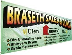
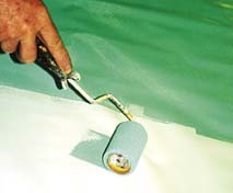
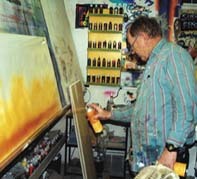
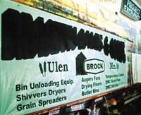
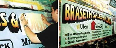
A Banner Makeover
Butch performs a sorely needed facelift for one company’s soft signage.


Introducing the Sign Industry Podcast
The Sign Industry Podcast is a platform for every sign person out there — from the old-timers who bent neon and hand-lettered boats to those venturing into new technologies — we want to get their stories out for everyone to hear. Come join us and listen to stories, learn tricks or techniques, and get insights of what’s to come. We are the world’s second oldest profession. The folks who started the world’s oldest profession needed a sign.


INX Promotes Three to Vice President

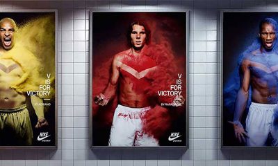
6 Sports Venue Signs Deserving a Standing Ovation

Hiring Practices and Roles for Women in Sign Companies


Bulletins
Get the most important news and business ideas from Signs of the Times magazine's news bulletin.
-

 Tip Sheet4 days ago
Always Brand Yourself and Wear Fewer Hats — Two of April’s Sign Tips
-

 Business Management2 weeks ago
When Should Sign Companies Hire Salespeople or Fire Customers?
-

 Women in Signs2 weeks ago
2024 Women in Signs Award Winners Excel in Diverse Roles
-

 Real Deal5 days ago
A Woman Sign Company Owner Confronts a Sexist Wholesaler
-
 Benchmarks1 day ago
6 Sports Venue Signs Deserving a Standing Ovation
-

 Editor's Note1 week ago
Why We Still Need the Women in Signs Award
-

 Line Time2 weeks ago
One Less Thing to Do for Sign Customers
-

 Product Buying + Technology1 week ago
ADA Signs and More Uses for Engraving Machines