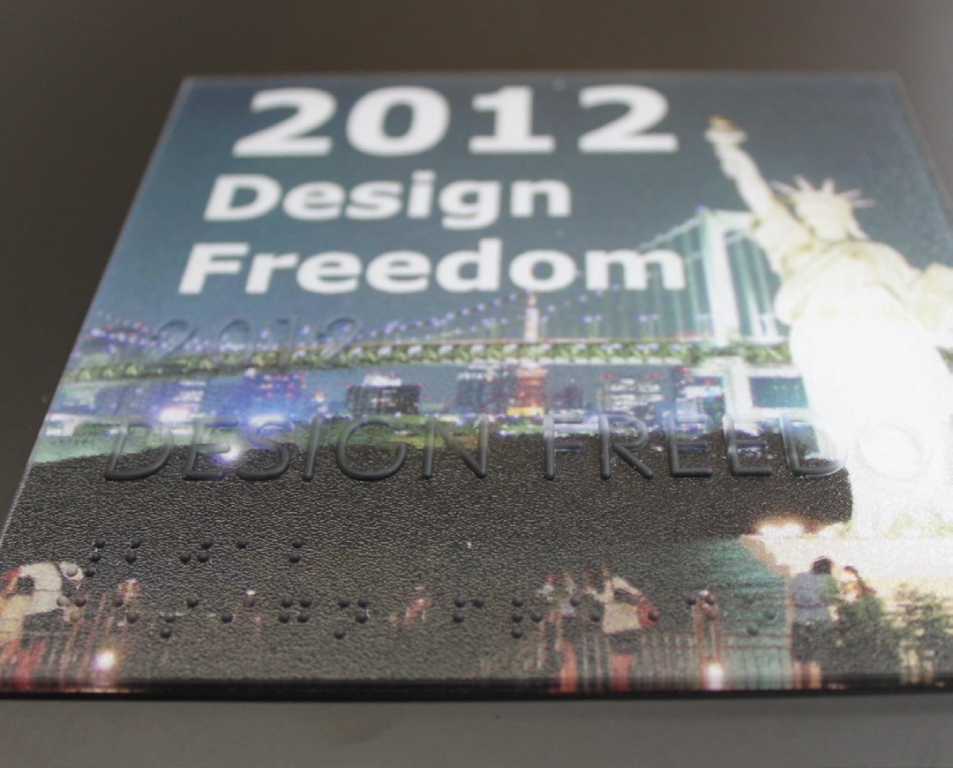
ADA Signs
ADA Code Changes Mark First Anniversary
Misconceptions persists, more changes possible
Published
11 years agoon
Signed into law by President George H. W. Bush on July 26, 1990, the Americans with Disabilities Act (ADA) represented a huge change in protecting the rights and quality of life for millions of disabled and handicapped Americans. However, despite the benefits of ADA-regulated signage, limitations and ambiguities permeated the original code. For instance, under the old standards, the specifications didn’t include dual-message signs that incorporated both tactile and braille signage.
Also, the prior standards greenlighted “simple serif” fonts for raised, uppercase, tactile characters, but the interpretation of “simple” remained subjective for overworked, local-code administrators. Among many other changes, the new standards allow dual-message signs with both tactile copy, for the unsighted, who must use their sense of touch to read a sign, and visual characters, with suitable contrast with the background to help those with low vision or non-sight impairments to locate their destination.
The latest Standards of Accessible Design (SAD) – the common name for ADA specifications – went into effect as the required standards for all new construction on March 15, 2012. Several industry experts offer insights into the most essential aspects of the 2010 SAD and how they benefit the ADA-sign market, as well as thoughts about what’s to come in this ever-evolving sign market (include some potentially disquieting developments on the horizon).
Grady Brown
Grady Brown, who recently became president of iZone Imaging (Temple, TX), has worked for 27 years as a designer and project manager within the ADA-sign market. He co-authored the Society for Environmental Graphic Design’s (SEGD) whitepaper about the SAD 2010 standards. He noted that the sign industry’s sophistication in addressing ADA requirements has grown exponentially from their inception.
“The initial launch of the ADA regulations caused tremendous consternation in the sign industry,” Brown said. “Many in the industry were afraid it was going to become a terrible burden. But, we generally adapted to it as just another challenge. In the early days, so many companies tried so many different fabrication techniques in an effort to become compliant. Braille and other ADA-compliant characters were fabricated by stamping, etching, reverse engraving, inserting raised pins into panels … there were a lot of innovative solutions, but some were more successful than others. The development of the Raster™ Braille system [which uses a routing or engraving machine to insert spherical dots into various substrates] helped standardize the market.”
He continued, “For the most part, I think the standards have been accepted by the market. The 2010 standards remove many areas that were unclear in the old standards. For example, requirements for raised characters were more clearly defined, as were mounting conditions. I think it was also significant to eliminate the ‘simple serif’ guideline for tactile signs, which eliminates the use of serif fonts for raised characters, because it removed ambiguity.”
AdvertisementWhile the inclusion of dual-message signs into the new standards was undoubtedly a key ADA-sign development, Brown also cited the development of specific character sizes that relate to the sign’s installed height above the ground. SAD section 703.5.5 clearly specifies that characters on a directional or informational sign installed 40 to 70 in. above the floor must measure at least 5/8 in.; those 70 to 120 in. above must span at least 2 in., and visual characters for wall- or ceiling-mounted signs more than 10 ft. above ground must be at least 3 in. tall. Another standard he deems significant is Section 703.4.2, a new stipulation that requires at least 18 in. sq. of unobstructed space in front of a tactile sign, centered on the tactile characters, and outside of the door’s swing or any other object that could block a clear sightline of the sign.
“This might require some adjustment from architects,” Brown said. “They often have long-established ideas about fixture placement, and they will have to account for a number of more defined location specifications.”
The SAD incorporates the International Building Code as a reference standard, which includes the technical requirements of American National Standards Institute (ANSI) A117.1, Accessible and Usable Buildings and Facilities Standards, and there’s a possibility more stringent codes may be implemented within this standard.
Recently, ANSI committee representatives from the Society for Environmental Graphic Design (SEGD) and the International Sign Assn. (ISA) participated in a meeting where changes were proposed for the next cycle of standard modifications, which will be published in 2015. Only one ISA- and SEGD-endorsed proposal, which addressed greater international-accessibility-symbol flexibility, was endorsed.
One disapproved proposal entailed modifying tactile, character-space requirements to be measured in percentages instead of standard or metric units. Brown said design-software programs use percentages more effectively, and, without the change, designers must apply manual specs, which increases the chance for error. Another disapproved proposal would’ve allowed secondary text on informational signs to be less than current minimum character requirements.
Another proposal, opposed by SEGD and ISA, that gained approval would establish a 70% color-contrast-ratio requirement for sign text and backgrounds, as well as a minimum light-reflective value (LRV) of 45. Brown said. “Mandating a 70% contrast requirement and LRV minimum will reduce color combinations, be difficult to measure and enforce, and create a significant burden to the sign industry. Material, paint and vinyl manufacturers may find that many of their materials will fall outside of compliance, which could harm sales.”
He continued, “More importantly, the evidence furnished by the proposal’s proponents for changing the proposal was weak, and, at best, may do a disservice to the disabled community, who are the true victims of any sign-code changes that aren’t evidence-based.”
The prospoal will be opened for public comment before being voted on by the entire ANSI com-
mittee. Brown said a majority larger than 51% will be required to pass the proposal, and he believes sign-industry representatives could sway ambivalent voters.
“The proponents of the proposal change have a clear agenda – promoting their definition of improved accessibility at any cost. Our industry supports accessibility – within common-sense guidelines. Our opponents on this issue have been very persuastive, and we need to put together a broad coalition of experts and industry professionals to bring awareness about how challenging this will be to our industry, and fairly questioning whether this requirement would ultimately, through better signage, improve accessibility.”
AccuBraille
Founded in 1947, the Garnett Sign Co. (South San Francisco, CA) has long plied its trade in etched-metal and other types of architectural signage. Being in the Golden State, which has been at the forefront of the development of accessibility-related standards (California’s own standard, Title 24, exceeds federal regulation’s requirements by mandating slightly larger text, dictates more rigid specifications for symbol usage, and requires that Grade II Braille characters be more raised and more separated from characters), Garnett has seen ADA-compliant signage become a large portion of its work in the past decade.
Until a few years ago, the shop worked exclusively with photopolymer components to fabricate interior-ADA signs. However, through extensive R & D, the company has created a proprietary thermoformed sign product, which it calls AccuBraille. Seth Wiles, the company’s business-development director, said, thermoforming creates a durable product that’s a single, contiguous piece rather than several pieces that require connection. A heat press, operating at 295-325º and 750-2,000 psi, forms acrylic, acrylic-PVC alloys, PETG and various plastic substrates.
Variations include Infused, a solid-color material designed for high-traffic, high-abuse environments; Metallics, a material produced entirely from recycled material with a low-VOC coating that simulates cast bronze, copper, pewter or icon; and Elements, which encapsulates materials within two acrylic sheets. According to Wiles, thermoforming generates 30-40% less waste than photopolymer because thermoforming allows material to be reformed and doesn’t require a washout step.
“In healthcare environments, I think the new dual-messaging standard is being used to help reinforce a strong branding component while being in compliance,” he said. “With the introduction of new materials and solutions to the market, ADA signage is becoming more versatile.”
Regarding the SAD’s adoption, Wiles said designers tend to understand the new standards, whereas a learning curve still exists for many signshops (to whom the company wholesales AccuBraille products), particularly smaller ones.
Advertisement“Certainly, the best aspect of the new standards is that they open up more possibilities,” Wiles said. “For instance, while the distance measurement for a tactile sign is for the copy, and not the entire panel, the 48 to 60-in. range allows more design possibilities. And, it’s good that, as long as you have tactile requirements satisfied on a dual-message sign, you have more freedom with color and typefaces on visual messages.”
The company recently introduced EcoBraille, a thermoformed material made entirely from post-consumer recycled material (“green” substrates always play well in California, with growing interest elsewhere). Primarily, it’s fabricated from 100% post-consumer, ABS plastics, particularly material generated from “e-waste” – such as computer towers, monitors and printers – and molded into material that can be painted, layered, CNC router- or laser-cut, or digitally printed. Concurrent with the latest round of revisions to the Leadership in Energy and Environmental Design (LEED) standards, Wiles said, Accu-Braille incorporates recycled material and other recycled-content materials that are eligible for LEED credits.
Nova Polymers
ADA-compliant signage has been Nova Polymers’ (West Caldwell, NJ) core focus since its 1997 inception. The company manufactures product lines within the NovAcryl photopolymer family, which includes Ex™, an exterior-grade material with an aluminum-alloy base; ECR, which combines clear photopolymer with 3form’s Varia™ EcoResin textured, translucent-resin panels that contain recycled material; PT, a clear-based photopolymer with at least 40% post-consumer, recycled media; and LP, a laminate-base material that allows textured or colored finishes.
Mike Santos, the company’s sales and product-development director, said the company has been providing continuing-education courses for those who design and build ADA signage: “Their standards were discussed in the initial 2004 ANSI committee meetings, so the information was out there well before the 2010 standard’s adoption.”
However, he noted that fewer shops fabricate ADA signage than sell it; Santos estimates roughly
600 shops in the U.S. produce accessibility-compliant signage, whereas approximately 20,000 shops could potentially sell it. Therefore, many who sell it don’t have familiarity with requirements, materials and production techniques.
Overall, he finds the new standards to be a positive step because they offer improved standardization and definition of acceptable typefaces, sign layout and installation guidelines.
Like other ADA-sign designers, fabricators and component vendors, Santos is deeply concerned about the advancement of the color-contrast proposal: “The industry’s general consensus is that a 70% color-contrast rule should be considered a best practice, and not made a requirement. This is because the proposed codes relate to LRVs, which are measured in controlled environments with a 5K light, which doesn’t reflect lighting conditions in any normal, interior environment. Several color combinations technically meet the standard, but are difficult to read, and defeat the intent of accessible signage.”
Moreover, he noted enforcement problems with such a code: “To accurately measure contrast, a building inspector would need to test the colors’ reflectivity with a spectroreflectometer. Time of day and facility lighting will impact visibility. With the cutbacks in local-government budgets, and the many other responsibilities these inspectors have, is it realistic to expect them to do this? No.”
He continued, “This creates challenges for designers and fabricators, and will require even more documentation while still not improving conditions for the visually disabled. And, once extra documentation is required for one facet of a project, it becomes that much easier to impose it for other elements. It will become a bureaucratic nightmare for ADA-sign suppliers.”
SEGD
SEGD, which was founded in the early 1970s to provide collaboration, education and advocacy for EGD practitioners, has long participated in ADA-policymaking advocacy. (As an editorial aside, I find it heartening and refreshing to see the SEGD and ISA working together to promote the interests of visual communications. Too often, it’s appeared they’ve existed in parallel universes. Minimizing infighting between designers and fabricators will go a long way toward a greater understanding of the workings of each other’s respective disciplines.)
Justin Molloy, the organization’s director of education and a former EGD provider, said the group works toward providing concrete examples of ADA signage that reflect the new standards. In April in Atlanta, the organization will present ADA-compliant programs that push the design envelope.
“I think there’s still a lot of uncertainty,” he said. “Designers will sometimes default to a simpler design because they’re unfamiliar with the new specs, or design managers will reject a design because they don’t know the code and assume it’s noncompliant.”
Molloy has observed numerous inconsistencies in delivering handicapped-accessible information. When he worked as a design professor at the Univ. of Oklahoma prior to joining SEGD, he said the university had no standardization with its signs, and that sign location, and text and braille placement, was a hodgepodge from building to building. He said academic-institution ADA signage often fails the compliance “eyeball” test; he cited the lack of properly raised braille and insufficient character separation as common failings.
Molloy said future ADA-compliant signage might include the development of electronic-display messages that meet accessibility standards: “Whether there’s an audio component that’s near-field-communication-activated to provide information, the use of dynamic messaging, paired with a static, tactile sign, or use of an interactive, mobile device that meets accessibility needs, we can only speculate what new innovative will continue to improve access for all users. But, you can be sure that our spaces will provide us more information in different ways.”
Roland DGA
Well known for its inkjet-printing products, Roland is a relative newcomer to the ADA-sign market. The company has promoted Accent Signage’s Raster-Braille products for several years, and introduced a bundled product series for ADA-compliant-sign fabrication early last year. Roland’s “ADA sign kit” includes an assemblage of engraving tools, CADlink EngraveLab software, an EGX-350 desktop engraver or EGX-400 or -600 benchtop engraver and Rowmark engraveable media, among other accessories. The company’s EGX-350 provides a 12 x 9-in. engraveable area; rasters are inserted manually with a handheld pen; the EGX-400 and -600 contain 12 x 16- or 24 x 16-in. (respectively) working platforms and provide an automatic, raster-insertion tool.
“A lot of our existing customers were looking for new revenue streams for their shops, and, given the new standards, ADA-sign production worked as a natural step in that direction,” Rachel Hammer, the manager of Roland’s rotary-device products, said. “We received a lot of questions about the new laws from first-time, ADA-sign producers.”
An important aspect of the new regulations is the requirement that braille characters, in order to be easily interpreted by the visually impaired, have a perfectly domed surface: “It’s important that the software includes a converter that translates English into Grade II Braille, which our system has, as well as a clip-art library that provides a variety of appropriate pictograms for these types of signs,” Hammer said.
With the new standards’ adoption, clients from an array of industries – healthcare, retail, hospitality, institutional and residential, among others – will require ADA-compliant signage for new construction.
“An ADA-sign fabricator is usually following the lead of an architect or an environmental-graphic designer who’s working on the project, and has specified the color of the material, the shape of the signs, the typeface and other attributes,” Hammer said. “To legally protect yourself, you want to make sure these project characteristics are compliant with the new standards. The penalties for failing to comply are significant.”
Compliance is paramount; the Department of Justice may file lawsuits in federal court to enforce the ADA, and, in accordance with Title III, may seek civil-suit penalties of up to $55,000 for the first violation, and $110,000 per subsequent violation.
Advance Corp., Braille-Tac Div.
Advance Corp.’s Braille-Tac Div. (Cottage Grove, MN) produces wholesale, cast zinc and mag-
nesium, photopolymer, inkjet-printed, Raster-Braille graphics, and injection-molded plastic. Engaged in the ADA-sign market since the regulations’ inception, Advance has collaborated with various organizations – such as sign associations, the American Institute of Architects and the Construction Specification Institute – to educate various industries about ADA-sign requirements.
The company is a member of the Awards and Recognition Assn., and an Advance representative has served on the ANSI A117 Accredited Standards Committee for four years. Kathy Wilson, the company’s director of marketing, said the new standards provide mixed benefits for the populations they intend to serve.
"For those with low vision, who would require the visual characters, the standards are a major upgrade for sign legibility,” she said. “However, I’m not sure they will make a positive impact for those who are blind. We sent samples of our products fabricated per the new standards to organizations that serve the visually impaired. Based on their clients’ feedback, they said the braille and tactile-letter size and spacing were, in some cases, confusing.”
Wilson continued, “The meaning of domed or rounded isn’t well defined in the new standards, but manufacturers are only allowed 1/5,000 in. deviation, or they can be subjected to penalties.”
She also expressed some concerns about the height requirements; signshop owners noted that installing within the 48- to 60-in. range made it more difficult for installers to properly align the signs when fastening them. Also, end users didn’t like the unbalanced appearance once they were installed.
Further, she said the requirement of uppercase letters only for tactile signage could prove problematic for certain environments: “For quite some time, hospitals, universities and other large campuses have used both uppercase and lowercases letters as part of their alphanumeric, room-identification systems. The new standard is disruptive to their existing program, and when they need to create new signage, some are leery about new compliance.”
However, she said reaching compliance with a new sign program is more economically feasible now, thanks to the introduction of new materials, particularly plastics available with finishes that mimic cast-metal, woodgrain and other complex materials, and provide retail signshops the opportunity to value-engineer compliant signs more economically than previously would have been possible.
Key SAD (ADA 2010) Changes
1. Standard 703.2: Raised Characters. Uppercase characters only, and only sans-serif typefaces with thin strokes are permitted for tactile characters. Characters must be between a minimum of 5/8 and 2 in. tall (depending on the sign’s height above the ground), with a minimum of 1/32-in. elevation above the background. Also, character width for the widest character, “O”, must measure 55 to 110% of the height of the narrowest character, “I”.
2. Standard 703.3: Braille. All braille characters used must be Grade 2, and located directly below the raised characters. Braille must be separated by at least 3/8 in. from raised, alphanumeric characters, and the braille must be domed or rounded, rather than with protruding, sharp-edged cylinders. “California Braille,” specified in that state under Title 24, is also permitted.
3. Standard 703.4: Sign Location. Signs must be placed such that the baseline of the raised characters exists 48 to 60 in. above the floor. They must also be placed on the door’s latch side. Signs must be situated such that a sign has 18 in. of clearance from the door’s swing. If there’s not sufficient room on the wall on the door’s latch side, the sign must be installed on the nearest adjacent wall.
4. Standard 703.5: Visual Characters. Visual characters must be a minimum of 40 in. above the ground. No italic, script or decorative fonts are permitted. Characters 40 to 70 in. above the surface must be at least 5/8 in. (if the reader can’t get within 6 ft. of the sign, text height must increase 1/8 in. for every foot of distance over 6 ft.); Characters 70 to 120 in. above ground must be at least 2 in. tall (when inaccessible by 15 or more ft., character height must again increase by 1/8 in. per ft.).
SPONSORED VIDEO
Introducing the Sign Industry Podcast
The Sign Industry Podcast is a platform for every sign person out there — from the old-timers who bent neon and hand-lettered boats to those venturing into new technologies — we want to get their stories out for everyone to hear. Come join us and listen to stories, learn tricks or techniques, and get insights of what’s to come. We are the world’s second oldest profession. The folks who started the world’s oldest profession needed a sign.
You may like


Advertisement
Subscribe

Magazine
Get the most important news
and business ideas from Signsofthetimes Magazine.
Advertisement
Most Popular
-

 Tip Sheet1 week ago
Always Brand Yourself and Wear Fewer Hats — Two of April’s Sign Tips
-

 Ask Signs of the Times2 days ago
Why Are Signs from Canva so Overloaded and Similar?
-

 Real Deal1 week ago
A Woman Sign Company Owner Confronts a Sexist Wholesaler
-

 Benchmarks5 days ago
6 Sports Venue Signs Deserving a Standing Ovation
-

 Editor's Note2 weeks ago
Why We Still Need the Women in Signs Award
-

 Women in Signs1 week ago
2024 Women in Signs: Megan Bradley
-

 Product Buying + Technology2 weeks ago
ADA Signs and More Uses for Engraving Machines
-

 Photo Gallery7 days ago
21 Larry Albright Plasma Globes, Crackle Tubes and More