Martin Treu is an urban designer and architectural historian. He’s the author of Signs, Streets and Storefronts, an historical look at the integration of graphics and architecture, and is the founder of Eye on Main Street, a foundation that assists historic-preservation efforts in older city centers. For more information, visit www.martintreu.com.
For more than 125 years, Chicago has been an experiential, influential design laboratory. The Chicago and Prairie Schools of Architecture earned international renown at the turn of the 20th Century, and inspired later design movements. The city’s innovations in commercial architecture and sign design, however, are less commonly heralded. Examples abound of iconic Chicago buildings integrating flawlessly with environmental graphics. The controversy over the 20-ft.-tall channel letters recently installed on Michigan Ave.’s Trump Tower (see ST, October 2015, page 72) reveals the passion with which Chicagoans revere the city’s legacy of design harmony.
Architecture
Chicago’s architecture, which gained the “City with Broad Shoulders” an international reputation, was a product of a unique place and time. The city’s pioneering skyscrapers clearly revealed the steel beneath their cladding – a perfect, vertical, street-grid representation. The unique ornamentation paid little heed to classical precedent; instead, native plants and designers’ imagination inspired the voluptuous carvings and patterns. Chicago’s commercial structures were advanced in their own way.
The buildings that lined electric-streetcar corridors were two stories or less in most cases, with flat roofs, but their parapets and façades were adorned with ornamental features distinctive to Chicago. Geometric details on simple, horizontally proportioned buildings meshed with the rise of the automobile, and great glass expanses, made possible by advances in steel-frame technology, filled the façades.
Cinemas of the 1910s and 1920s employed prominent signs – some designed by architects, others by sign companies. Most relate carefully to the façade’s design. Rapp & Rapp, a prolific architectural firm that developed cinemas nationwide, called Chicago home. Nationwide. Its most famous structures included the Paramount Theatre on Times Square, Loew’s King in Brooklyn, and the Paramount in Denver. In Chicago, the firm devised the city’s signature, namesake theatre, with an iconographic marquee and sign. Its features visually anchored the street and served as a superlative, place-defining landmark.
Graphic statements
Chicago’s prominent role in America advertising made the city a mecca for talented graphic designers. Titans such as Leo Burnett and Foote, Cone, and Belding created countless national campaigns and well-known trademarks. Chicago’s Container Corp., under the leadership of Walter Paepcke, hired European designers like A. M. Cassandre, Jean Carlu and Herbert Bayer to create promotional environments for the company.
Chicago’s signmaking legacy is no less important. Three companies in particular had a vast and lasting impact in Chicago and across America. The Federal Sign Co., formed in Chicago in 1901, became the preeminent U.S. electric-sign company. It pioneered many technological advancements for incandescent-bulb signs and innovatively contoured sign boxes, an upgrade from early, primitive, orthogonal frames.
The White Way Sign Co. next took the lead among Chicago’s signmakers. It created movie-palace spectaculars and developed a near-monopoly well beyond Chicago’s borders. Finally, the Beverly Sign Co. specialized in painted-wall graphics and custom outdoor billboards. It originated panelized sign strategies, which segmented information into discreet, graphic shapes. When Wayne Heath left Beverly for the West Coast, this novel approach was eventually translated to electric signs.
Beautifying built environments
Architecture and graphics merged powerfully in Chicago. A sophisticated, highly advanced design strategy was explored in the design of the city’s Schlitz Brewery taverns. In the early 20th Century, Schlitz promoted beer consumption by constructing as many as 57 neighborhood pubs. The company’s trademark globe emblem was universal. Sometimes integrated in brick bas relief, elsewhere it was rendered in polychromic, glazed terra cotta. Each was integral to the building, rather than a clumsy afterthought.
Chicago’s leading architects precluded signs from being the cumbersome constructions so common on America’s commercial corridors during the early 20th Century. At the time, most architects denied the importance of an on-premise sign for their freshly finished facades. With the exception of cinemas, electrical light was generally awkwardly integrated into façade designs – if addressed at all.
Legendary Chicago architects Daniel Burnham and Louis Sullivan provided exceptions. Sullivan orchestrated the increased scale and prominence of environmental graphics for financial institutions.
Although banks typically invested modestly in identity, his deft interweaving of graphics into façade compositions garnered nine commissions. Burnham played a central role in developing Chicago’s World Columbian Exposition (1893) – which famously came to be known as the “White City” – and the sweeping Chicago Plan (1908), which integrated graphic standards that aptly complemented office buildings’ and department stores’ vast facades.
Chicago’s status as the nation’s center for terra-cotta production enabled its common usage for exterior buildings’ graphics. Its efficient manufacture permitted mass-produced, ornamental, multi-colored tiles, and made sculptural forms and glazed graphics affordable for even simple commercial structures. The possibilities for business identity were limitless. Even without their lettered signs, many businesses announced their trade graphically. If the details didn’t communicate overtly, they suggested powerfully.
Signs’ golden age
The 1930s ushered in a golden age for Chicago’s marriage of architecture and graphics. Architectural firm Holabird & Root set trends in merging these arts. Its long concourse at the mammoth Chicago Daily News building, built in 1929, directed visitors across the riverfront toward the train station. A 180-ft.-long mural, painted by John Warner Norton, embellished it. Its depiction of spinning press wheels, speeding trains and endless columns of newspaper text suggestively mirrored the relentless flow of commuters below.
In 1929, Holabird & Root devised another landmark space, the Chicago Motor Club building, which also featured a Norton mural. It recently reopened as an upscale Hampton Inn property; a gargantuan map in the lobby highlights major roadways from the era when the Motor Club opened.
Holabird & Root’s Board of Trade Building (1930) symmetrically regards the broad expanse of LaSalle St. from the middle of this corridor, like NYC’s Grand Central Station, is positioned on Park Ave. Ominous allegorical figures of “industry” and “agriculture” in limestone bas- relief flank a clock on the façade.
Holabird & Root’s retail storefronts captured the press’ interest, and influenced architects and graphic designers’ storefront designs globally. The firm even explored creative possibilities for service-station design, where graphics dominated structure and identity trumped shelter.
George Fred Keck was another prominent Chicago architect adept at incorporating graphics into his compositions. His prescient design for the Miralago Ballroom building, a mixed-use retail center built in 1931, features a vertical blade sign attached as a fin to a tower feature that visually anchored the long, low composition. The sign fin segued into a canopy over the entrance to the ballroom – everything aligned and connected.
Bertrand Goldberg, another Chicago modernist, gained attention in the late 1930s for his futuristic plans for a gas station and an ice-cream stand that relied heavily on signage for visual impact. Goldberg eventually became famous for his twin Marina City towers along the Chicago River.
Advertisement
The world’s attention (again)
Inventive signs were plentiful at Chicago’s 1933-34 World’s Fair, titled “A Century of Progress.” The exposition provided many Americans with their first glimpse of European modernism; ST covered various facets of World’s Fair signage throughout 1933, from the various lighting technologies on display (see ST, May 1933, page 14) to its overall influence on sign art and design (see ST, June 1933, page 11).
Inside the electric pavilion, GE created an enormous city diorama, complete with streamlined skyscrapers, miniature storefronts, moving prop automobiles, and a sky that changed from day to night.
A full-scale faux Main Street was also available as a walk-through exhibit. The fully illuminated storefronts on display, with large-scale lettering arranged in a poster-like fashion, employed a strategy imported from Europe. Such dynamic design was still a complete novelty to most fair-goers in 1933, who were familiar only with the traditional retail building front defined largely by a slim fascia sign or hanging, electric-bulb sign.
Backlit lettering evolved due to sign limitations imposed by World’s Fair regulations – ironically, just when exposed neon was first getting a foothold on Main Street. The fair showcased the creative blending of graphics and architecture for the future commercial corridor, a bold move pushed by corporate sponsorship aimed to stimulate increased consumption.
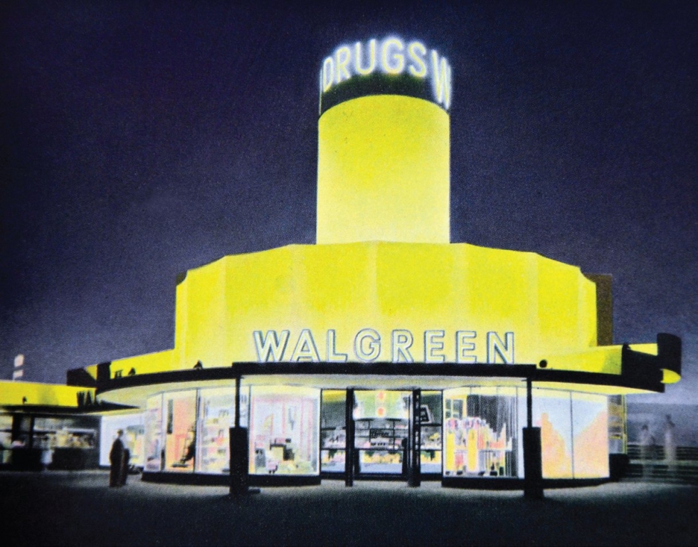
Outside the electric pavilion, Chicago retailer Walgreens introduced a freestanding prototype store fashioned to be a visual lure along the roadside that captivated travelers with bold signage and a carefully integrated tower feature. Chicago architects and sign designers created much of the chain-store design that spread modernism and its novel, graphic approach to middle America.
Chicago architect Alfred Alschuler developed many chain-store structures built across the U. S. He’s an unsung hero today, despite his prolific and particularly seamless integration of architecture and graphics. Alschuler was probably most highly recognized for his work that appeared along State St. in the 1930s. In 1936, in his sign for men’s clothier Benson & Rixon, Alschuler explored the full potential for use of glass block (a newly introduced material). He defined the building envelope in essentially a graphic manner, as a simple, sweeping curve, articulated with stripes of ribbon windows. Elegant, restrained ribbon lettering complemented the masculine modernity of the façade. Down the block, a year later, Alschuler unveiled his Chicago design for the Kitty Kelly shoe store, again employing glass block in a striking way. The lettering was so compressed it mimicked the vertical lines of the very narrow building.
Both stores were enormously influential nationally, appearing in many editorial pieces and advertisements for glass block.
Further evolution
Despite its modern reputation for harmony between sign and architecture, Chicago was the national leader in the municipal legislation that addressed commercial signs. As early as the 1880s, Chicago began to examine its streets, aesthetically and practically, and became increasingly intolerant of the potential dangers and unsightliness of overhanging signs. In 1907, city commissioners demanded that all projecting signs on State St. be refastened flush or removed altogether. In stark contrast to Chicago’s Progressive-era crackdown on on-premise business advertising, sign codes become more lenient or were less vigorously enforced during the 1950s.
During the postwar period, the careful integration of sign and façade fell into disfavor as suburban development and the car’s vital role in daily life mandated much larger signs – often physically detached from the architecture. Neon signs grew in scale in old urban centers, and post and pylon signs began their ascendency.
The city, as a result, is marked everywhere with signs that serve as visual landmarks. Yet these icons, which may have been an affront in 1910, are so valued today by Chicagoans that they have collectively landed this year on Preservation Chicago’s list of its seven most endangered “buildings”.
The rooftop sign, a ubiquitous city feature for more than a century, still has its place in Chicago. It’s the ultimate landmark graphic, a beacon for all to see from great distances – an orienting device for locals, and a welcoming feature for strangers. This sign type enjoys a long heritage, and is most often associated with hotels. Placing a sign of this scale on a roof removes it from the plodding pedestrian world and holds it aloft, where it suggests something heroic and powerful, yet inviting and memorable.
Chicago’s sign tradition offers a clear model for graphic placement on the many old structures on Chicago’s Loop that are now being converted from office buildings into hotels. For decades, Chicago has demonstrated that signs aren’t an offense to a building or skyline; rather, if skillfully designed, they’re powerful, well-loved amenities.


 Tip Sheet1 week ago
 Photo Gallery2 days ago
 Ask Signs of the Times4 days ago
 Real Deal1 week ago
 Benchmarks6 days ago
 Editor's Note2 weeks ago
 Women in Signs1 week ago
 Photo Gallery1 week ago