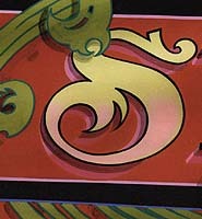
He’s what you might call the Letterheads’ Pied Piper.” During meets, throngs of eager sign-makers gather at his easel, watching him transform thin bands of color into masterful works of art. For under his capable direction, ordinary pinstripes metamorphose into ’57 Chevys, classic Harleys, raging bulls — even birds of paradise.
His gentle humor and kind Canadian eyes put all assembled Letterheads at ease, and they begin asking questions: “How much do you get for a typical truck job?” “What kind of paint do you use?” “How do you choose your colors?” Patiently, he answers each one.
His patience — not to mention his God-given talent and hard-earned skills — have earned this signwriter more than just a crowded easel at Letterhead gatherings, however. They’ve also earned him teaching engagements at tradeshows, a book deal, an electronic collection of his pinstriping designs and countless industry design awards.
But John “Tramp” Warner, Tramp’s Designs, lets none of this go to his head. After all, signwriting is only his part-time job; firefighting is this Mississaugan’s (ON) full-time gig.
Recently, I sat down with Tramp and talked shop. More specifically, we talked banners: how he markets them, where he gets design ideas, how he chooses materials, and more. Not surprisingly, Tramp graciously, patiently, answered all my questions.
Small commercial shops sometimes view banners as a loss-leader enterprise — a hardship to be endured, rather than an opportunity for creativity. Do you pursue banner jobs?
If they come my way, I pursue them. I look at a banner just like a 4 x 8. It can be block lettering with white under it, or it can be a gorgeous piece of work.
I guess the industry’s banner controversy began a few years ago when the computer became popular. People just started banging out letters on banners. So the shops that used more elite scripts on banners thought they couldn’t compete. They let the market go.
I have a portfolio with my banners. I carry pictures of my banner work, just like my truck and sign work.
When a customer phones me with a banner job, in his mind, he’s envisioning a white banner with black, blue or red letters. He’s also thinking, “Well, I’m only going to have the banner up for this sale.” He doesn’t realize that if he uses it for a spring sale or a Christmas sale, he can also use it the following year. So I educate the customer that if he rolls the banner back up properly, it can be used again — for two or three years worth of sales, tradeshows, etc. All of a sudden, he starts to think, “Well now it’s worth some money to do this right.” Maybe I don’t get repeat business in one sense, but then again, I teach the customer the value of the banner.
That’s what I work on. I try to pick the person’s mind and find out not what he wants to spend, but what he’s really looking for. He’s looking for a sign that he can roll up in a tube and ship or carry or display where he can’t hang a traditional sign.
Ideas and education
How do you educate your customers?
First, I discuss the possibilities. I tell them they could add a foot onto a banner’s height instead of its length — going 3 or 4 ft. high instead of 2 ft. Also, I teach customers banners can be longer than just 8 ft.
And I do a little thumbnail sketch. I suggest using a black, blue, teal or purple background instead of white. Often, customers are really shocked, because they don’t even realize they get any other colors. And that’s our fault as signwriters. Our suppliers have a ton of supplies, but we don’t use them to their limits. 1-Shot paint, for example, has 40 colors. Yet, at tradeshows, some sign-makers I run into think there’s still only 10.
To my customers I might also suggest using some airbrush work or a caricature. But for special work like that, I add on an extra $100; I just price it into the banner. And I don’t ever mention price until the very end. I try to stay away from giving them a price until I can give them an idea.
Where do you get your ideas?
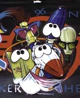
For all my work — be it my striping, lettering or banners — I take the adult out of my head and I think like a kid. Because if you think like a kid, you learn how to bend the rules without breaking them. A kid designing a banner for a flower shop would not think “Flower Shop” in big black letters across a white background. A kid would think “flowers.” So if I were designing such a banner, I might put a soft collage of flowers in the banner’s background. Or three big flowers in one corner. When I explain these options to my customers, and explain that they afford more advertising impact for the buck, my customers are willing to pay for it.
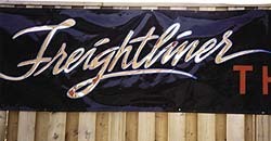
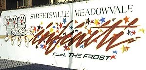
I also get ideas from magazines and newspaper advertising. That’s why my banners look a little more up-to-date. Right now, a lot of my banners use Litho, a bouncy desktop-publishing font that’s been out for about five years. Taco Bell, McDonald’s — everybody’s using this style of block letters.
What other font styles do you use?
You’ve got to know your fonts. You may use a classy Americana style for a suit store or a ladies wear shop, but you wouldn’t use it for a grocery store.
In all, I have probably 1200 fonts in my computer. Of these, there are probably 30 that are really practical to use. And of the 30, I could call 10 of them my everyday fonts. They’re clean and easy to read.
On a banner, my heading is usually a totally different style than anything else — Clarendon bold perhaps. For the rest of the lettering I may use a lighter style like Helvetica. Some customers give me logos, but I don’t hold the belief that there’s only one way they can be portrayed; I still try and adapt them to the layout.
I also have customers re-evaluate their text. For a business that’s opening, customers often want to put everything on there but their kids’ and dogs’ names. So I talk them backwards through the process. I say, “You want to advertise your business’s name and maybe what you specialize in. You also want to announce that the business is new. But could any of this information go on the window instead?” Because, if “Now Open” could go on the window, the banner, with the company name only, could later be hung inside the building.
Backgrounds, materials, color palettes
Once your basic design concept and fonts have been determined and sketched, what’s your next step?
I go to the computer. I’ve got Gerber Scientific Products’ (Manchester, CT) Graphix Advantage software, version 6.0, and an old 4B cutter — the workhorse of the industry. I figure I can only weed at 1 mile an hour, so I only cut at 1 mile an hour. Actually, I hope to get a faster cutter soon.
Laying out a banner is like laying out a sign. It has to be pleasing to the eye. So the first thing I do is take into account air space. I leave 4-6 in. of space all the way around a banner’s edge.
Are your pictorials all cartooned, or do you create realistic images too?
I try to stick to cartoons and caricatures. Even if I just add a little hand with a set of eyeballs, it makes people look at the banner longer.
Do you use clip art?
I do, once in a while. Fortunately, I can draw; a lot of people can’t. It’s the same as with fonts: There may be 1200 pieces of clip art on a disk, and only 10 images you can use. But even one use pays for the disk.
Sign-makers need to be creative with clip art; they need to experiment. If you have a clip-art baseball player, for example, you can mirror the image and have him swing both ways. Or you can use half his body and the bat: Nobody says you have to use the whole piece of clip art.
What about digital images?
I’ve used digital imaging for one transfer-company job. This company sponsors a boxer, and wanted his image on the sides of their gray trailers. I prepared the boxer image in Photoshop®, and also created a boxing-glove image for back ends of the trailers. I took both designs — the boxer and the glove — to a service bureau that did the imaging for me.
A few months later, the transfer company wanted three banners for the boxer’s upcoming fight. I ordered all gray banner material to match the company’s truck color. Then, I used my original boxer Photoshop file (I don’t throw anything out) and had him digitally imaged again — three times, to a new, smaller, scale. I applied these images to the banners, lettered them in blue vinyl, and got paid $500 a piece.
How do you create banner backgrounds? What techniques do you use?
I’ve started to mask out my backgrounds lately. I’ll put a real wild stripe through a background and letter it the next day.
I also create trick backgrounds. I might use the computer to cut out snowflakes to put across the background of a “Christmas Sale” banner. Or I may cut out snowflakes in mask, paint over them and remove the mask.
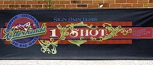
You could also use some corner designs and filigree to make a rich-looking border around your banner.
I just did some banners in a demo where I used a 1/4-in. Buegler pinstriping wheel and, every 3 in., rolled an angled line. If I had lettered “Suit Sale” on top of that background, right away you’d think “pinstriped suits.” And creating the background only took me 15 minutes.
What materials do you use?
I always use CPF’s (Gary, IN) 1-Shot paint. I also use Gerber and Avery Dennison (Painesville, OH) high-performance cast vinyls.
For all-vinyl banner jobs, I use Ancor (Cambridge, ON, Canada) vinyl banner material. For painted banners, I use US Banner (Greenville, SC) top-coated nylon banners. Both varieties come already hemmed and grommeted. I also use these top-coated banners for jobs that use vinyl in combination with paint. But I apply a heat gun on the vinyl to really adhere the graphics.
If you’re going to use top-coated materials, wash them off with Windex before you letter them. Otherwise, your paint may take three days to dry. Even though US Banner material comes ready to go, I wash it off just to be safe.
What’s a typical color palette you use?
I’m very comfortable using lots of color. I have a color wheel that sits in my room and I look at it all the time, so I know which colors don’t work.
If you look at my banners, you find very little white or black on them. If I do use black, I tint it with blue or red so it’s not as harsh. For cartoon characters’ eyeballs, I add a little gray to the white to soften them up. And I don’t even own white vinyl; it’s too harsh, so I use pearl gray instead.
I’ve read Walt Disney’s books and I follow his advice: I try to tone everything into my background. If you see a Disney cartoon, for example, that has Snow White in a green forest setting, every color on her body will have a touch of green in it. That’s why the caricature looks like part of the background. Whereas, if you watch Warner Bros. cartoons, the characters look like they’re more on top of the background.
Gary Anderson (Bloomington Design, Bloomington, IN) is a master at tinting: Whatever color the sign’s background is, he tints his letters into that background. So his signs are very pleasing to the eye.
Another trick I use, is that I always outline my cartooning with a color. Initially, you look at my banners and say, “I don’t know how he does that. He’s got black outlines on a black banner.” But if you look closely, you’ll see that they’re colored outlines. The 1-Shot t-shirt logo that I designed, for instance, has a thin purple outline around its black outline. That’s what makes it stand out.
Name your other fabrication techniques.
I often airbrush the bottom half of letters. Or I’ll airbrush highlights.
I’ve marbleized some backgrounds, and have even taken a white banner for a party shop and drizzled different colors all over it. I let it dry, and the next day, lettered it.
In addition, I’ve used scraps of vinyl and created little stars, circles and squares to create a “confetti” background for a New Year’s Eve banner.
I’ll also sponge triangles in the center of a banner and “hang” the letters over the top of it — like Bert Quimby (Bert Graphix, Pompton Lakes, NJ) does on truck doors.
I’ve even used Mylar® material on my banners with great success.
Do you install your banners?
I do no installation at all. Instead, I guide customers, providing ideas on where and how to install the banner. I also tell them how to roll the banner back and put it in a sleeve. If I can, I try to provide a sleeve for it. And I explain how to rinse the banner off, with mild soap.
What are the most commonly asked questions in your banner seminars?
I tell them what I told you: Think like a kid. You should have fun with banners; you should never get stiff.
Basically, it comes down to layout and design. Mike Stevens wrote the book on it (Mastering Layout, ST Publications): People just don’t read it.
I never had Mike’s book when I started, so I learned from some older people. Nowadays, I get inspiration from Jack Lindenberger (Creative Signs, Evansville, IN), Gary Anderson, Mike Jackson (Jackson Signs, Jackson Hole, WY) and David Butler (Butler Designer Signs, Syracuse, IN). I think about all their work and how I can incorporate it into my jobs.
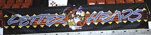
Remember, banners are just an extension of modern-day advertisement. And when you create a banner for a customer, regardless of what he says, he’ll use it for the next five years. So you better get as much business as you can from him the first time.


 Tip Sheet3 days ago
 Business Management1 week ago
 Women in Signs2 weeks ago
 Real Deal4 days ago
 Editor's Note1 week ago
 Line Time2 weeks ago
 Product Buying + Technology1 week ago