Banners + Awnings
Change the Channel
Published
7 years agoon
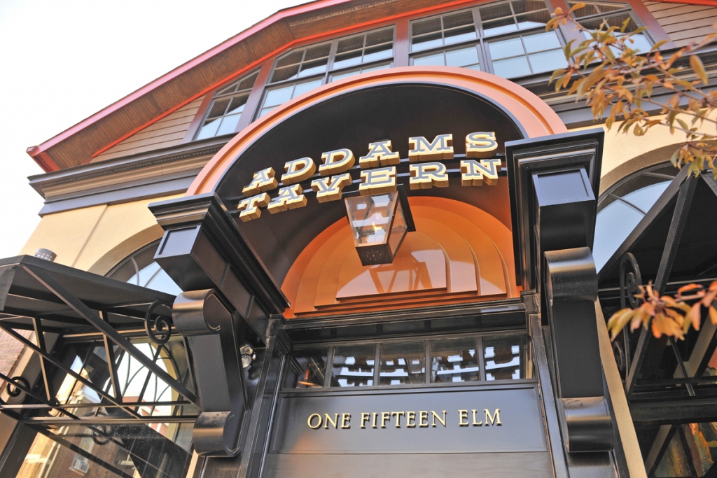
Over the years, many of ARTfx’s (Bloomfield, CT) most successfully designed projects were collaborative efforts – initial concepts and sub- sequent refinements passed back and forth between our creative staff and outside designers. An architect or designer might supply a clever idea, but the practical parameters are derived through our fabrication experience: hands-on intimacy with materials, finishes and lighting. Such was the case with the recent sign and architectural fabrication package ARTfx provided for Addams Tavern in Westfield, NJ. Addams Tavern was named after John Addams, a Westfield native who wrote “The Addams Family” comedy strip that inspired the 1960’s TV show, movies, a musical and more.
The package is highlighted by a set of illuminated letters set into a half-barrel metal entry canopy from which a gas lantern hangs. Other components include two traditional awnings and a series of layered-metal window skirts, two of which are featured under the windows of the restaurant front. Additionally, for the interior, ARTfx provided an illuminated, mica-faced bar mirror valance. However, here I would like to focus on the main illuminated component of the package, a multi-tiered channel letter sign/canopy ensemble.
INCREASING DESIGN BURDENS
Many designers we work with today have diminished the once-detailed portions of their drawings in exchange for what they refer to as “inspirational imagery” – photos downloaded from the Internet. They present images of existing work similar to what they have in mind in lieu of the detailed renderings we once expected for guidance. Although the imagery paints something of a picture, extracting precise information necessary for fabrication becomes arduous. ARTfx’s drawings for Addams Tavern (all produced with the latest version of CorelDRAW) required multiple iterations and dozens of emails before our interpretation suited both the designer and the client.
Thus, increasingly, we inherit the lion’s share of the design burden. Concept solidification requires numerous color sketches before we can supply detailed shop drawings. What was often a give and take process has become more give than take. I highlight this prior to describing the physical work itself because the extra work can burden the job disproportionately. Therefore, the design demands of the signshop must be itemized clearly in the quotation for proper assessment and suitable reimbursement.
Our client, a successful restaurant group with a four-star portfolio, works with a fantastic architectural/interior theming designer to trans- form average spaces into places of grandeur. In the case of Addams Tavern, little expense was spared. Both inside and out, geometric details and elegant architectural features of the Arts and Crafts style abound. We knew our work, situated in prime focal spots, had to both co- ordinate with and punctuate the style.
FESTERING LIGHT ISSUES
Plans indicated an ambitious entry sign/canopy: bowed channel letters projecting from a copper-colored barrel vault. In lieu of copper, we elected to use sprayed aluminum because the designer and client did not particularly care for the inevitable look of a green oxidized patina. In addition, aluminum fabrication is routine for us, and ARTfx has pioneered a variety of convincing faux finishes over the years when a standard paint finish is not accept- able. We use Akzo Nobel base coat/ clearcoat catalyzed acrylic polyurethane when applying metallic finishes and Axalta (formerly DuPont) catalyzed acrylic enamel when applying straight colors.
The canopy roughly measures 5 ft. 10 in. high (including the paneled sides), 8 ft. 5 in. wide and 4 ft. deep. It sits atop two, thick decorative brackets which contain diagonal 4 x 4-in. aluminum supportive braces. Other than 0.063 aluminum rolled for the internal and external sheathing of the barrel, most of the major fabrication employs welded 0.125 aluminum plate and extrusion. The sturdy shape of the arch required only nominal internal structural components.
In front of the backside of the arch sits a triple tier of 1.5-in.-thick, halo-lit, semicircular pans mounted 1.5 in. apart. Each pan is constructed like a typical halo letter with 0.125 aluminum faces welded to 0.063 returns, and is mounted to a 3/16-in. frosted polycarbonate backer. The pans are silhouette lit around their perimeters with Bitro OpticsElliptix 4000K white LEDs at 1.36 W/ft., mounted to the polycarbonate and pointed inward toward the back of each face. For greater reflectivity, the insides of the pans are painted white.
Unfortunately, the gloss clear finish we used over the metallic copper yielded an unsatisfactory halo effect. Because of the reflective surface, the light did not spread properly and the LED modules produced spotty shadows. If a back- ground surface is too reflective, it functions more as a mirror than a transportive light plane. To alleviate this undesirable illumination we surrounded the background of each pan edge with 2 in. of Gerber Dusted Crystal 210-314 film, one of three Gerber films developed by 3M that we would utilize.
LURCHING THE SIGN LETTERS
We received minimal instructions for the sign letters. Additionally, the single-line logotype sent from the owner was unusually horizontal and showed no resemblance to the neatly fitting copy suggested in the supplied renderings. Unfortunately, further clarification was no option because the client was sidetracked with major structural issues and the theming designer and consulting architect were not in communication with the graphic designer. It was squarely up to us to devise a logical solution.
First, we took the liberty to double-line the logotype, then to tighten the kerning before applying minute percentage squeezes and careful outline effects to the letters that we felt would be indecipherable. After manipulating the copy to fit the canopy opening, we added outlines to the letters to beef up their general volume. In situations such as this, our keen interpretive skills have rescued and greatly improved the look of signs that could have otherwise fallen victim to poor planning.
Both rows of two-tiered channel letters (letter form and outline), roughly measuring 7 in. high and 2 in. deep, were mounted to minimal raceways of rolled 2 x 2-in. aluminum tube painted black. The outlined shapes are constructed of welded aluminum with 0.125-in. thick fronts and backs with 0.063-in. sides. The faces are stencil cut, with push through ¾-in. clear, acrylic logotype insets backed with Gerber Translucent White 230-20 film and faced with Gerber Black Gloss 220-12 vinyl. We then mounted Bitro OpticsElliptix 4000K white LEDs at 1.36 W/ft. within the letter cans. This accomplished an effective lighting glow around sanded- edged letter perimeters, allowing their black faces to silhouette against the contoured, metallic-gold backgrounds.
AdvertisementGOMEZ-URE THE ILLUMINATION
ARTfx employs a multitude of Kelvin ranges for white illumination. Depending on the purpose, the color temperature of the white lighting in our signs ranges from 2700-6500K. In some situations, we will mix color temperatures for particular effects. With the main sign/canopy ensemble for Addams Tavern, we relied solely on 4000K for lighting both the letters and the tiered halo backdrop to tastefully contrast with the glow of a gas lantern supplied by others that was piped through the canopy hood and hung within. We determined that flame produced by the gas yielded an extremely low color temperature somewhere toward amber, in the vicinity of 1000-1500K. Therefore, we chose electrical lighting that did not venture more than 2500 or 3000K from that of fire itself.
In the end, we accomplished what I feel was a step beyond the client’s and designer’s expectations, even without a clear initial vision or expectation. Our successful interpretation was based on years of familiarity with form, color, graphic design and architecture, along with lessons learned in complex custom fabrication and electrical lighting projects.
EQUIPMENT AND MATERIALS
SOFTWARE: CorelDRAW, coreldraw.com; Adobe Illustrator, adobe.com
ROUTER: Gerber 600 (for metal), Gerber Saber (for polycarbonate and acrylic), gspinc.com
SHEET METAL SHEAR: Roper Whitney Pexto Power Shear, roperwhitney.com
WELDERS: Millermatic 210, millerwelds.com
TOOLS: Ercolina Pneumatic tube bender, ercolina-usa.com; Pexto manual sheet roller, roperwhitney.com
PAINTING: Akzo Nobel base coat/clearcoat catalyzed acrylic polyurethane (for metallic), akzonobel.com; Axalta single stage catalyzed acrylic enamel (for black), axaltacs.com
LIGHTING: Bitro OpticsElliptix 4000K white LEDs, bitrogroup.com
VINYL: Gerber Technology film products, gspinc.com
SPONSORED VIDEO
Introducing the Sign Industry Podcast
The Sign Industry Podcast is a platform for every sign person out there — from the old-timers who bent neon and hand-lettered boats to those venturing into new technologies — we want to get their stories out for everyone to hear. Come join us and listen to stories, learn tricks or techniques, and get insights of what’s to come. We are the world’s second oldest profession. The folks who started the world’s oldest profession needed a sign.
You may like


Advertisement
Subscribe

Magazine
Get the most important news
and business ideas from Signsofthetimes Magazine.
Advertisement
Most Popular
-

 Tip Sheet2 days ago
Always Brand Yourself and Wear Fewer Hats — Two of April’s Sign Tips
-

 Business Management1 week ago
When Should Sign Companies Hire Salespeople or Fire Customers?
-

 Women in Signs1 week ago
2024 Women in Signs Award Winners Excel in Diverse Roles
-

 Real Deal3 days ago
A Woman Sign Company Owner Confronts a Sexist Wholesaler
-

 Editor's Note1 week ago
Why We Still Need the Women in Signs Award
-

 Maggie Harlow2 weeks ago
The Surprising Value Complaints Bring to Your Sign Company
-

 Line Time1 week ago
One Less Thing to Do for Sign Customers
-

 Product Buying + Technology1 week ago
ADA Signs and More Uses for Engraving Machines