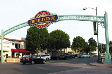
Civic leaders agreed — the city of Chula Vista, CA, which had a population of approximately 215,000 in the 2000 Census, needed a new look to accompany its dynamic personality and entice residents in outlying areas to venture downtown. Situated approximately eight miles south of San Diego, Chula Vista had gradually gained population because of its affordability in comparison to the state’s northern suburbs.
To enhance its image, local business leaders and the city’s Community Development Dept. partnered to pursue a gateway sign on Third Ave. in the heart of the city’s business district. In June 2002, the city hired locally based Graphic Solutions Ltd. to devise a sign.
Grand designs
Simon Andrews, principal of Graphic Solutions, said his firm first became involved when Jack Blakely, executive director of the 700-plus member Chula Vista Downtown Business Assn. (CVDBA), approached Andrews about the project.
Andrews said a modest sign, installed in a median walkway, was considered, but the business community wanted something impressive. After numerous powwows, the consortium concluded the design should mix familiar elements from the city’s logo, which included a rising sun over mountains and water, and new graphics and colors to portray a progressive persona.
Andrews noted the neighborhood is commercially oriented, but for years lacked pedestrian traffic; it wasn’t seen as a destination by non-residents. However, the avenue’s transformation reflects an influx of restaurants and trendier shops.
Advertisement
Meeting with city officials and the public required approximately four months. As with any publicly funded project, a few obstacles arose.
"Some on the city council were opposed to the sign’s design and scope," Andrews recalled. "However, after public input, this was the consensus."
Andrews underscored that the city had no intention of creating a historic district. "It looks fairly sedate during the daytime," he noted. "But with five colors of neon on a two-sided sign, even using reflected light it looks as bright as an ice-cream parlor, and it’s a beacon for blocks."
Graphic Solutions produced the design using Adobe Illustrator® and Aldus Freehand®. Selected typefaces included ITC Leawood for "Third Ave.," and customized Pillsdon for secondary copy. Andrews observed a sign in San Diego’s Gaslamp district that highlights legibility’s importance.
"It can’t be read day or night, which is problematic when it’s normally viewed from a distance," he said. "The type needs to be distinct from the background or negative space."
Putting it together
Advertisement
San Diego-based Ultrasigns Electrical Advertising successfully outbid seven other signmaking outfits in April 2003 and earned the right to fabricate the Chula Vista gateway sign. The full-service company, founded in 1962, opened a 40,000-sq.-ft. facility last autumn.
Ultrasigns Principal Gus Hadaya had cultivated a productive relationship and good reputation with city officials through Ultrasigns’ creation of a gateway sign for San Diego’s Little Italy district.
Huddling with Graphic Solutions, Ultrasigns made some modifications. For instance, the aluminum specification changed from 0.090 to 0.125 in. to create a stronger frame that would withstand the inevitable expansion and contraction that the metal trusses would undergo with weather and humidity changes. Also, they expanded the sign’s reach from 62 to 70 ft. to accommodate power lines, while still letting it stand symmetrically over the street.
To construct the frame, Ultrasigns combined three pole sections in a sandwich-like construction that concealed any hardware or minor surface abrasions. All parts comprised forged aluminum, which were encased and formed, except for the overhanging steel structure. Ultrasigns chose materials that would withstand the region’s constant exposure to salt air. To calibrate the aluminum and steel for expansion and contraction, the company separated the pieces with |1927|™ Scotch Wrap® gaskets. 3M Industrial Adhesives & Tapes Div.$image2
Ultrasigns routed the sign’s background to accommodate the standard, 5-in.-return, Plexiglas® acrylic faces. However, Ultrasigns devised the letters to protrude only 3 in., which allows the sign a cleaner appearance. The secondary copy comprises Gemini-formed, plastic letters decorated with 23k goldleaf that shines brilliantly when bathed in neon.
Hadaya said neon was chosen because the sign required significant white light, as well as red, blue, green and orange. When this project was fabricated, white LEDs were still largely untested. Thus, they used 13- and 15mm, |2123|’s CL neon tubing and 20, Lecip 9- and 12kV transformers. Hadaya said voltage testing was an integral part of the project. EGL
Advertisement
The base, caps and pole ornaments were fabricated from 23 casting molds. Each part was molded and forged separately, then assembled, to create four, equal sides to fabricate pole covers. The top ornament also features a "halo" sphere with 23k, surface goldleaf.
Hadaya said encapsulating the hardware seamlessly within the frame could be summarized in one word — perfection.
"The parts couldn’t deviate so much as 1/8 in. from one another," Hadaya recalled. "The steel truss was manufactured in a separate facility, so the final patterns had to be adjusted to fit precisely."
Ultrasigns fabricated sections of the sign in house. With effective planning, the city needed to close the street for only four hours so the sign could be erected. The company implemented a 40-ton, hydraulic crane to set the truss and signs to the support columns. To match the sign’s footings to the district’s red-brick sidewalks, Ultrasigns poured custom- mixed concrete and stamped the pattern onto the surface.
Hadaya recalled, "At that point, we worried that the sign would flex inward. Had that happened, we would’ve never been able to weld the edges. Picking this structure up with a crane, there is the potential of 6 in. of fluctuation within the structure if the sections aren’t properly matched. This much fluctuation would’ve destroyed the sign."
Andrews praised Ultrasigns for its willingness to use materials and processes that exceeded specifications, and for its unsolicited input.
We approve this message
Blakely said the sign serves two missions: to unequivocally identify the Third Ave. district as the heart of Chula Vista’s downtown, and attract those living in the outskirts of the 13-sq.-mi. community, the 7th-fastest growing in the nation, to the central city.
He said, "Business owners like the sign as a focal point, and they note higher sales figures. It’s a very welcome asset."
Moreover, the city is considering using elements of the sign as symbols for letterhead and city-employee uniforms.
Reflecting on the project, Andrews commented, "The total success of this project was the result of a rare confluence of effort and cooperation on the part of the city, designer and fabricator."


 Tip Sheet1 week ago
 Ask Signs of the Times2 days ago
 Real Deal1 week ago
 Benchmarks5 days ago
 Editor's Note2 weeks ago
 Women in Signs1 week ago
 Product Buying + Technology2 weeks ago
 Photo Gallery6 days ago