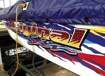
My friend, Brenda Thomas, of |2214| (South Bend, IN), asked me to write another article about how to use special-effects vinyls (see ST, June 2003, p. 26), such as Avery Dennison Graphics & Reflective Products Div.’s shade-shifters or Coburn’s metallized vinyls. Brenda believes most signmakers are fascinated with such unique films, but they might not know how to use them. Shortly after promising Brenda I’d write a column about special-effects vinyl, I designed a graphic using these films. On paper, the design looked great. However, instead of making a prototype to see what the design really looked like, I charged ahead with a production order of 500 pieces. When the finished product crossed my desk, I was mortified. The background was so sparkly and busy, I couldn’t read the copy. The design failed because I failed to follow basic design rules, which is the topic of this month’s column (sorry, Brenda, you’ll have to wait for me to write another article about special-effects films). The design appraisal Asking questions is an important first step in the sign-design process. Gaining a better understanding of a customer’s business will help you select the appropriate colors, typeface and other design elements. Some of the questions include: * How do your customers and prospects currently view your business? * How would you like to be viewed as a company? * What are your current advertising and marketing themes? * What colors, logotypes, typefaces, design motifs and slogans are you currently using? * What liberties can be taken with corporate logos and colors? Such design elements as color selection, typeface and logotype must be in sync with the theme your client wants to convey. For example, contrasting colors usually aid readability. The most readable color combinations include: black on yellow, yellow on black, white on black, and blue on white. What type of typeface? When I worked in advertising more than 30 years ago, I learned that serif type, such as Times New Roman, was more readable than sans serif, because the first words we read in elementary-school primers are in that typeface family. The morning newspaper is also set in a serif font, with which we’re more familiar and more comfortable reading. "Readability," however, isn’t the same as "legibility." Times New Roman may be more eye-pleasing, but this doesn’t mean it’s more legible. So, what do we mean by legibility? Generally, sans-serif fonts can be read more easily from a distance than fonts with serifs — the small, embellishing strokes that finish off a letter’s main strokes. However, this doesn’t imply that you should always use sans-serif copy. In fact, most designers believe that serif type is more likely to be read, because it’s more pleasing to the eye. And they’re right. As with other things in life, size matters, especially if your sign is viewed from a considerable distance. The distance from which a sign is viewed determines suitable copy character height. One standard suggests that 1-in. copy can be read from a distance of 50 ft. Only a person with eagle eyes could read something this far away. The rule I was taught states that every inch of character height yields 25 ft. of readability. I believe this rule is truer. Viewing distance is only one consideration. For on-premise signage, you must also consider the speed at which traffic is moving past the location. Furthermore, words that comprise initial capital letters followed by lower-case letters are more readable than words that employ all upper-case letters. On the other hand, from a greater distance, signs that incorporate all capital letters are probably more legible. Outlines and drop shadows can also improve readability. For example, heavy, black, drop shadows can create the right contrast and improve readability. Although black is frequently used for drop shadows, it isn’t the only color you should consider. For example, if you’re using gold lettering on a bright-red background, use a dark red for the shadow — the dark red will soften the transition from the gold in the foreground to the red background. Popular metallic vinyls aren’t always readable. While contrasting colors can improve readability, contrast in line value, typeface and shape can attract viewers’ attention and differentiate your signage. During the paint-and-brush era, script with big block lettering was frequently and effectively employed. Composition Good composition — how a sign’s elements/objets are organized — improves a sign’s visual appeal. When arranging a sign’s design objects, remember a few basic guidelines. Although rules are meant to be broken, I know only a few extremely creative signmakers who can make their own design rules. For the rest of us, it’s best to stick to the industry’s long-established guidelines. The first guideline is the KISS rule: Keep It Simple, Signman, or Keep It Simple, Stupid (whichever you prefer). With this in mind, use only three or four key design elements — pictures; a company’s name, logo and/or slogan; trim; and accent stripes and/or borders. Don’t use backgrounds that conflict with the copy, and limit the text to six or fewer words. Typeface variations can be interesting, but don’t use too many different fonts. Usually, two different typefaces suffice. Typically, too many words, colors and design elements create visual clutter. White space should represent 30 to 40% of the overall design. Be careful, though, and don’t trap any white space between the design elements — this breaks up the design’s continuity and/or flow. A border frames your layout and ties all the design objects together. In fact, using special-effects films for the border can make your signage even more eye-catching.


 Tip Sheet2 days ago
 Business Management1 week ago
 Women in Signs1 week ago
 Real Deal3 days ago
 Editor's Note7 days ago
 Maggie Harlow2 weeks ago
 Line Time1 week ago
 Product Buying + Technology1 week ago