Design
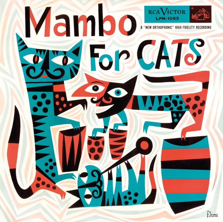
Design Matters: Flora’s Fauna
Jeff Russ celebrates the art of legendary commercial artist Jim Flora
Introducing the Sign Industry Podcast
The Sign Industry Podcast is a platform for every sign person out there — from the old-timers who bent neon and hand-lettered boats to those venturing into new technologies — we want to get their stories out for everyone to hear. Come join us and listen to stories, learn tricks or techniques, and get insights of what’s to come. We are the world’s second oldest profession. The folks who started the world’s oldest profession needed a sign.


American Sign Museum Names New Executive Director

3 Things Print Pros Must Do to Build Stronger Relationships in the Interiors Market

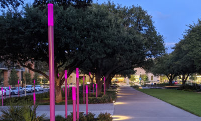
Graphics Turn an Eyesore Cooler Into a Showpiece Promo in Historic Plaza


Bulletins
Get the most important news and business ideas from Signs of the Times magazine's news bulletin.
-

 Tip Sheet1 week ago
Always Brand Yourself and Wear Fewer Hats — Two of April’s Sign Tips
-

 Photo Gallery1 day ago
30 Snapshots of the 2024 ISA Sign Expo
-

 Ask Signs of the Times3 days ago
Why Are Signs from Canva so Overloaded and Similar?
-

 Real Deal1 week ago
A Woman Sign Company Owner Confronts a Sexist Wholesaler
-

 Benchmarks6 days ago
6 Sports Venue Signs Deserving a Standing Ovation
-

 Editor's Note2 weeks ago
Why We Still Need the Women in Signs Award
-

 Women in Signs1 week ago
2024 Women in Signs: Megan Bradley
-

 Photo Gallery1 week ago
21 Larry Albright Plasma Globes, Crackle Tubes and More