Change is inevitable. Just one year ago, we were buying Enron stock, Martha Stewart was our hero, and we'd never even heard of Osama Bin Laden.
Change is especially unavoidable in sign systems. Bus routes change, retailers move, and maps must be amended. Updating signs to accommodate such flux can prove cost-prohibitive to end-users without deep pockets. Consequently, a smart designer accommodates change on the front end, creating signage that customers can revise themselves, as needed.
Two projects by Michael Courtney Design (MCD), Seattle, illustrate client- and change-friendly design principles: The Lodge at Bellevue Square and The Fred Hutchinson Cancer Research Center (FHCRC) Shuttle.
The Lodge at Bellevue Square
For The Lodge, Kemper Development hired MCD to complete a comprehensive environmental graphics program. Part of a 110,000-sq.-ft. addition to the existing, well-established Bellevue Square shopping mall, The Lodge, designed by Sclater Architects (Seattle), simulates an upscale, Northwestern resort.
Encompassing various high-end retailers and restaurants, The Lodge is separated from the primary mall by a road and sky bridges, so it's not easy for the facility's 16-million annual visitors to locate.
Advertisement
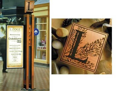
As such, MCD created "trail markers" (wayfinding signage) within the existing mall, pointing the way to The Lodge. Also, MCD designed directories with maps, entry and identification signs for The Lodge and elevator plaques.
Made of sanded, varnished, Douglas fir, the trail markers mimic the rough wooden beams in The Lodge's ceiling. Fabricated by Trade-Marx Sign & Display Corp. (Seattle), each marker sports a rectangular copper plate with a black, etched leaf in the background and an attached "L" made of painted aluminum. In addition, each trail marker includes a white-on-blue directional arrow and a Plexiglas® acrylic box in which items symbolic of the Northwest are displayed, such as river rocks, shells, feathers and fly-fishing lures.
"When people go for walks, they bring back treasures — things they've picked up along the beach or a trail. The little museum box between the timbers helps embellish the story by incorporating these treasures," MCD's Mike Courtney says.
Ten 8-ft.-tall permanent trail markers are bolted to the floor at pedestrian intersections. Additional 4-ft.-tall moveable markers have 2-ft.-sq. bases. Courtney has dubbed these temporary signs "bread crumbs" for shoppers.
A frame attached to each trail marker's side makes them even more adaptable. They allow Kemper to change posters in the frames when necessary — for example, if a new retailer moves into The Lodge, or if special sales are taking place.
MCD and Trade-Marx's over-the-door and primary directories are similarly adaptable, incorporating backlit panels and maps. Produced by Graffix Inc. (Seattle) using 7-mil Scotchprint® electrostatic graphics, with a matte laminate and applied to Dibond® composite material, the maps purposely include only numerals on store spaces, not retailers' names. Separate keys denote each store's number. MCD designed a key template and selected an appropriate paper stock on which the keys could be printed. Thus, Kemper staffers can update the templates as soon as new retailers move in.
Advertisement
"It's a good, smart, practical solution that really benefits the client," Courtney says.
Obviously, The Lodge entry signage, elevator plaques and other graphics don't need to be frequently changed like the trail markers and directories. The aluminum entry signs are painted to simulate the building's blackened-steel structural components using two-part Matthews polyurethane paint, and the plaques are paint-filled, random-orbital-finish copper. Graffix and Messenger Signs (Seattle) fabricated the copper signage.
FHCRC Shuttle
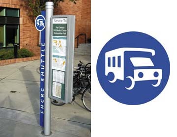
Like The Lodge, the FHCRC Shuttle branding and environmental graphics program needed to accommodate changing messages.
Designed to transport patients, families, visitors and staff throughout a nine-block campus of medical buildings in downtown Seattle — including the University of Washington Medical Center, Children's Hospital and the Pete Gross House — the FHCRC Shuttle faced some unique challenges.
Not only did the shuttle need a new identity, it needed signage that helped users readily identify it, distinguish it from other public and private transportation systems, and extend public awareness of the service.
Advertisement
MCD's new wayfinding system — fabricated by Trade-Marx — features a custom bus illustration depicting the shuttle.
Each shuttle-stop sign also incorporates a cabinet housing information that shuttle personnel can update themselves, such as digitally printed maps and schedule information. As with The Lodge, MCD designed the route templates, so that the graphics look consistent.
"We wanted to make the system as useful and as consistent for them as possible, while also keeping it low cost, long term," Courtney explains.
When developing the signs' color palette, MCD looked to the contemporary yet classic, brick and stainless-steel architecture of FHCRC's primary building. As such, aluminum became the fabrication material of choice.
"We looked at having the signs made using random-orbital-finish or polished aluminum," Courtney says. "But the price was better to have them painted silver."
In the future, there will be at least five transit-stop signs. But at press time, only one had been installed because the FHCRC Shuttle is having them put in "as budget cycles allow," Courtney explains.
How has the shuttle's sign program been received?
According to Shelly DaRonche, FHCRC's transportation manager, "The new identity and signage are exactly what we wanted. The shuttle service is of great value to our patients, their families and our staff. The new materials heighten its functionality by providing easy-to-recognize touchstones and increasing community awareness of the service."


 Tip Sheet1 week ago
 Photo Gallery2 days ago
 Ask Signs of the Times4 days ago
 Real Deal1 week ago
 Benchmarks6 days ago
 Editor's Note2 weeks ago
 Women in Signs1 week ago
 Photo Gallery1 week ago