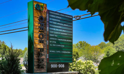
Enter a New Dimension
Letters and logos that literally stand out.
DIMENSIONAL SIGNS ARE A simple, yet nuanced sign solution for businesses looking to get their perfect logo, branding or message across. Available in a slew of sizes, colors and materials, this signage form is perfect for lettering but its reach extends way beyond the alphabet. For Mike Mayernick of Mike Makes Signs (Warren, OH), using a combination of formed-plastic dimensional letters alongside a custom-molded tree logo was the ideal solution for a pediatric therapy waiting room. “Our customer wanted their logo in an area that would have children in it, so we wanted a product that would be durable to handling [and] be pretty,” he said.
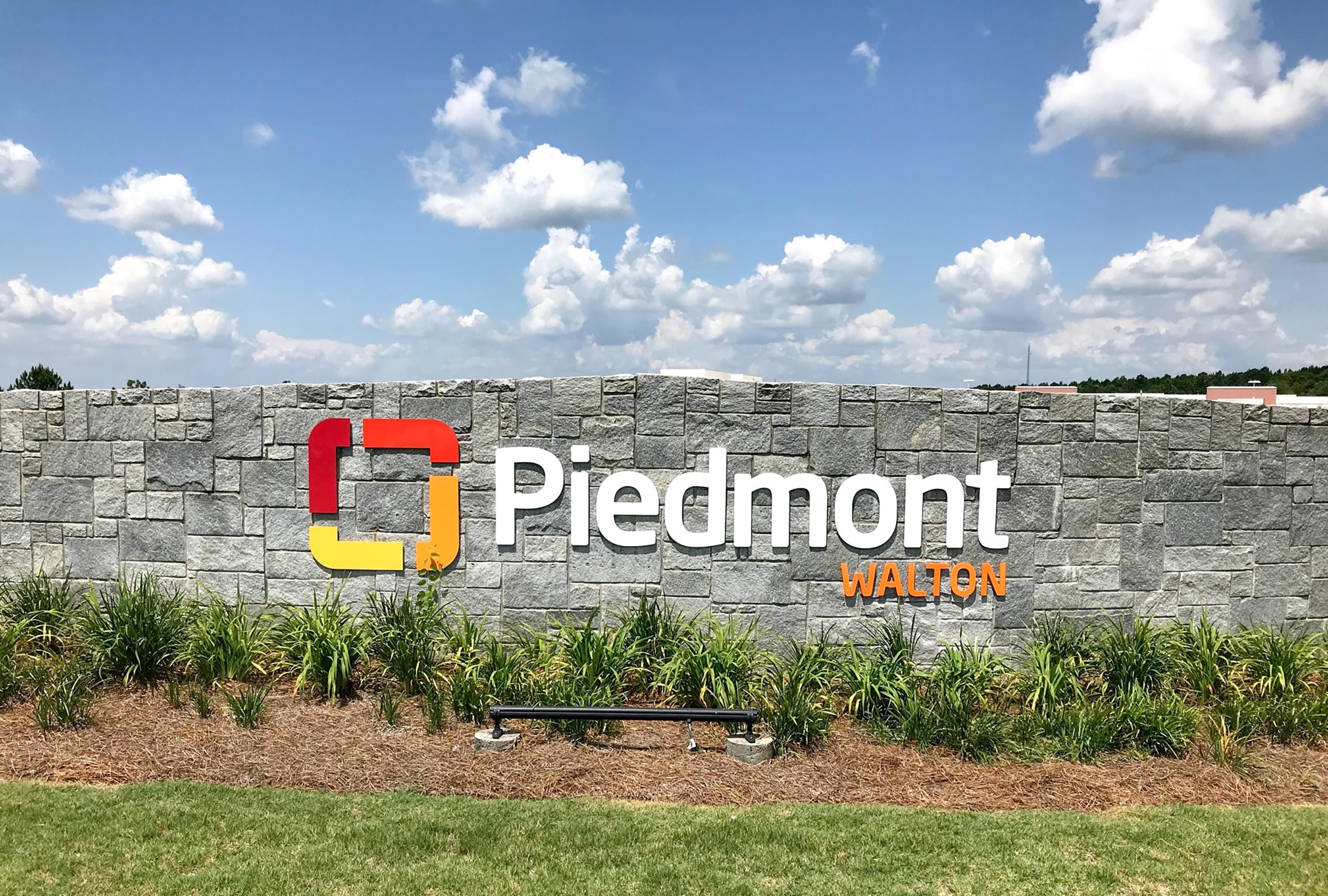
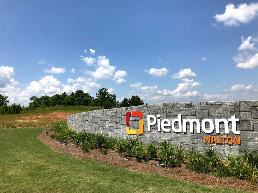
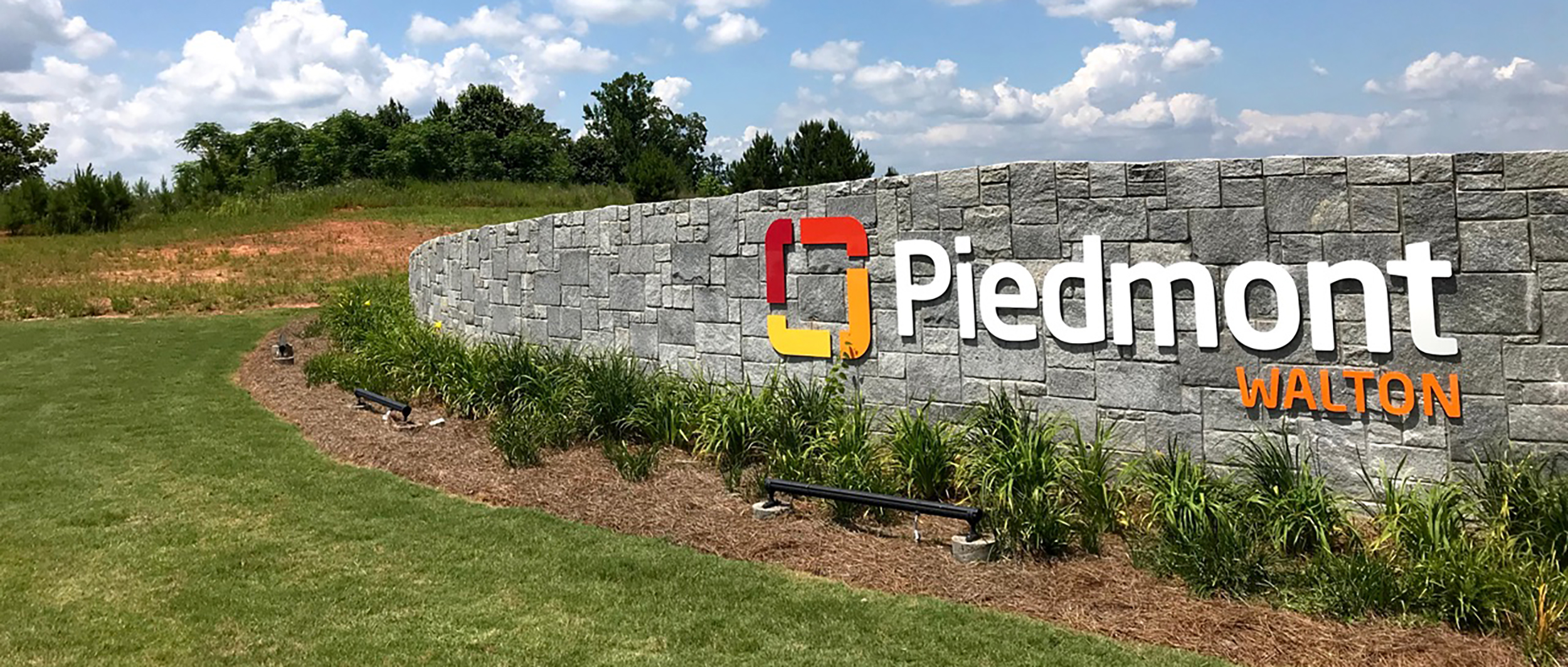
Stonewalled
Philip Henry, senior project manager at The Sign Brothers (Bogart, GA), describes their work with the Piedmont Healthcare system as “much more than a logo and a set of color values,” as the system and its mission of improving healthcare facilities and resources in underserved communities is extremely important to them. As part of a rebrand of a small hospital in the Piedmont system, The Sign Brothers created the logo and lettering by routing dimensional acrylic, adding color with Matthews Paint and then stud-mounting directly into a stone wall to keep the look consistent with the hospital’s previous signage.
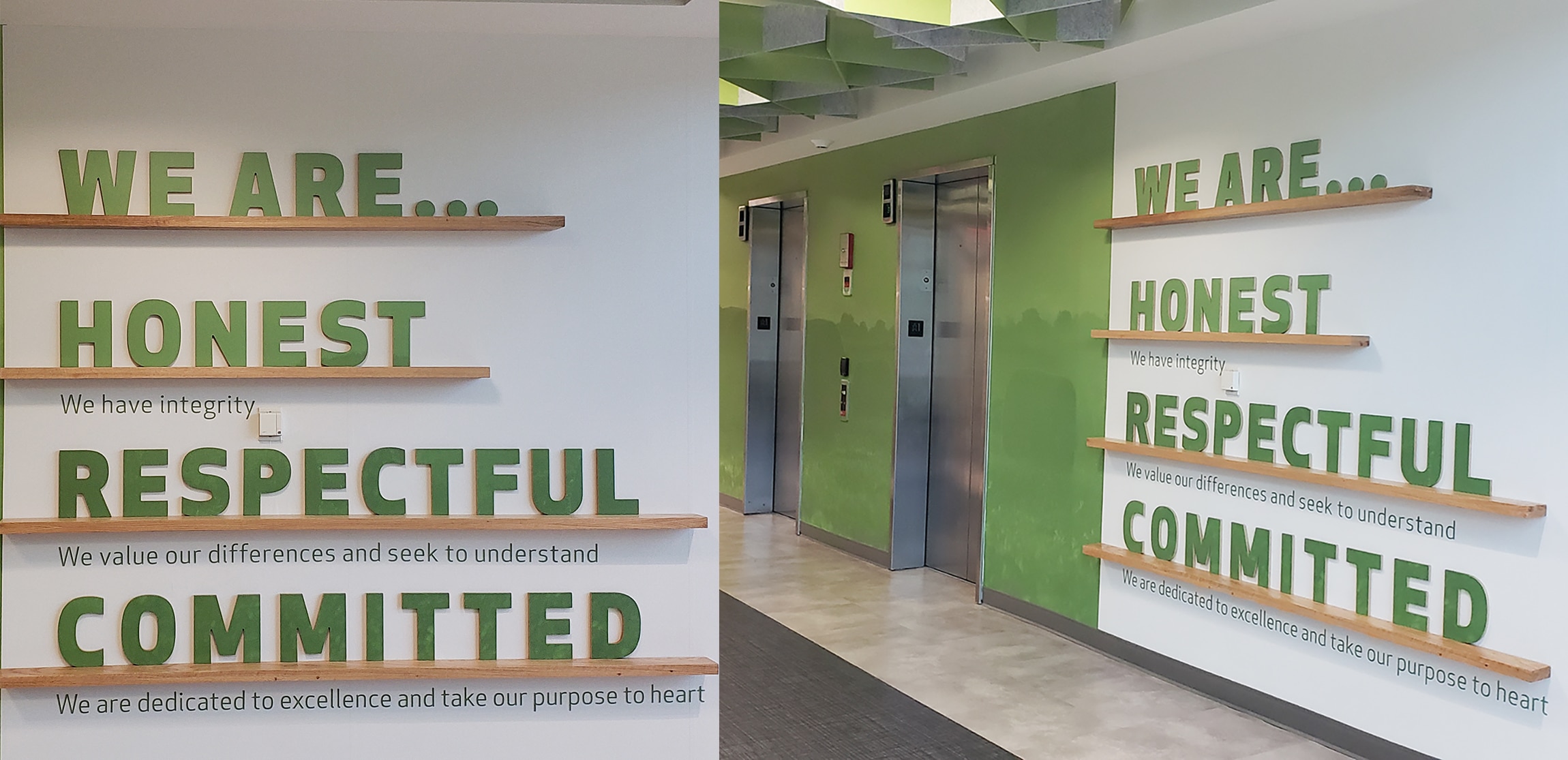
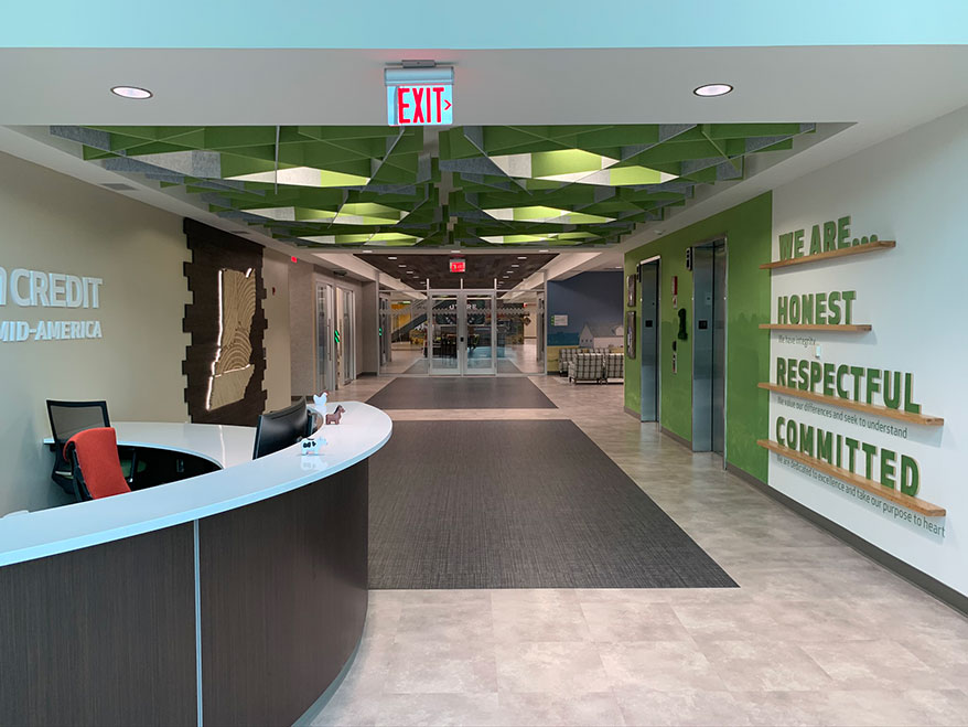
Shelf Reading
Signarama Downtown Louisville (Louisville, KY) partnered with Open Grain Woodwork (Louisville, KY) to fabricate red-oak wood letters, which the signshop then covered in a green, digital-patterned print to create a new branding project for financial services cooperative Farm Credit Mid-America’s new headquarters. “We love the choice and the commitment the client made to real wood. They would not consider faux finish or foam, which would have been easier and more affordable,” Signarama Downtown CEO Maggie Harlow said. “These kinds of projects stretch us as a team and inspire our creative thinking.”
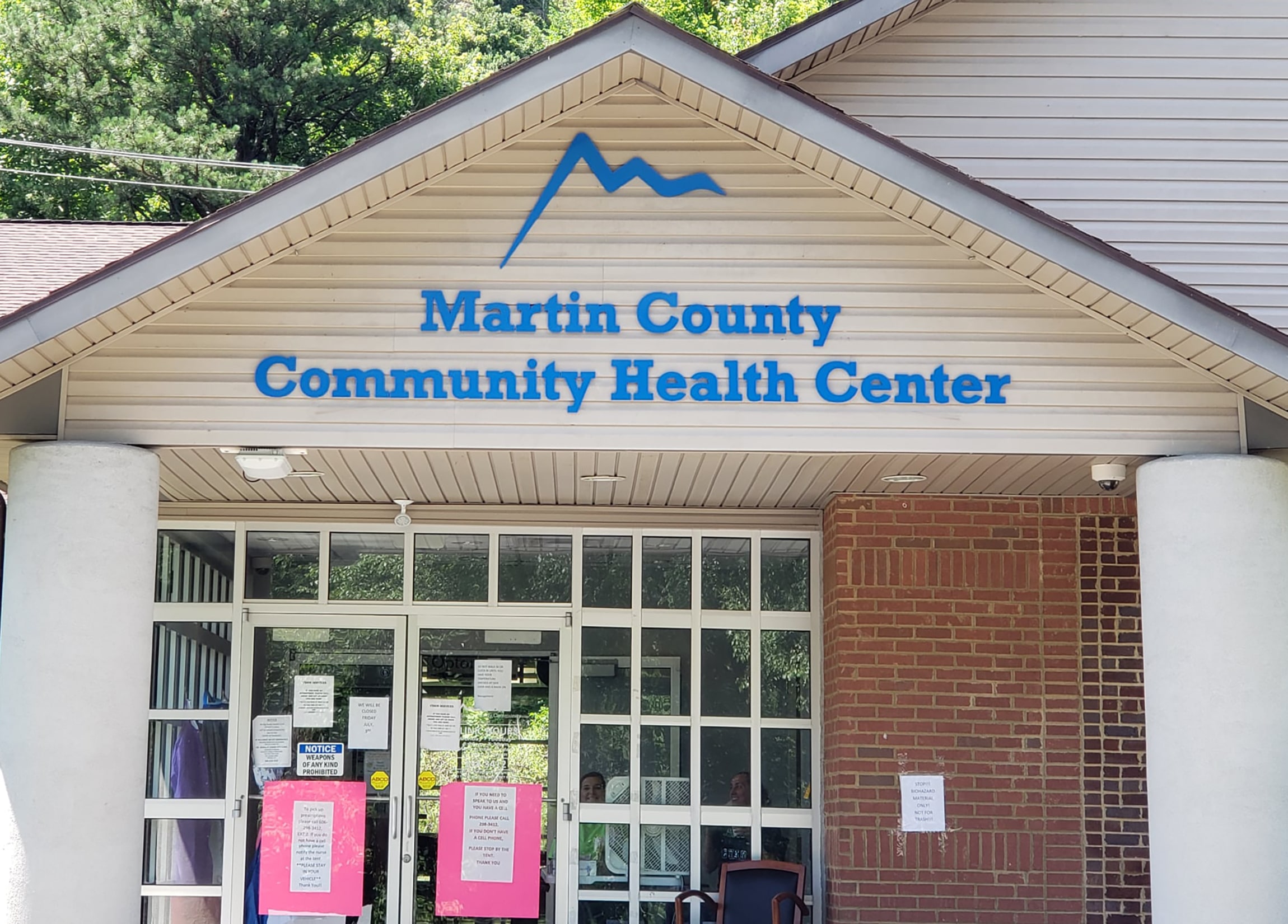
Keeping It Simple
The Martin County Community Health Center (Inez, KY) was able to receive a brand-new dimensional-lettered sign outside of its building inside of two weeks thanks to Paris Signs’ (Huntington, WV) quick turnaround and by having a full stock of the materials needed already on hand at their shop. The letters are made from ½-in.-solid acrylic, cut on a CNC router and painted with Matthews Paint acrylic polyurethane to the customer’s color preference. “The customer wanted the simplicity and look that only individually raised letters could provide on this wall,” Sales Manager Wade Murphy said.
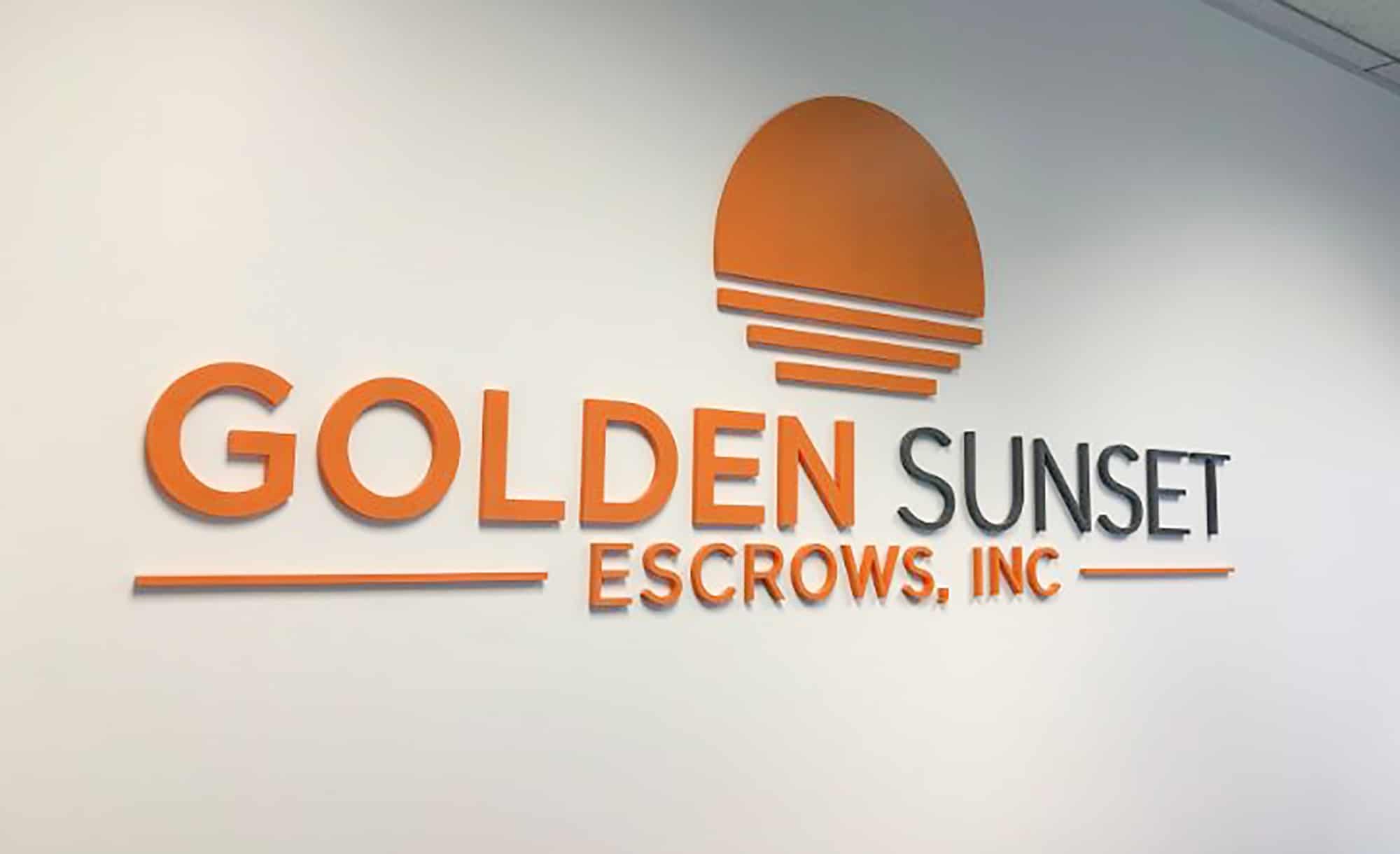
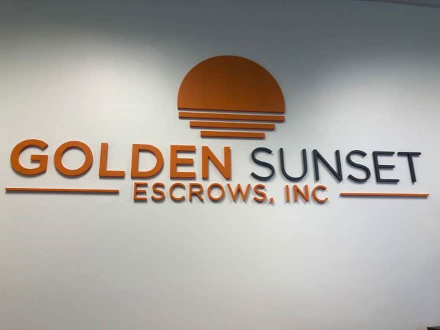
Into the Sunset
Golden Sunset Escrows Inc. (Glendora, CA) was looking for someone to create a new brand-centric lobby marker on their wall, so they turned to Superior Signs and Graphics (Buena Park, CA), and hired them to handle the design, production and installation of the sunny, gold-and-black acrylic wall logo. The ½-in.-thick Acrycast acrylic was cut on a Laguna CNC router, sanded lightly, then painted with a satin finish acrylic latex paint before being stud-mounted flush to the wall, according to Superior Signs President Scott Hoffman.
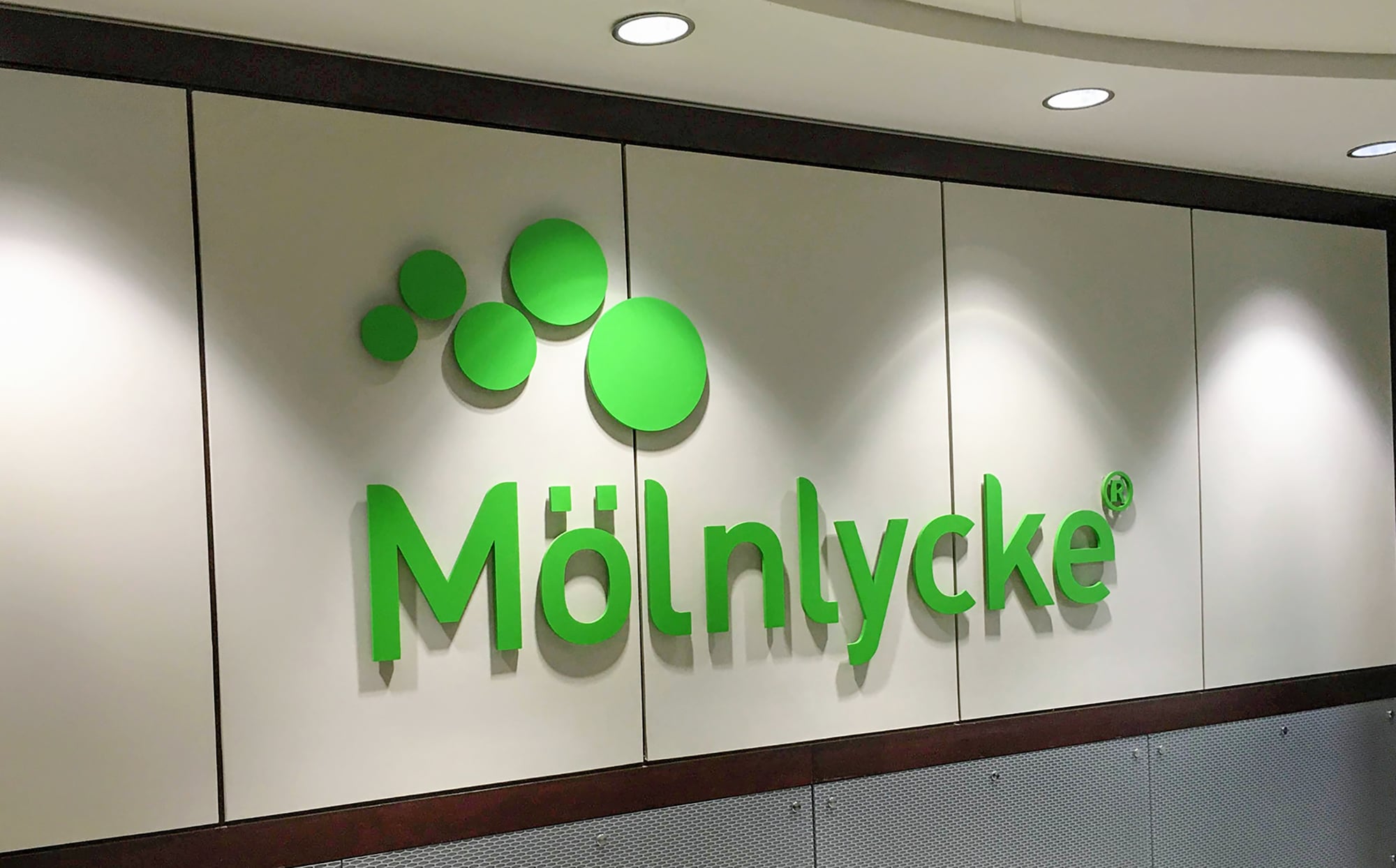
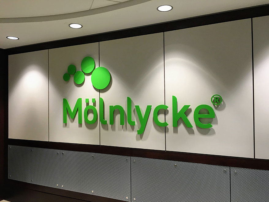
Dots, Umlauts and An ®
When Swedish medical device company Mölnlycke moved into two floors of a building in the metro Atlanta area, The Sign Distillery (Alpharetta, GA) was asked to create “substantial” signage that would make an impact as people stepped off the elevator into the offices’ wide vestibules. To that end, The Sign Distillery used ½-in.-thick, flat, cut aluminum with ½-in. spacers painted the company’s trademark green to fulfill that goal. Ross Dinnsen, master sign distiller, said the production and installation phase was easy compared to remembering how to pronounce the company’s name. “We had to look it up: It’s pronounced ‘Mon-licka.’”
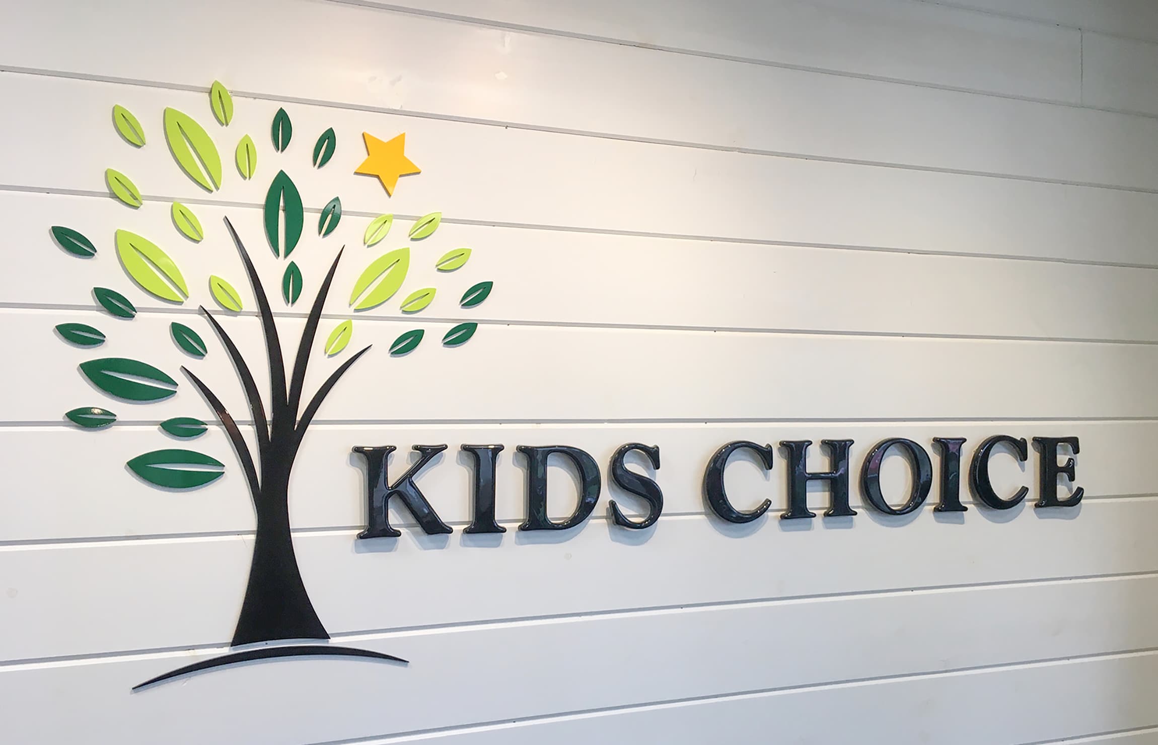
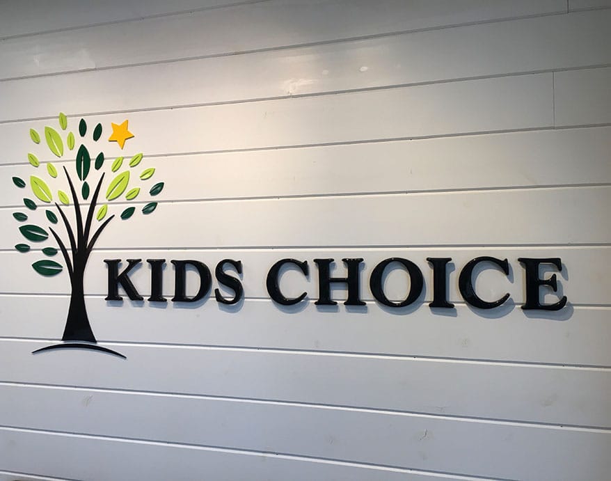
Kids’ Choice Awards
After completing a digital message center for a local shopping plaza, Mike and Rosalie Mayernik of Mike Makes Signs were approached by plaza tenant Kids Choice Pediatric Rehab & Therapy Center to create an entire sign suite for them, including a colorful, formed-plastic logo from Gemini in their lobby. “The logo is a tree, so we wanted to mount all the leaves individually for an added dimension,” the Mayerniks explained.
Introducing the Sign Industry Podcast
The Sign Industry Podcast is a platform for every sign person out there — from the old-timers who bent neon and hand-lettered boats to those venturing into new technologies — we want to get their stories out for everyone to hear. Come join us and listen to stories, learn tricks or techniques, and get insights of what’s to come. We are the world’s second oldest profession. The folks who started the world’s oldest profession needed a sign.


Avery Dennison Adopts Mimaki Printer for Traffic Sign Print System

Fiery Releases SignLab 11

21 Larry Albright Plasma Globes, Crackle Tubes and More


Bulletins
Get the most important news and business ideas from Signs of the Times magazine's news bulletin.
-

 Tip Sheet3 days ago
Always Brand Yourself and Wear Fewer Hats — Two of April’s Sign Tips
-

 Business Management1 week ago
When Should Sign Companies Hire Salespeople or Fire Customers?
-

 Women in Signs2 weeks ago
2024 Women in Signs Award Winners Excel in Diverse Roles
-

 Real Deal4 days ago
A Woman Sign Company Owner Confronts a Sexist Wholesaler
-

 Editor's Note1 week ago
Why We Still Need the Women in Signs Award
-

 Maggie Harlow2 weeks ago
The Surprising Value Complaints Bring to Your Sign Company
-

 Line Time2 weeks ago
One Less Thing to Do for Sign Customers
-

 Product Buying + Technology1 week ago
ADA Signs and More Uses for Engraving Machines