In 1958, Guadalupe, CA, ranchers Clarence, Rosalie and Richard Maretti founded the Far Western Tavern in what had formerly been the historic Palace Hotel in downtown Guadalupe. The restaurant made its mark as a steakhouse and barbecue joint (with most meat dishes slow-cooked over an oak-burning flame, which yields a heartier taste), but has evolved to include an array of California-style dishes such as polenta and artichoke and goat-cheese fritters (and, for the thick-skinned, Western traditionalists, mountain oysters and sweetbreads).
Sunset magazine named it one of the West’s finest barbecue joints, and celebrity chef Bobby Flay recorded an episode of his Food Network show there. The Marettis were also featured on the Cooking Channel’s Man, Fire, Food show.
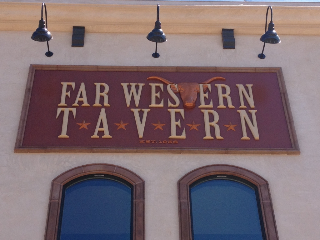
However, despite the restaurant’s success, a move became a necessity. Local ordinances required extensive retrofits to the Guadalupe building to make it earthquake-proof, which would’ve proven cost-prohibitive. Instead, the third-generation owners moved the Far Western approximately 10 miles down the road to a newly constructed building in Orcutt, CA’s Old Town neighborhood. Wisely, they decided to invest in a bold sign to reflect an aggressive rebranding. The sign at its former location comprised a series of painted, flat panels that had begun to show their age, so it was a fitting time to make a clean break for the future with a handsome, 3-D sign.
Renee Righetti-Fowler, one of the restaurant’s new owners, enlisted SignCraft (Santa Maria, CA) to fabricate a building-mounted sign that “steered” the Far Western’s advertising in a new direction. The shop partnered with Berto Van Veen Construction, which executed essential renovations for the new property. Jon Blackford developed the design using Adobe Illustrator; its color scheme pays homage to the original Guadalupe location, but firmly establishes its own identity with a striking bull’s-head logo and deep, router-cut letters that evoke a Western theme as definitively as spurs and a Stetson.
The shop built the main sign panel with 0.125-in.-thick aluminum that’s primed, painted and clearcoated with Sherwin-Williams exterior-latex products. SignCraft created a custom color with the semi-gloss coating to match customer specifications. The 1.5-in.-thick letters were fabricated on the ShopBot CNC router with a 5 x 12-ft. panel of 15-lb. Sign*Foam® III high-density-urethane (HDU) letters, and smoothed to shape with sandpaper and rasps. Fabricators assembled the bull’s head from HDU layers bonded together with West System epoxy resin. They painted the dimensional elements with Jay Cooke’s high-fill primer and copper-colored 1Shot lettering enamel.
“The most interesting challenge to the job was creating the steer’s head,” Blackford – son of the shop’s owner, Mark – said. “The bull’s head featured was originally a longhorn, so, through the magic of computer design and elbow grease, we were able to graft the horns onto the head to meet the customer’s demand.”
SignCraft’s installers accessed the installation on a Ford-chassis Altec 65-ft. boom lift, set the drilled backer into the border-tile framework, and situated the sign on 3/8-in.-diameter lag bolts and shields, which are conveniently hidden behind the deep letters.
Advertisement


 Tip Sheet3 days ago
 Business Management1 week ago
 Women in Signs2 weeks ago
 Real Deal4 days ago
 Editor's Note1 week ago
 Maggie Harlow2 weeks ago
 Line Time2 weeks ago
 Product Buying + Technology1 week ago