Design
How Should It Look? Where Should It Go?
A sign’s appearance and placement are key considerations to designers.

If Image Is Nothing,” Britney Spears wouldn’t be wearing barely there “Sexsi” T-shirts and promoting Pepsi. Instead, she’d be a fully clothed, not-so-sexsi Sprite drinker. And, if visually appealing people, places and things didn’t garner positive feedback, full-service, graphic-design firms specializing in image management wouldn’t be in business.
For more than 10 years, Michael Courtney Design (MCD) has been creating memorable branding programs for its clients. In addition to product-, corporate- and event-branding programs, the Seattle-based company specializes in Web design, print materials, environmental-graphics programs and promotion design.
According to Michael Courtney, the firm’s founder, one of MCD’s primary goals is to create approachable and impressionable images for its clients. To do so, MCD designers learn about their clients’ targeted audiences, goals, budgets, schedules and whether they desire a new brand identity or simply want to add to or update an existing look.
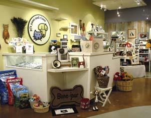
Recently, MCD designed a complete branding and marketing program for Patti Howell, founder of PJ’s Paws and Claws (also of Seattle).
Michael says, “She really understood the power of a good image. She sells upscale pet items, and we wanted to provide her with an approachable image to attract people seeking specialty items for dogs and cats.”
In addition to PJ’s color palette, gift packaging and merchandising elements, MCD designed the shop’s interior signage. PJ’s exterior neon sign, which replicates the store’s logo — a playful, simply sketched dog and cat — was a gift from one of the founder’s family members.
The 850-sq.-ft. PJ’s required two interior signs. A painted, 3-ft.-diameter, MDF (medium-density fiberboard) and Sintra® PVC component, featuring the shop’s logo, is displayed behind the cash wrap; a 2 x 3-ft. glass sign comprising a smaller version of PJ’s logo and the store’s mission statement (all done in vinyl) is displayed within the retail environment so customers can view it “up close and personal.”
“We didn’t know whether to make the splash at the window/entrance area or behind the cash wrap,” Michael explains. “Because it provided enough space for a fairly large branding element, we opted to display the primary logo behind the cash wrap. On the other hand, we felt the client’s mission statement could be read easier if customers could get a closer look. Therefore, we displayed this sign near the entrance.”
Because there’s typically an abundance of visual activity within a retail setting, MCD felt it was necessary to make PJ’s logo prominent, yet clean and simple. Michael says that, although a sign for such an environment should be large enough to be noticed, it shouldn’t be so large that it overwhelms the surrounding space. Plus, the sign’s message and/or graphic should be simple and to the point.
| MCD’s Techniques for Creating the Right Look |
| * Explore different looks. Create multiple illustrative versions from which clients can choose. * Design signage to reflect a client’s personality. For example, if a client operates a fun and quirky business, the signage should reflect this. * Avoid using dull or extremely trendy colors. Dull colors are usually “too corporate” for a retail setting, and colors that are too fashionable tend to date a sign over time. Thus, whenever possible, incorporate traditional colors that provide a contemporary look. |
To create PJ’s logo, MCD designed nearly 30 different illustrations before opting for the existing circular version. Further, the design firm sought contemporary logo colors to create a non-corporate, yet not-too-trendy look.
Michael says, “Because this is a long-term signage application, we wanted to incorporate colors that would remain contemporary over the years. We didn’t want the colors to be boring, but we also didn’t want them to appear too trendy.”
For some time, fashion designers have been incorporating such basic colors as deep browns, warm camels and black to create contemporary, yet timeless, styles. Now, if you think the colors fashion designers select for clothing are irrelevant to signage color choices, consider this: In a Graphic Design USA June 2002 article, Liatrice Eiseman, a Pantone® official, notes, “Graphic design is always affected and/or inspired by fashion colors.”
| MCD’s Signage-Placement Tips |
* Study and get a feel for a project’s environment to determine where visitors are more likely to encounter signage. * Consider the order in which information is being presented. In what order will people view a collection of signs? Properly placed signage provides people with the right information at the right time. * Leave room for flexibility. Realize that, in the long run, signs might be rearranged to accommodate a newly positioned cash wrap, for example. * Signs bearing unique, possibly hard-to-read fonts should be placed in areas where visitors can view them up close. * Place primary sign components in high-traffic areas. For example, a retailer’s primary logo sign would be noticed near or behind a cash wrap. |