Dimensional Letters
How To Be Hospitable
Hotel signs beckon guests, attract tourists and can become local landmarks.
Yosemite park rangers were confused. The sign that always greeted guests of the park’s well-known Ahwahnee Hotel had disappeared from its usual perch. The circle-shaped, Art Deco-style metal sign, mounted atop a stone wall was “a part of the park’s historic fabric,” the Park Service’s Scott Gediman told SFGate.com in late February 2016. The sign was set to be switched out due to an upcoming name change when it mysteriously disappeared.
Despite a weeks-long investigation, the sign hadn’t resurfaced by April, so park officials offered a $1,000 reward for its safe return, no questions asked. But the reward was left unclaimed.
A single line from a follow-up story on SFGate.com says it all: “Whoever took it came prepared, because the sign was bolted down and would have required tools to pry free.”
(Anyone?)
CRAFTING AN IDENTITY
Not every sign starts out as a masterpiece, and not every location is an instant icon in the way that Yosemite’s historic lodging has been. According to Australian designer Hilary Lancaster, sometimes you have to make something out of, well, very little. Lancaster founded the London-based Fusion Interiors Group (FIG), providing design services to clients in hospitality, retail and corporate settings.
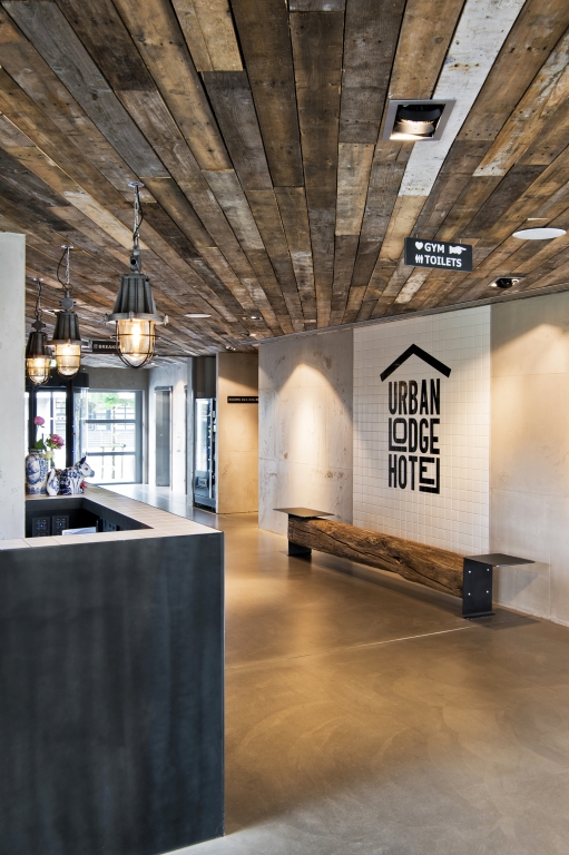
Last September, FIG completed a sleek design for Amsterdam’s Urban Lodge Hotel. The design concept marries a contemporary urban feel with a rustic lodge, yielding a minimalist lobby that features poured concrete, reclaimed wood and a spate of signage.
AdvertisementIT’S PERSONAL
Lancaster’s client, a Chinese developer, asked only that the budget be streamlined with a simple exterior and guest room designs, saving the “wow” for lobby spaces. Geography gave Lancaster few hints; while the hotel is located just a few minutes from both the city center and Amsterdam’s Schiphol Airport, it had few defining traits. So she pulled from the surrounding land’s farming roots, adding a splash of modernity; she even gave the hotel its distinctive name, drawing directly from her design vision.
And though not every hotel requires such breadth of creativity, many expect a more personal touch. According to Jason Nattrass, founder of Mixit Signs & Visual Ltd. (Newcastle upon Tyne, England), “The hotel owners want you [on site] when they’re going to be there. If they’re managing numerous other venues, their time is very important to them; meetings on time, on site are crucial whereas with a retailer, most of the correspondence is via email.”
To be successful in the hotel world, consider a few personal touches. Jason Coltun of Crown Sign Systems (Yonkers, NY) says his installers carry iPads containing floor plans and installation schedules, so they don’t pester clients with basic questions.
WORKING WITH DESIGNERS

While the Urban Lodge project’s developer hand-selected the sign fabricator, Lancaster often designs the signage, then hands it off to a fabricator she selects. And while she looks for experience in the hospitality sector, she also demands capabilities beyond simple signage fabrication and installation.
“I check their record, that they’ve dealt with design before, that they’re good with materials. …They’re more than just people making a sign,” she said.
AdvertisementIn hotels, Coltun said, “Guys have to clean up after themselves, take precautions, measure twice, that kind of thing. We’re dealing with high-end finishes. … We did one project that required stud mounting letters and drilling into marble. I remember thinking the total sign project cost less than that one piece of marble, so that drill better not slide.” As for materials, take note: “Materials don’t have to be expensive,” Lancaster said. “It’s just creativity in how you use them. If you can find [reclaimed wood] in crates for your vegetables delivered to fruit stores, it costs nothing. You put it on a wall and suddenly it looks amazing.”
TIMING CHALLENGES
Beyond materials, the primary challenge posed by hotels is not so different from that in any signage project: timing, timing, timing. For example, hotel wayfinding signage may not be difficult to produce, but large quantities of wayfinding can be a challenge to install, particularly with tight deadlines.
“If they want you to do the room plaques and you’ve got a hotel with 300, 400 rooms, you’re going to be doing a lot of walking around,” said Coltun.
Still, these projects can net healthy profits. Lancaster said that hotel signage need not stop with the venue itself; affiliated restaurants are often in need of signage themselves, along with printed graphics, like menus. But beware underbidding on these projects, as layers of approvals required by developers, designers, general managers and the like can extend timelines.
That was the case for Nattrass when he installed illuminated channel letters at The County Hotel in Newcastle upon Tyne. Built in 1874, the Victorian structure sits just opposite the city’s main train station. Its original letters had been affixed to the building’s stone façade with wrought-iron rails. When it became part of a chain, it was subject to the new brand’s “standard signage,” Nattrass said. And when the hotel changed hands yet again, the new owners wanted the new lettering to be true to the original.
RESOLVING DISPUTES

The trouble was, there was some disagreement about the letters’ placement. Each existing railing had a small, wrought-iron detail exactly in its center. Nattrass knew it wouldn’t work to space the words “County” and “Hotel” with the detail in the middle, but that was exactly what the client wanted. “We had to advise them without being too forceful and telling them, ‘This won’t work,’ basically,” he said. “It was to do with the fact that the building is a perfect mirror of itself and [with] the one word being longer than the other … We had to center the sign on the railing and then split the difference from the center of the building. And we had to space ‘County’ on the right-hand side, away from that [detail] the same as how ‘Hotel’ was spaced on the left-hand side, which gave us an even, mirrored look.”
To avoid possible misunderstandings, Coltun said, “Have an understanding of everyone’s wants and goals on the project. Make sure you’re managing everyone’s expectations accordingly.” Rather than pitching his signs on quality alone, Coltun said Crown’s motto is “service, service, service.”
Sometimes, that means dropping everything to help a customer put out a fire. At a five-star hotel in in New York City, a hotel manager forgot to order room number placards for the entire building. A Crown team worked around the clock, fabricating the signage in three days and installing it just in time for an upcoming inspection. “Some people would say it can’t be done, but we do whatever it takes,” Coltun said.
FINISHING TOUCHES
For The County Hotel, the Mixit team crafted illuminated letters and three-sided fascia around the entryway comprising aluminum routed panels topped by another front panel with push-through acrylic lettering, and a third, final layer of acrylic on the signface. The channel letters are router-cut out of aluminum with an AXYZ 6010 router and illuminated with a three-module Samsung LED, with design work done in CorelDRAW. As with the Urban Lodge project, a design firm passed along font, design and branding details.
During installation, Mixit mounted the 35.4-in. (900mm) letters on an aluminum rail in sections, then used a scissor lift to place each section on the original wrought-iron railing. Once they were in position, the wrought iron was drilled and tapped, then secured into place using locknuts. Because the front side of the building is a mirror of itself, Nattrass and his team installed two identical signs on the front façade, as well as a single set on the side of the building.
Once debates about spacing for the lettering were resolved, the Mixit team was ready to tackle the next challenge: The fabrication company crafting the hotel’s wrought-iron entryway had fallen behind, so signage installation had to be squeezed into a tiny window.
(Remember that tip about timing?)
At Urban Lodge, keeping with the contemporary touch, simple black and white wayfinding signage hangs from the unfinished ceilings with a hand pointing the way for a touch of humor. For contrast and contemporary flair, as guests exit the elevator, an enormous, oversized number denoting each floor is affixed to wooden cupboards.
Opposite the reception desk, a splash of white tile with black adhesive vinyl affixed to the concrete wall carries the exterior signage and logo to the interior of the space. In addition, the logo was stamped into the walls using an impression of the Urban Lodge logo pressed into the wet concrete.
Lancaster’s design left not only these literal impressions, but increased the developer’s estimation of her work; they are currently collaborating on a new project. As with any sector, a happy client is a loyal one.
Introducing the Sign Industry Podcast
The Sign Industry Podcast is a platform for every sign person out there — from the old-timers who bent neon and hand-lettered boats to those venturing into new technologies — we want to get their stories out for everyone to hear. Come join us and listen to stories, learn tricks or techniques, and get insights of what’s to come. We are the world’s second oldest profession. The folks who started the world’s oldest profession needed a sign.


Magazine
Get the most important news
and business ideas from Signsofthetimes Magazine.
-

 Tip Sheet1 week ago
Always Brand Yourself and Wear Fewer Hats — Two of April’s Sign Tips
-

 Photo Gallery2 days ago
30 Snapshots of the 2024 ISA Sign Expo
-

 Ask Signs of the Times4 days ago
Why Are Signs from Canva so Overloaded and Similar?
-

 Real Deal1 week ago
A Woman Sign Company Owner Confronts a Sexist Wholesaler
-

 Benchmarks7 days ago
6 Sports Venue Signs Deserving a Standing Ovation
-

 Women in Signs1 week ago
2024 Women in Signs: Megan Bradley
-

 Photo Gallery1 week ago
21 Larry Albright Plasma Globes, Crackle Tubes and More
-

 Women in Signs1 week ago
2024 Women in Signs: Ashley Borell