Business Management
Ion Art Provides Austin’s Hotel Van Zandt With Street Cred
An iconic neon sign and wayfinding reflective of local color
Published
8 years agoon
Wesleann Polkowske works as project manager for Ion Art (Austin, TX).
Equipment and Materials
Coatings: Acrylic-polyurethane paint, from Matthews Paint (Delaware, OH), a PPG Co., (800) 323-6593 or www.signpaint.com
Cutters: CNC router and plasma cutter, from MultiCam (Dallas), (972) 929-4070 or www.multicam.com;
MIG welder, from such vendors as Miller Electric Mfg. Co. (Appleton, WI), (920) 734-9821 or www.millerwelds.com
Lighting: Neon tubing, from Voltarc (Orange, CT), (800) 825-9465 or www.lightsources.com; transformers, from France, a Scott Fetzer Co. (Fairview, TN), (800) 753-2753 or www.franceformer.com, and Tech22 (Vista, CA), (800) 748-6644 or www.t2neonpower.com
Substrates: Aluminum sheet, from such vendors as Southern Aluminum Finishing (SAF), Atlanta, (800) 241-7429 or www.saf.com
Austin has been known for decades for its music. Famous concert venues, such as Big Gil’s, The Broken Spoke, Armadillo World Headquarters and The Continental Club, have hosted local upstarts and national touring acts alike. Its cultural legacy launched Austin City Limits, which has been a staple of PBS programming for more than four decades, and the South x Southwest Festival (SXSW), a music and film festival that has also become a showcase for the tech sector. Blues and country legends such as Stevie Ray Vaughan, Lyle Lovett, Willie Nelson and Robert Earl Keen began their careers here.
Although music is still as vital as air to most Austinites, its hip, dynamic culture has evolved. Hundreds of tech-industry companies, such as Dell, Oracle and Legalzoom, are headquartered in or near Austin, and, according to Forbes, Austin had the largest tech-sector expansion of any U.S. city. This industry’s explosive growth has dovetailed with Austin’s growth as a cultural center. In addition to SXSW, the city hosts numerous festivals that embody both the city’s heritage and its evolution. Austin keeps it classy while also keeping it weird.
According to the Austin Convention & Visitors’ Bureau, the Greater Austin area welcomed more than 22 million visitors in 2014, and the number grows annually. Building new hotels has become commonplace in Austin, and, given the city’s cultural draw, many travelers will avoid the big hospitality chains.
As such, Ion Art was proud to fabricate and install a comprehensive sign program for the Hotel Van Zandt, a sleek, yet comfortable hotel that features two cafes, a rooftop pool with a fireplace and, in keeping with current trends, yoga mats in every room. It’s part of the Kimpton chain, the largest boutique hotelier in the U.S., and its character is all Austin.
This was a wonderful project. The Hotel Van Zandt is a truly unique building with interesting architectural aspects that allowed us to organically conform the signage to the building. The client, JMIR Austin Hotel LP, was energetic, friendly, enthusiastic and positive. We should be so lucky on every project.
Given its location just off I-35, the building provides a high-profile showcase for our signage. The project required considerable planning and due diligence, with slow and steady progress towards the finish line. Installations of this scale can’t be rushed, and no one wanted to forgo any measure of quality. The attention to detail by all departments was indicative of our highest standards.
Cooperation and communication between departments ensures project success, and this job’s multiple moving parts required us to rise above any work we’ve done in the past. We’re all immensely proud of the project, and I couldn’t ask for a better team to work beside.
Background
In May 2014, JMIR approached us about the project, and we met to discuss signage concepts. After several rounds of revisions, we reached a consensus on a large, marquee-style entry sign and a painted mural that would cover the wall’s entire “fin” structure, as well as channel-letter signs on the building’s east- and west-facing walls. While the signage would undergo many versions through the process, only the channel-letter signs would remain unchanged in style, but slightly altered in size.
To be allowed the largest possible, non-illuminated mural, we decided to apply for a permit variance from the City of Austin. We endured four months of variance proceedings, but despite neighborhood support, were ultimately denied. Ultimately, the council rejected our original request, as well as our proposed size reductions.
In light of this, we reexamined the exterior signage, and simplified the façade and entry signs to allow maximum square footage for the fin sign, which the client decided would comprise illuminated neon. The clients reviewed potential neon colors, and, after having narrowed it down, we created test sticks in blue and white, and hung them from the top story of our building to evaluate which color the client preferred — they chose white.
After all revisions, edits and final contracts were approved, we went through several rounds of production-file revisions to verify that all aspects were correct. We produced a few rounds of paint samples and finishes, and tweaked details to create the desired final product.
The clients were very excited about the signage, and appreciated being involved with the process. We enjoyed seeing them so excited about the process and the product, and their enthusiasm was contagious. The excitement helped us stay focused because the project spanned more than a year. We realized the project could impact our city’s skyline, and were motivated to produce.
Monument and walls
A property’s sign program is unlikely to succeed if it doesn’t feature an attention-grabbing, main-entry sign. The Hotel Van Zandt’s monument sign comprises 1-in.-thick, 2.5- to 8-in.-tall, acrylic letters routed on our MultiCam 5000 5 x 10-ft. CNC router, and pin-mounted to a steel-planter structure installed by a different vendor.
The hotel’s east-facing wall sign, which Ion Art industrial designer Chase Meyers devised, spans 444 sq. ft., comprises ¼-in.-thick-acrylic-faced, white-LED-lit letters, with 0.090-in., aluminum backer panels and 5-in.-deep returns and 2-in.-wide trimcap painted white. Two-in., galvanized-steel tabs bolt through the backer and attach to the façade. A 3-ft.-wide raceway mounts behind a parapet wall, and 3/5-in. spacers stand the sign off from the wall. The smaller, west-facing sign, which measures 170 sq. ft., was similarly constructed.
Good eats here
With upscale-hotel properties such as the Hotel Van Zandt, signage for onsite restaurants and bars plays nearly as important a role as the hotel’s environmental graphics. The Café 605’s (the Van Zandt’s address is 605 Davis St.), exterior blade, which was designed as a collaboration by Mark Zeff, an NYC-based designer, and Ion Art, features a 2 ft. 10 in.-diameter, circular blade sign with CNC-routed, aluminum numerals secured to welded-steel sheet with a textured-wood, faux finish. The 5-in. returns were built from 20-gauge steel, with ¼ x 3-in. welded-steel tabs for support. Steel plate (0.125 in. thick) serves as the trim cap, and a steel-tube, ¾-in.-thick center bracket supports the sign. The cut-out letters were pin-mounted and secured with #8 allthread. Faux-finish crown nuts were secured at the end of each center post.
The complementary “Café” and “Hotel Van Zandt” signs were CNC-routed from ¼-in.-thick acrylic, and pin-mounted with #4 allthread. The inner, 20-gauge-steel ring was plasma-cut and welded ¾ in. from the returns’ edges. The Sintra composite-material faces were epoxied against the ring’s backer into the returns. We painted the numerals with a distressed-light-gray finish with Matthews Paint PMS 538, and the backer disc with Matthews PMS 52982 dark-gray.
For the Café 605’s interior blade sign, Ion Art coordinated with Zeff to create the 12-in.-diameter sign, which features CNC-routed, antique-finish, brass secured to a 1-in.-thick, MDF disc. Antique-finish returns were fashioned from 1/8-in.-thick brass, and the ¼-in. brass mounting plate and arm were welded to the interior mounting plates. Antique-brass hardware was flush-mounted, and ¼-in., dark-bronze letters received a custom, aging-patina finish.
Geraldine’s, which features upscale bistro fare and regular live music, was identified with an awning sign, designed by Zeff, which features 7.25-in.-tall, 1.25-in.-deep channel letters that comprise a metal face with acrylic backing that’s pin-mounted to the building façade. We CNC-routed the 0.090-in.-thick, aluminum underside layer, and welded returns from 0.063-in.-thick aluminum. We routed the face from ¼-in.-thick, white Lexan® polycarbonate attached with aluminum-angle clips to the return. We painted the Lexan face and returns with a Matthews bronze faux finish, and populated the sign’s interior with SloanLED white modules. To provide a sheen that would make the sign more luminous, we sealed it with a clear resin compound.
The north face(s)
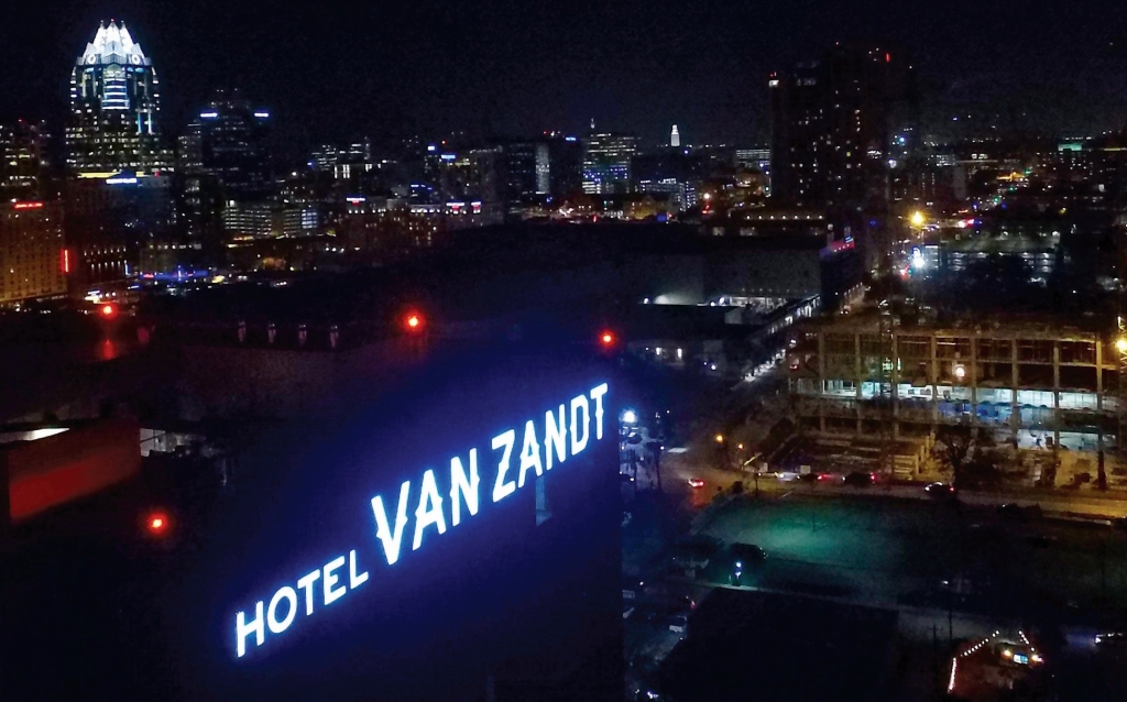
The Hotel Van Zandt’s fin sign, which Meyers designed, measures 545 sq. ft., stands on the hotel’s north side. We mounted it directly to the hotel’s stone façade, and created its full-size pattern on sewn banner canvas. The sign’s illumination comprises double-stroke, 15mm Voltarc 6,500k, snow-white neon powered by 9,000V France Servicemaster electronic transformers.
Also on the north side, we installed an awning sign, also designed by Meyers, that identifies the property. “Hotel” measures 33.2 x 6 in., and “Van Zandt” spans 100.45 x 12.07 in. We installed 0.040-in., aluminum sheet, and laminated acrylic with a brass-patina faux-finish, decorated with Matthews acrylic-polyurethane paint, to its face. We painted the letters’ returns to match the face.
Atop a baseplate, we installed welded-steel letters to a 2.5 x 170.3 x 3/16-in. baseplate. Flush-finish steel plates were screwed into the back of the acrylic, and we installed steel plate and angle painted to match the “C” channel. We created a ¼-in. reveal, and ran power through the top of the channel’s interior, with a transformer located at the awning’s base.
Installation
Luckily, the building provided swing stages to assist in the installation of the large wall signs. Our teams completed safety training and swing-stage-operations courses prior to beginning work. Initially, most team members were skeptical of working at such high elevation, but, as the job progressed, they became more at ease with the project — and took wonderful photos of the city skyline!
Hanging the patterns was the first step, to ensure proper placement of the signs. For each large exterior sign, the pattern would be hung, then either approved or adjusted, and all clips and mounts were attached to the building before the letters were installed.
In some cases, swing stages had to be moved to the other side of the building to continue work. Each sign required more than a week to coordinate, and we were in constant flux with scheduling of other trades who required the stages. Also, during one of Austin’s wettest years ever, we were often at the weather’s mercy. We coordinated with other trades, such as concrete-core drilling, which required access after we’d installed our pattern to drill through the concrete wall to provide holes for us to access the transformers.
One of the installations’ most challenging areas was behind the neon wall, where the transformers were mounted and all wiring was concealed. Only a single bosun’s chair fit in the compact area, and no one is looking forward to the day when those transformers need servicing!
Here are a few insights from Ion Art employees closely involved with the project:
“This project was really unique for multiple reasons. With the name Van Zandt, it was also important to focus on the Austin music scene. All contributors, from interior designers to architects, kept this in mind. It was challenging to work with the building itself. We had to work around drainage, and steel cable, and we knew that even with all the prep work, the plans could still change abruptly.” – Chase Meyers, lead project designer
One of the most impressive aspects of this project was simply the sheer size of the neon letters. The bending was actually pretty standard; most of the letters were done in right angles. The large letter "O"s were trickier because the bend was so gradual it was hard to match consistently. Our solution was to make jigs that I could bend the outer and the inner circles around to maintain the uniform shape.
“The most challenging aspect really came down to the neon pattern. We had to take a page of art and put it into a pattern, then had to make a second pattern out of banner material for mounting. That banner pattern was then sewn together in long sections, and to completely unfold it, we had to take it outside and run it across the parking lot! It was also difficult to get an agreement between the banner pattern and the paper pattern and then to get the predrilled tube supports to match the neon that was made for them.” – Mark Westphal, neon bender
“The installation process for Hotel Van Zandt was challenging. Each neon letter was approximately 10 ft. tall, and entailed approximately six separate units of neon per letter. We spent a day hanging the 70-ft. neon pattern vertically down the side of the building. Installing the transformers took two days, and installing the neon took another two days. The neon had to be brought up to the scaffolding one letter at a time, which added additional time to the install. We also had a time-consuming process installing the 8-ft.-tall, LED channel letters on the east and west hotel walls.
The upside of working at such a high elevation was our amazing view of downtown Austin. The downside was being exposed to the elements of wind and sun while working 16 stories up. We love that our hard work can be seen from far away throughout downtown Austin.” – Holden Stoner, lead installer

SPONSORED VIDEO
Introducing the Sign Industry Podcast
The Sign Industry Podcast is a platform for every sign person out there — from the old-timers who bent neon and hand-lettered boats to those venturing into new technologies — we want to get their stories out for everyone to hear. Come join us and listen to stories, learn tricks or techniques, and get insights of what’s to come. We are the world’s second oldest profession. The folks who started the world’s oldest profession needed a sign.
You may like
Advertisement
Subscribe

Magazine
Get the most important news
and business ideas from Signsofthetimes Magazine.
Advertisement
Most Popular
-

 Tip Sheet4 days ago
Always Brand Yourself and Wear Fewer Hats — Two of April’s Sign Tips
-

 Business Management2 weeks ago
When Should Sign Companies Hire Salespeople or Fire Customers?
-
 Women in Signs2 weeks ago
2024 Women in Signs Award Winners Excel in Diverse Roles
-

 Real Deal5 days ago
A Woman Sign Company Owner Confronts a Sexist Wholesaler
-
 Benchmarks23 hours ago
6 Sports Venue Signs Deserving a Standing Ovation
-
 Editor's Note1 week ago
Why We Still Need the Women in Signs Award
-

 Line Time2 weeks ago
One Less Thing to Do for Sign Customers
-
 Product Buying + Technology1 week ago
ADA Signs and More Uses for Engraving Machines


