Despite the proliferation of sign-illumination sources, neon still holds a place in the hearts of most signmakers — it still graces many signs in American urban skylines.
Rudi Stern (1937-2006), one of modern neon’s biggest advocates, popularized neon as an art form and a serious signage-illumination source. He dreamed of aesthetically setting the world ablaze with glowing light.
“I have plans for neon pavements, neon highways, neon tunnels; neon on bridges, under water and outlining trees in parks,” Stern told Omni magazine in 1981.
Stern popularized neon with his NYC-based neon shop, his storefront art gallery and his book, all of which bore the same name, Let There Be Neon (LTBN). The current owner and president of LTBN, Jeff Friedman, entered the neon world in 1977 and held a spectrum of company positions. He began by cleaning the studio and proceeded to become a fabricator and production manager.
In 1980, Stern fired him because of a job conflict, which led Friedman to start Neon City with Philip Hazard, who had been in sales and art at LTBN (where they met). That company operated for nine years.
Advertisement
Soon after setting up Neon City, Friedman was back on talking terms with Stern, which led to a greater involvement with LTBN. In 1990, both companies discussed a merger, and, soon after, LTBN absorbed Neon City. Within a year, Friedman became LTBN’s president and sole owner; Stern pursued his interests in light projections and documentary film.
Friedman said, “LTBN was Rudi Stern’s brainchild, because he created both the company as a producer of neon work and its art gallery to showcase neon’s beauty. Rudi brought a certain artistic sensibility to the medium by introducing neon as a form of architectural lighting. Rudi also spruced up commercial neon by incorporating an ‘art look’ to it. We like to think that Rudi brought neon into the home as an interior art décor.”
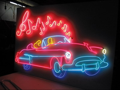
Stern introduced neon as an accessible, populist, art medium, Friedman said. He created small neon sculptures, formed with bases, so people could buy them and bring them home to place on their coffeetables or shelves. Some of his more popular artworks were the neon lips, palm trees or a flamingo profile.
Stern’s original artistic efforts still dominate the creative aspects of the company’s neon work. “Rudi always described neon as drawing with light, and it’s still like that today,” Friedman said. “Although we have new leadership at the company, we continue to follow and enhance LTBN’s original guiding principles.”
The contemporary neon style is very elastic, Friedman said, and tends to morph with current trends, and customer interests and requirements. “A lot of work is based on what the customer wants, and that is influenced by what’s popular in terms of logos, stylistic looks and fonts. This look changed in the 1980s, the 1990s and again today. But the essence of LTBN’s style will always be a clean, classic look.”
Advertisement
Neon doesn’t exist in a vacuum, however. Neon still retains prominence at LTBN (roughly 90% of its projects), but customers can also opt for LEDs. “We are first and foremost a neon shop and still see neon as the dominant, sign-illumination medium, with a continuing demand for it in signage, as well as architectural lighting, graphic designs for the home, film and television prop work, and a lot of interior neon designs for corporate clients as well. Neon’s been around for 70 years, and we have as much demand for it today as we ever did,” Friedman said.
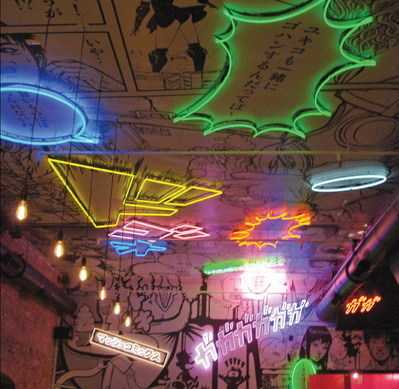
Roughly a fifth of LTBN’s projects come from new, young artists who’ve incorporated neon in their artwork or use it as the primary medium. LTBN has worked with Tracey Emin, Olafur Eliasson, Jonathan Monk and Laurent Grasso, as well as “the newly minted art students who’ve discovered the glow of neon,” as Friedman describes them. LTBD has worked with such established luminairies as Mario Merz, Nam June Paik and Robert Rauschenberg.
LTBN’s art gallery, an evolving shop showcase of all things neon, exhibits an ever-changing collec¬tion of custom, vintage and stock items, as well as current projects.
The gallery also hosts biannual art installations. Past shows have included “Neon Elvis,” “Eat Light,” “Neon Furniture” and “Travelling Light,” which was in association with the Museum of Neon Art and the Glass Arts Society.
Advertisement
Friedman said, “Our neon art gallery is as popular as ever; we still have people coming to visit. When school teachers come in with their classes, we show kids around, let them see the art and how neon gets made.”
The following are several examples of neon projects that LTBN recently completed and installed including work for Junior’s and Hunter’s College.
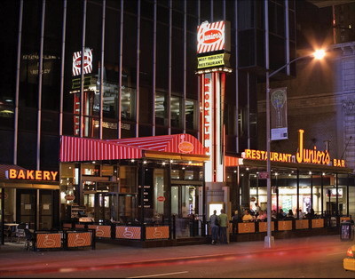
Junior’s
In 2005, Junior’s, a Brooklyn diner known for its mouthwatering cheesecakes, opened a location in Times Square at West 45 St., between Broadway and Eighth Ave. The restaurant retained LTBN to create its illuminated-neon, modern-retro look. This included a set of backlit towers and backlit channel letters, along the top of the roof awning, that spell out the restaurant’s name. Each plastic-covered channel letter was backlit with 15mm neon lighting. Neon colors, including EGL citrus orange and EGL 4500 white, reflect the corporate logo’s color scheme.
To insure farflung, midtown cheesecake fans could easily find Junior’s, a set of 40-ft. sign towers (which LTBN had made originally) were retrofit from the location’s previous incarnation; each tower, located at a building corner, faces the nearest street. Each backlit tower follows the column’s vertical shaft.
The column’s main facade is clad with white, frosted Lexan® polycarbonate panels, backlit with fluorescent lighting. Planted on each tower’s front-facing frosted panel is a vertical formation of opaque, plastic, orange letters that spell out its two locations, Brooklyn and NY. Exposed, vertical, 15mm citrus-orange tubing runs along the towers’ sides.
Atop each tower, a separate lightbox mimics the take-out cheesecake boxes. Directly above the main-tower column runs a series of incandescent chase lights, and above that, a backlit segment states the obvious (to most New Yorkers, anyway): “Most Fabulous Restaurant.” Overlaying the frosted panel in the center of the sign face, Junior’s logo is decorated with a series of red, candy stripes that run diagonally across the signface.
Hunter College
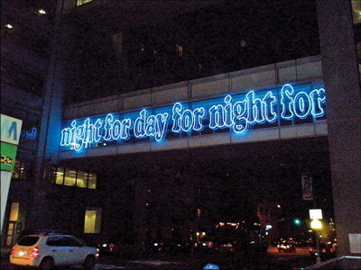
French light artist Laurent Grasso commissioned LTBN to create a temporary neon-art installation for Hunter College of the City University of New York, on Manhattan’s Upper East Side. The exposed neon piece hung on a set of overhead pedestrian walkways that connects main university buildings and spans from Lexington Ave. to 68th St. The neon artwork (installed from September to December 2008) spells out the repetitive phrase “day for night for day for night …”
Grasso said his illuminated phrasing paid homage to French cinematographer Francois Truffaut and his movie by the same name. “Day for night” is a cinematographic technique that simulates dusk by shooting in daylight with blue filters over the lens. Neon’s blue color, which symbolizes the blue filters, completes the metaphor – illuminating neon is only visible once night begins to fall.
The repetitive phrasing stretched across the entire length of the glass walkway walls. “The transparency of the bridge walls for me is very interesting,” Grasso said in a New York Times statement, “because it’s like the neon letters are in suspension with the sky behind it.”
The 20mm clear tubes were formed over a traced template to create the uniform curves of the 6-ft.-tall neon letters. To illuminate the piece, LTBN used 32 transformers and at least 1,100 ft. of neon attached to the college’s east-side pedestrian walkways.
The temporary installation nixed drilling through the pedestrian-walkway walls to create anchor points. LTBN hired an engineer, who proposed a Unistrut® framing system of nuts and bolts.
The soul of radiance
LTBN has come full circle, Freidman noted. “It’s 36 years after our shop’s opening, and we’re still doing neon the same way as when we began. Neon still has a dramatic appeal for people and businesses. It’s still a craft and always will be. It’s still made by hand, and when it’s done right, you can get a sense of the soul of its radiance coming from the light.”
Thus, neon lives on, its burnished light an afterglow of a homage to Georges Claude, Rudi Stern and others yet to come.
Louis M. Brill is a journalist and consultant for high-tech entertainment and media communications. He can be reached at (415) 664-0694 or louisbrill@sbcglobal.net


 Business Management1 week ago
 Women in Signs1 week ago
 True Tales2 weeks ago
 News2 weeks ago
 Editor's Note5 days ago
 Maggie Harlow2 weeks ago
 Line Time1 week ago
 Product Buying + Technology6 days ago