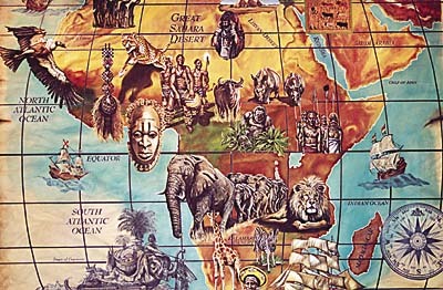
This project got off the ground last March, when Todd Nelson, the owner of the Kalahari Resort & Convention Center in the Wisconsin Dells, first hired me. I had met him while painting murals at the adjacent Desert Star Cinema. The ways I obtain jobs sometimes amuse and amaze me. I spent seven weeks painting murals within the Kalahari’s primary restaurant and 60,000-sq.-ft. indoor waterpark. Before I could say goodbye, Todd said that he wanted to show me something. I’ve come to know Todd as someone who knows what he wants and accomplishes it. He pointed to a wall in the resort lobby, where a tapestry hung, and said, "That ugly thing is coming down. You’re gonna paint a mural there." Despite my fatigue from having just completed the other job, as well as my desire to see my wife and kids, I managed to get excited about the idea. When I asked him for an idea, he simply said, "A map of Africa." He told me to think about it, and return after the summer tourist season if I was interested. I have always admired the old-fashioned art of mapmaking, and decided to combine classic and contemporary elements in creating the mural.
Designing the "Dark Continent"
I found a satellite photo of Africa to use for reference. Old books on mapmaking provided ideas for peripheral elements, such as a compass, wind medallions and ships. Research of African culture gave me ideas for reproducing images of people and wildlife who inhabit the continent.
Due to the project’s size and detail, everything had to be designed to scale, so I elected to use patterns to transfer the mural. I created the original layout in Adobe PhotoShop ®, and scanned in the map to create latitude and longitude lines.
From computer to wall
I needed an articulating boom lift to set the pattern and paint the wall. A planter below the right side of the wall limited my working space, making a scissor lift unmanageable.
Advertisement
I used 18 sheets of 4 x 8-ft. butcher paper to create the pattern. I had to alter the latitude and longitude lines because of distortion from the projector. Performing freehand repairs on a design at this scale was not simple.
I traced the entire pattern with a marker, allowing the color to bleed through two coats of paint. This enabled me to paint land and water masses, yet still see the final images.
I wanted to capture the look and feel of an aged map, with fading and wrinkling. Applying multiple layers of color washes accomplished this. I began with dark hues to replicate shadows and creases, then blended in lighter tones to portray a wrinkled appearance, creating the base for the mural.
I had never painted this technique on such a grand scale, so it required some experimentation. Anyone familiar with painting faux effects knows the process isn’t very attractive until it’s finished.
The heart of the matter
Typically, it’s better to paint a mural in a step-by-step process, working with the background and then painting your way forward. To speed the process along, I "cheated" a little bit and completed a corner of the mural to tease passers-by about its subject.
Advertisement
I painted the water, mixing cerulean (an azure blue color) with forest green to create an eye-catching aqua tone. Blending in white paint toned down the aquatic color. To create a translucent appearance, I blended the paint with eight parts water to create a "wash." This was applied with a 4-in.-bristle brush, blending out towards the mural’s boundaries.
The next step was painting the land masses. I used satellite photos as a guide, and blended various shades of green, brown and yellow to represent the continent’s various types of terrain; jungles, deserts and mountain ranges. I left pictorial areas completely white.
To satisfy geography buffs, I included elements that would not have been present in an antique map, such as islands and unique coastal features. Using a 1/2-in. fitch, I painted the latitude and longitude lines. With no margin for error, this was grueling.
Bringing the map to life
The next step was probably the most time consuming, but also the most enjoyable — painting the people and animals that best represent "the dark continent." I enjoyed a stroke of good luck while painting the mural; the resort hosted a two-day African festival. During the merriment, an elephant performed a live show. I was very fortunate to have a live model for one of the more significant animals to be portrayed on the mural.
Upon completing most of the pictorial designs, I pounced the elements for numerals and text. I needed a day to make patterns and paint text for labeling bodies of water, the Sahara Desert region and bordering countries.
Advertisement
To maintain an aged appearance, I lightly scuffed the ships, compass and other details with sandpaper, then applied a whitewash over them and the text. This effect provided a 16th-century tone, and hinted that the pictorials had been added later. Next, I traced the map’s perimeter with sienna and amber tones, giving a burnt appearance. I incorporated tears and drop shadows to provide a dimensional feel that would project beyond the wall. Touches like these are what truly impart an artist’s "signature" on a mural.
This was truly a memorable job. I received a lesson in mapmaking and was treated to a fantastic, inspirational festival. Moreover, the client was very satisfied with my work and has scheduled another job for me to complete later this year. Attention to detail really makes the difference in impressing a client and garnering repeat business.


 Tip Sheet1 week ago
 Ask Signs of the Times3 days ago

 Real Deal1 week ago

 Photo Gallery21 hours ago

 Benchmarks5 days ago
 Editor's Note2 weeks ago
 Women in Signs1 week ago

 Photo Gallery1 week ago
