Built in 2013 at a cost of $48 million, Montreal’s Rio Tinto Alcan Planetarium is an essential cog in the city’s Espace Pour La Vie development, a scientific-museum compound that also features the BioDome, which allows visitors to walk through environments that mimic the four ecosystems found in North and South America, as well as the Montreal Botanical Garden and Insectarium.
Julie Margot, a Montreal-based, environmental-graphic designer who’s worked in the field for more than 20 years, was contracted to specify the sign program for the 81,000-plus-sq.-ft. facility. She partnered with architectural firms Cardin Ramirez Julien and Ædifica to develop the wayfinding strategy, design and fabrication specifications.
“The site can be overwhelming, and the sheer scale of the facilities’ structures can be intimidating for a first-time visitor,” Margot said. “However, the Planetarium fits neatly between Montreal’s Olympic Stadium – the central venue for the 1976 Summer Games – and the Biodome.”
She continued, “The Planetarium’s architecture features two protruding cones that serve as intuitive clues onsite, and provide physical landmarks for understanding and navigating the space. However, we considered how to orientate diverse types of visitors arriving from different entrances and levels. This provided a strategic opportunity to communicate what the institution offers while providing a complete visitor experience.”
Margot said modifying the signage was challenging because the marketing strategy and Planetarium brand identity were reinvented after the initial sign concept had been approved. Certain “ambiguities” impacted the sign-system nomenclature and the hierarchy of how the information would be presented. She said the traffic flow between two adjacent theatres created congestion that required tweaking the program to direct patrons more smoothly.
“A successful [designer/fabricator] partnership is a collaborative process with a shared vision and goal that conform to project constraints,” Margot said. “A good fabricator’s knowledge and skill can improve a design concept.”
Advertisement
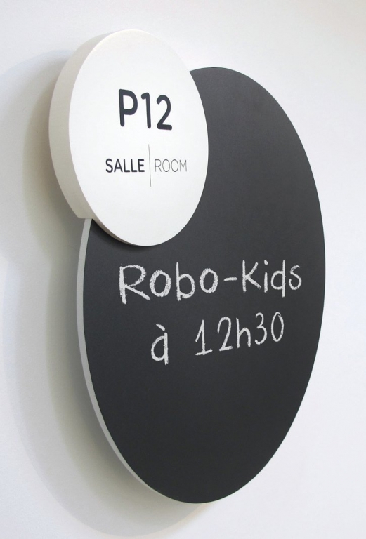
To remain coherent with the new brand identity, the sign system features Tobias Frere-Jones’ Gotham Rounded sans-serif typeface. Margot called the typeface “geometric, yet friendly”, and said it complemented the system’s design and functionality perfectly. To reinforce the Planetarium signs’ identity, she designed a family of pictograms that shares design characteristics with the Gotham Rounded typeface and “resonates with the architectural environment and the facility’s cultural and educational operations.”
“The pictograms act as a transitional design element in creating a functional sign system, while maintaining a playful appearance aimed at younger visitors,” Margot said. “Also, the pictogram system carries through multiple platforms – signage, video-screen animations and printed materials – so they could play a role in bringing the Planetarium brand to life.”
Margot partnered with Groupe BLH, a Terrebonne, QC, Canada-based sign fabricator, which earned its contract through a municipal-bid process. The wayfinding program, excluding room-ID signs, includes approximately 26 different types of signs that encompass approximately 250 markers that incorporate plotter-cut vinyl on metal or acrylic, as well as screenprinted graphics. Several thicknesses of metal supports were used. For all sizes and type of structures, the goal was “durable, without being chunky”, she said.
Dominic Hamel, Groupe BLH’s project manager for the Planetarium’s signage, said the signs’ coating was altered from gloss to a matte finish.
“In an environment that attracts many visitors, a matte-finish paint is preferable, because it doesn’t show fingerprints,” he said. “We showed the clients a sample, and they agreed.”
The wall signs comprise 3/16-in.-thick aluminum, with sharp, radius corners on the top folds. To create the corners, Groupe BLH cut V-grooves on the signs’ back before folding them. The shop decorated the faces via manual screenprinting on 280-mesh screens with Nazdar inks. The ½-in.-thick, black acrylic letters were mounted directly to the walls; Groupe BLH shaped them on its AXYZ Automation 6 x 10-ft. 5010 CNC router. The shop created engraved copy on its Epilog Laster Legend 36EXT laser cutter. To keep mounting screws concealed, Groupe BLH’s installers positioned them on the folded top side, and Z-bars behind the signs stabilize the front panel.


 Business Management1 week ago
 Women in Signs1 week ago
 True Tales2 weeks ago
 Editor's Note5 days ago
 Maggie Harlow2 weeks ago
 Line Time1 week ago
 Product Buying + Technology7 days ago
 News2 weeks ago