Meet Your Marker
Custom monument signs feature increasingly creative, high-end touches.
CONTEMPORARY MONUMENT SIGN customers are demanding options. They want more colors, extensive design flourishes, thoughtful illumination (both external and internal) and customizable electronic message centers (EMCs).
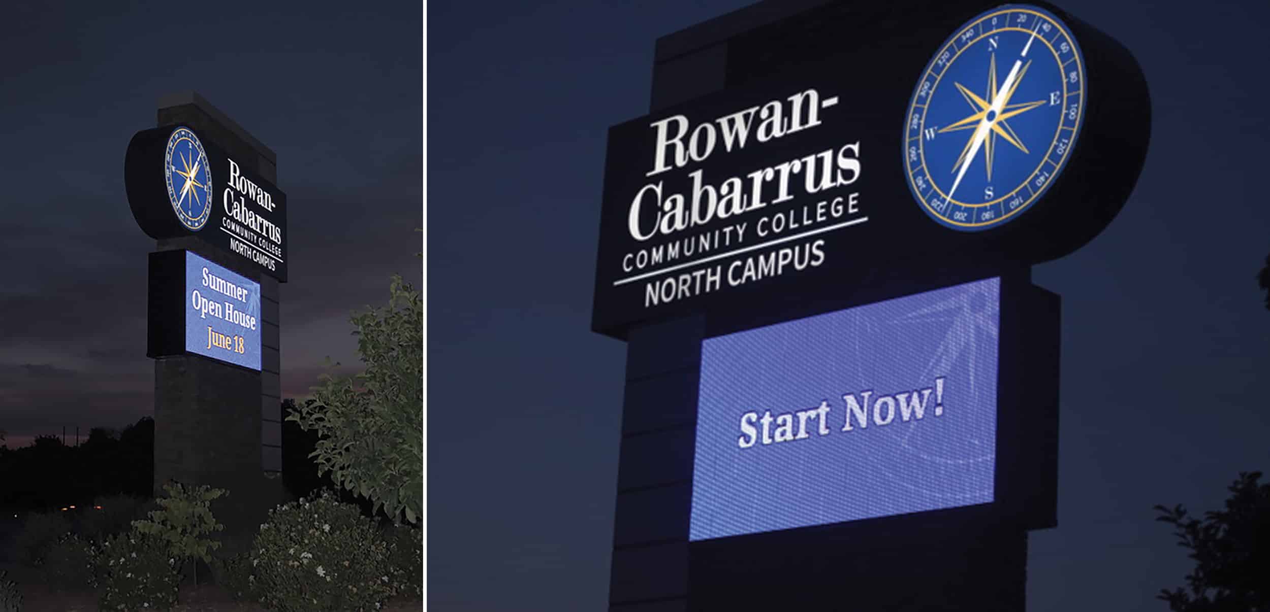
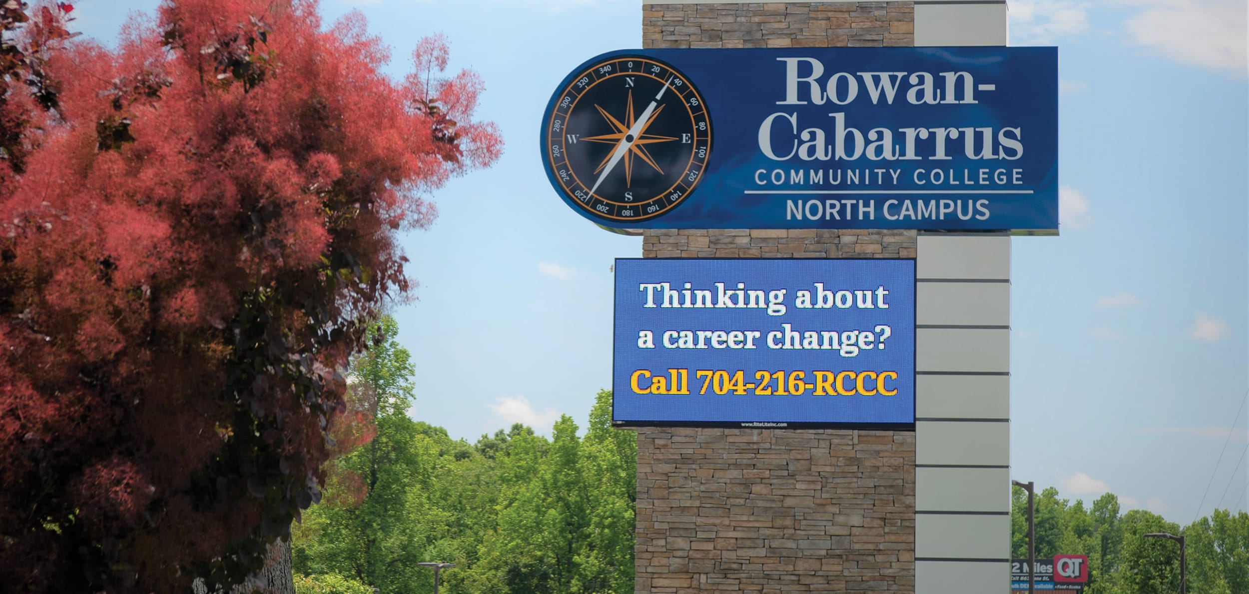
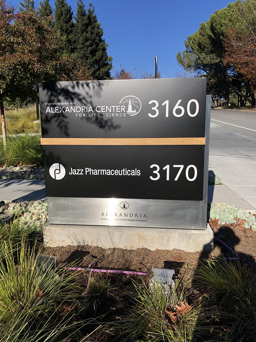
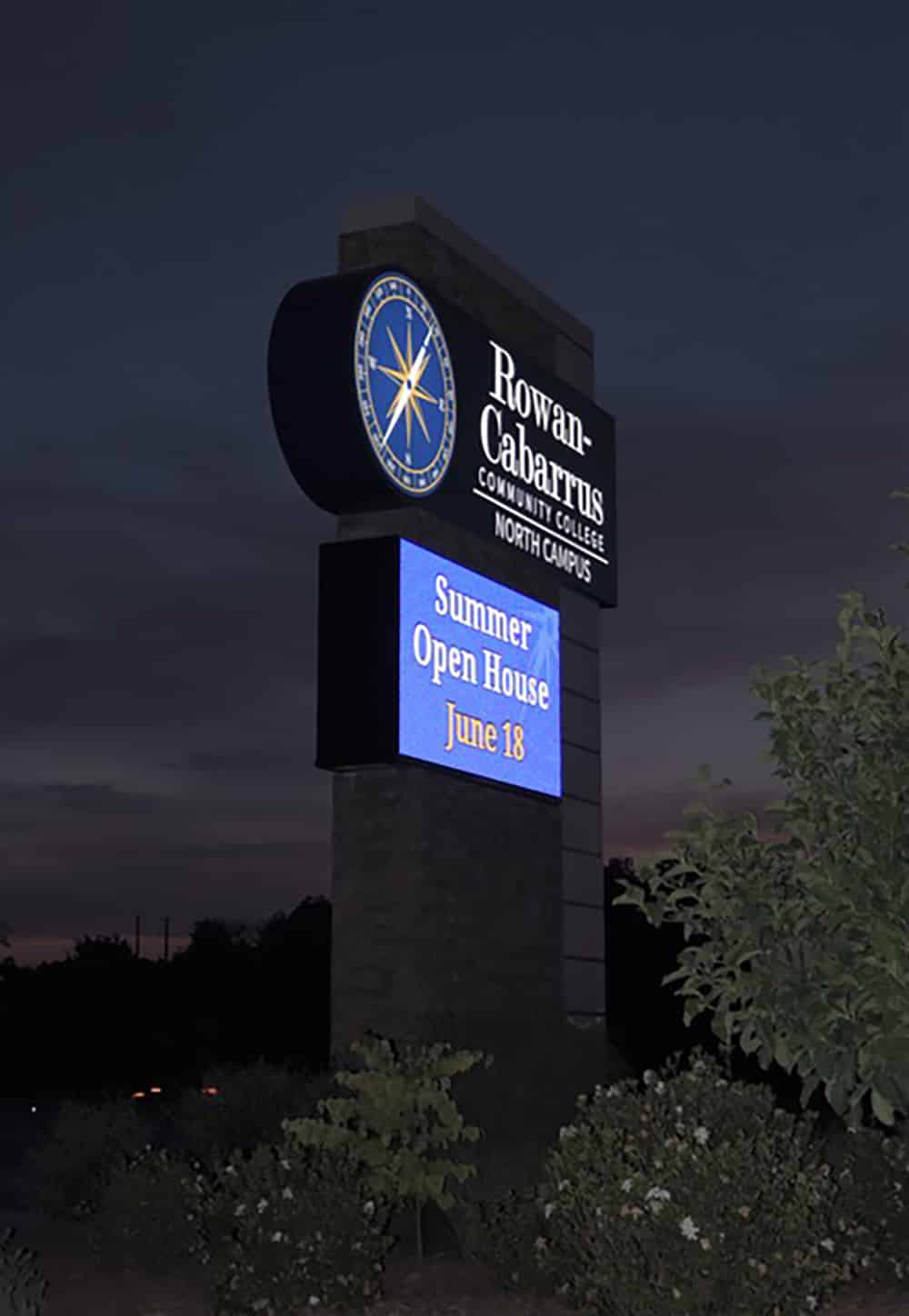
Campus Finder Rite Lite Signs enlisted the help of Watchfire Signs to determine placement and height of this sign.
COMMUNITY
APPEAL
Rowan-Cabarrus Community College (RCCC) needed a 35-ft.-tall monument sign for its north campus in Salisbury, NC that would reflect the architecture of its surrounding campus buildings, and, even more importantly, be approved by the city’s board.
The challenge was to go before the Alternate Methods of Design Commission for the City of Salisbury as well as the City Council to amend its current code for educational institutions along the busy I-85 corridor, allowing the college to erect a monument sign larger than 12 ft. with a 7 x 13-ft. electronic message center, says Tim Stout, a sales consultant with Rite Lite Signs, a national sign company headquartered in Concord, NC. “RCCC told us if we could get the city to approve a larger sign, then the job was ours,” Stout recalls. In the end, it took nearly a year to get the code amended and the city to sign off.
Rite Lite Signs’ first order of business was to determine the precise sign location and height, for which the company enlisted the help of Watchfire Signs. The EMC manufacturer sent a demo truck to the site and parked it where the monument sign would be constructed. Staff drove several miles in each direction on the interstate to determine the perfect viewing height for the sign, which turned out to be 35 ft.
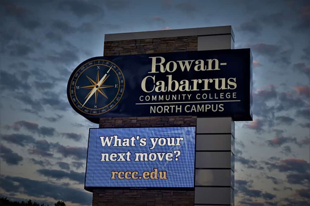
Using an original plan from ADW Architects out of Charlotte, NC, Rite Lite made alterations by increasing the EMC’s size and making the overall design more proportional with a better aspect ratio. Using CorelDRAW software, the team increased the design’s size to enable larger text, easily viewed from the highway. A large backlit graphic compass was added to provide a 3D look.
After the college approved those plans, Rite Lite began construction. Following its mantra of playing off a building’s architecture, Rite Lite’s team used nearly 10,000 lbs. of custom stonework to produce an exact match of an adjacent building’s masonry. Rite Lite chose to build the majority of the sign’s stonework on site, even though they had to stop just short on the underside of the EMC. The team then finished the masonry work on the sign’s upper panels in Rite Lite’s shop.
After a year of work, the team returned to the site to place the panels, using the shop’s 192-ft. crane not for height but for its lifting power to install the poles and Watchfire EMC elements.
“The highway patrol said that the sign has helped to slow traffic down along that section of the interstate,” says Stout. “They attribute it to bright blue lights on the EMC sign, which gives drivers a glimpse of the sign through the trees and it gives the impression that there is a police vehicle. Once drivers see the bright blue lights, they slow down.”
Made ya look!
STRENGTH IN
SANDSTONE
When a company wants its monument sign to complement its building’s architecture and landscape, they may turn to wood, brick, stone or other masonry. This approach provides a streamlined design and a consistent aesthetic, look and feel. Authentic, natural materials are still preferred over foam replicas, depending on the customer’s budget.
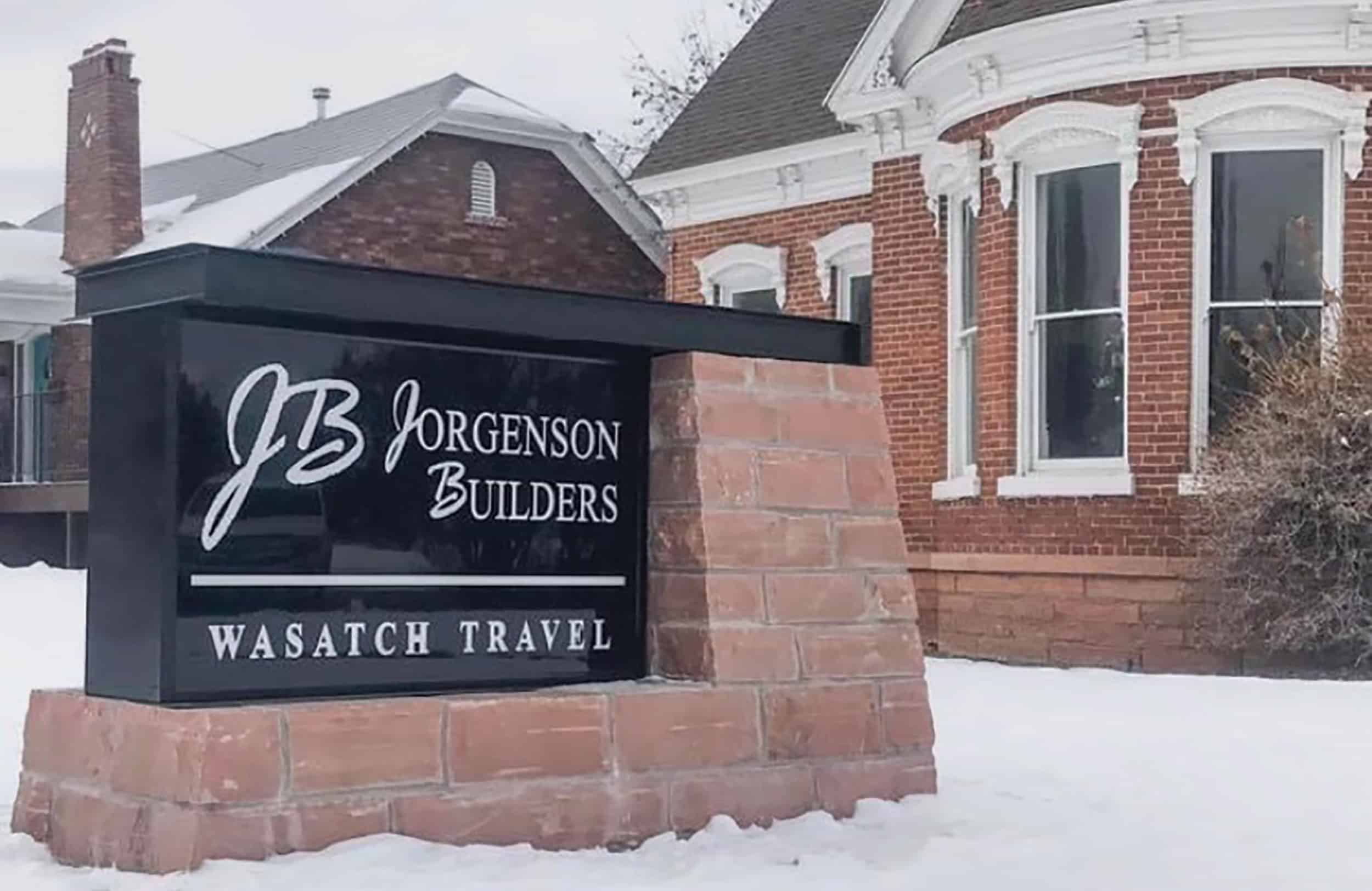
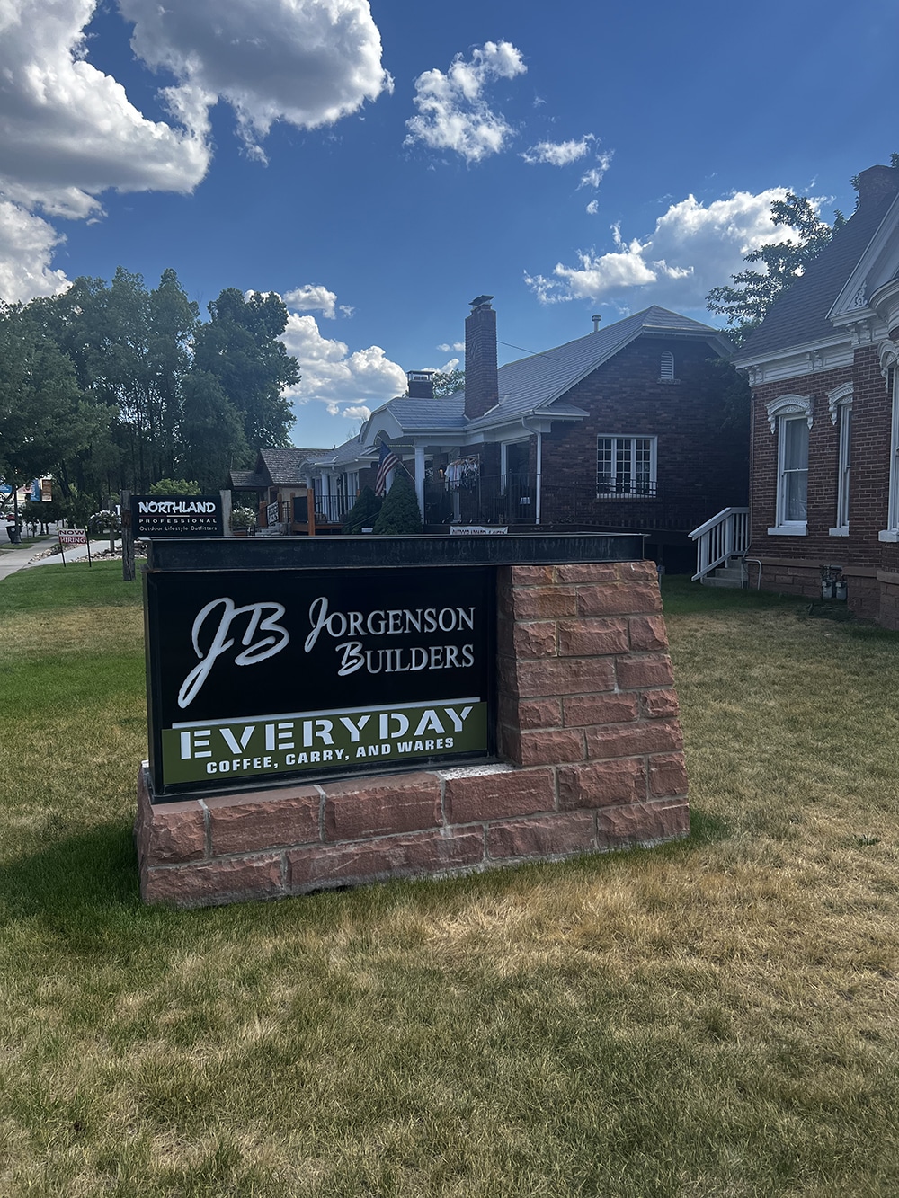
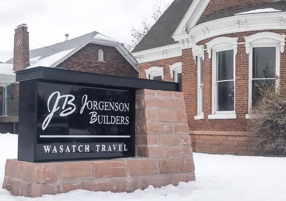
That was the case with Jorgenson Builders, a general contractor of custom-built multi-million-dollar homes in Heber City, UT. After this prominent firm moved into a new location, the company wanted a monument sign to reflect who they are and the quality of their work. The owner, Jake Jorgenson, turned to Wasatch Back Signarama, a long-time local collaborator.
“Since Jorgenson [Builders] is on one of the busiest roads in town and sits across from a large community park, the monument sign needed to bring attention to its headquarters, yet look like it naturally belonged there,” explains Spencer Coleman, president of Wasatch Back Signarama. “[Jake Jorgenson] gave us a few sketches and wanted to incorporate a rustic and sturdy feel to the sign to demonstrate his brand. We came back with some ideas using stonework and metal fabrication that he loved.”
To reflect the high-end builder’s superior work, Wasatch designed a custom pillar and top for the new sign, which at certain times of the year is decorated with live flowers. The shop also incorporated a tenant change-up area. Designers at Wasatch Back Signarama used Corel software to produce renderings and drawings to show the customer, and to create the height and size of the logo and tenant name. “The size and height of the whole sign had to fit into the code for the city,” says Coleman. “Using their rules and regulations, we were able to maximize what the sign could be and make sure it fit within those parameters.”
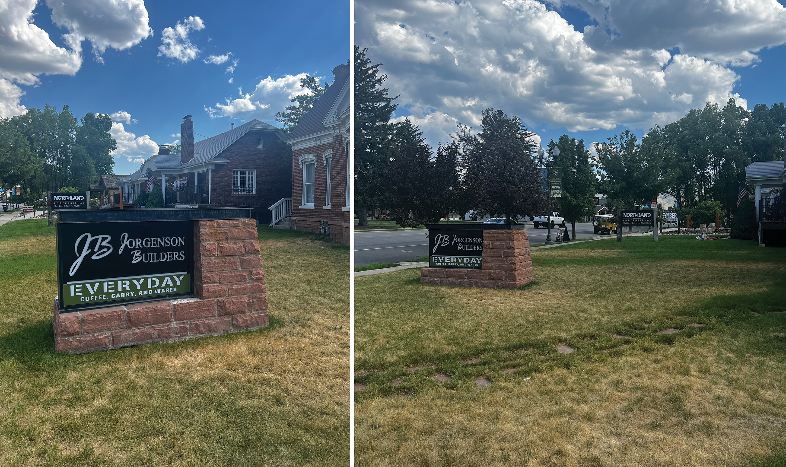
Solid as a Rock Wasatch Back Signarama used valued local stonework in this monument to convey quality and permanence.
But it’s the unique rustic red veneer-like stone from a local quarry that sets this monument sign apart from others. Jorgenson’s red sandstone building is reminiscent of the 1920’s and its monument sign needed to convey that same nostalgic feel. Hewn from the nearby Wasatch Mountain Range, the red stone is a treasured natural element for inhabitants of the region. Because the stone is three to four inches thick and extremely heavy, Wasatch Back Signarama produced and assembled the footing on site. The sign and the top were produced in the shop, using aluminum and acrylic push-through letters. A lightbox painted black was inserted into the sign and all of the pieces were welded together.
All in all, the project took four weeks to complete. Jorgenson feels that the sign conveys the quality of the brand before a customer enters the building, reflecting its high-end services. And the city is so pleased with the sign and how it meets the local criteria that the keepers of the codes use it as a standard reference for other new signs.
Advertisement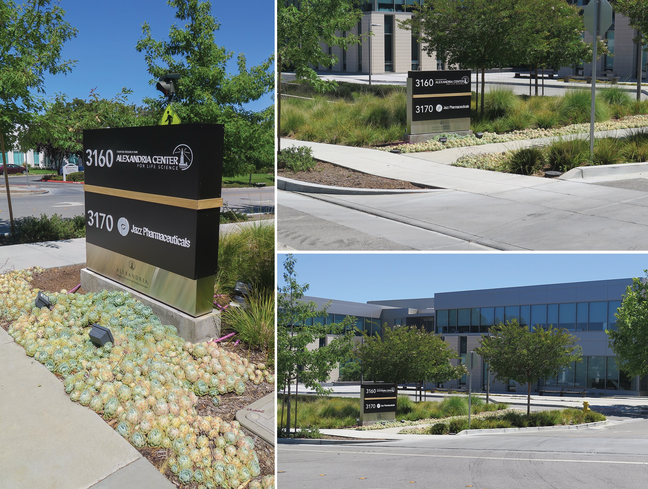
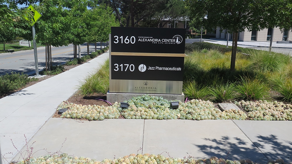
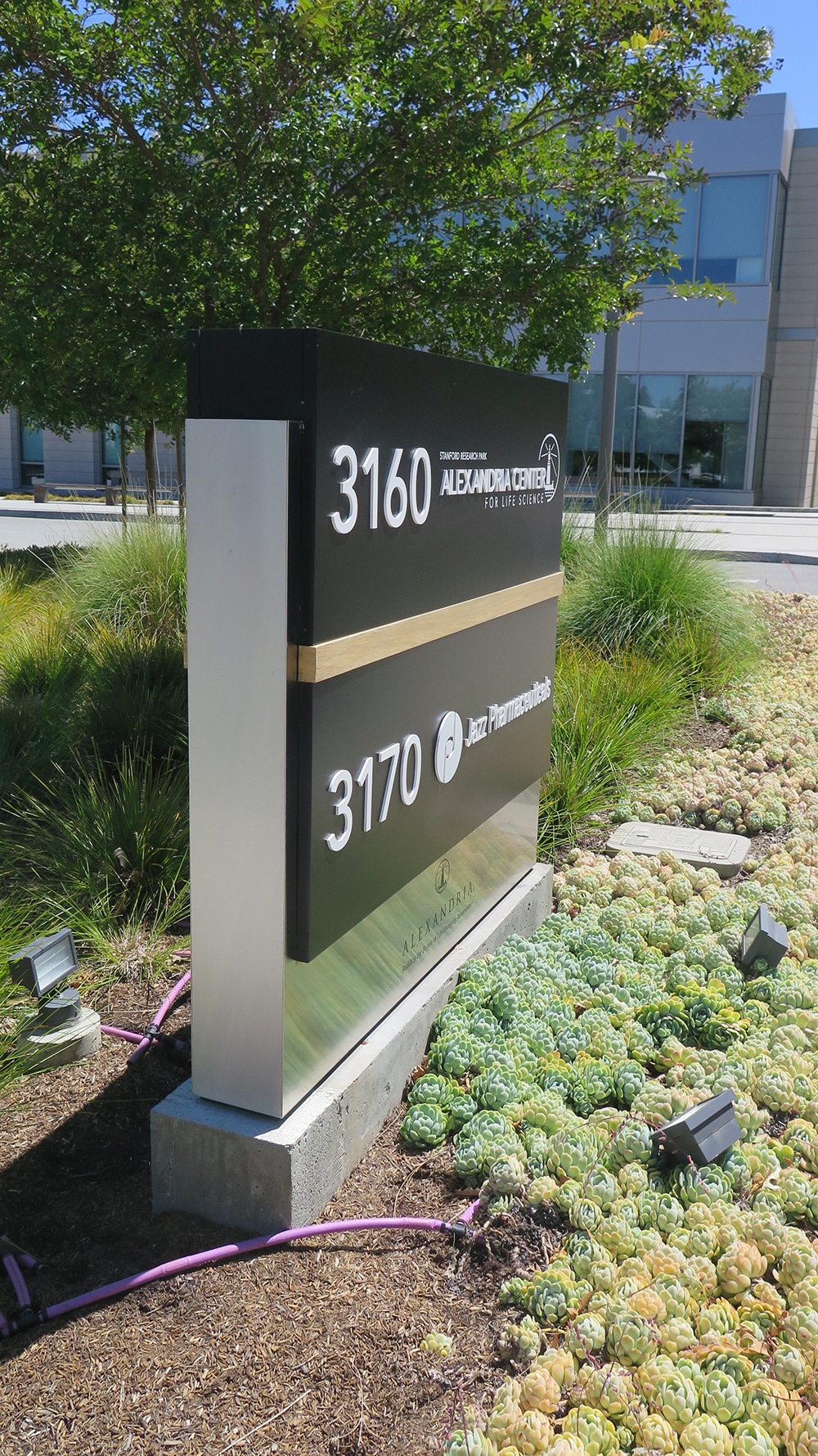
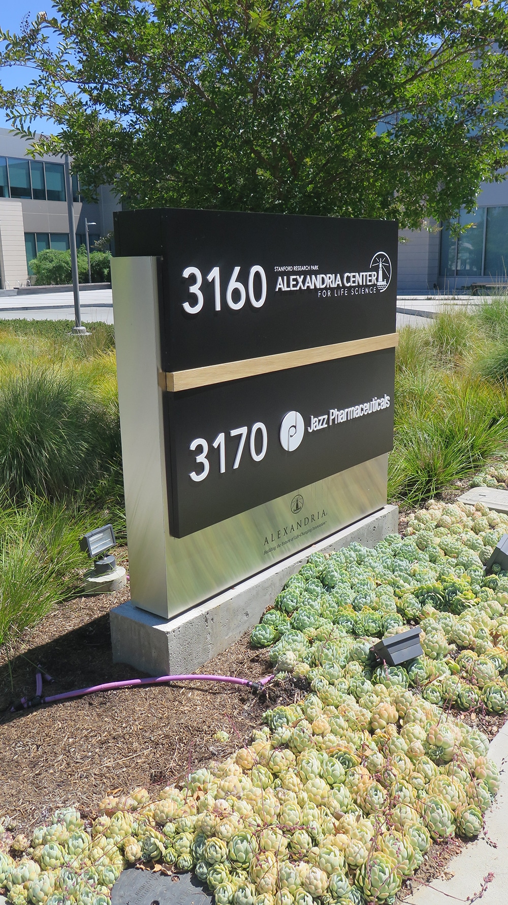
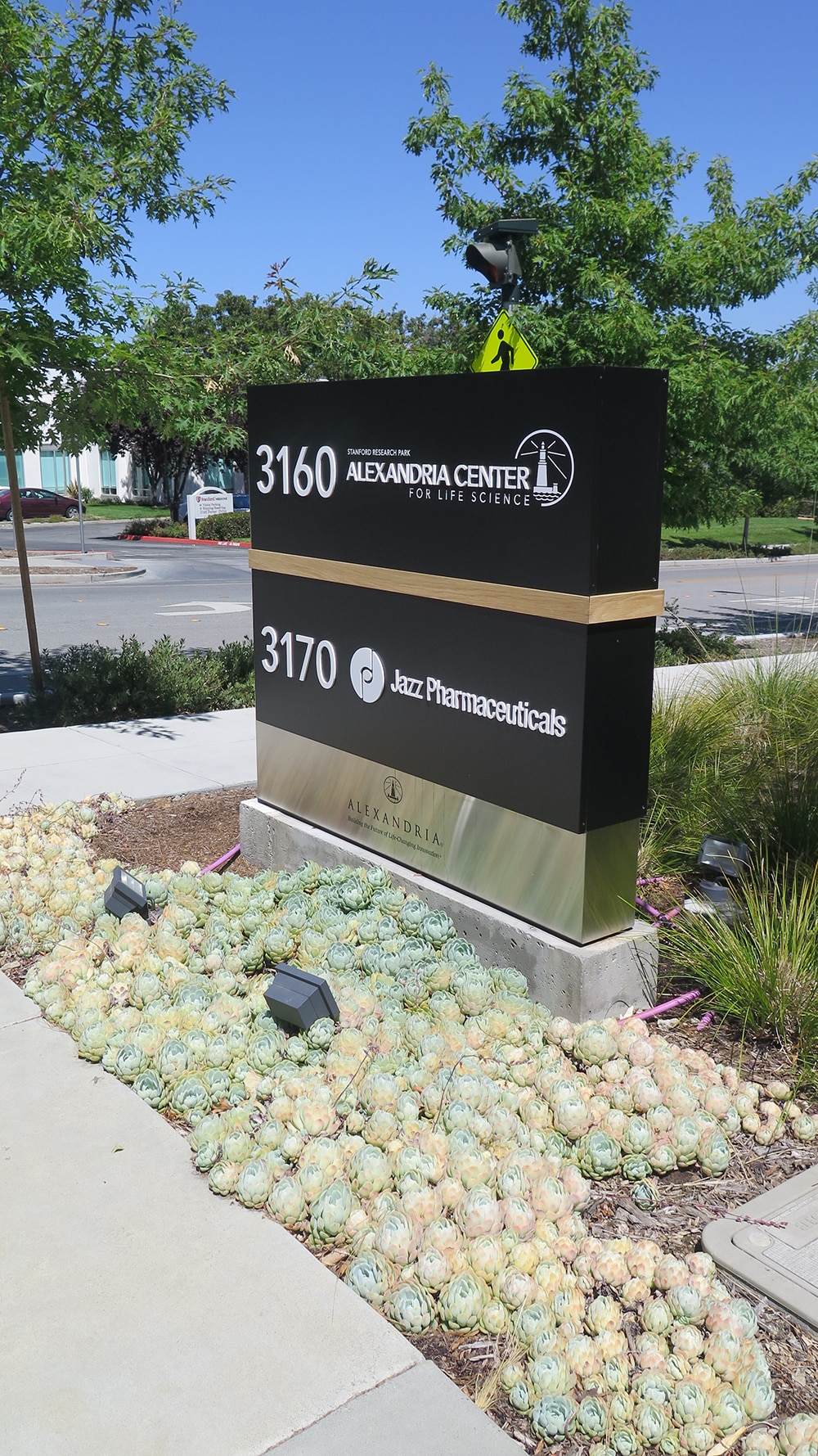
No Fasteners This research park client asked Ad Art to create this maker with no fasteners showing.
MODERN
EDGES
Out in Palo Alto, CA, Ad Art — hired to build a monument sign for the area’s Stanford Research Park owned by Alexandria Real Estate Equities — also had to struggle with local permits before the sign was approved. The award-winning sign company headquartered in San Francisco found dealing with various municipalities via email and telephone very time consuming, which extended the schedule.
However, the monument sign was just part of an entire project to develop a one-of-a-kind, high-end signage package for both the buildings — including freestanding displays throughout the property, a second monument sign and four directional displays — along with Perkins&Will, a Chicago-based architectural firm.
Ad Art’s team began by removing the existing sign and creating a new multi-tenant, double-sided monument sign by the main entrance to the building. The former display was a traditional monument sign with typical Tex-Cote finish and exposed fasteners. “By and large, monument signs are a cabinet with a metal base with a Tex-Cote finish and countersunk screws (fasteners),” says Nate Moreno, senior project manager at Ad Art. “In this case the design elements were emphasized and required to integrate with the other exterior signage on campus.”
Although the new monument would be similar in size, Ad Art was required to expand the existing concrete base pedestal. The new marker features high-end accents, laser-cut stainless steel, custom white oak wood components and no visible fasteners. Aluminum panels with acrylic flat cut out (FCO) and vinyl copy with routed-out push-through letters/symbols for both the corporate Alexandria name and the tenant Jazz Pharmaceuticals add a unique edge.
Measuring 5 ft. tall by 5.5 ft. wide, the new monument sign houses tenant panels crafted from 1-in.-deep aluminum and finished with satin paint. Ad Art’s designers chose Avenir Medium for the address font and opaque vinyl using black 3M Scotchcal ElectroCut Graphic Film 7725-12 for the Alexandria logo. The address numbers are ½-in. acrylic FCO in white., while the tenant copy called for ½-in. acrylic FCO with white satin paint and opaque vinyl for the small text. A 2.5 x ½-in. white oak accent sealed for outdoor application visually lightens the industrial design with a natural note, while existing lamps from the previous sign illuminate the new piece.
“Our biggest challenge in producing the monument sign was to create a design in which the display avoided all visible fasteners,” says Bob Kierejczyk, president of Ad Art. “We also had to ensure that the stainless-steel component came out just right and the new concrete base was revised correctly to accommodate the new sign.”
From start to finish, the Alexandria project took a bit more than a year to complete, including a two-week installation. Although materials are becoming scarcer by the day, Ad Art’s team was fortunate to have suppliers who had most of the materials required for this project in stock.
After seeing these signs, it’s no wonder that businesses continue to recognize the potential of custom monument signage to build brand awareness and create a consistent aesthetic and feel. And sign companies remain up to the challenge.
PHOTO GALLERY (18 IMAGES)
Rite Lite Signs | Signarama Wasatch Back | Ad Art


Introducing the Sign Industry Podcast
The Sign Industry Podcast is a platform for every sign person out there — from the old-timers who bent neon and hand-lettered boats to those venturing into new technologies — we want to get their stories out for everyone to hear. Come join us and listen to stories, learn tricks or techniques, and get insights of what’s to come. We are the world’s second oldest profession. The folks who started the world’s oldest profession needed a sign.


ISA Announces New Tradeshows and Meetings VP

5 Reasons to Sell a Sign Company Plus 6 Options

Sign Products Wrap-Up for April


Bulletins
Get the most important news and business ideas from Signs of the Times magazine's news bulletin.
-

 Tip Sheet1 week ago
Always Brand Yourself and Wear Fewer Hats — Two of April’s Sign Tips
-

 Ask Signs of the Times2 days ago
Why Are Signs from Canva so Overloaded and Similar?
-

 Real Deal1 week ago
A Woman Sign Company Owner Confronts a Sexist Wholesaler
-

 Benchmarks4 days ago
6 Sports Venue Signs Deserving a Standing Ovation
-

 Editor's Note2 weeks ago
Why We Still Need the Women in Signs Award
-

 Women in Signs1 week ago
2024 Women in Signs: Megan Bradley
-

 Product Buying + Technology2 weeks ago
ADA Signs and More Uses for Engraving Machines
-

 Photo Gallery6 days ago
21 Larry Albright Plasma Globes, Crackle Tubes and More