Orlando’s competition for the entertainment dollar is fierce. From Walt Disney World and the Epcot Center to Universal Studios’ City Walk, seemingly endless amusements abound for all ages in the central Florida vacation mecca.
Sea World Orlando is a heavyweight presence in this disposable-income derby. The aquatic-themed amusement park, long renowned for entertaining exhibitions that feature killer whales, dolphins and other crowd-pleasing sea creatures, also boasts Kraken (named after a mythical sea monster caged by Poseidon), a floorless, 15-story roller- coaster that approaches 65 mph.
Seeking to grow its success, the park’s management (Anheuser Busch’s amusement-park division operates the attraction) decided to cultivate a community” of restaurants, shops and entertainment that utilized elements from exotic seaports. To that end, park officials hired the St. Louis-based architectural firm Peckham Guyton Albers & Viets Inc. (PGAV) to devise the architecture for the five-acre, multi-million-dollar development.
Anselmo Testa, a PGAV senior project designer, said the firm wanted to create an engrossing, almost timeless environment.
“The Waterfront environment was a new venture for Sea World,” he said. “This was an upscale departure from typical, theme-park stores and restaurants. We wanted the architecture to embody a Mediterranean fishing village that’s bustling and rich with history.”
In turn, PGAV contracted Ten8 Group, also of St. Louis, to devise the Waterfront’s environmental graphics. The graphic project entailed two phases. The first comprised development of its overall identity, main-entrance gateway signage and graphics, as well as identification programs for the High Street, Harbour Square and Tower Island “neighborhoods.”
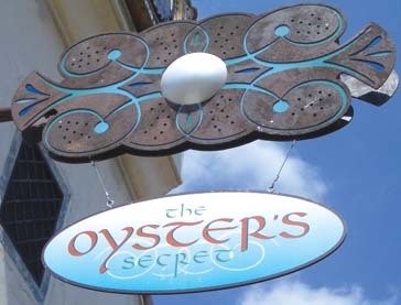
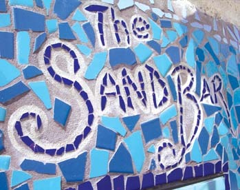
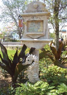
The second stage involved producing graphics for the Waterfront’s Docks area. Each neighborhood carries its own identity — High Street features the most upscale environment, complete with high-end restaurants and shops; Harbour Square embodies a thriving business district; the Docks are presented as a slightly aging, rustic area; and Tower Island is a “mystical” area heavily laden with seafaring paraphernalia, such as tile mosaics and fishing netting.
According to Stephanie Brown, Ten8’s marketing director, the graphic elements that exude the personality of each region are rooted in European legend.
“In Siena, Italy, there’s a horse race called Il Palio that’s taken place in Piazza del Campo since the 11th Century,” she said. “Each city district selects a rider who wears riding silks bedecked with its colors, and it’s quite the rivalry. The history of Il Palio inspired the Waterfront’s design of distinctive colors and identities.”
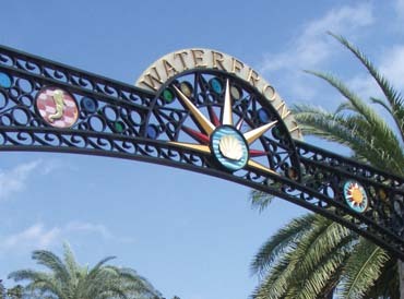
Terry Miller, formerly of the Orlando-based Nassal Co., and now an entrepreneur who fabricates signage and other themed-environment programs for Sea World, constructed the system. The Waterfront’s most prominent sign, its 22-ft.-tall, overhanging gateway sign, entails routed PVC with glass inserts enclosed in an aluminum frame and crafted to replicate wrought iron. Also, the colossal sign contains a bas-relief logo fabricated from Sign•Foam® 3 HDU.


 Tip Sheet3 days ago
 Business Management1 week ago
 Women in Signs2 weeks ago
 Real Deal4 days ago
 Editor's Note1 week ago
 Line Time2 weeks ago
 Product Buying + Technology1 week ago
 Women in Signs4 days ago