The fast-paced Information Age demands numerous of computer and communication skillsets that would have been unimaginable just a decade or two ago. However, without one of the most fundamental building blocks of knowledge – basic reading and writing skills – a person holds little hope to progress to a meaningful job in the modern economy.
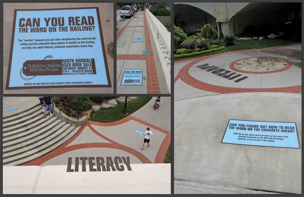
Playing off the essential needs for these skills, and underscoring how lost can feel without the ability to read, the Greenville (SC) Literacy Assn. (GLA) hired The Bounce Agency (Greenville) to develop an environmental-graphic campaign that creates a series of optical illusions that give the viewer a sense of the disconnection an unlettered person feels.
Stephen Childress, Bounce’s associate creative director, said the agency has collaborated with GLA for nine years, much of which for the association’s book-sale fundraiser, which he said had grown into the largest one-day sale of used books nationwide.
“The sale had become so big that we wanted to bring the focus back to what the GLA does while reminding patrons where their money goes,” Childress said. “We wanted to put passersby in a situation where they had to learn to read again. The concept of deciphering a word illusion made a perfect metaphor.”
The first graphic installation features the top half of the word “literacy” printed on the ground of high-traffic walkway. A neighboring sign instructs pedestrian to decipher the world by standing atop a bridge and looking down, where the other half was printed on the railing and, when standing in the right spot, the two halves spelled out the word. The walkway graphic measures 3 x 15 ft., and the diminutive railing sign was only 18 x 4 in. Another application sits above elevator doors (3 ft. by 18 in.), and a series of lines creates “literacy” when the viewer stands below them.
“The posters over the elevators made sense because the captive audience has to walk right underneath the illusion as they board the elevator,” Childress said. “The ridge execution, a large-scale installation, created a very engaging graphic in a high-profile location. It was important to get approval from city officials; if you don’t communicate with them for this type of guerilla campaign, it will be taken down quickly.”
Advertisement
The Bounce Agency worked with The Print Machine (TPM), also of Greenville, which produced the graphics. To create the challenging bridge graphics, TPM developed a template to represent the top half of the word on the bridge. Because of the different perspective, letters on the walkway’s rail were much smaller.
Childress said, “We used printouts to figure out the correct size for the rail’s smaller half. Once we’d created the sizes, we made mechanical drawings and provided them for TPM to print and install the graphics.
TPM’s Dustin Batson noted the shop produced the graphics, as well as the explanatory, blue panels, on the shop’s Durst Rho 6000 flatbed printer using 3M’s Scotchcal™ 3662 2-mil, slip-resistant film, which it protected with 3647 matte-finish overlaminate.
The attached video explains the campaign’s mission.


 Tip Sheet1 week ago
 Ask Signs of the Times3 days ago
 Photo Gallery1 day ago
 Real Deal1 week ago
 Benchmarks6 days ago
 Editor's Note2 weeks ago
 Women in Signs1 week ago
 Photo Gallery1 week ago