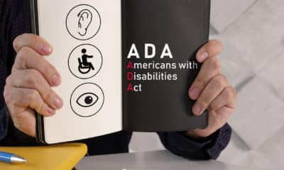
In its March issue, ST published an article about ADA signage as a follow-up to the one-year anniversary of the adoption of Standards of Accessible Design (SAD) regulations. We also highlighted a proposal under consideration for the American National Standards Institute’s (ANSI) A117.1, the Accessible and Usable Buildings and Facilities Standards, which would mandate a 70% color contrast and a light-reflectance value (LRV) of 45 for all ADA-compliant signage. Even if the proposal wasn’t adopted into the SAD, ANSI A117.1 regulations would receive widespread adoption into building codes. Thus, it would become a de facto standard.
As noted in last month’s article, the International Sign Assn. (ISA) and the Society for Environmental Graphic Design (SEGD) oppose the color-contrast proposal, claiming the lack of viable combinations would create undue design and production hardships.
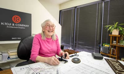
Sharon Toji, vice president of H. Toji and Co. (Long Beach, CA), authored the color-contrast proposal and has been a vocal leader in advocacy for the disabled. In the interest of equal time, we’re publishing her insights about the proposal.
Why did you serve as author and advocate for the ANSI A117.1 color and contrast standard?
Enough ANSI members thought it was important that they established a Contrast Subcommittee. The standard is the same that ANSI submitted for the last A117.1 cycle. Code officials have asked for a standard of measurement for LRVs that is applicable for many different surfaces in the architectural field. I believe this standard addresses that. We’ve asked ISA and SEGD to participate in the committee, but they refused and, instead, seek to refute the committee’s findings.
By no means am I the primary advocate for the standard. People who suffer from color blindness and other visual impairments have long complained about the vagueness of the current (color contrast) standard. A member of the Access Board’s technical staff commented that, in an accessibility focus group that gathered visually impaired individuals, the lack of contrast was the primary concern mentioned.
Why has 70% been chosen as the minimum amount of contrast allowed?
The 70% threshold is used as the minimum contrast throughout much of the world. Sometimes, it is expressed as a difference of 30 points of LRV minimum rather than as 70%, but 30/70 appears to be the bottom line. Virtually every piece of published literature mentions the 70% minimum or some variation.
After having commissioned research on the subject, the U.S. Access Board published the following statement in 2006: “Where luminance contrast was 70% or greater, approximately 95% of participants were able to see detectable warnings from 8 ft. away. Detectable warnings that provided at least 60% contrast could be seen by 92% of participants from the same distance.”
Advertisement
We could ask, “Why 70%, and not 69?” Throughout the code, you’ll find exact minimums, maximums and ranges. Although they’re often based on research or practical experience with people with various kinds of disabilities, none are proposed as the perfect number. To create a measurable standard, you have to choose one that will satisfy the needs of as large a population as possible. It’s worth noting that SEGD urges its members to follow the 70% standard and LRV formulas as guidelines.
How and why did you choose 45 as the minimum LRV for the lighter hue in a color combination?
All numbers are slightly arbitrary, because there will always be people who can use an architectural element that’s not quite so stringently controlled, and then there are those who can’t. To arrive at 45 as a standard, we tested many color pairings and made a representation of combinations that would be forbidden, and those that would be allowed.
We made up small signs, with 5/8-in.-tall characters and various contrast values and LRVs, mounted them at 60 in. on center and laid down measuring tape. At the American Council of the Blind’s annual convention, we had visually impaired attendees walk forward until they could read the characters. The most easily read combinations all had contrast that measured at least 70%, and an LRV between 40 and 50, so 45 seemed a reasonable, minimum figure.
Why aren’t lighting requirements specified in the proposal?
Lighting is important, but lighting in many venues is difficult to control. Even if we developed standards for lighting that require a certain number of footcandles, we couldn’t be sure that lights would be on or functioning, or if something in front of the sign would obstruct visibility. Someone may vandalize a sign, or the sun might be too bright or too obscured by clouds. These same external factors impact many of a building’s accessibility-related amenities.


 Tip Sheet1 week ago
 Ask Signs of the Times3 days ago
 Photo Gallery1 day ago
 Real Deal1 week ago
 Benchmarks6 days ago
 Editor's Note2 weeks ago
 Women in Signs1 week ago
 Photo Gallery1 week ago