My wife, Li, and I, are driving in Cincinnati’s Over-the-Rhine neighborhood, an archaic area that’s teeming with outdated, architectural structures; many are more than 100 years old. It’s a charismatic neighborhood, although roughened by economies and time.
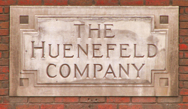
We’re in my silver-colored Honda CR-V — as conspicuous here as Dockers and deck shoes — with two large Nikons resting on the center tray. Our self-imposed assignment is to photograph old signs, to capture images of hand-created, pre-computer fonts.
We double-park to study a set of cast-concrete letters that arc above an art-deco doorway. Six or seven tough guys stand nearby, in a circle, talking. A pale mist hangs in the air. We ponder the shot, the nearby faction, the rainy mist and wisdom of getting out of the car with a camera.
“‘ll jump out and shoot it, real quick,” Li says, opening the car door. As the latch clicks, the band of toughies turns to face us.
We decide we don’t like this shot after all.
Advertisement
Last Saturday, we set out to photograph a few, long-standing signs. We wanted shots that exampled pre-software fonts. Trouble soon ensued, however, because, although the television weather guy had promised afternoon sunshine breaks, he also forecast rain. Unfortunately, the rain won. The day’s weather alternated between downpour and drizzle, with no breach for the blue.
It wasn’t a day for photographing signs, not if one wanted cheerful colors framed in summery, cerulean blue.
Old signs aren’t copyrighted, by the way, so it’s easy to find and steal ideas. I say steal because all ideas are built upon an earlier one. To steal — okay, to borrow and improve — ideas, designers larcenously study old and new signs; they’ve also been known to embezzle type from magazine and newspaper advertisements.
Great sign and graphic designers love type. My best reference is my friend Frank Overton, a London-based typographer and graphic designer who has worked for both the U.K. Postal Service and explorer Jacques Cousteau. Frank would visibly energize when he discovered either new, or interestingly altered, fonts.
Frank and I once drove from Laramie, WY, to Santa Fe, NM. We must have stopped a hundred times to look at signs. Often, he would sketch the letters on a pad.
In his early years, Frank worked with the renowned European typographer, book designer and design writer Jan Tschichold (1902-1974). Tschichold was a leading advocate for the Bauhaus-inspired, modernist, publication-design movement that favored off-center layouts and san-serif type. Tschichold designed several, well-known fonts (Sabon is the most prominent). His uniqueness, historians write, came from two, early elements: He trained as a calligrapher, and his father was a signwriter.
Advertisement
If you’re looking for more interesting fonts, Monotype Imaging Inc. (Woburn, MA and Salfords, England) has recently introduced a three-part collection comprising some 5,000 CD-loaded fonts — a moveable feast, indeed, for signmakers and graphic designers.
The trilogy includes the Monotype Library OpenType edition; the ITC Library OpenType edition; and the Adobe Type Collection OpenType edition. Each set includes an accompanying reference book.
If you’re a fontissimo, Monotype’s CD trilogy will make you nuts. For example, the Monotype Library Display section’s Ashley Crawford (page 95) font’s curvaceous and comical (almost) serifs will inspire any afontianado to create a new sign or poster. Paging through the reference books is a compelling experience. Check out the high and mighty Binner Gothic on page 97, or Sackers Classic Roman on the same page (the M and N diagonal strokes rise and artfully overlap the right vertical) or the four, Plate Gothic fonts on page 103. These offer regular, italic and bold selections, making 12 in all.
Be sure to examine page 105 for Smart Sans, a strong, bold headline type that, the book says, is, “A modern typeface which sets a new standard for condensed sans-serif designs.”
True.
The International Typeface Corp. (ITC) Library book, on page 2, introduces ITC type by saying “First, a typeface must be engaging — it must be visually appealing to graphic designers.”
Advertisement
True again.
Allan Haley is ITC’s director of words and letters. In the book’s introduction, he tells of ITC collecting fonts for more than 35 years, to build a library of more than 1,650 text and display designs. With each font, ITC provides a set of icons that indicate the included, OpenType glyph sets.
A glyph is a pictograph or symbolic character. In non-print terms, a glyph is usually cut into a surface or carved in relief, a cinquefoil pattern, for example.
For odd news, you’ll enjoy learning that Monotype Imaging is introducing its ESQ Mobile phone brand of (200) fonts that are designed for viewing on mobile phones. Its part of a typeface collection that allows developers, content providers, wireless operators and handset manufacturers to enhance their small-screen, mobile products with scalable, stylistic fonts.
One last treat. Visit www.fonts.com to see Hermann Zapf’s Zapfino type. Zapf, a greater peer of Tschichold and Overton, is the creator of Palatino, Optima, Saphir and several dozen other typefaces. (Microsoft’s Office Book Antigua font is said to be a knockoff of Palatino.)
Interestingly, Zapf first sketched Zapfino in 1944, but its interlocking complexity prevented it from being produced in the hot-metal type used at that time. Working with Linotype GmbH (Bad Homburg, Germany), Zapf released his computer version of Zapfino in 1998.


 Tip Sheet1 week ago
 Photo Gallery2 days ago
 Ask Signs of the Times3 days ago
 Real Deal1 week ago
 Benchmarks6 days ago
 Editor's Note2 weeks ago
 Women in Signs1 week ago
 Photo Gallery1 week ago