Louis M. Brill is a journalist and consultant for high-tech entertainment and media communications. He can be reached at (415) 664-0694 or louismbrill@gmail.com
As Las Vegas constantly reinvents itself with new themes and new buildings – via architectural nips and tucks – its cityscape constantly morphs from one iteration to another. In a latest incarnation, Caesars Entertainment has added a new venue, The QUAD Resort and Casino, to its hotel and gaming center portfolio.
The Quad is the reincarnation of the Imperial Palace (IP), which began life in 1980 as a Strip hotel/casino and stayed the course until 2012, when it closed and reopened immediately as The Quad. Atypically for Las Vegas, the former IP wasn’t spectacularly imploded. Instead, the building was transformed into the more sleek, modern-looking Quad hotel and gaming center. The identity change necessitated entirely new exterior building signage, new graphic implementation of its building facades, and a floor-by-floor room makeover. YESCO of Las Vegas managed the process.
Also atypically, during the entire transformation, most of the hotel stayed open, with two exceptions. The casino was closed off, and the building’s top three floors were closed to become a construction area for sign removal. The front desk remained open; new bookings continued, and hotel guests came and went during its entire construction process.
No cranes allowed
The 32-year-old, neon-illuminated channel letters were removed first. However, a crane or heavy lifting equipment couldn’t be used. Richard Kirsch, YESCO’s Quad project manager, outlined two reasons. “First, with the surrounding hotel infrastructure already built up around the front of the hotel, it was nearly impossible to move a crane into position next to the building for the channel-letter changeout.
“Secondly, and even more critical, was that the crane’s intended parking area was above the roof of Harrah’s [adjacent] parking garage. Because its interior underground rooms and hallways were covered with an unreinforced roof, the surface-floor deck couldn’t support the weight of a crane parked above it. Thus, to manage that sign-replacement process,” stated Kirsch, “we used swing stages for the work crews and specially rigged hoisting equipment.”
Advertisement
Good bye, Imperial Palace
All of the IP signage needed to be removed, beginning with the two-story-high, closed-face channel letters and all other IP signage on the building’s front. First, the hotel’s top three floors were closed so YESCO could set up its sign-removal equipment.
Kirsch said, “With the floors closed off, we then set up swing- stage arms within the rooms on the west side of the hotel directly above the hotel name and IP channel letters. The arms extended out the windows, and reached out across the balcony, with scaffolding in place to lower the crew down to the channel-letter level. The IP takedown began with all the interior neon, one channel letter at a time. Once the neon lighting was pulled, the removal of the two-story channel letters began, each detached individually. Each letter was connected to a hoist, lowered to the ground, cut up and hauled away. While most of the IP signage was recycled, a few smaller pieces went to the Las Vegas Neon Museum for archival purposes.”
Hello Quad
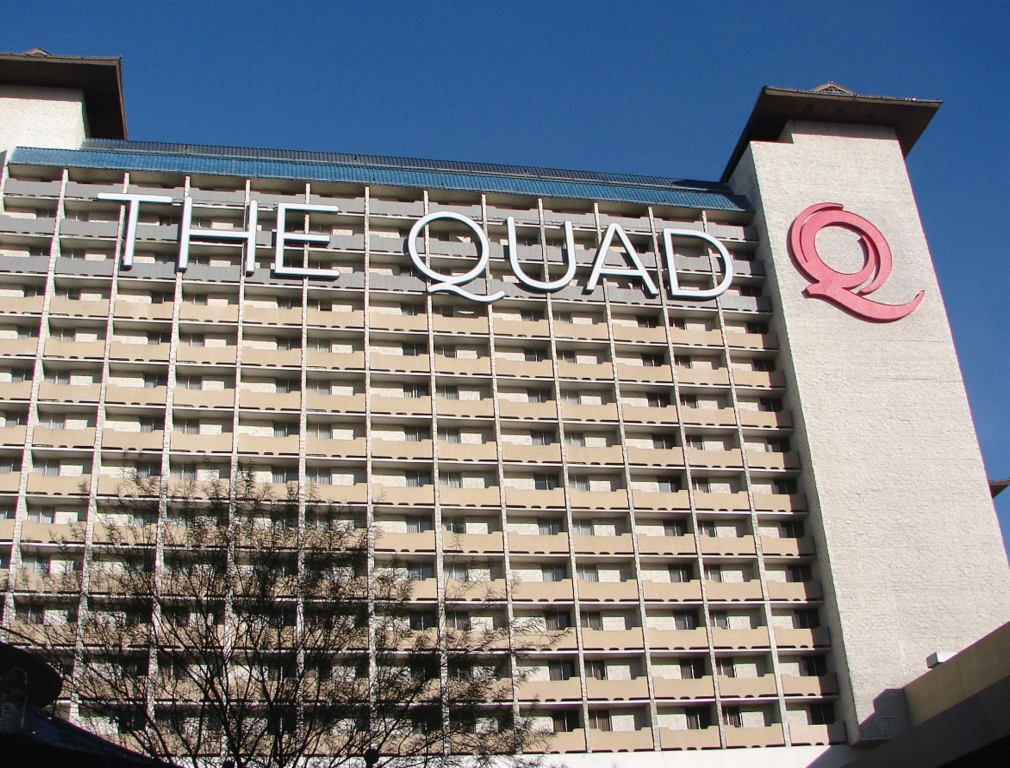
Putting The Quad’s identity on The Strip was simply hanging its new name in exactly the same building space the IP signage previously occupied. First came fabrication of channel letters that spelled THE QUAD. All of the aluminum, pan-channel letters were 16 ft. tall, with varying widths, depending on the letter shape. Each letter was fitted with Brite-White string LEDs. White Lexan® polycarbonate faces were cut to shape to cover each letter. YESCO painted the channel letters and their returns a cool gray to match the building decor.
Accompanying the Quad name is a 28-ft.-high, closed-face, red channel letter of the Q logo, which was attached to an adjoining tower opposite THE QUAD letters. The aluminum Q is illuminated with 241 red LED pucks after dusk. The Q letter returns were also painted red to match the signface.
Kirsch said, “Because we knew the letters were going to be lifted up on a vertical hoist, they were first completely built at the YESCO Las Vegas signshop, then cut apart into practical segments [usually two], with each segment having its interior LED lighting pre-installed. The segments were brought onsite, lifted up and stitch-bolted together. The LED sections were quick-connected, and the face caps were placed over the entire letter.”
Each channel letter was anchored to the building with a minimum of three anchor points. Larger letters had up to five anchor points. Attachment involved inserting power studs into a metal-clip system, embedded within the concrete walls, which became anchoring points for each channel-letter connection.
Advertisement
Smaller versions of THE QUAD letters appear by the hotel’s front entrance. The closed-face channel letters, approximately 2.5 ft. tall, are populated with white LEDs. The returns were also painted a charcoal-metallic dark gray. 3M silver-gray, perforated vinyl film, which functions like a two-way film, covers each letter face. During the day, the faces look silver, and match the building’s color theme. At night, when illuminated, the channel letters appeared white.
After the letters were completed, a stylish Q followed, more than double the height of the letters. The smaller Q was also filled with LED pucks.
Unexpected Kodak moments
Continuing around to the porte-cochere area, opposite the valet-services station, a monument display of 4-ft.-high channel letters at ground level spells out the hotel’s name. Here, the adjoining “THE” is turned sideways and faces its companion “QUAD,” which is laid out horizontally along a concrete and steel base. The channel letters are all fabricated from heavy-gauge aluminum and painted with a cool-gray satin finish to match its silver-metallic Alucobond® composite-material surface.
The porte-cochere channel letters have elicited a surprising visitor reaction. They’ve became a perfect posing place for hotel guests and their Kodak/Flickr moment. The Q and U serve as nesting positions for children or adults to sit upon or curl up in.
While exterior signage was being placed around the hotel, the hotel’s façade likewise experienced refurbishment. “The effort to modernize The Quad’s exterior look,” stated Kirsch, “became a collaborative effort between the owner [Caesar’s Entertainment], the architect [Klai Juba Wald], the contractor [W. A. Richardson Builders] and YESCO. The common goal was an architecturally modern look. The facade’s construction emphasis was cost effectiveness, with less labor in removing and reattaching a new building cladding.”
Shades of Cristo
“The final method for transforming the building,” stated Kirsch, “was to use a Panaflex® material skin
as an enormous building wrap. We settled on a modern-looking graphic, printed up in 15-ft.-tall sections, with lengths determined by the wall area. The mounted graphic panels were brought onsite, framed and set up for installation. The Imperial Palace had its existing façade prepped and replaced with a SignComp (Grand Rapids, MI) frame, grid-clip system. The panels were outfitted with clips that inserted into the framing grid on each wall. The clip system became a guide for sizing the Panaflex panels and installing them on each building wall. As with the channel-letter replacement, we used swing stages and rigging to lift and install all the Panaflex panels.”
Advertisement
The panels’ big assembly challenge, using the clip system, was matching each panel’s four sides with neighboring graphic panels. Preplanning in production helped. Overall, the graphic pattern appears across the entire building to be an uninterrupted, seamless design.
Las Vegas continues to evolve while adapting to its visitors’ needs and expectations. So, it continues building new hotels, retail areas and fascinating (if not mind-blowing) new venues of fun and entertainment. And how do visitors find all these great places? With equally great signage that points the way.


 Tip Sheet1 week ago
 Ask Signs of the Times2 days ago
 Real Deal1 week ago
 Benchmarks5 days ago
 Editor's Note2 weeks ago
 Women in Signs1 week ago
 Product Buying + Technology2 weeks ago
 Photo Gallery7 days ago