Searching for a distinctive hotel experience can prove challenging. Megachains reek of homogeneity and conformity. Airbnb? I prefer personal space at the end of a day’s travels, and would rather avoid nosy hosts. I relish the faded majesty of hotels of a certain age. The Hotel Congress in Tucson, AZ and Driskill Hotel in Austin, TX, which date to 1919 and 1886 respectively, stand out as favorites that embody local history and color.
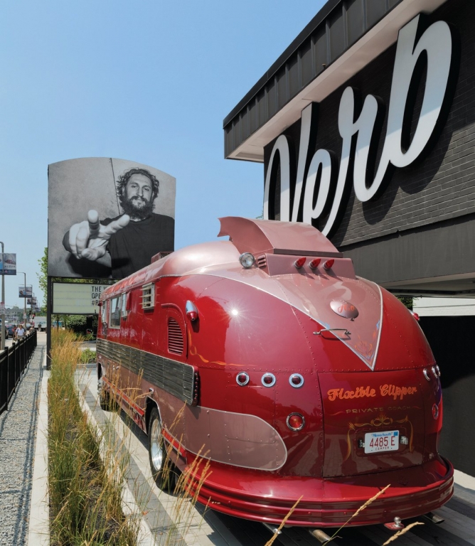
As such, I consider it a victory when a previously shuttered hotel is reanimated. In 1959, the Fenway Motor Hotel opened on Boylston St. near Fenway Park, the venerated home of the Boston Red Sox. It later closed, but this property gained new life once it was acquired by the Samuels & Assoc., a Boston-based developer of upscale properties, who transformed it into The Verb Hotel. Samuels & Assoc. engaged Gregory Bonner Hale (GBH), a Boston design firm, to develop the environmental graphics befitting the Verb’s lively name.
“This project didn’t just focus on creating a new hotel brand, it breathed new life into a local icon,” Jason Gregory, a GBH designer, said. “We wanted to honor its mid-century modern architecture, but also tell authentic stories about local music history.”
The Verb’s exterior channel letter signage features a playful cursive script. Its parking lot features six, double-sided branded signs that were custom-fabricated from aluminum extrusions that are LED-illuminated. Inside, 12 internally illuminated lightboxes depict memorable scenes from local music
history. Hall corridors feature printed graphics that convey such maxims as “Listen to more music and less advice.”
TV shows from the ’50s and ’60s inspired the wayfinding, and GBH’s color palette of pastel blue, yellow and pink “balances the industrial with the artful,” he said. To create door signage, the firm commissioned a local photographer to shoot numerals on local buildings, and combined them into new, kitschy creations using Adobe Photoshop and InDesign. The motif carries into each room, where guests view acrylic-mounted prints that show past covers from The Phoenix, a local publication known for its music-scene coverage.
Boston Building Wraps fabricated the entire sign program. The shop fabricated the Verb’s channel letters by hand, and printed all graphics on a Roland DGA SolJet Pro 4 XR-640. Shop President Joseph Correia II said one of the biggest challenges was getting the banners atop the front pylon into a “radius-perfect” stretch.
“We had to go out with a 45-ft. lift and create a template of the sign’s top, which was needed to stitch the banners correctly,” he said. “It was also quite a task to reproduce the Phoenix covers properly; we retouched more than 200 covers before submitting them to the Samuels team for selection. But, it was rewarding and took our entire crew back in time. A very cool concept.”


 Tip Sheet1 week ago
 Ask Signs of the Times3 days ago
 Photo Gallery1 day ago
 Real Deal1 week ago
 Benchmarks6 days ago
 Editor's Note2 weeks ago
 Women in Signs1 week ago
 Photo Gallery1 week ago