Fess up. You’ve dreamt about having your own Get Smart shoe phone. You’ve fancied yourself battling Dr. Evil and his shagadelic sidekick, Mini Me. And late at night, when you think no one is watching, you’ve mixed yourself a martini (shaken, not stirred), gazed into the mirror and — doing your best Sean Connery impression — introduced yourself as Bond, James Bond.”
Thankfully, you no longer need to rely upon Hollywood movie magic to feed your closet Avenger tendencies. Instead, you can marvel at real intelligence paraphernalia at the International Spy Museum, which opened July 19 in Washington, D.C.
Brimming with gadgets galore — from Enigma cipher machines, forged currency and explosive charcoal to lipstick pistols, poison gas guns and buttonhole cameras — the museum documents the history of espionage.
And, in perhaps the coolest design job on the planet, Gallagher & Assoc. (Bethesda, MD) and Nesnadny + Schwartz (Cleveland, New York City and Toronto) were charged with creating the facility’s graphics program.
Their mission, which they chose to accept, was multifold. Gallagher was responsible for overall interpretive master planning and design leadership, including the design of the museum’s exhibits and environments. Meanwhile, Nesnadny + Schwartz developed the graphic identity of the museum complex, including the logo and related materials, signage, retail merchandise, marketing communication materials, digital animation and identities for the museum’s Zola and Spy City Cafe restaurants.
Gallagher plays the spy game
Of the 27 consulting and design firms that worked on the project, Gallagher was among the first to be brought on board.
“We became involved at the museum’s inception,” explains Terence Healy, Gallagher’s principal. “We had connections through [Malt-rite Co. President and internationally renowned museum director] Dennis Barrie, whom we worked with on the Rock ‘n’ Roll Hall of Fame. In fact, he had us work with the auditing firms that did the Spy Museum’s feasibility studies. We helped conceptualize what the experience could be — not only the museum, but the whole 60,000-sq.-ft. facility.”
A critical part of Gallagher’s responsibilities involved hiring a content team of writers and photo-researchers to develop the museum’s exhibits.
“After development got completely started, it was a 26-month-long process. The commitment among the design team and content group was very intense. The museum didn’t have any artifacts when we started. So, as they acquired artifacts, we were able to write a story, find images and design around it,” Healy recalls.
“It was a very collaborative process, with a content meeting every week filled with updates, presentations and reviews. By meeting face-to-face, we built consensus, tested our ideas and made objective decisions. So we weren’t operating on the whim of the designer or the desire of the client.”
The museum exhibits — many of which comprise Lambda digitally printed murals made by Design Craftsmen Inc. (Midland, MI) — are organized into various areas, or phases. Each area features a distinct graphic look:
* Covers and Legends/Briefing Room/School for Spies: This area showcases the motivations, tools and techniques of real-life spies. Visitors are encouraged to adopt a cover identity, memorize specific details about it and learn the importance of keeping one’s “cover.” As such, the displays and signage here possess a “technological feel” and incorporate white metal and chrome.
* The Secret History of History: Historical espionage is explored — from the Trojan Horse to the legendary Mata Hari. Consequently, graphics feature sepia tones and old-style typography.
* Spies Among Us/War of the Spies/The 21st Century: Not surprisingly, Cold War intelligence tactics are highlighted in this area. Thus, the area’s exhibits and signs utilize a contemporary, slate-gray color palette, punctuated with red accents.
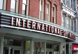
In addition to the museum’s displays, Gallagher designed the facility’s exterior signage. Doing so proved to be an exercise in diplomacy, because the museum is a complex synthesis of new and historic construction.
Because the facility is composed of five buildings structurally connected to accommodate the Spy Museum, historical-preservation requirements dictated that its exterior signage not harm the structures’ architecture.
Gallagher wanted internally illuminated signs, not only to reinforce the theatrical nature of the facility, but also to accommodate evening tours, receptions and other events.
Preservationists, however, feared that electric signage would ruin the buildings’ fascia.
Eventually, a compromise was reached. Gallagher designed a large, halo-lit marquee for the facility’s main entrance and smaller marquees for the museum’s front corners. ATI (Virginia Beach, VA) handled their fabrication.
“It was a theatrical approach, but also a technological approach, and very different from Washington’s mainstream method for identifying museums and other institutions,” Healy says. “The signage holds its weight against the signs on the MCI Arena, which is just one block away, In addition, the street is wider where the museum is located, so there are broader sight lines at work. You can see the marquees from far away.”
I spy Nesnadny + Schwartz
Like Gallagher, Nesnadny + Schwartz had previously worked with Barrie on the Rock ‘n’ Roll Hall of Fame. Hence, Barrie paid the firm — as well as Gallagher and FRCH (Cincinnati) — to participate in a Spy Museum logo competition. Nesnadny + Schwartz’s logo concept was selected and incorporated into the museum’s ID manual, which Nesnadny + Schwartz gave to all design firms involved in the project for reference.
Nesnadny + Schwartz President and Creative Director Mark Schwartz says the logo’s black, white and red colors virtually chose themselves.
“In fact, we looked at a more limited color palette for the museum than for any other project in recent memory,” he explains. “You have to have black and white to depict good and evil. Red was also self-evident because it’s used so much in the visual literature of spying — on ‘Top-Secret’ stamps and on the former Soviet flag, for example.”
Nesnadny + Schwartz also sought a logo with bold typography, so they developed a unique, proprietary font for the project.
“How do you ‘own’ the word ‘spy’? You can’t,” Schwartz says. “But you can own a special typography in which to render it.”
To develop the “spy man” shadow that’s part of the Spy Museum logo, the firm worked with five freelance illustrators.
“We have 15 people in our firm,” Schwartz explains, “but no fulltime illustrator. Essentially, we were freelance brainstorming.”
Ultimately, however, the firm developed its own rendition of the figure, complete with a trench coat and hat. Likewise, the company created a “spy woman” for graphic use.
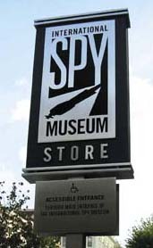
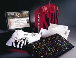
The logo, typography and “spy people” are now being used in all aspects of the facility — from the exterior and interior signage to stationery, t-shirts, Website, billboards and advertisements.
“I think part of the reason our logo was selected was because we had a comprehensive understanding of all the ways the design would be used — from print to broadcast media. The logo is easily reproducible; it’s memorable, and it has great impact,” Schwartz concludes.
Spies Like Us… because we helped develop their museum.
* Adamstein & Demetriou Architects (Washington, D.C.): Designed the Zola restaurant, the Spy City Cafe and the museum’s private event space.
* Mark G. Anderson Consultants (Washington, D.C.): Overall project manager for the 27 companies involved in design and fabrication.
* James G. Davis Construction Corp. (Washington, D.C.): General contractor.
* Design Craftsmen Inc. (Midland, MI): Created interactive environments.
* Edwards Technologies Inc. (El Segundo, CA): Designed and installed multi-sensory media and technology systems.
* FRCH Design Worldwide (Cincinnati): Created a unique retail environment, including interactive media, thematic and image elements.
* Mather Jorgensen Lighting Design Inc. (New York City): Integrated theatrical and architectural lighting.
* Northern Light Productions (Boston): Produced all video components.
* Quatrefoil Assoc. (Laurel, MD): Created 15 interactive (mechanical, computer-based and audio) exhibits.
* SmithGroup (Washington, D.C.): Partnered in the design, development and historic preservation of the museum complex.


 Tip Sheet3 days ago
 Business Management2 weeks ago
 Women in Signs2 weeks ago
 Real Deal4 days ago
 Editor's Note1 week ago

 Line Time2 weeks ago
 Product Buying + Technology1 week ago