Requests from design-firm clients for impactful channel letters have altered the approach that Clear Sign & Design (San Marcos, CA) is taking for the medium, most pronounced in channel letters without trim cap, and including other elements for more-refined looks.
Following are just a few outstanding examples of the next generation of channel letters that Gabe Griffin, general manager of Clear Sign & Design, and his team are creating. Check out his “Illuminated Signs” column on creativity in channel letters in the December 2021 issue of Signs of the Times.
All photography and captions provided by Gabe Griffin.
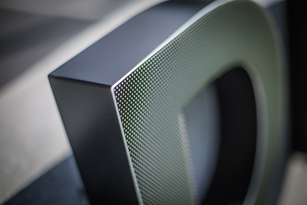
These letters replaced a 15-year-old set of non-illuminated letters. We opted for fully welded letter bodies coated with Matthews Paint’s Ultra Low VOC, and a satin clear coat. The letters were filled with Bitro Group’s OpticsPRO Plus LEDs that diffuse through shoulder-cut ½-in. white acrylic faces decorated with 3M smoke-gray perforated film.
Although these letters sit far from the street, you can get close from behind, so it was important to us to upgrade these enough to stand the test of time, and keep the finishes sharp and elegant.
Canopy-mounted letter sets always provide their own mounting and wire-management challenges, but this one was definitely at the top of the list for us. With spaced horizontal planes and a tapered upper-glass section, it would have been much easier to provide a standard face-lit letter, but the team at Hollis Brand Culture (San Diego) had a more challenging vision.
This letter set ultimately looks much more custom and elegant as the primary branding effort for the main entrance of this luxury apartment building. In this case, the color match cloud provides the minimalist backdrop and reflector for the internal lighting, which helps create such an elegant daytime view.
When our client StreetLights Residential (San Diego) requested two upgraded sets of letters at The Rylan apartments in Vista, CA, we opted for fully welded letter bodies coated with Matthews’ Ultra Low VOC clear coat and filled with Bitro’s OpticsPro Plus LEDs.
Clear Sign’s fabrication team diffused the LED light through shoulder-cut ½-in. white acrylic faces. Special attention is put into the #6 countersink face-screw finish and placement to prevent shadowing.
For one of our national banking clients who wanted some sharp lettering within a walk-in ATM vestibule, we designed a letter solution that was clean enough to pass visual scrutiny of all who enter, and were bright enough to cut through the ambient task-lighting of the space.
Our solution included 1-in.-deep, solid-acrylic letters hogged out to make room for Bitro’s TRACER flexible LED tape. We then painted the returns white to keep the light focused through the face. A letter like this requires a lot of attention to small details, but the final product pays dividends.
When one of our great clients calls and says she wants some razor-thin backlit letters that install onto a board-formed concrete wall with a completely exposed back section, we need to get creative. The solution here was a 1-in.-deep solid acrylic letter that had been hollowed out to make room for Bitro’s Tracer LED tape. We then had to rough-in 100+ ft. of flexible conduit in the precast wall before it was poured, so we routed all electrical paths behind a removable mirror.
Getting all the electrical paths behind the mirror was a lot more challenging than expected, but it worked 100% as planned, leaving no sign of wiring. The letters appear plate cut, but provide a fantastic halo glow when the sun sets on the Pacific Coast Highway.
When our good friends at Studio E Architects (San Diego) shared their design intent to blend direct and indirect lighting using backlit stencil-cut panels and face-lit offset letters, we jumped into action filling in the details. One important element to us was creating some color contrast in order to further juxtapose the lighting difference.
We achieved the desired contrast using a 3000k Bitro OpticsPro Plus module with narrow spacing to provide a hot-spot-free, backlit effect and playing off 6000k color modules within the welded face-lit letters without trim cap. We felt the attention to lighting details really helps bring attention to this housing development.
Designed by TCA Architects (Los Angeles), this halo letter was made even more interesting by recessing the face 1.5 in. on a 4-in. letter body, which really creates an added dimension and richer feeling during the day.
The dimensional effect is further highlighted at sunset when the lighting accentuates the recessed layer.
Taking a razor-thin custom-machined halo letter one step further included the addition of an extra push-through inline that converts an already cool letter-set into something significantly cooler and richer looking. Perhaps not the most fun letter design to engineer and build — it is for sure, one of our most favorite to admire and showcase.
Designed by the creative team at Altitude Design (Santa Monica, CA), several sets of letters for La Jolla, CA’s newest performing arts center were designed to be edge-lit using a combination of ¼- to ½-in. exposed white acrylic sections, while fitting all of the super-slim Bitro Tracer X 3000k modules within ¾-in. custom-machined letter bodies.

16 Photos of Next-Gen Channel Letter Projects
Requests from design-firm clients for impactful channel letters have altered the approach that Clear Sign & Design (San Marcos, CA) is taking for the medium, most pronounced in channel letters without trim cap, and including other elements for more-refined looks.
Following are just a few outstanding examples of the next generation of channel letters that Gabe Griffin, general manager of Clear Sign & Design, and his team are creating. Check out his “Illuminated Signs” column on creativity in channel letters in the December 2021 issue of Signs of the Times.
All photography and captions provided by Gabe Griffin.