In the early 1950’s, post-war economic growth quickly made mom-and-pop grocery stores obsolete. There just wasn’t enough available shelf space to feed (literally) all of the growing demand. But before modern-day mega-stores rose to dominate the landscape, regional supermarkets became the heart of American neighborhoods. Their distinctive illuminated signs served as beacons of mid-century optimism and prosperity. From the whimsical pig mascot of Piggly Wiggly to the bold red letters of A&P, these signs weren’t just advertising — they were community landmarks.
Step back in time with us as we explore this era of retail, and sign industry evolution. Whether it’s Food Fair’s futurism or Kroger’s confident metamorphosis, these signs tell the story of an era when grocery shopping became more than just an errand — it became part of the American dream.
PHOTOS: CURATED AND CAPTIONS BY JEFF RUSS
Piggly Wiggly pole sign in the early 1950’s. No food advertising would be complete without a cartoon mascot.
Piggly Wiggly just a decade later, in the early 1960’s.
Winn-Dixie grocery store in 1958. The combination of brick-and-mortar box and vertical sign is quintessentially mid-century American.
Winn-Dixie with a modern new look for the ’60s, much more expansive to match the larger store.
Winn-Dixie “The Beef People,” 1977. The letters now encompass the whole width of the building.
A&P 1960’s. The serifs add a historical touch, harking back to an earlier era.
A&P New Jersey. The logo has been adapted for the all-family consumer age.
Albertons at the Cottonwood Mall, Holladay, UT, 1968. With the gray mountains against a blue sky, this shot is postcard-worthy.
Ben Franklin and its iconic key logo, 1966. We’re starting to see a block letter trend within 1960’s signage.
Food Fair going all in on MCM, 1963.
Kohl’s with an exterior that looks like a set for the TV series Mad Men.
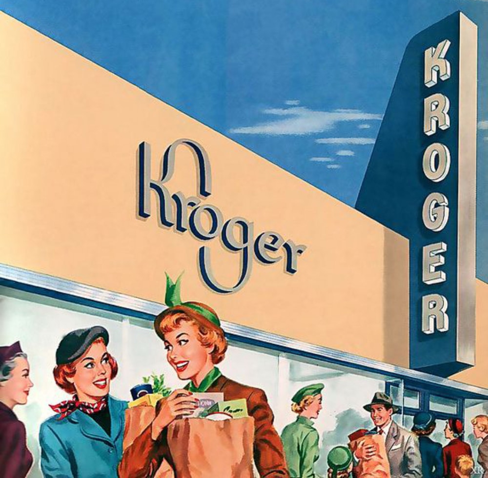
A brick box was typical of Kroger stores in the 1930’s. The three-part logo and lettering were later simplified as mid-century modernism came along.
Kroger and Rexall, what else do you need? 1970’s.
Kroger with a building so big it dwarfs its sign, 1980’s.
Marsh and their glorious neon that beckoned customers late into the evening.
Do you remember Pantry Pride? Handpainted signs let us know that everything was 20% off.
The Dream Team: Town and Country and Pantry Pride team up on a pole sign.
Shopping, and redeeming S&H Green Stamps, was a pleasure at Publix, 1950’s. Note the slightly but noticeably italicized letters.
Another angle on Publix Supermarket. The channel letters’ sides are more visible, and just look at those flags.
Sam Walton’s unassuming original Five and Dime, Bentonville, AR. This is now the Walmart Museum Visitor Center.
Wal-Mart (now Walmart) sign from 1975, not so much mid-century as Middle Ages. What do you think of the logo from this Walmart era?

22 Photos of Vintage Grocery Store Signage
In the early 1950’s, post-war economic growth quickly made mom-and-pop grocery stores obsolete. There just wasn’t enough available shelf space to feed (literally) all of the growing demand. But before modern-day mega-stores rose to dominate the landscape, regional supermarkets became the heart of American neighborhoods. Their distinctive illuminated signs served as beacons of mid-century optimism and prosperity. From the whimsical pig mascot of Piggly Wiggly to the bold red letters of A&P, these signs weren’t just advertising — they were community landmarks.
Step back in time with us as we explore this era of retail, and sign industry evolution. Whether it’s Food Fair’s futurism or Kroger’s confident metamorphosis, these signs tell the story of an era when grocery shopping became more than just an errand — it became part of the American dream.
PHOTOS: CURATED AND CAPTIONS BY JEFF RUSS