The path to a sign project going horribly wrong can begin at many different junctions. Maybe the design was ill-conceived from the start, or simply looked far better on paper or in a pdf file than in the real world.
Poor fabrication is another potential culprit. Another possible slip-up can occur during installation, like a misread of installation instructions.
Our intention with the following images of “signs gone horribly wrong” is not to mock signmakers, but rather to reinforce (A) just how hard signmakers and their cohorts have to work to ensure everything goes according to plan and (B) what the end result can look like if a mistake or two isn’t caught prior to a sign’s public unveiling.
Ercrsms Mryhita! ??
Rin Tin Tin just blew his cover.
What are the chances this wasn’t done on purpose?
Disagreement fits where cars don’t.
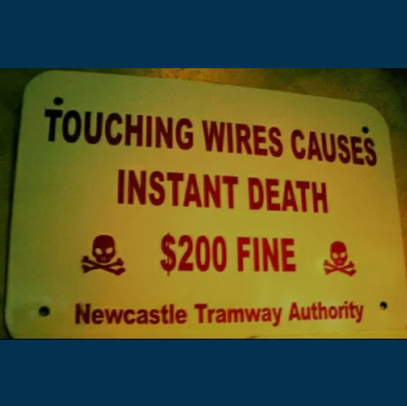
“So the writer who breeds more words than he needs, is making a chore for the reader who reads.” – Dr. Seuss
Maybe it’s an acronym.
The
y
Ha
d
On
e
Job
It’s not a contradiction; it’s a paradox.
We beg to differ.
Sign design at Walmart could stand to be improved.
The effort is commendable, the execution isn’t.
Clever or ironic?
Actually …
“Good intentions are not the whole story. You must also pay attention.” – George Hammond
One might say this club cuts to the point.
Count Remaxula! When the balloon logo on your bus graphic transforms you into a vampire …
It’s hard to imagine a sign failing harder than this one.
This restaurant in West Bend, WI was founded in 1989. Its sign went wrong 33 years later.
A solution in search of a problem.
Signmakers, we implore you: Think of the children!
Not exactly a sign that inspires confidence.
“Infection Free” or “Free Infection”?
The client bought one too many vowels.
Hard to say what’s worse — the sign itself, or the fact it was still posted.
A totally useless sign, no two ways about it.
This Starbucks drive-thru works like Platform 9 ¾ — you reach it only by driving full speed between the two signs.
When a sign supplies more confusion than answers.
A structure fire is bad enough; let’s at least make sure people sleep soundly through it.
Glad they cleared that up for everyone.
In signmaking, as in life, two wrongs don’t make a right.
We found the creepiest bus wrap on the internet. You’re welcome.
So, in other words, everyone.
The sign is too cute when you need the Rosetta Stone to read it.
Nope.
Either this is an unfortunate design, or the spa is deadly serious about its buy-one, get half-off promotion.
It’s the thought that counts.
Not the most kid-friendly combination of signs.
For the sake of the business, let’s hope people don’t read this sign from top to bottom like they would every other sign in the world.
Seems like there’s some room for disagreement here.
Retail sign fail.
Let’s hope the surgeon handles a scalpel better than he does quotation marks.
The double whammy of signs gone horribly wrong — confusing and ugly.
This sign, on second thought, seems just right.


45 Photos of Signs Gone Horribly Wrong
The path to a sign project going horribly wrong can begin at many different junctions. Maybe the design was ill-conceived from the start, or simply looked far better on paper or in a pdf file than in the real world.
Poor fabrication is another potential culprit. Another possible slip-up can occur during installation, like a misread of installation instructions.
Our intention with the following images of “signs gone horribly wrong” is not to mock signmakers, but rather to reinforce (A) just how hard signmakers and their cohorts have to work to ensure everything goes according to plan and (B) what the end result can look like if a mistake or two isn’t caught prior to a sign’s public unveiling.