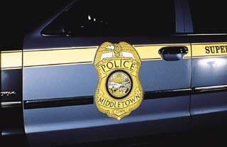
When it comes to fleet graphics, my heart pumps faster when my headlights illuminate a trailer with well-designed reflective markings. I admit, maybe I should get a life. However, I’ve seen similar reactions from middle-aged businessmen who spend 30 minutes turning their high beams on and off to experience new reflective truck graphics.
That’s the level of interest and excitement that great graphics should create. A winning, reflective-graphics program effectively communicates the client’s fleet advertising message while providing optimum safety at a competitive price. That’s much easier said than done.
Over the years, I’ve worked with many talented pros who’ve taught me the essential do’s and don’ts in the design and manufacturing of reflective fleet markings. In reviewing some of the following time-tested tips, I hope you discover new ways to improve your designs and give your customer the biggest bang for his reflective buck.
Reflecting on reflection
Approximately 18 years ago, I was trying to win over a large tanker fleet account on the south side of Chicago. The graphics package incorporated green and blue reflective markings on the sides and rears of the units.
Fortunately, my employer was practically the best production man in the business. After carefully inspecting the printed markings, Larry noticed that one of the colors didn’t reflect. He was sure that white had been added to the ink system to achieve a color match. Mixing any opaque color with transparent ink will kill reflectivity.
After I demonstrated to the fleet manager that he’d been buying reflective markings that didn’t reflect, he was furious. In his mind, he’d been cheated. That signaled the end for the incumbent printer.
Advertisement
Whether you screenprint or digitally print colors, make sure that the ink neither clouds the nighttime appearance of color nor deadens the reflectivity. Surprisingly, colors printed with some thermal-resin printers — such as the Gerber Scientific Products Edge — can have higher candlepower ratings than pigmented sheeting’s equivalent. However, be sure to print with transparent foils.Gerber Scientific Products
The moral of this story? If you quote on an existing reflective-graphics program, take the time to inspect the markings at night. A spotlight is a handy tool for nighttime viewings. As you evaluate the graphics program, ask the following questions:
* What are the existing program’s shortcomings or problems?
* How can you re-engineer the job to improve the nighttime visual impact of the graphics?
* How can you improve the graphics’ readability?
* How could you make the program more cost-effective?
Advertisement
Remember, the key to achieving better graphics solutions is to ask better questions.
Do your sheets match?
Early in my career, a co-worker learned a costly lesson about the importance of matching reflective sheets for daytime and nighttime appearance. The design for an Ohio-based manufacturer incorporated a 7-ft.-tall graphic of a staple gun. To minimize material waste, he printed the pictorial on two sheets of reflective material, with one sheet coming from a 3-ft.-wide roll and the other from a 4-ft. log.
However, the two white reflective sheets were noticeably different. During the day, one sheet appeared yellowish, while the other looked light gray. The nighttime variance was even worse.
Using material from two different rolls was the first in a series of errors. Color and reflective values often vary from one roll to the next. That’s why it’s prudent to use material from the same roll. If that’s not possible, at least make sure all the material comes from the same lot number.
Second mistake: Each log used for the staple-gun pictorial came from a different production run. Reflective sheeting’s color can vary greatly from one lot number to another, and also from one roll to another within a specific lot. Appearance can even vary on different parts of a roll, from one side of a roll to another.
Advertisement
Because variations are so common, matching sheets of reflective film should become a routine production procedure. Good design and production planning can minimize color-shift problems. Joining sections of a multi-panel graphic along a hard, dark line in the design can camouflage any change in color from one panel to an adjacent panel.
Design tips
The bigger, the better. A large mass of reflective sheeting increases nighttime visibility and improves the advertising message’s total impact.
Choose your colors carefully. The measure of a reflective color’s luminescence is called its candlepower rating. This rating corresponds to the amount of light that is reflected back to the source. These values can vary greatly, depending on the angle at which the light source strikes reflective markings and the viewer’s angle. For this reason, product specifications usually indicate entrance and observation angles when listing ratings.
Descriptions and "type" classifications for retro-reflective sheeting are listed later in this article. The chart (Table 1) compares the candlepower ratings of various colors for different classifications of reflective sheeting.
TABLE 1 Comparative Candlepower Rating for Various Types of Reflective Sheeting
(At an observation angle of 0.1° to 0.2° and an entrance angle of -4°.)
Color Type I Type II Type III Type IV Type V
White 70 140 300 400 2,000
Yellow 50 100 200 270 1,300
Orange 25 60 120 160 800
Green 9 30 54 56 360
Red 14 30 54 56 360
Blue 4 10 24 32 160
Brown 1 5 14 12 N/A
Note: Candlepower values for reflective sheeting can vary from one manufacturer to another. The values listed in the above table represent only one manufacturer’s products. To obtain product specifications on other reflective sheeting products, call your sign supply distributor or the manufacturer. The angle formed between the light source’s path and a line perpendicular to the surface of the reflective sheeting is the entrance angle. The observation angle measures the angle between the line of the observer’s sight and the path of the light source.
Because candlepower varies greatly between colors, the selection process is extremely important for the design of reflective graphics. For instance, orange, yellow and gold usually have comparatively high reflective brilliance, while blue, green and red have very low candlepower ratings. To improve their effectiveness, colors with low ratings should cover an area large enough to allow the motorist to see the vehicle from a reasonably safe distance.
Contrast improves readability. Studies prove that color combinations with the most contrast are more legible. Black or brown copy on a yellow, white, orange or gold background is a visually effective combination for reflective markings. Light colors on a dark background provides contrast, but with severely limited reflective intensity.
Try creating contrast — along with a more distinctive look — by using drop shadows. Shading letters with an opaque color provides readability when light colors are used for both the copy and the background. Drop shadows also effectively improve daytime appearance and legibility. When using light colors for reflective striping, border the stripe with a dark color so the stripe shows up during the day.
Copy considerations. Although there are thousands of available typestyles, keep it simple — big, bold block letters read better. Ideally, lettering should be at least 10 in. high. Spacing between letters should be approximately twice the letters’ width.
Although dark copy on a white background is usually effective, thin letters spaced too tightly together on a highly reflective background create an "overglow" — the background’s reflective brilliance bleeds around the edges of the lettering, making it illegible.
Make contoured cuts. You can compensate for poor reflective intensity by printing colors with low values on white reflective sheeting. Trim the sheet on the outside of the printed graphic so that a 3/8-1/2-in. white border remains on the perimeter; this greatly improves the marking’s reflective brilliance, readability and overall visual impact. Shaping the graphic in such a manner is also more appealing than a square print. Contour cutting can remedy the overglow problem.
Nesting minimizes material waste. Compared to opaque cast and calendered vinyl, reflective sheeting is costly. Many fleet graphics producers nest lettering by arranging them on a sheet of reflective to maximize material usage. This helps the user obtain significant savings and a competitive edge.
Use reflective art boards. Producing and presenting a reflective art board of your client’s design can generate the excitement necessary to close the sale. When you show a miniature version of reflective truck graphics, have your prospect view the design in the dark with a flashlight at eye level. Also inspect mock-ups of reflective graphics to reveal design flaws.


 Tip Sheet1 week ago
 Photo Gallery3 days ago
 Ask Signs of the Times5 days ago
 Real Deal2 weeks ago
 Benchmarks1 week ago


 Women in Signs2 weeks ago