As sign professionals, we all know typical end-users don’t quite understand their signage needs. They might ask, why do I need a sign? What kind of sign do I need? Where will it be installed? How long will it take? As sign professionals, our answers will vary, depending on our business platforms, but we all know good signage can determine a business’s success or failure. This article intends to help you consider integrating ADA signs into your platform.
Unlike most signs, ADA signs are first determined by their rules and regulations. They only exist due to federal mandate. But also, each state may establish its own regulations, if they’re at least as restrictive as those set by federal laws. To learn more, review the “ADA Standards for Accessible Design” published by the Department of Justice. You’ll find relevant information on page 53 under section 4.30 (www.ada.gov/adastd94.pdf).
Next, you should log on to www.access-board.gov, a website that lists current accessibility standards, along with ADA accessibility guidelines adopted by more than 25 states. Finally, Reuven Rahamim (Accent Signage Systems Inc., Minneapolis) has created a shortcut for those of you think “Forget it; too much information to read through.” His shortcut, the “How to Create Great-Looking Interior Signage Using the Raster™ Method of Fabrication” manual, is updated annually, so it can help you stay current with government regulations. Go to www.accentsignage.com for more information.
The physical sign
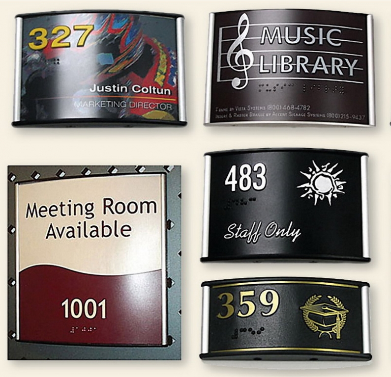
Consistent use of design elements is critical, including the use of one typeface style, a unified color palette and consistent placement of such signage elements as text, braille and pictograms. Graphic portions of signage should be simple; they should add to the sign’s overall value, not detract from it. ADA compliance calls for Grade II rounded or domed braille, situated below the related text. This facilitates reading of the braille and decreases desensitization of the reader’s fingers.
Digital imaging with UV-stable inks is permissible. Finally, remember, the vast majority of people who will use an ADA sign are sighted, so consider adding a logo, mascot, decorative border, etc. Even ADA signs
contribute to branding!
Next, ensure the signs can be read by the visually impaired. Here are six key elements:
1. Contrast between raised and recessed areas is your main concern.
2. As with any good sign, the characters must contrast with the background for legibility. Inappropriatecontrast can make the sign illegible.
3. The room, or at least in the sign’s vicinity should be well lit.
4. The copy should avoid abbreviations and punctuation.
5. The signage should incorporate standard placement, with pictograms and symbols on top, followed by text, with the braille at the very bottom.
6. Lettering should be uppercase in a sans-serif font to ensure readability. Highly decorative lettering may be visually appealing, but it curtails tactile reading.
The sign’s framing should be considered next. Ideally, choose one that’s compatible with the most braille/ADA sign methods, both for cost effectiveness and versatility. Second, consider service and support. The “perfect system” will fail with bad vendor service, because it will somehow get passed on to your customer. Contact colleagues and ask the manufacturer for references.
Check the vendor’s fabrication services. Some outsourcing could prove cost effective. Also, check delivery times. Dependability is important, and being late can be very expensive!
Next, choose a system with a wide range of sizes, to better satisfy the customer or designer. Look for a comprehensive system that can cover signs throughout the establishment. Finally, choose a system that you like. It will show when you sell it.
To conclude, here’s a tip offered by Matt Williams of Dixie Graphics (Nashville, TN). He believes the main issues are the materials and finish chosen. For instance, will the material chip or crack under the intended weather conditions? Will the materials tarnish or fade? How easily can the sign’s contents be replaced?
Danny Schneider is the development manager for Vista System (Sarasota, FL), an architectural-signage company best known for its Modular Curved Frame Technology (MCFT) sign-frame products. The company’s website is www.vistasystem.us.


 Big Survey2 weeks ago
 Photo Gallery1 week ago
 News1 week ago
 News5 days ago
 Heidi Tillmanns4 days ago
 Editor's Note6 days ago
 Dale Salamacha2 days ago
 News1 week ago