Russell Toynes
Adding That Little Extra to Sign Designs
3 examples that push past standards.
THERE’S A SAYING: “Design is solving other people’s problems. Art is solving your own.” While sign designers strive for self-expression, opportunities are often few. Most projects are bound by established brand assets like logos, colors and fonts. However, when budget and timeline allow for exploration — and designers are backed by bold leadership — a basic sign can become a real showstopper.
I push my team to find ways to bring something “extra” to their designs: unconventional materials, adding a brand easter egg or infusing paint with dust from a building’s original bricks. By identifying these unexpected opportunities, designers add a touch of “zhuzh” to the wayfinding experience, giving your company an edge over the cheaper, faster shop.
Let’s look at three projects where a “dollop of sauce” took a sign to a new level and made the client say, “Damn! You didn’t have to do that.”
What If My Sign Gets Tagged?
El Raval (Austin, TX) is a Spanish restaurant inspired by the street art of Barcelona. The team at Studio Dzo saw an opportunity to bring that energy to a straightforward sign cabinet. They connected with Denisse Hudock, the artist behind the restaurant’s interior graffiti, and invited her to do what most owners fear: tag the sign. Denisse met the installers as they were unloading and, with graffiti markers, tagged up the backside of the brand-new sign.
Advertisement
1
1. Great ideas, regardless of how “out there” or simple they might be, just work. For the cost of two paint markers and a single email, Studio Dzo authentically elevated the entire vibe for El Raval.
Leaving No Loose Ends
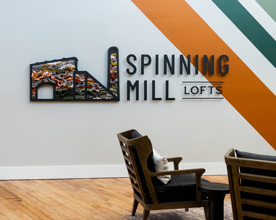
Lauren Stern of Studio 618 was hired to design signage for the Spinning Mill Lofts, a renovated 1901 textile factory in North Carolina. While the scope was defined, Lauren felt the project demanded more. A passionate weaver, she saw an opportunity to bridge the building’s legacy with her personal craft. Despite initial worries about “scope creep,” Lauren pitched a custom fiber art installation integrated with the branded interior signage.
2
2. The client quickly green-lit the vision. Lauren sourced vintage wooden textile spools, hand-spun newspaper yarn and global fibers to weave into the design. The result transformed a functional sign into a tactile masterpiece that honors the property’s industrial roots. Lauren’s success serves as a reminder to never gatekeep your hobbies: By sharing her passion, she delivered an elevated and unique, site-specific experience.
Exchanging Layers for Depth
Ryan Fox of Fource Communications designed the sign package for The Ludlow, a luxury apartment community in Plano, TX. Ryan was challenged with integrating the brand’s signature “pop of terracotta” while maintaining a sophisticated tone.
“Cake layering” — stacking materials to build dimension — is the typical approach to ADA signs, but Ryan knew The Ludlow required depth without bulk. He explored combining two textural architectural films from Belbien: a light wood grain and a red sand-textured laminate. By using rounded window cutouts to reveal the terracotta through milk-white acrylic and dark bronze tactile text, he achieved visual depth through consistency rather than bulky layers.

3
3. The result is a masterclass in rethinking fabrication. By embracing the versatility of laminates, designers can deliver high-end experiences that don’t cut into margins or break the client’s bank.
Choosing “extra” over “expected” doesn’t always require a massive budget, but does require vision and intent. By pushing past the “standard,” designers create work that resonates on a deeper level. Next time you’re starting a project, ask yourself: what’s something that will make them say, “Damn, you didn’t have to do that?”
AdvertisementSecrets of Lead Generation
Boost your sales by generating more leads! In this light and lively webinar featuring Maggie Harlow, CEO of Signarama Louisville Downtown (Louisville, KY) and the “Business of Signs” columnist for Signs of the Times, learn the secrets of how leads are generated, where they come from and how you can cultivate better (not just more) leads.


Bulletins
Get the most important news and business ideas from Signs of the Times magazine's news bulletin.
-

 Russell Toynes2 days ago
Is AI Coming for Sign Designers?
-

 Maggie Harlow2 weeks ago
Secrets to Connecting With Sign Customers
-
 Mark Kissling2 weeks ago
Phoenix Shopping Center Sign Connects With the Past
-

 Real Deal2 days ago
One Signshop’s Installers Approach Another Shop
-
 Product Buying + Technology7 days ago
Digital Sign Displays and EMCs
-
 Signs of the Times1 week ago
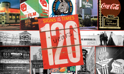
Signs of the Times at 120 Years
-

 Brain Squad1 week ago
Brain Squad Forum Ep. 2: Hard-Won Lessons From the Front Lines
-
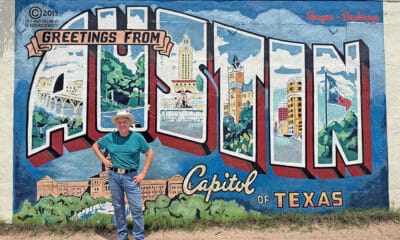
 Photo Gallery7 days ago
25 Signs That Keep Austin Weird