Architectural Signs Should Deliver Consistency and Appeal
Three sign companies explain their keys to success in the category.
FROM MONUMENTS TO wayfinding, architectural signs deliver messaging with a look that builds from — and often enhances — their building’s overall aesthetic. Three sign companies share their approach for delivering elevated, sophisticated signage that appeals to building developers and end users alike.
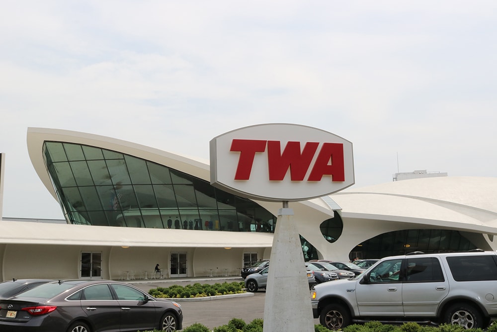
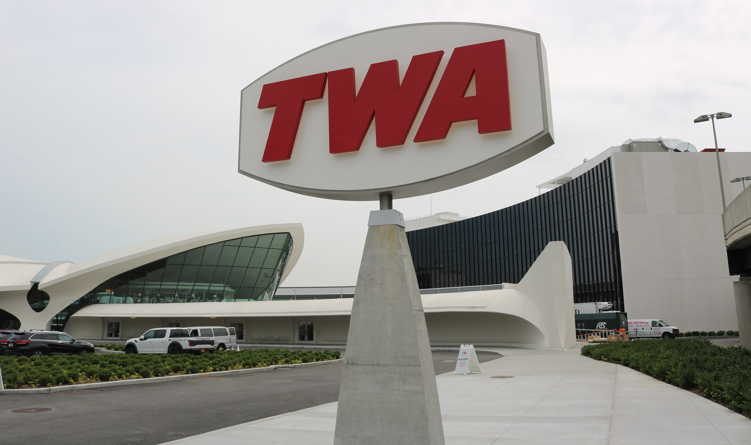 FIRST CLASS: The monument sign for the TWA Hotel blends perfectly with the ’60s surroundings.
COME FLY WITH ME
SHOP: Crown Sign Systems Inc.
LOCATION: Mt. Vernon, NY
URL: crownsigns.com
Perhaps no recent project illustrates drawing inspiration from a setting more than Crown Sign Systems’ (Mt. Vernon, NY) extensive sign development for the TWA Hotel, which opened in 2019. Occupying the former headhouse of the storied TWA Flight Center at JFK International Airport in Queens — unveiled in 1962 following designs by famed architect Eero Saarinen — the new hotel fully embraces its midcentury-modern beginnings, so its signage needed to as well.
Overseen by MCR Hotels and MORSE Development, the project preserved the iconic bird-shaped main terminal building, which is on the National Register of Historic Places but had sat largely unused since 2001, when TWA folded. Following a restoration by architecture firm Beyer Blinder Belle (New York), the terminal now houses restaurants, bars and retail shops. Brooklyn-based LUBRANO CIAVARRA Architects also designed two new seven-story buildings — which serve as the hotel wings, a ballroom and conference center — in a style that pays homage to the original landmark.
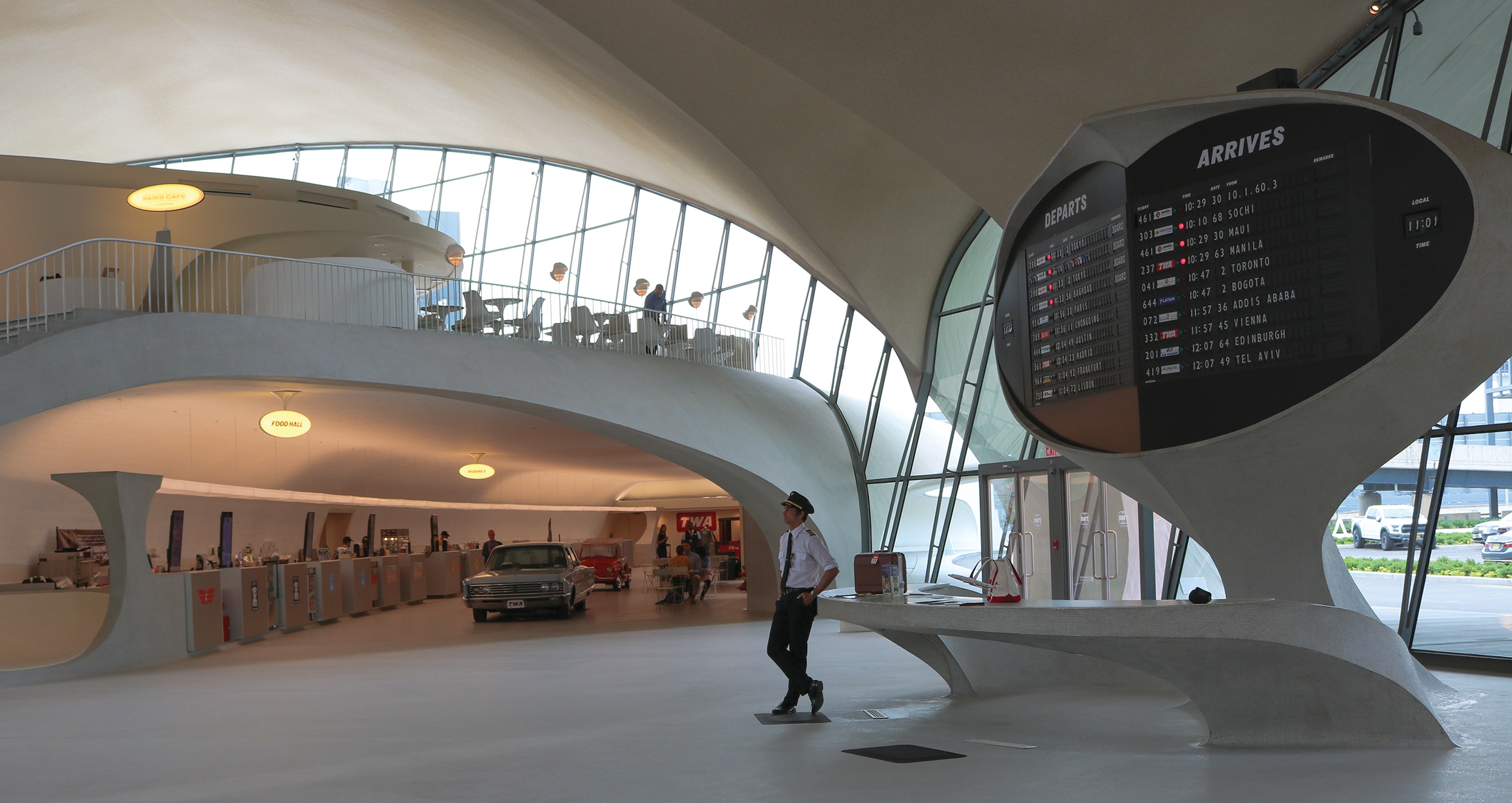
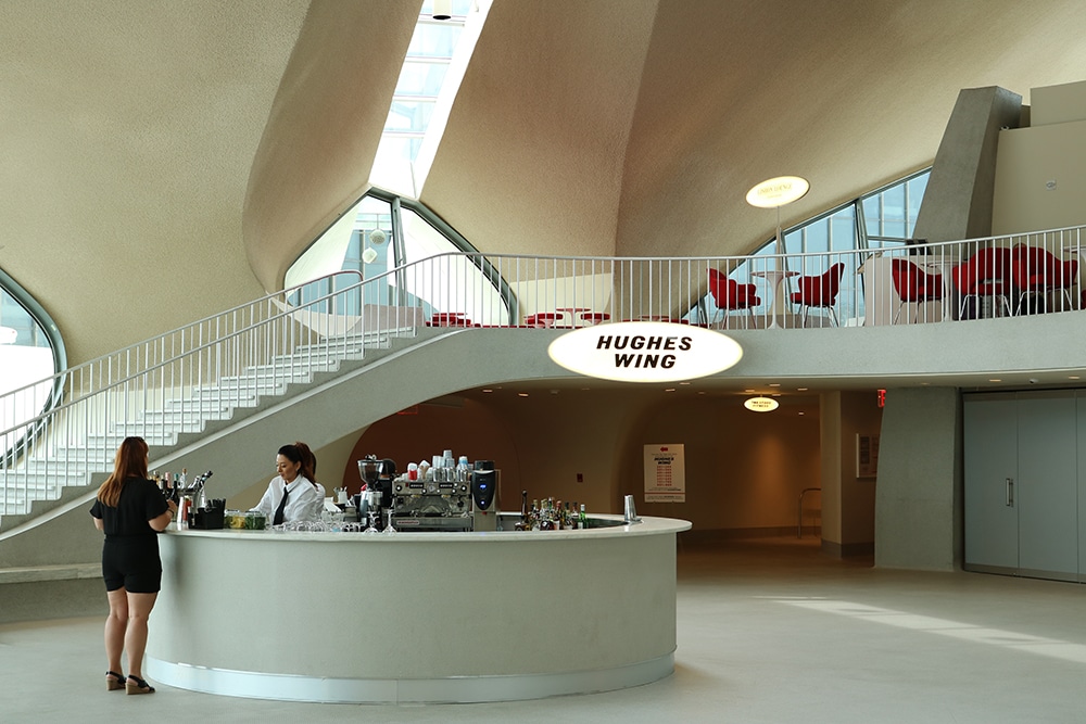
OVAL TIME: Designers deliberately placed oval-shaped signs throughout the complex.
Crown Sign was charged with creating both interior and exterior signage for the new hotel development, a large-scale project that was “a little overwhelming to start, but fun to tackle,” says Corrie Jo Lebens, Crown Sign’s senior director of projects and design.
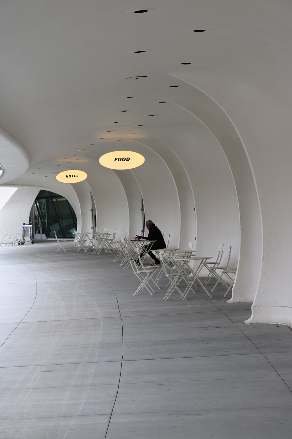
Originally hired during the sign design process, the company also won the bids for fabrication and installation. The project called for hotel and conference center branding signage as well as wayfinding for the entire complex, including an underground tunnel connecting the hotel to the rest of JFK airport.
“During the sign design process, we worked together with the project architect to look at historical photos and even archival drawings from the original architects,” Lebens says. “When possible, we matched [new text] verbatim to old signs that had existed in the original airport terminal.”
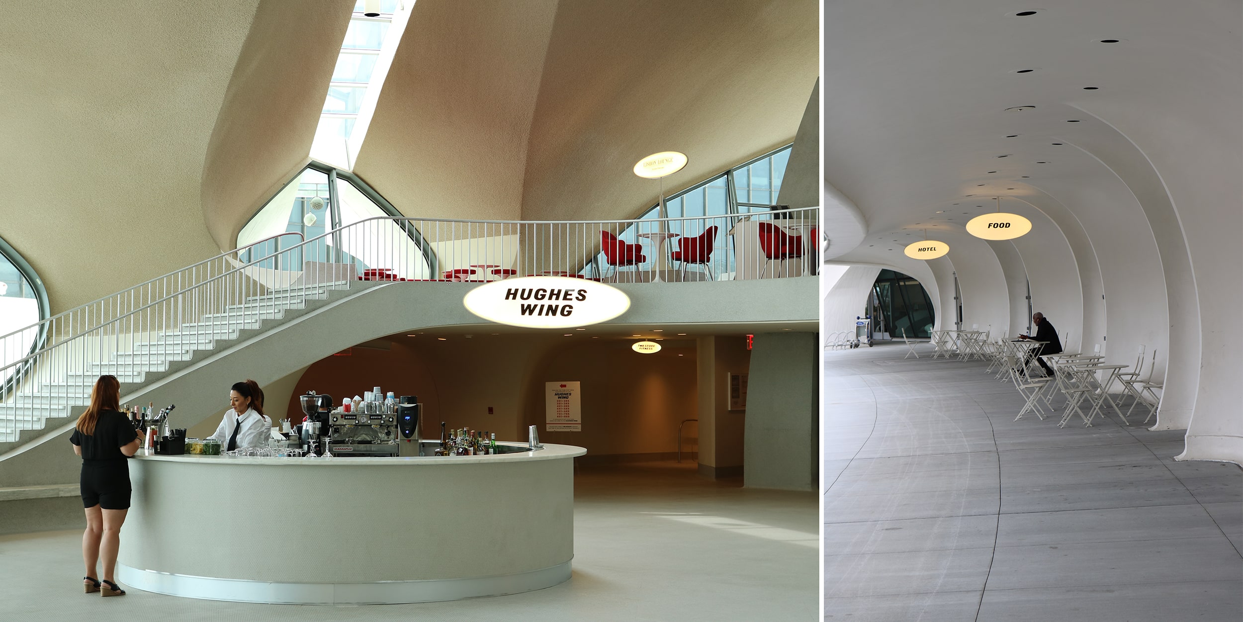
At other times, Crown Sign worked to blend completely new sign builds with existing terminal structures in such a way that the original architecture was not damaged. Case in point: the oval signage marking the Lisbon Lounge in the terminal building. “For that, we were using the base of a former pylon stanchion sign — an existing structure — that we had to figure out how to attach to, and yet not damage,” Lebens explains.
Advertisement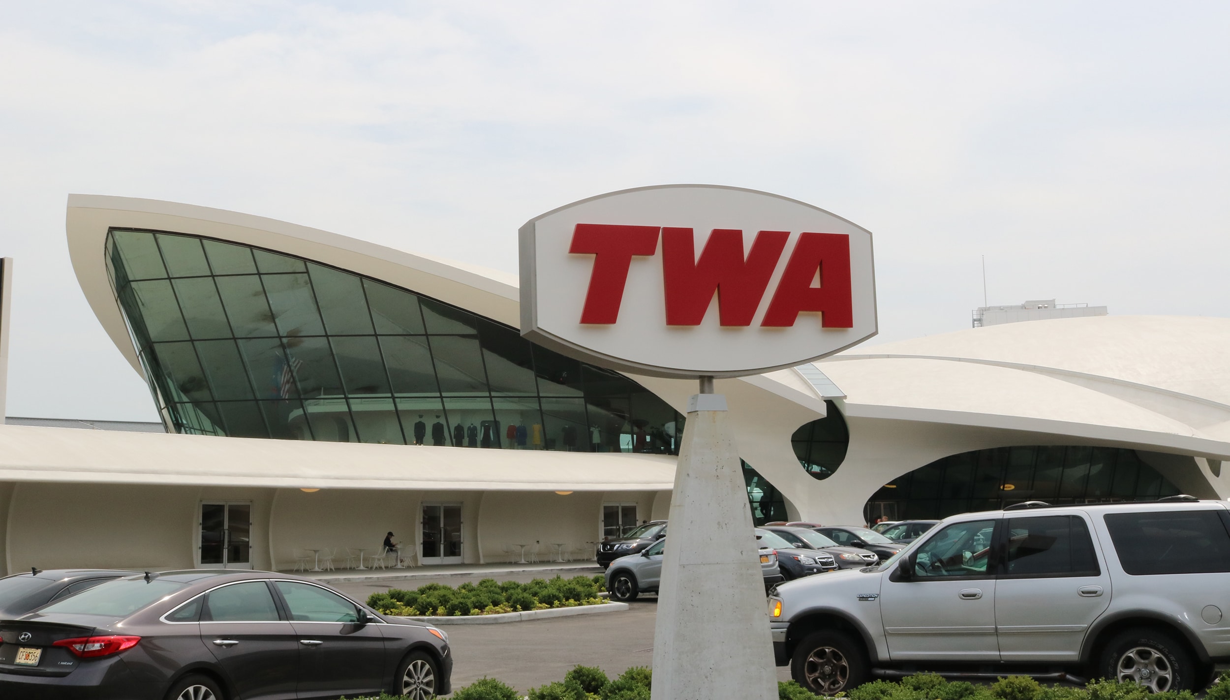
For the exterior TWA sign, Crown Sign created a stainless steel cabinet roughly 14 in. deep and covered with fabricated 3/4-in. stainless steel white face plates. They used 2-in. fabricated stainless steel to create red channel letters that spell T-W-A on both sides of the cabinet. The sign is halo lit to draw attention at night.
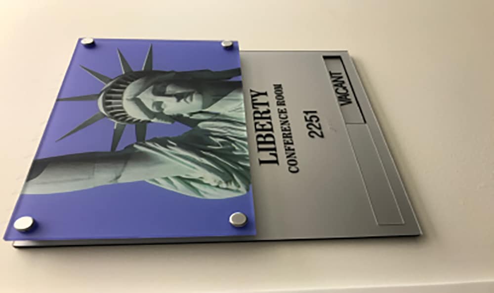
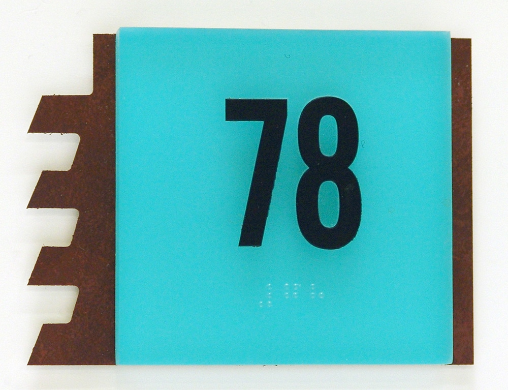
The repeated use of the ovals — from large-scale exterior and interior signs to smaller ones, including even hotel room number markers — was intentional throughout the TWA project.
“We chose to echo the oval shape of the historical signs in the room ID signs and in other spaces as well,” Lebens says. “So, for consistency, we had the same shaped signage for whatever the sign was, whether it was a room ID or an evacuation map, or whatever the case may be.”
To help differentiate areas of the property, Crown Sign used different-colored oval signage. While signs in the original terminal building use stainless steel, the oval signs in the hotel and conference spaces are a dark, oxidized brass.
“That allowed us to highlight a consistent look, but still have separate, defined interior spaces,” Lebens says.
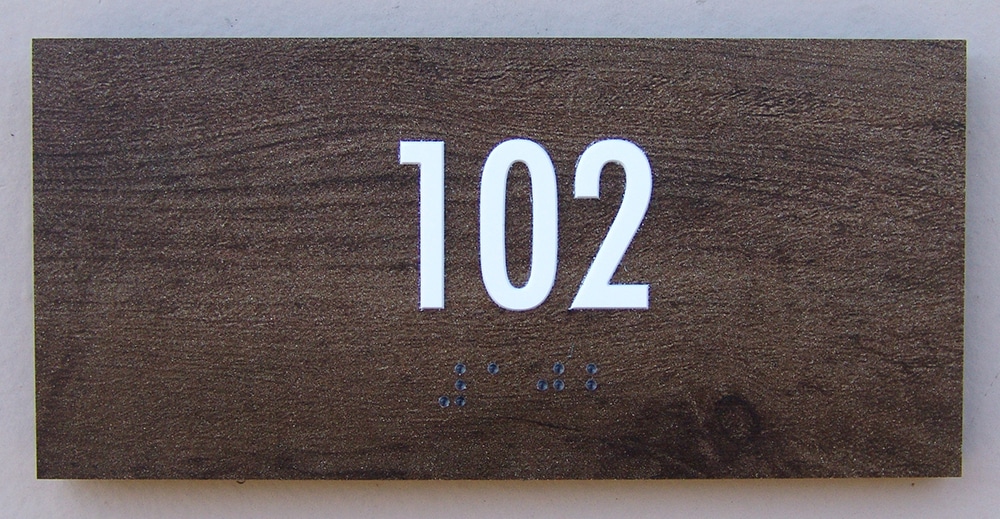
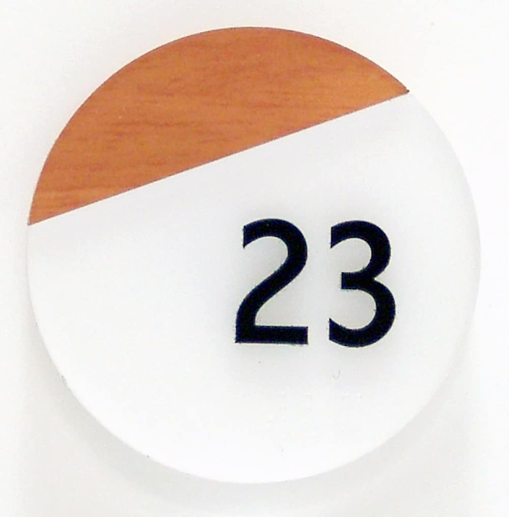
 NUMBERS GAME: Elements, finishes and colors used for the building tie overall branding in well with room ID signs.
MULTIFAMILY SWELLING
SHOP: Sequoia Signs & Graphics Inc.
LOCATION: Pacheco, CA
URL: sequoiasigns.com
“Early on in our business operations, we became an electrical sign contractor for the state of California so that we could install any type of sign,” explains Sequoia Signs & Graphics (Pacheco, CA) President Tom Schnurr. “Being a contractor then led us to a few jobs in the multifamily housing sector — and we quickly discovered that this was a niche that we really liked and wanted to pursue. And it is our primary focus today.”
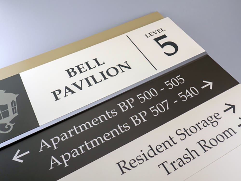
For a typical multifamily housing client, Sequoia manufactures and installs both exterior and interior branding signage as well as the dozens of wayfinding signs needed to guide residents safely through the buildings and grounds. “For most of our jobs, we are doing every sign on the complex — from the exterior signs to the interior lobby signs all the way down to the unit IDs and exit signs, as well as other required ADA-compliant signs, which are made with both tactile graphics and braille,” Schnurr says.
Plus, Sequoia Signs works hand in hand with property developers, designers and architects to ensure that selected signage “displays and is consistent with the architectural intent of the building,” he says. In other words: Schnurr helps his clients realize their property building signage plays a large part in reinforcing their overall brand.
“Signage is a very small part, on a dollar basis, of any multifamily housing project. And yet, it is one of the most significant branding opportunities — in fact, the most significant branding opportunity — and it can really contribute to the overall look and feel of the resulting project,” he says.
Advertisement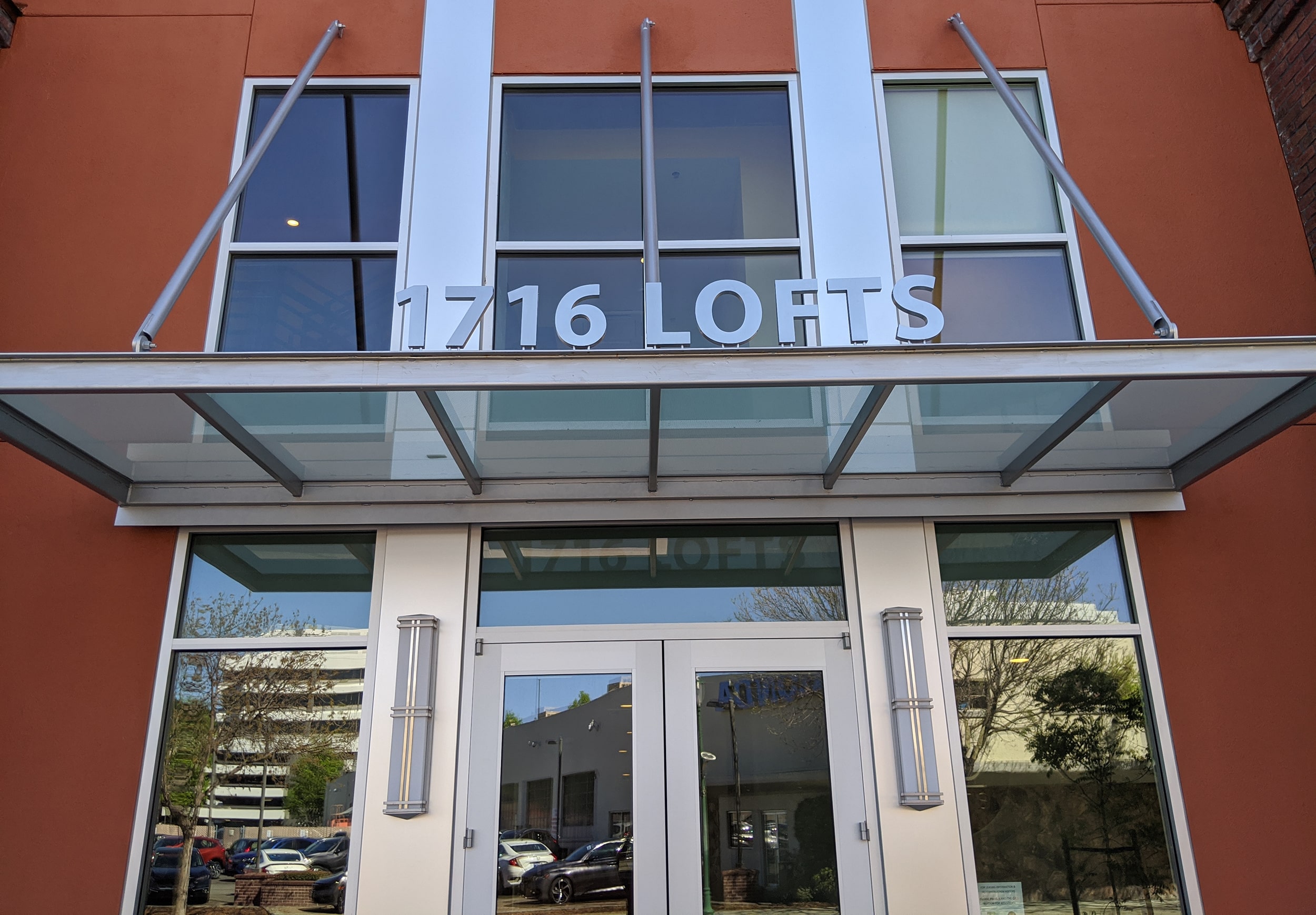
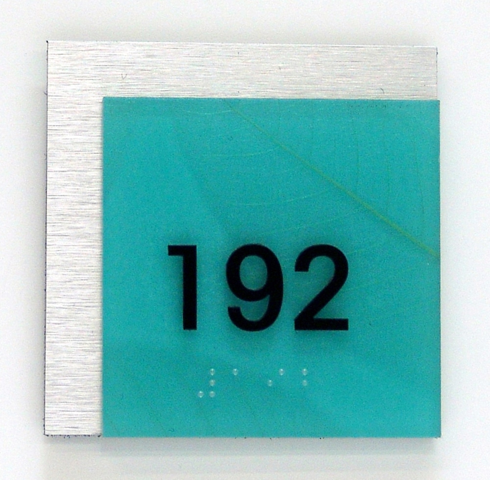
CLEAN AND BRUSHED: This entryway sign of brushed aluminum keeps the look clean and simple.
While Sequoia does occasionally outsource, it produces most of its signs in house. This operational decision allows the company to “have control over the product and quality as well as timing,” says Schnurr. To produce their signs, his team frequently uses key pieces of in-house equipment, such as their Vision 2550 CNC Router/Engraver, Safety Speed SR5 Panel Saw and Router, HP Latex 360 Digital Printer and Laguna SmartShop Laser EX — a CO2 laser cutter and engraver.
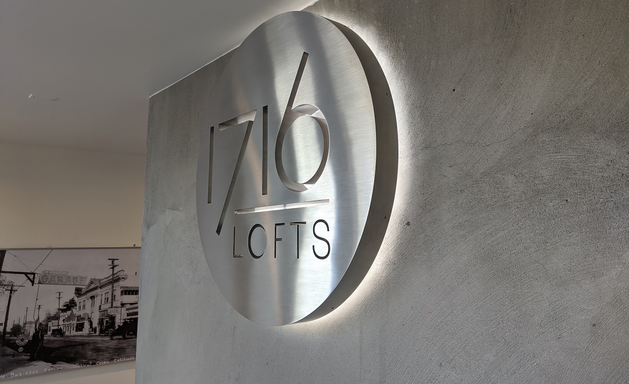
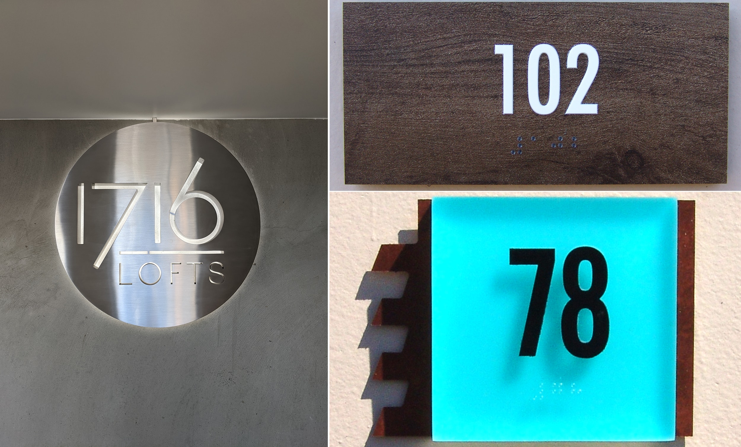
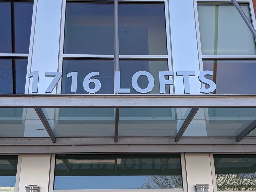
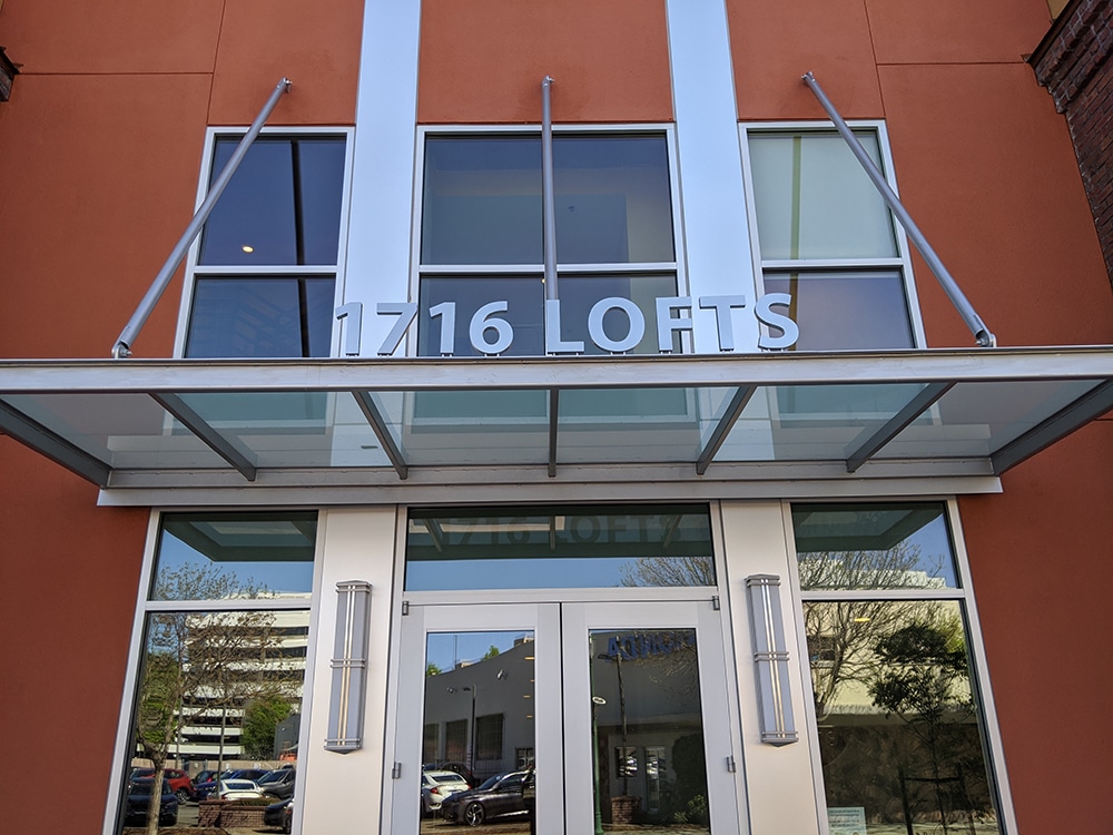
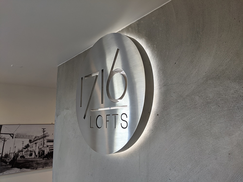
For recent client 1716 Lofts, a new apartment complex in Walnut Creek, CA, Sequoia Signs designed, manufactured and installed exterior and interior signage using fabricated brushed aluminum. While the exterior sign used simple lettering, the interior sign incorporated a halo-lit circle design. The overall goal was to capture and echo the building’s “very clean, modern look,” Schnurr says.
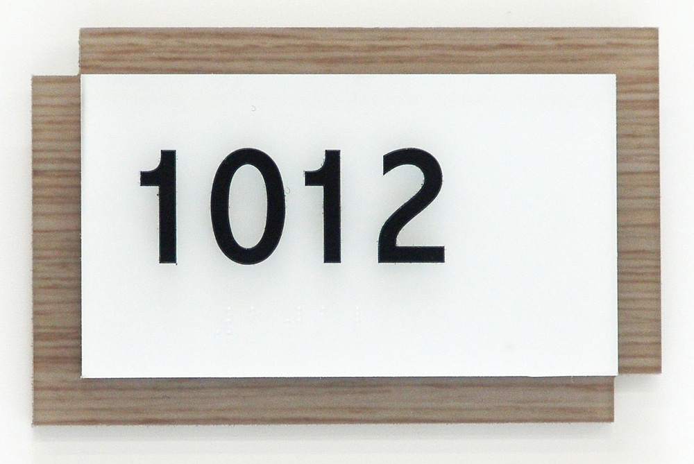
While some clients seek sleek, minimalist concepts, others are increasingly leaning toward an elevated aesthetic — particularly when it comes to architectural signs and even room number ID signs, Schnurr explains.
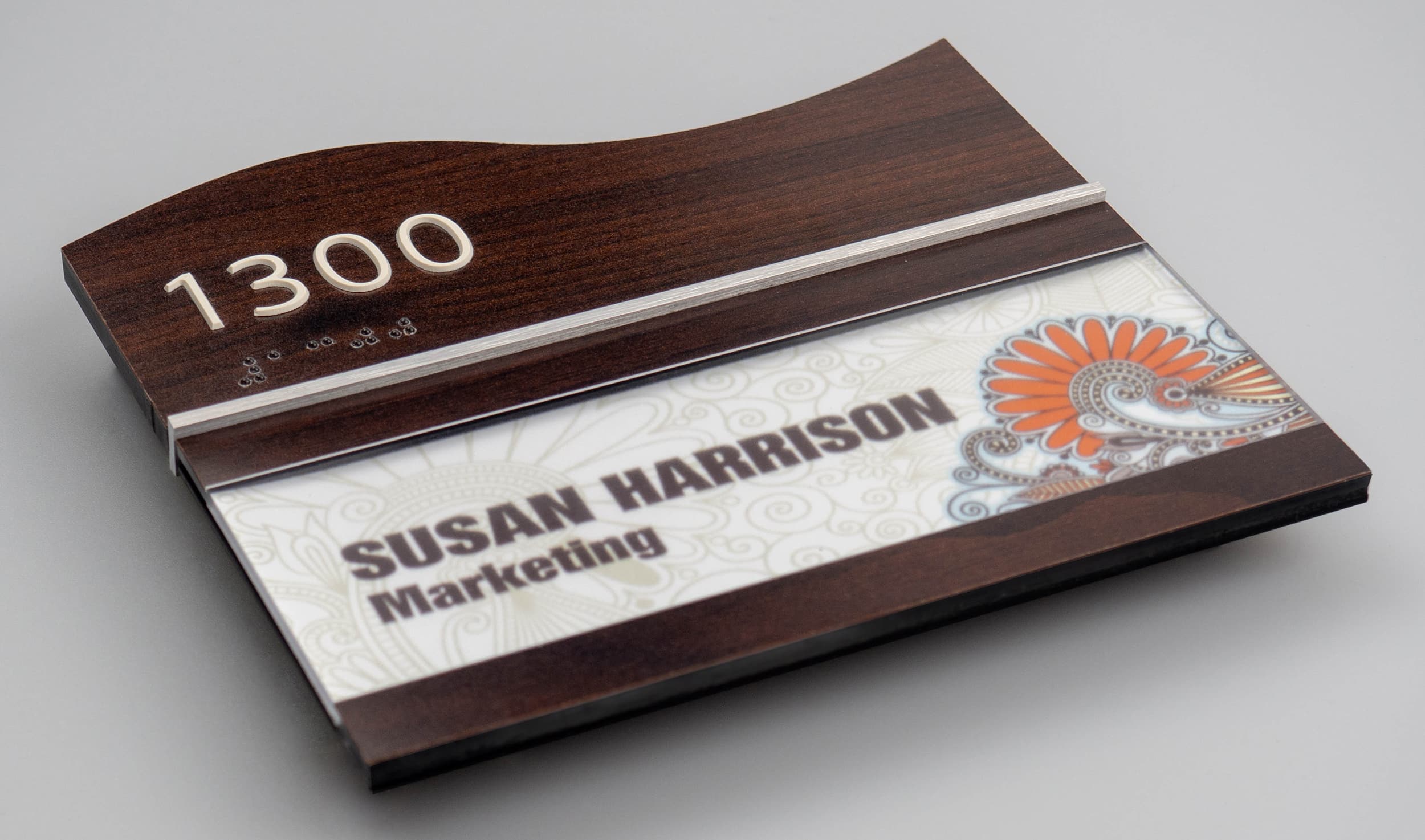
“I think our clients are recognizing the differentiation that can be achieved with attractive signage,” he says. “Developers want to create the ‘in-demand’ or ‘desired’ property to live in, so they’re opting for higher-quality, layered signs or signs that incorporate a wood feature or other element of architectural interest.”
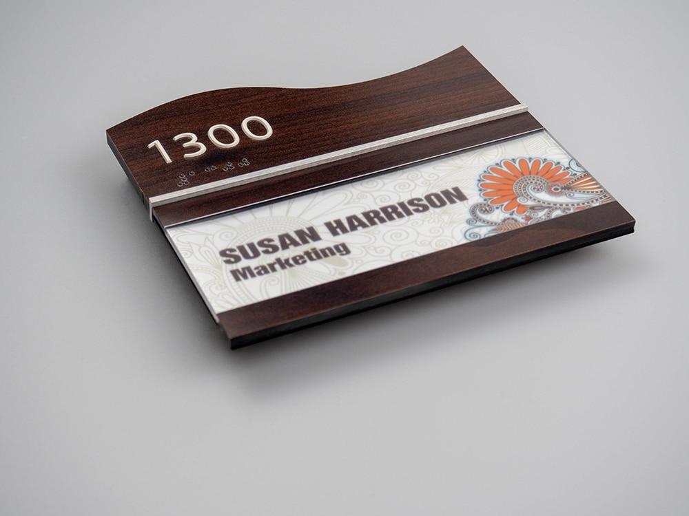
NEW DIMENSIONS: A variety of shapes add interest to contemporary modular sign systems.
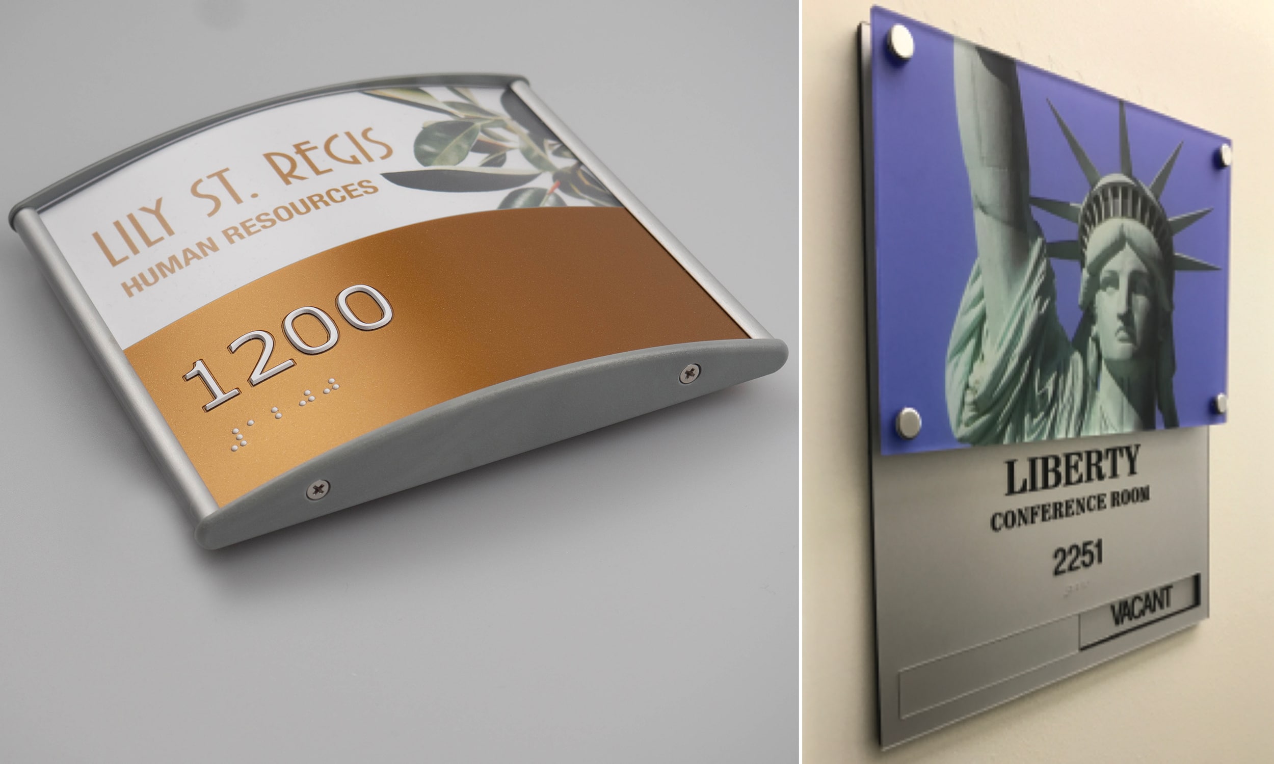
A MODULAR APPROACH
SHOP: Clarke Systems
LOCATION: Allentown, PA
URL: clarkesystems.com
Clarke Systems, a Pennsylvania wholesaler specializing in architectural and wayfinding signage, has been supplying its modular sign systems for building and lobby directories and more to signshops across the country for nearly 40 years. Clarke is the sole North American distributor for the SLATZ line of modular sign products, which includes vinyl signs as well as paper-insert and engraved-insert options.
“The Slatz system, which came to the marketplace in the late 1970’s, was one of the first modular sign systems that could — using parts and pieces made from aluminum extrusions and injection molded plastics — be used to create any type of signage that might be needed,” explains Charles Kelly, Jr., Clarke Systems’ president. “So, from this series of parts and pieces, we can make a desk sign, a door sign, a panel sign, a projecting sign and more.”
Advertisement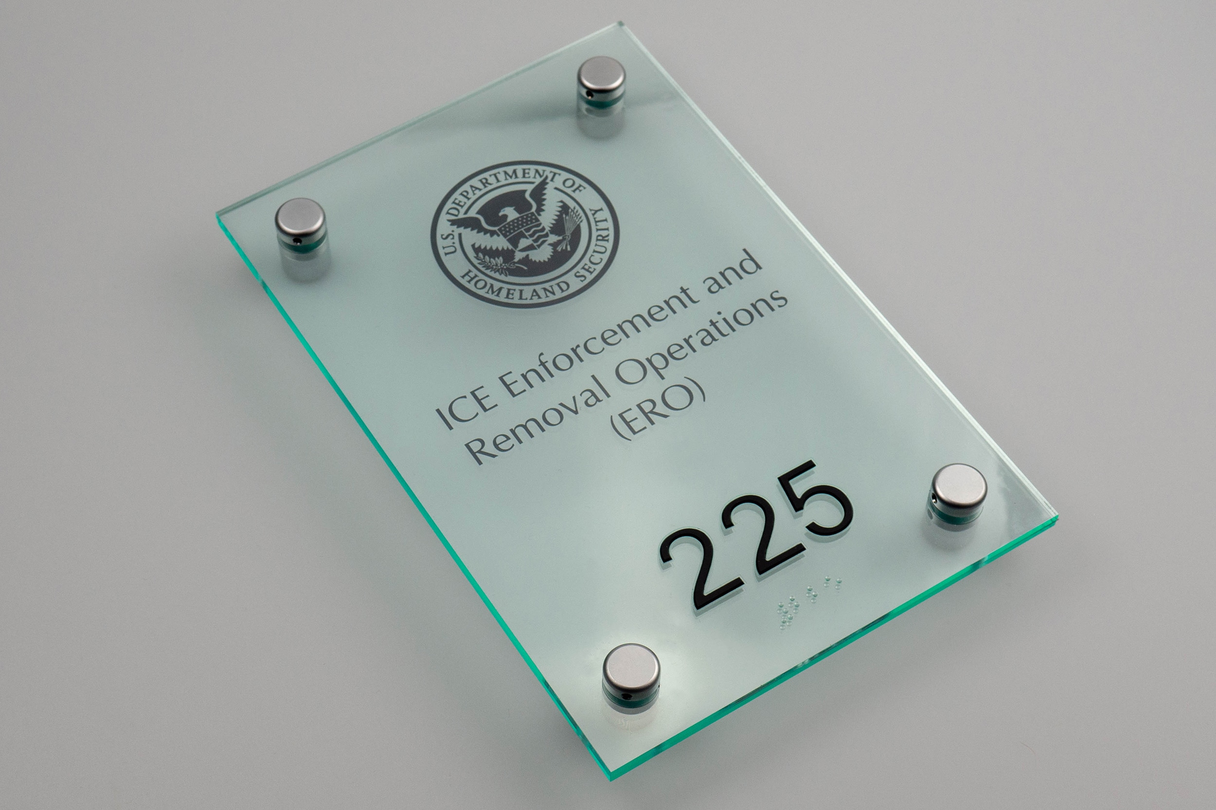
Clarke partners with suppliers to source the extruded aluminum panels that form the basis of their modular signs. It then laminates the extrusions — both faces and edges — using Avery Dennison Graphics Solutions premium color films to match customized colors requested by their clients.
“We have been able to perfect our wrapping process to the point that if I were to send you an extrusion, you would not be able to tell the difference between our wrapping and paint,” Kelly says.
For the sign production processes it does in house, the Clarke Systems team frequently uses a Direct Color Systems Direct Jet flatbed inkjet printer and Gerber routers for cutting, especially when delivering a pre-cut kit.
Increasingly, within the last 10 to 15 years, demand has been moving away from modular signs that use surface-applied, vinyl-cut graphics in favor of modular systems that rely on paper inserts, Kelly says. “So, instead of having a directory with multiple panels where each panel has a single line of text, there’s larger demand now for a directory sign with a single, full window that allows you to slide in a digital print that conveys the same information,” he explains, noting that Vista System signs were a key driver of this change.
In recent decades, Kelly has also seen rising demand for modular sign systems that incorporate curves, innovative shapes and dimensionality — rather than only linear rectangular panels. “There has been an evolution in the sign world, since 2000, where we’ve moved into more shapes. These signs are also made of multiple layers, rather than just single bodies of aluminum,” he says.
When signshops source wayfinding signage for their clients through Clarke Systems, the wholesaler is able to provide both the sign materials — exit markers, door ID labels and so on — as well as overall messaging and location planning assistance. “We can create a sign style, but we also do the messaging schedules [a plan noting what each sign will say],” Kelly says. “And we can also take a floor plan of the facilities and mark the location where every sign will go.”
Kelly says these additional services allow sign companies to feel confident taking on a wayfinding project even for clients who are not currently working with their own designer or architect.
If the signshop knows they have this support, they can take these wayfinding projects on as a revenue generating opportunity, Kelly says. “We’re able to basically expand their company.”
PHOTO GALLERY (23 IMAGES)
📷: Clarke Systems | Crown Sign Systems | Sequoia Signs & Graphics


Introducing the Sign Industry Podcast
The Sign Industry Podcast is a platform for every sign person out there — from the old-timers who bent neon and hand-lettered boats to those venturing into new technologies — we want to get their stories out for everyone to hear. Come join us and listen to stories, learn tricks or techniques, and get insights of what’s to come. We are the world’s second oldest profession. The folks who started the world’s oldest profession needed a sign.


NUtec Digital Ink Invests in Solar Energy for Facility

5 Reasons to Sell a Sign Company Plus 6 Options

21 Larry Albright Plasma Globes, Crackle Tubes and More


Bulletins
Get the most important news and business ideas from Signs of the Times magazine's news bulletin.
-

 Tip Sheet2 weeks ago
Always Brand Yourself and Wear Fewer Hats — Two of April’s Sign Tips
-

 Photo Gallery4 days ago
30 Snapshots of the 2024 ISA Sign Expo
-

 Ask Signs of the Times6 days ago
Why Are Signs from Canva so Overloaded and Similar?
-

 Real Deal2 weeks ago
A Woman Sign Company Owner Confronts a Sexist Wholesaler
-
 Paula Fargo1 day ago
5 Reasons to Sell a Sign Company Plus 6 Options
-

 Benchmarks1 week ago
6 Sports Venue Signs Deserving a Standing Ovation
-
 Photo Gallery1 day ago
21 Larry Albright Plasma Globes, Crackle Tubes and More
-

 Women in Signs2 weeks ago
2024 Women in Signs: Megan Bradley