Dimensional Signs
A Sense of Place
Restaurant projects from Ohio to California define the flavor of local community.
What’s the first thing you talk about when you’re describing a cool, new neighborhood or your most recent travel destination? I might be a little food-obsessed, but I don’t think I’m alone when I say the most memorable part of a place for me is the restaurants. I’ll never forget the plantain-wrapped sushi I ate in Costa Rica, nor the open-air restaurant’s view of the full moon that I basked in. And every spring, I await the opening of Tucker’s Whippy Dip, a walkup ice cream shop that still doesn’t take credit cards, and I hope they never do. My favorite thing about my office is the bacon-topped doughnuts I can get across the street, and every day I walk underneath the Holtman’s sign, a doughnut with a bite taken out of it, and think Wow, this city is cool. Food often acts as an anchor, bringing us a sense of place and belonging within the community.
And it’s more than just the food. The atmosphere, the views and the style of a restaurant say a lot about what you’re going to get when you walk in. And that starts, of course, with the sign at the door, which is why, for these three restaurants, a sense of place was everything.
ENERGY AND LIGHT
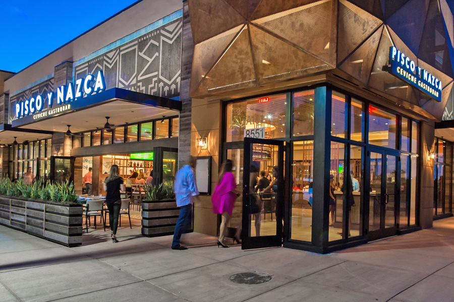
Downtown Doral, FL, located outside of Miami, hasn’t always been known as a go-to for fine dining. But that perception is rapidly changing; the city’s population has grown almost 30% in less than a decade thanks to a renaissance in the form of a master-planned, mixed-use urban space. The neighborhood now features spots like Peruvian gastropub Pisco y Nazca. Seated on prime corner real estate, Pisco y Nazca sports a 750-sq.-ft. façade that melds together intricate metalwork and lighting. Its menu features exotic choices from grilled beef heart to squid ink noodles, locally sourced snapper, and more. And that adventurous-yet-rooted spirit is reflected in every inch of the design of the restaurant, from its reclaimed wood and metal piping details on the interior to the illuminated, dimensional display outside.
Every choice feels like it was made on purpose, and according to the founder and principal of Celano Design Studio (New York), it was. “The sign material, the look, and the lighting are all very specific to a brand’s identity,” said Vincent Celano. The restaurant’s façade, of course, is the first step in establishing that identity. “I always say you want to capture the audience from a few blocks away; have that moment; create an interest,” he added. “And then as you get closer, you start understanding what the concept is, and then when you’re standing directly in front of the building, there’s a connection.”
Celano’s vision for that connection comprised a multifaceted, perforated metal panel with a copper finish that would transform with the light of the day. At night, edge-lighting, backlighting, and up-lighting would bring a theatrical effect to “really activate the architecture,” Celano said. “It’s not a run-of-the-mill, pick-out-of-the-catalog type of signage.”
VISION IN MOTION
American & Interstate Signcrafters (Islip, NY) got its start in architectural metalwork when executing a signage package at the Barclays Center in Brooklyn, NY: The designers wanted interior and exterior metalwork that would echo the look and feel of old Brooklyn, and said, “I wonder who we could get to do this.” American & Interstate owner Jeff Petersen said, “We can.”
AdvertisementFrom there, it was good old word of mouth. DS Jordan Construction (North Miami, FL) was the contractor on the Pisco y Nazca project and had a good working history with American & Interstate, and recommended them for the job.
“We said, ‘We can pull off the vision,’” said Lisa Johnson, senior VP at American & Interstate. “So we did.”
The team created a model of the façade in SketchUp 3D software for the client to approve and for the production team to base their work on. “It wasn’t just a pretty storefront,” said Johnson. “It needed to work. It needed to really be a piece of the building that functioned properly.”
The façade was built from 66 unique, ½-in. aluminum plate cross members that were output directly from the 3D model via an AXYZ router. The pieces had to fit together like a jigsaw puzzle, and that puzzle had to be tested – the whole “monstrosity,” said Johnson – before being sent out into the field in pieces. The exterior was covered in McNichols perforated aluminum and hand-painted.
Then came the lighting. Installers mounted Philips Color Kinetics Color-Blast Powercore fixtures to metal brackets from the top of the screen structure to provide colored lighting that can change for special events. White linear strip lights by Boca Flasher provided a baseline near the viewer’s line of sight.
The project took roughly six weeks, in part due to back-and-forths with the city about permits. “Cities don’t like monstrosity,” laughed Johnson. But the project was completed on time, and the client was thrilled.
AdvertisementJohnson said it doesn’t always come together so easily: “Sometimes when architects draw something up, and the customer is absolutely head-over-heels in love with the idea, it can be very difficult to translate into a manufactured piece that works. To tie all of that together” – if they do say so themselves – “was truly a work of art.”
A TRUE AMERICAN TOWN

It only takes a few minutes on the phone with Lois Wellner to realize that the owner of Signery2 (Hamilton, OH) is a no-nonsense woman. Her 3,000-sq.-ft. shop sits on her 12-acre farm, about 40 minutes northwest of Cincinnati. Wellner started out as a journeyman sign painter in the ’70s, took a commercial art course and has been making signs ever since.
Connie Fessler, co-owner of Fessler’s Legendary Pizza and Hoagies across the river in Bellevue, KY, found Signery2 online. After operating under the Pasquale’s franchise for 50 years, the Fessler family purchased the pizzeria and rebranded under their own name, and a new name, of course, necessitates new signage.
Fessler has a background in design, typography and branding, so she knew it would be critical to maintain continuity, especially in the classic American small town of Bellevue, with the long-loved Pasquale’s brand. The Pasquale’s sign was a sandblasted piece mounted to a bracket that had been there since the building was a hardware store decades prior.
“She had a really nice bracket there,” said Wellner, so they decided to simply fit the new sign to it. Fessler herself designed the logo; Wellner cut the 72 x 35-in. sign on a Vytek router – a “dinosaur,” she said, that she bought in 1999 – sandblasted it, and finished with metallic gold Porter Advantage 900 paint. It’s the perfect fit for a good old American town.
AdvertisementLIFE OF LA FIESTA

When Alvaro Rodriguez’s daughter was born in 2012, it didn’t take him long to realize that his career as a traveling color management consult-ant was at a crossroads – it was time to stay local. He considered his 20 years’ experience in the printing industry and landed on digital printing as an area of huge potential. Rodriguez had worked frequently with white ink in the packaging industry and saw an opportunity to test the limits of white inkjet ink, as well as his own creativity. He bought a UV printer and launched ARB Digital (Sacramento, CA). Simple as that.
ARB started out printing phone cases and then moved on to imaging tile. The first sign of success was a slew of customized, photographic coasters that flew out the door during the holidays. And then Rodriguez thought, “What other markets are out there?” That’s when he zeroed in on the restaurant and interior design industries.
“Next thing you know, we’re printing menus on wood; we’re printing tile; we’re printing on aluminum and really playing with the texture so that the images shimmer,” Rodriguez said.
One longtime client is La Fiesta, a local chain of Mexican restaurants. ARB printed artwork, menus and more onto reclaimed wood for La Fiesta’s various locations. When the chain began renovating its Folsom location, Rodriguez saw the chance to print something truly unique.
The Folsom store had an old, hand-painted 14 x 7-ft. canvas that the owner wanted to update. The owner pondered a new canvas or a metallic print, but to match the rustic feel of both the restaurant and the classic western town of Folsom, Rodriguez suggested filling the space with tile.
They brought in a local photographer friend, Bjarne Winkler, who shot pictures of iconic spots around Folsom on a Nikon camera and blended them into a collage of the town’s heritage. ARB printed the collage onto 5 x 5-in. travertine tiles – “a 512-piece jigsaw puzzle,” Rodriguez said – via a Roland VersaUV LEF-12 printer. The shop prints jobs like these in small sections; if tile number 234 breaks, they only have to reprint a 2-ft. section.
The tiles were primed with Rust-Oleum white latex primer – an essential step, according to Rodriguez. Without primer, it’s tough to get ink to adhere to a glossy tile – not to mention the color management challenges of imaging directly on one-of-a-kind natural stone.
Add in the primer and Rodriguez’s formula is simple: “People want unique.” Isn’t that what a place is all about?
Introducing the Sign Industry Podcast
The Sign Industry Podcast is a platform for every sign person out there — from the old-timers who bent neon and hand-lettered boats to those venturing into new technologies — we want to get their stories out for everyone to hear. Come join us and listen to stories, learn tricks or techniques, and get insights of what’s to come. We are the world’s second oldest profession. The folks who started the world’s oldest profession needed a sign.


5 Reasons to Sell a Sign Company Plus 6 Options

21 Larry Albright Plasma Globes, Crackle Tubes and More

Orbus Celebrates Earth Day With Recycling Achievements


Bulletins
Get the most important news and business ideas from Signs of the Times magazine's news bulletin.
-

 Tip Sheet1 week ago
Always Brand Yourself and Wear Fewer Hats — Two of April’s Sign Tips
-

 Photo Gallery3 days ago
30 Snapshots of the 2024 ISA Sign Expo
-

 Ask Signs of the Times5 days ago
Why Are Signs from Canva so Overloaded and Similar?
-

 Real Deal2 weeks ago
A Woman Sign Company Owner Confronts a Sexist Wholesaler
-

 Benchmarks1 week ago
6 Sports Venue Signs Deserving a Standing Ovation
-
 Photo Gallery5 hours ago
21 Larry Albright Plasma Globes, Crackle Tubes and More
-

 Women in Signs2 weeks ago
2024 Women in Signs: Megan Bradley
-

 Women in Signs1 week ago
2024 Women in Signs: Ashley Borell