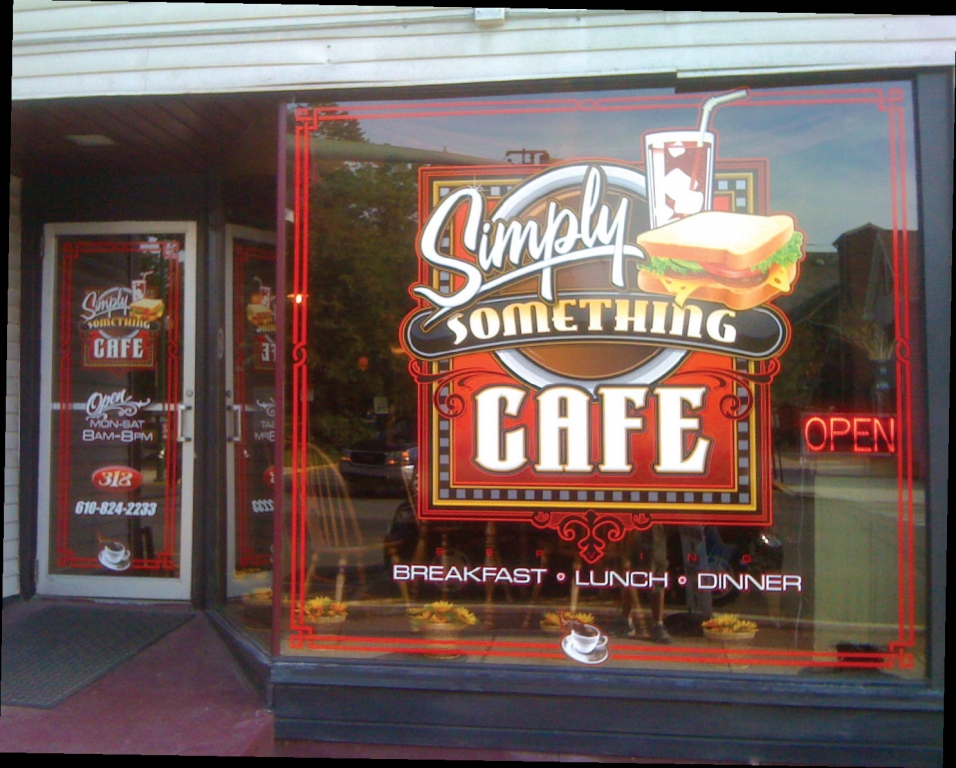
Debby McDermott, the owner of the Simply Something Café in Palmerton, PA, a town of approximately 5,000 near Allentown, wanted inviting window and door graphics for her eatery. Something classy and cordial, but not pretentious – in other words, suitable for a place that’s offered chicken pot pie and bacon cheeseburger soup as specials, and touts “Baby Back Ribs Night” on its Facebook page.
She hired Jason Nale, proprietor of Nazareth, PA’s Originale Designs, to develop the graphics. Describing himself as “the son of talented artists who never dreamed of being anything else,” Nale offers wrap and banner production, 3-D-sign fabrication, and an array of illustration and branding services.
When making his color and typography choices for the logo, Nale considered what he’d find most appealing if he wanted to find an upscale diner. First, he wanted a vibrant color contrast; red, white, black and a few other complements would grab attention. Then, he wanted to layer three fonts attractively.
For the top row, he chose the upbeat, underlined A&S Signwriter script, with an appetizing photo of a cold-cut sandwich and soda. For the middle layer, within a slightly arched banner scroll, he used East Market (a personal favorite, Nale said), with a subtle, gold-to-white fade. (“Something” is a word that piques curiosity anyway.) For the last layer, “Café” is rendered in LHF Valencia.
Nale specified the logo, which measures 77 x 64 in. It was printed on Oracal’s Orajet® 3651, a 2.5-mil, calendered film with a transparent, permanent adhesive intended for flat surfaces or those with simple curves or contours. The company outsourced printing to wholesaler Signs365.com. He now subcontracts printing because a lightning strike on Nale’s building fried his printer’s electronics, and he declined to incur the expense and upkeep of a new printer.
“Normally, I don’t like to seam any graphics I produce,” Nale said. “But, because of the size, I thought it was necessary for this logo. To make the seam inconspicuous, we did it horizontally on a curve below the bottom edge of the ‘Something’ banner. It’s almost invisible, and I’m very pleased with the end result.”
The border and complementary lettering on the door graphics were produced with FDC vinyl, which Nale cut on a GCC VE Jaguar cutting plotter. All told, the installation required approximately a day and a half for both the window and door.
Advertisement
Although Nale hasn’t eaten the food at Simply Something – he cites a strict diet – he said the place is best known for its blue potato chips.


 Tip Sheet1 week ago
 Photo Gallery2 days ago
 Ask Signs of the Times4 days ago
 Real Deal2 weeks ago
 Benchmarks1 week ago
 Women in Signs2 weeks ago
 Photo Gallery1 week ago

 Women in Signs1 week ago