3 of the Year’s Toughest Channel Letter Sign Projects
Size, weather and rebranding challenges overcome with teamwork.
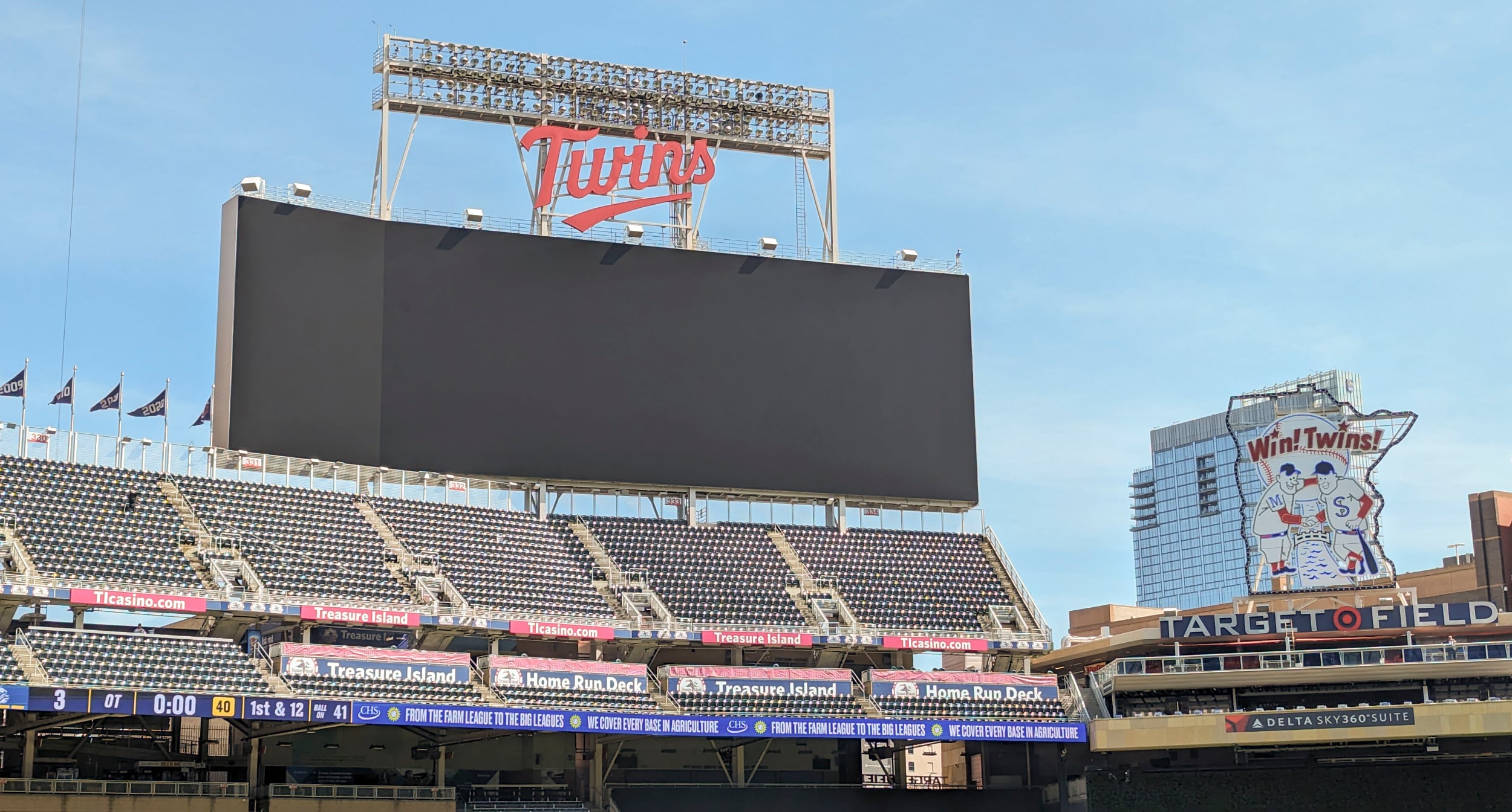
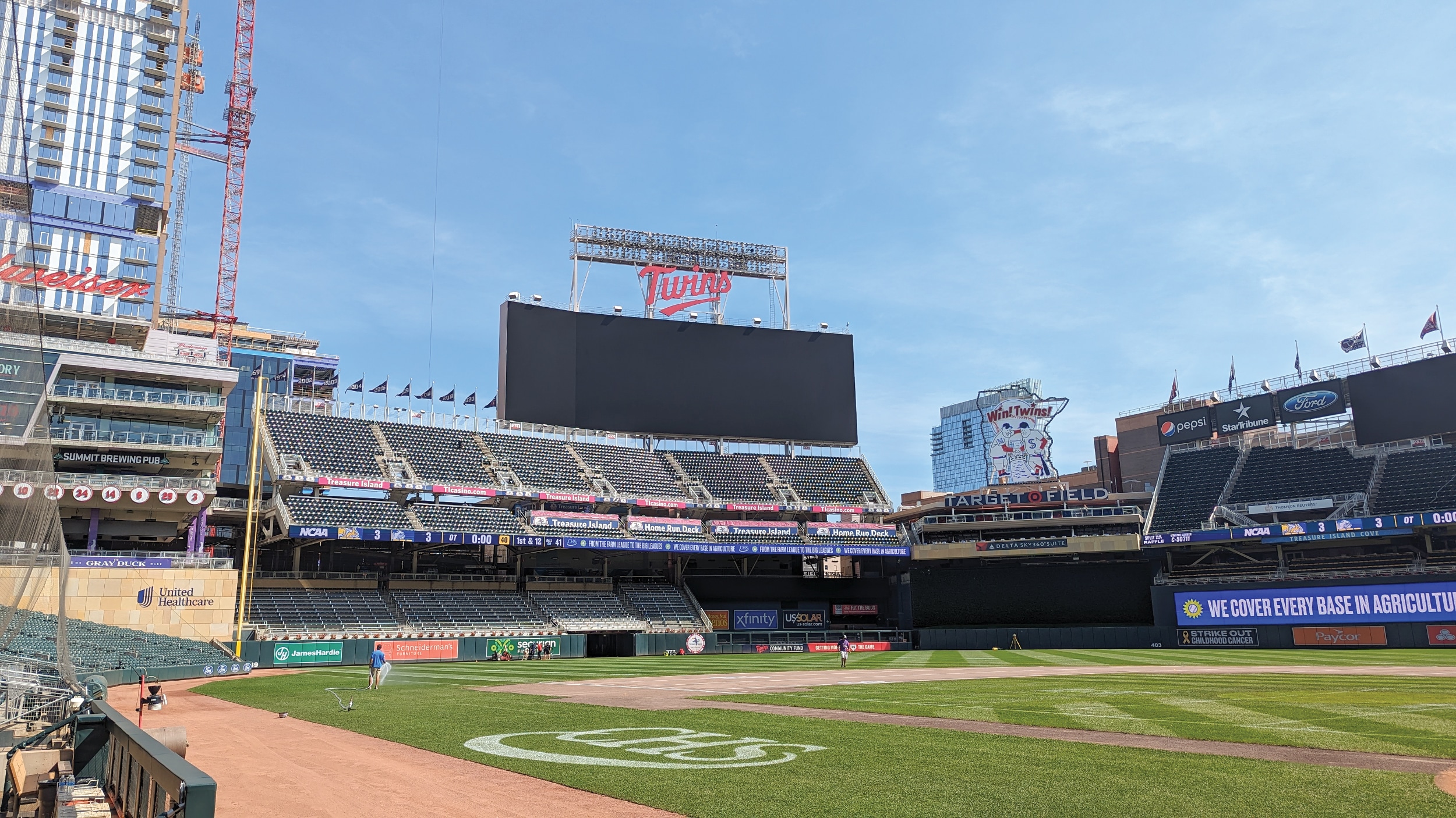
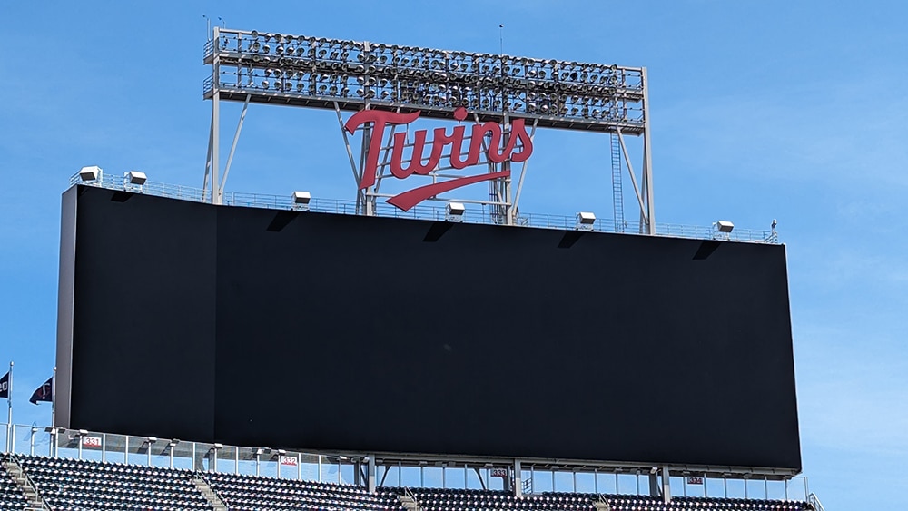
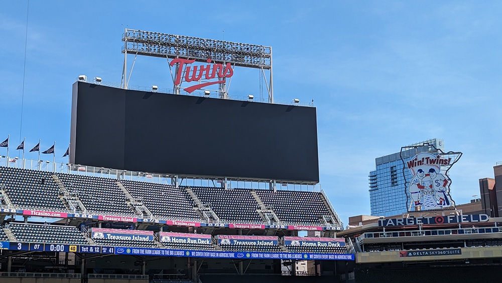
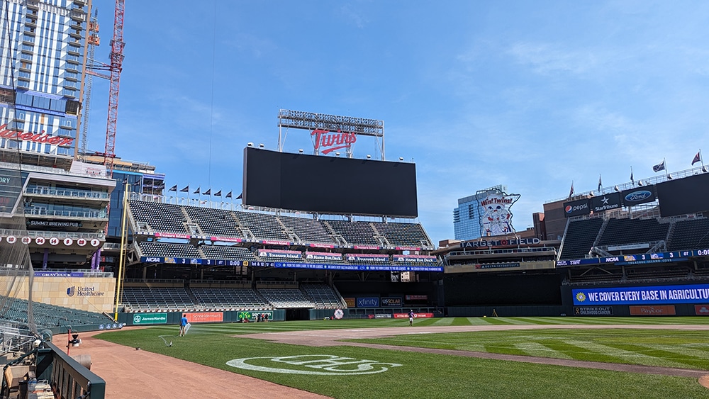
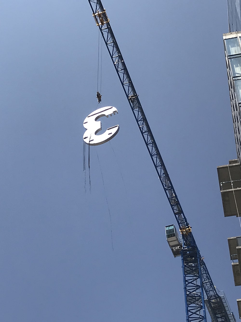
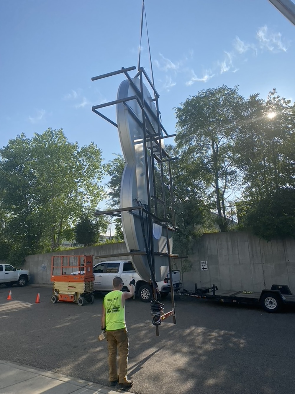
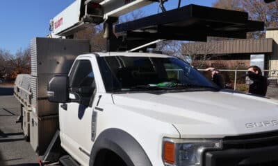
SHANE BOSKOVICH WAS anxiously watching the winter weather forecast. As the general manager of Albrecht Sign Co. (Fridley, MN), it was his responsibility to monitor the Minnesota precipitation in January 2023, as he and his team were erecting an important channel letter sign on the Minnesota Twins new scoreboard at Target Field. It needed to be ready for opening day on April 6. One challenge — and there were many — was to remove an old sign, fabricate and install the new 322 x 568.75 x 12-in.-deep sign 240 ft. above the field within a tight deadline during the dead of winter.
“Weather is always a factor in our industry, especially during January and February,” says Boskovich. “It is enhanced when working at extreme heights. There were a few days that welding could not take place due to precipitation and a few afternoons when the wind picked up and we followed our safety plan to not continue lifting with the crane. There’s not much we can do other than work longer days and the weekend to catch up when the weather is more favorable.”
 Every sign company loves projects where millions of fans will see your work annually.
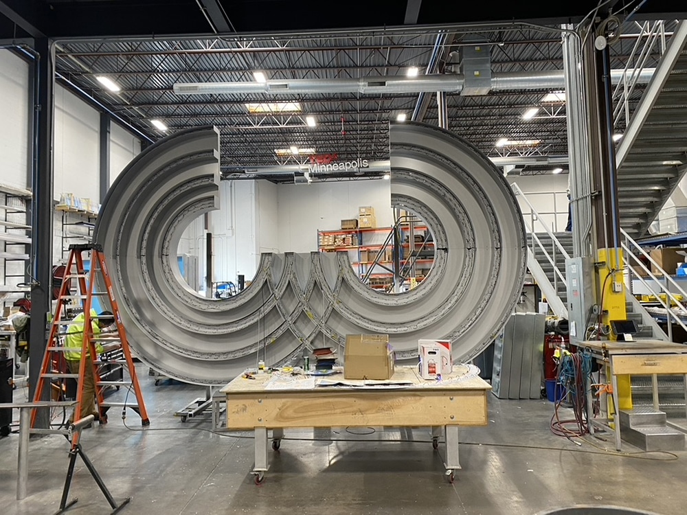
But weather wasn’t the only obstacle. The firm — aided by wholesaler Quality Manufacturing (St. Paul, MN) fabricating the iconic T-W-I-N-S logo — faced design, mounting, transportation, accessibility and scheduling hurdles.
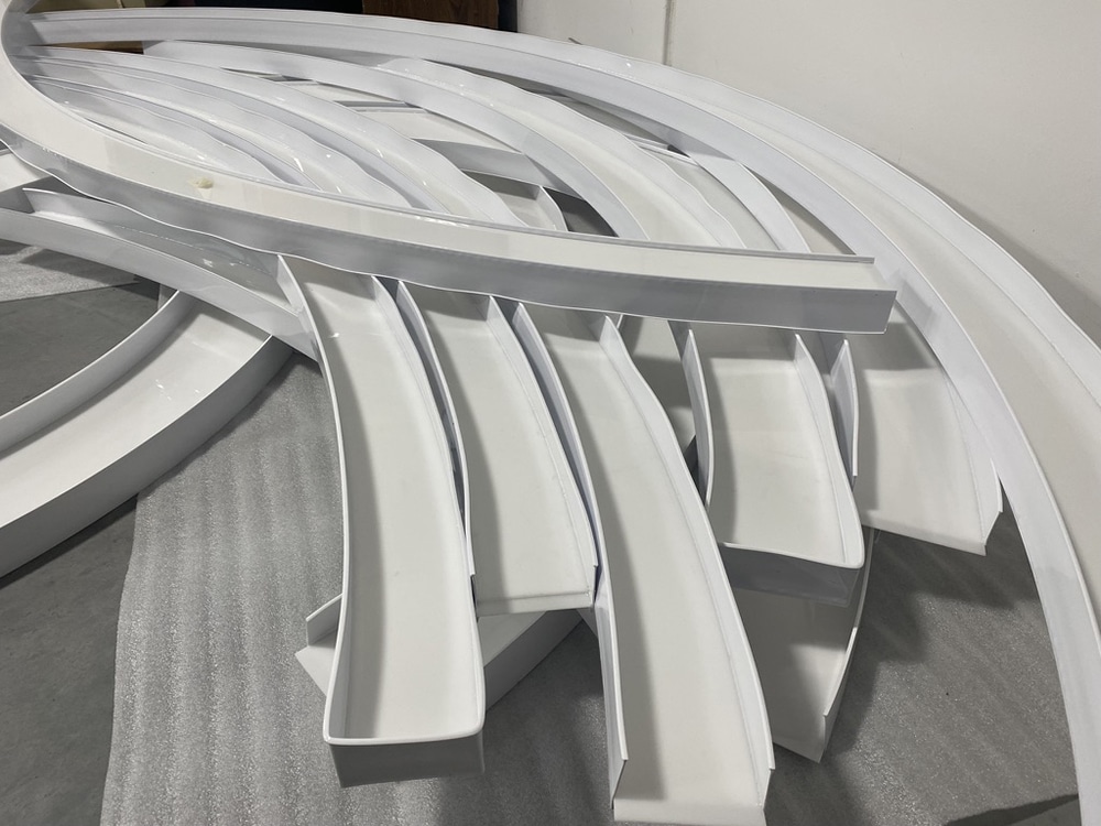
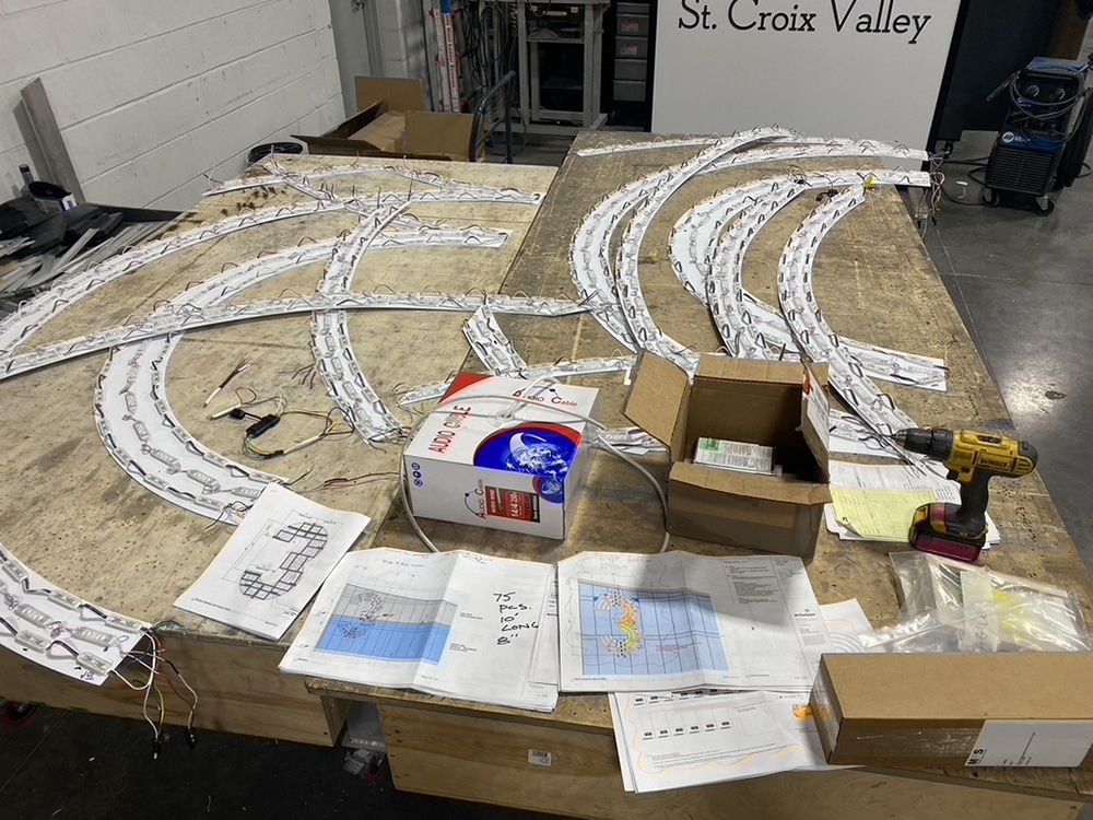
To fabricate the T-W-I-N-S logo, Quality Manufacturing used its ShopSabre IS-M 612 CNC router, an EFI VUTEk GS3250 Pro printer and Millermatic 350P welder. They fabricated the main structural component of the channel letters with a double rectangular tube frame that consisted of 2 x 1 x .125-in. aluminum tube, cut and rolled to specific shapes to create the final intended design. The shapes were then wrapped with .080 aluminum sheets permanently fastened to the rectangular tube structure. Next, .125-in. aluminum sheets were fastened to the back to close off the frame and create a source for external mounting clips. Lastly, the team used an extruded aluminum retainer system to create the face border to which the .177 white acrylic faces with custom color UV digital prints would be able to slide into place.
The recognizable logo’s letters were loaded with 936 Hanley Phoenix PF-3120 Red LED modules and 10 Hanley 120W and three 60W power supplies. Digitally printed 3M Scotchcal Graphic Film IJ3650 with 3M Scotchcal Luster Overlaminate 8519 completed the faces.
One of the first major difficulties was mounting a new letter profile to an existing steel structure. Albrecht solved the problem by using SolidWorks 3D CAD modeling software to adjust portions to fit the new design. Another challenge was the overall size constraints, with the large-scale letter forms tough to keep visually seamless, Boskovich says.
Because the script letters were mostly one piece, Boskovich recalls, getting them loaded safely on a trailer and transported from Quality’s facility to the ballpark were critical. Oversized load road permits were required.
Once the sign arrived at Target Field, the sign’s installed height would make accessibility to its internal components nearly impossible. Thus, the team seamed the rear panels of the signage to match the structure, which allowed access throughout the entire unit.
The team installed the field-facing script letters with a crane. They erected a four-level scaffold above the top level of the catwalk around the steel, and above the top level of the scoreboard. From the scaffolding they worked to install new steel, move some of the old structure and weld the new letters in place.
Weather notwithstanding, the team was always under scheduling constraints. “We had to complete our own work in a timely fashion because other trades had to finish their work on time,” says Boskovich. “It can be challenging to coordinate all fabrication and on-site crew departments.”
The project took seven months from start to finish. All of the equipment had to be removed so that new sod could be laid before opening day this past April 6.
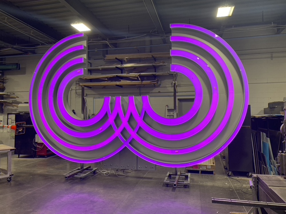
Advertisement 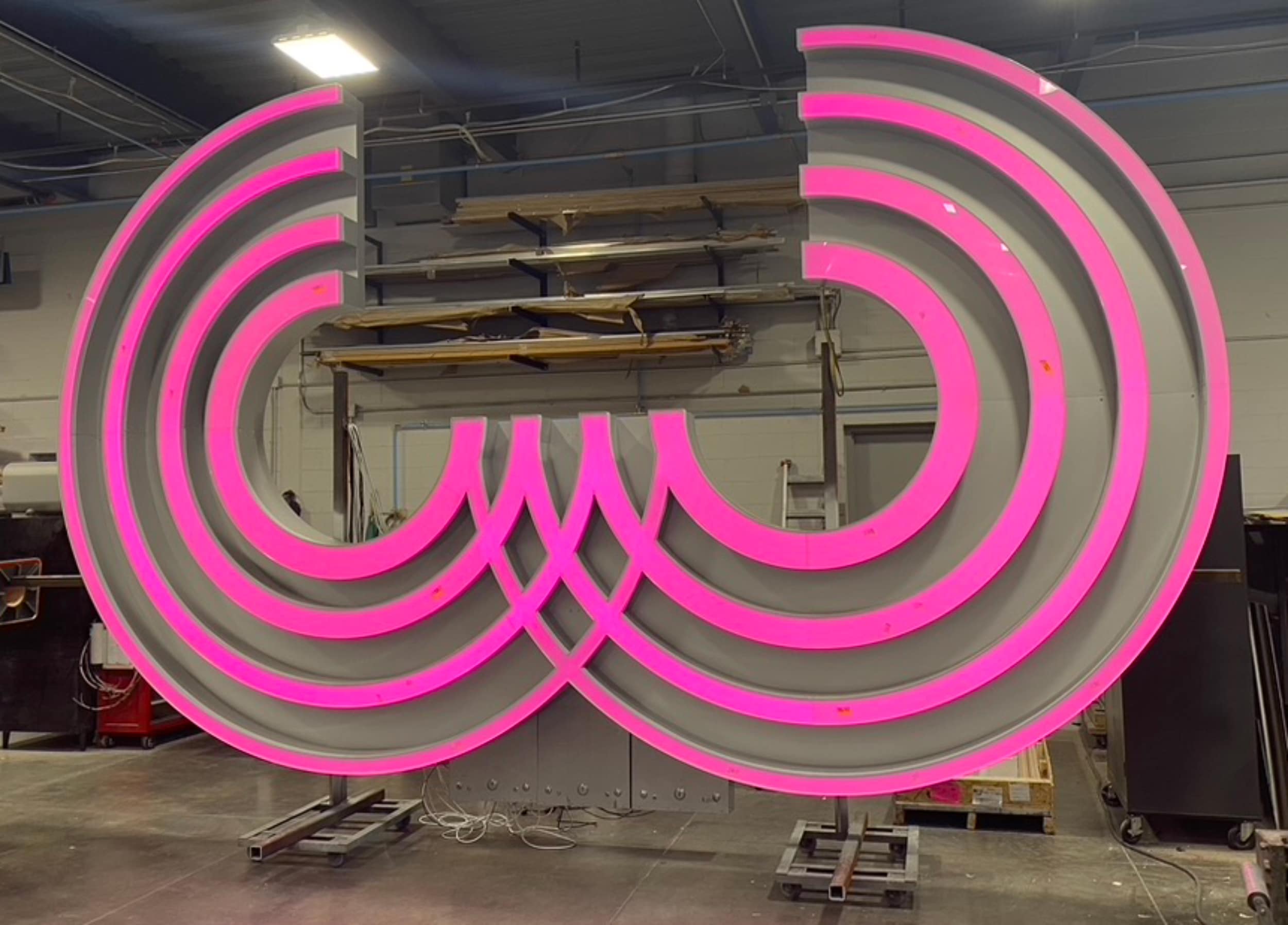 Who? Who does not want to look at the ribbon?
RUN TO THE LIGHT
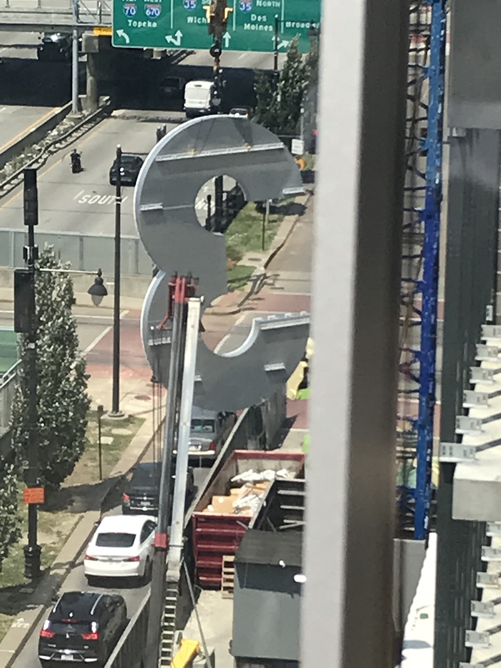
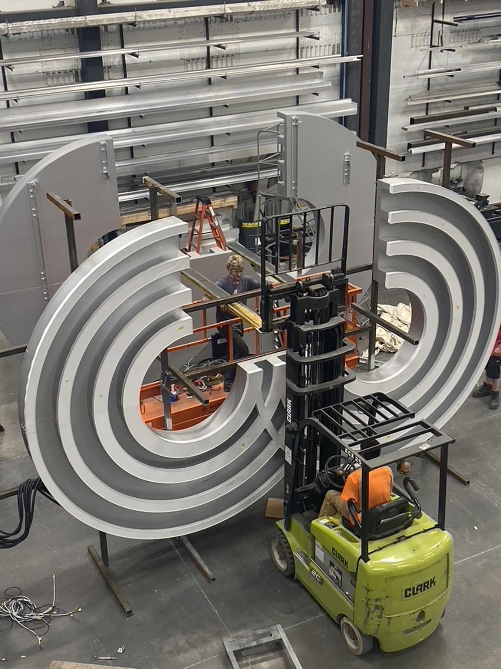
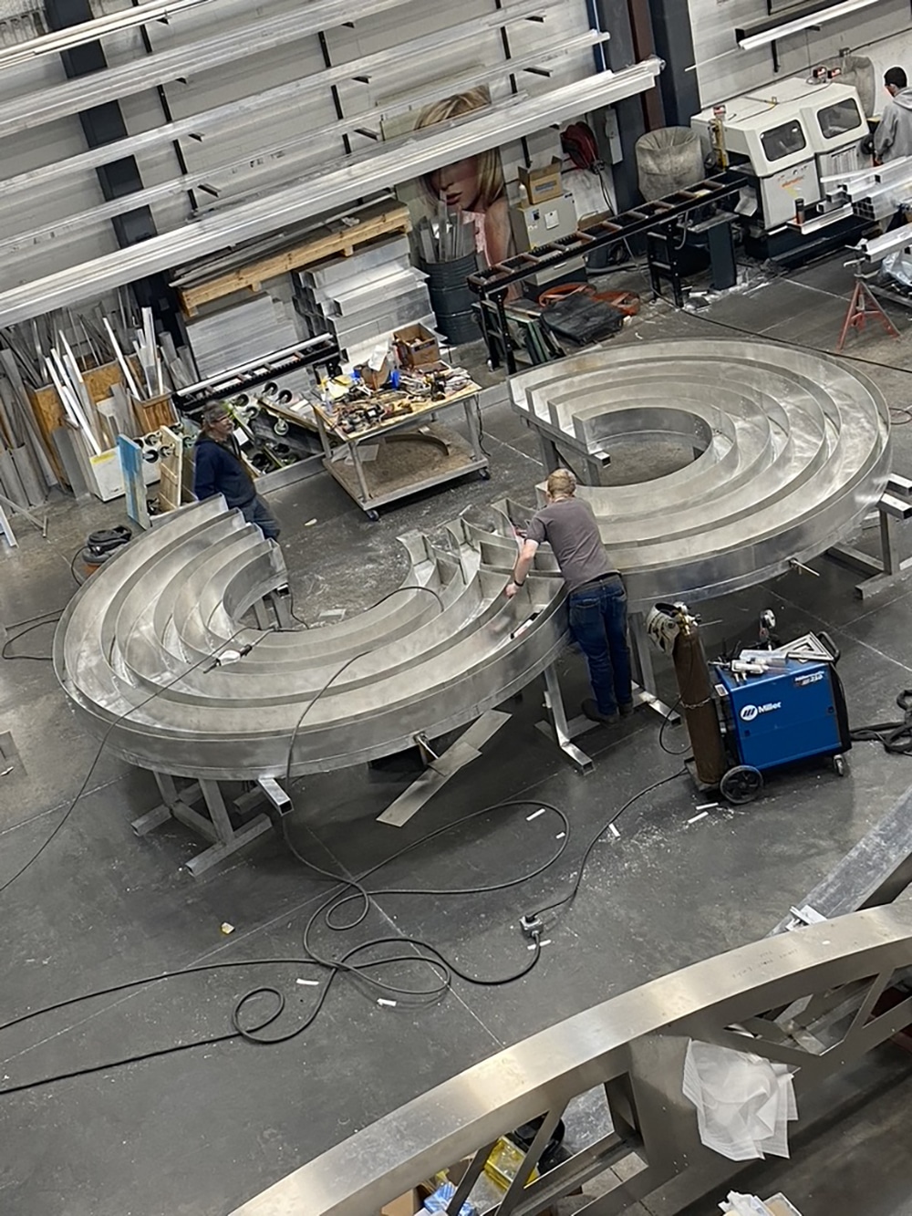
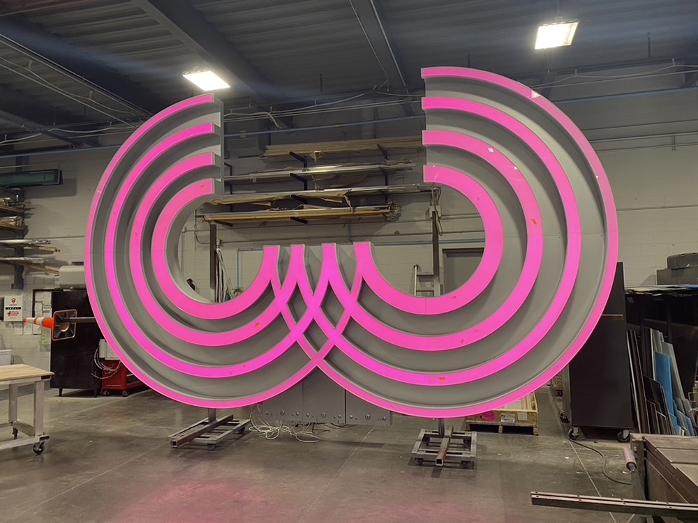
Sitting atop a newly opened luxury high-rise residential tower in the Power & Light district of Kansas City, MO, shines the city’s newest beacon: a 20-ft.-tall rooftop sign in a ribbon style depicting the #3 perched on top of a 20-story building. The Three Light project, completed for the Cordish Companies, is designed to draw people to a dynamic, new nine-city-block retail, entertainment, office and residential district, located in the heart of downtown. What onlookers do not realize is the story behind the sign.
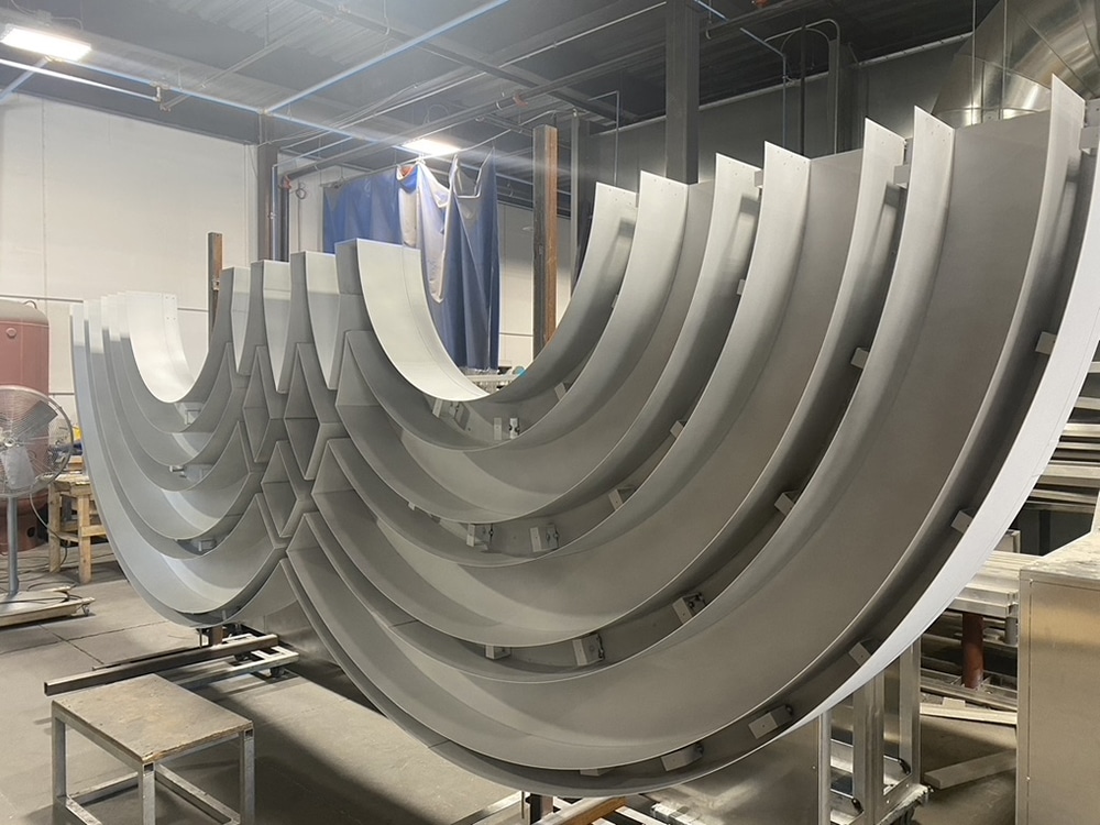
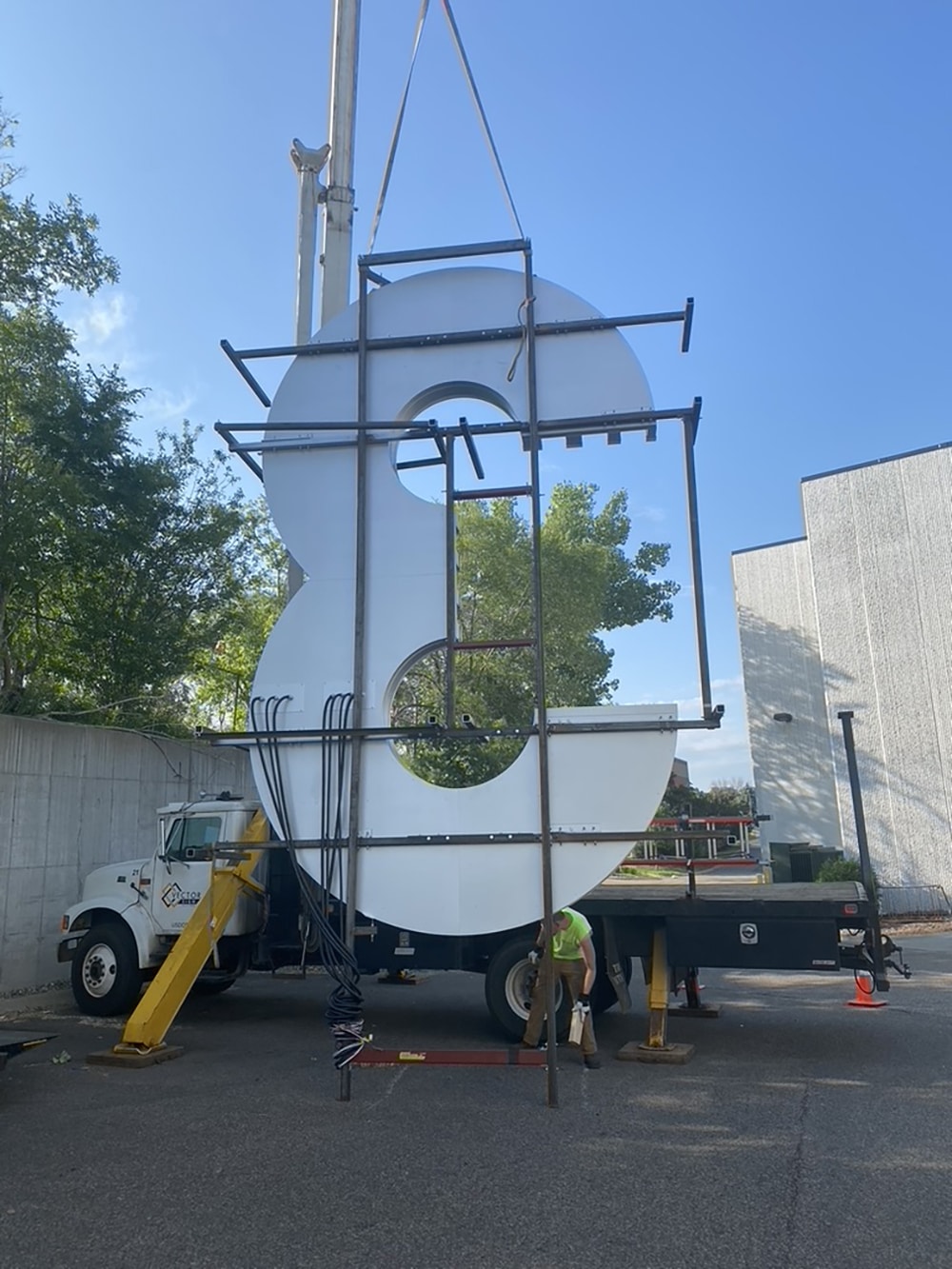
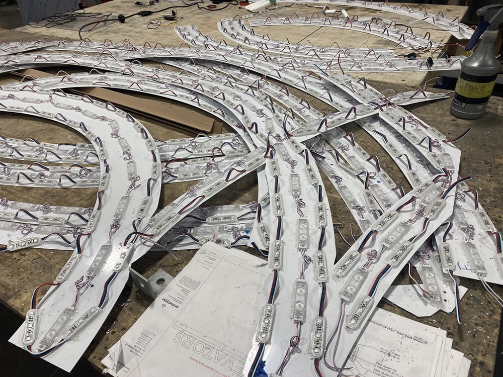
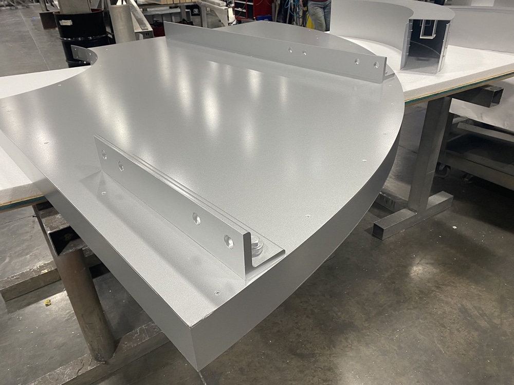
“Its complex fabrication, its massive size and complicated installation were the top three challenges,” says Gary Stemler, vice president of Archetype (Minneapolis), which received the project and its design from John Lutz, partner of Selbert Perkins Design (Chicago). The two teams worked on how best to fabricate and install the signage. Archetype constructed the #3 using aluminum and some steel subframe, with high-impact acrylic faces held by 2-in. trim cap. Making the ribbon style with three thin strokes 20 ft. tall was pretty complex, Stemler says.
Among the tricky parts were the LEDs and drivers, he says, as well as the computers that run the drivers and animators, as the sign features RGB illumination programming for different colors during holidays or special occasions. Archetype turned to LED manufacturer Bitro Group’s OpticsPro X Series bright white and OmegaMax RGB M3C medium body LED modules, running on a Bitro Pharos control system.
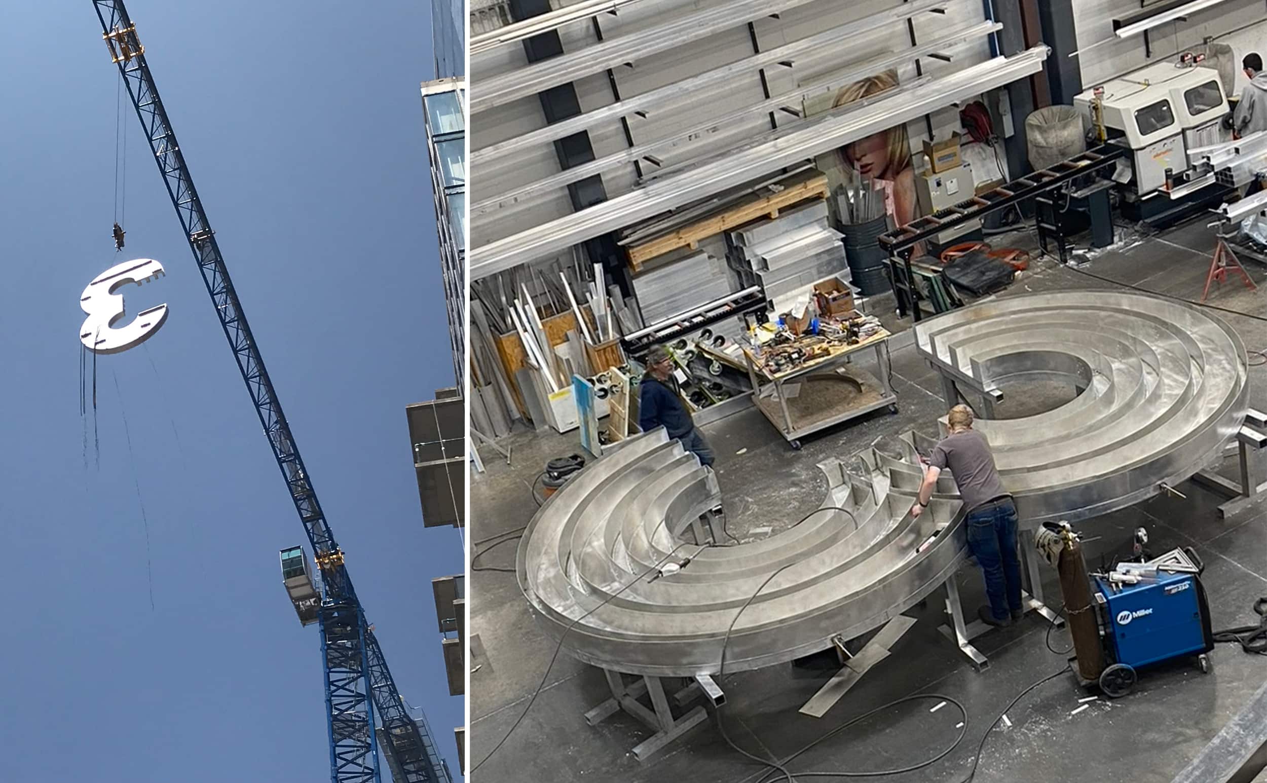
The team at Archetype developed many scaled prototypes of the sign before the final version was fabricated in the company’s yard. They then lifted it by crane in their parking lot, just like it would be in Kansas City. The team videotaped the assembly/reassembly system and discovered that the illumination had to be boosted for increased brightness.
To travel south to KC, the immense sign had to be disassembled into three sections. Once on site, the sign was reassembled and crane-installed. Archetype partnered with local installer Excel Lighting and Signs.
After six months from contract to installation, the Three Light building opened in early September with its distinctive top. “The client is very happy with the channel sign,” Stemler says. “It attracts people to the location, acting as a beacon in the district. It designates the Second Light building from the Third Light.”
Advertisement 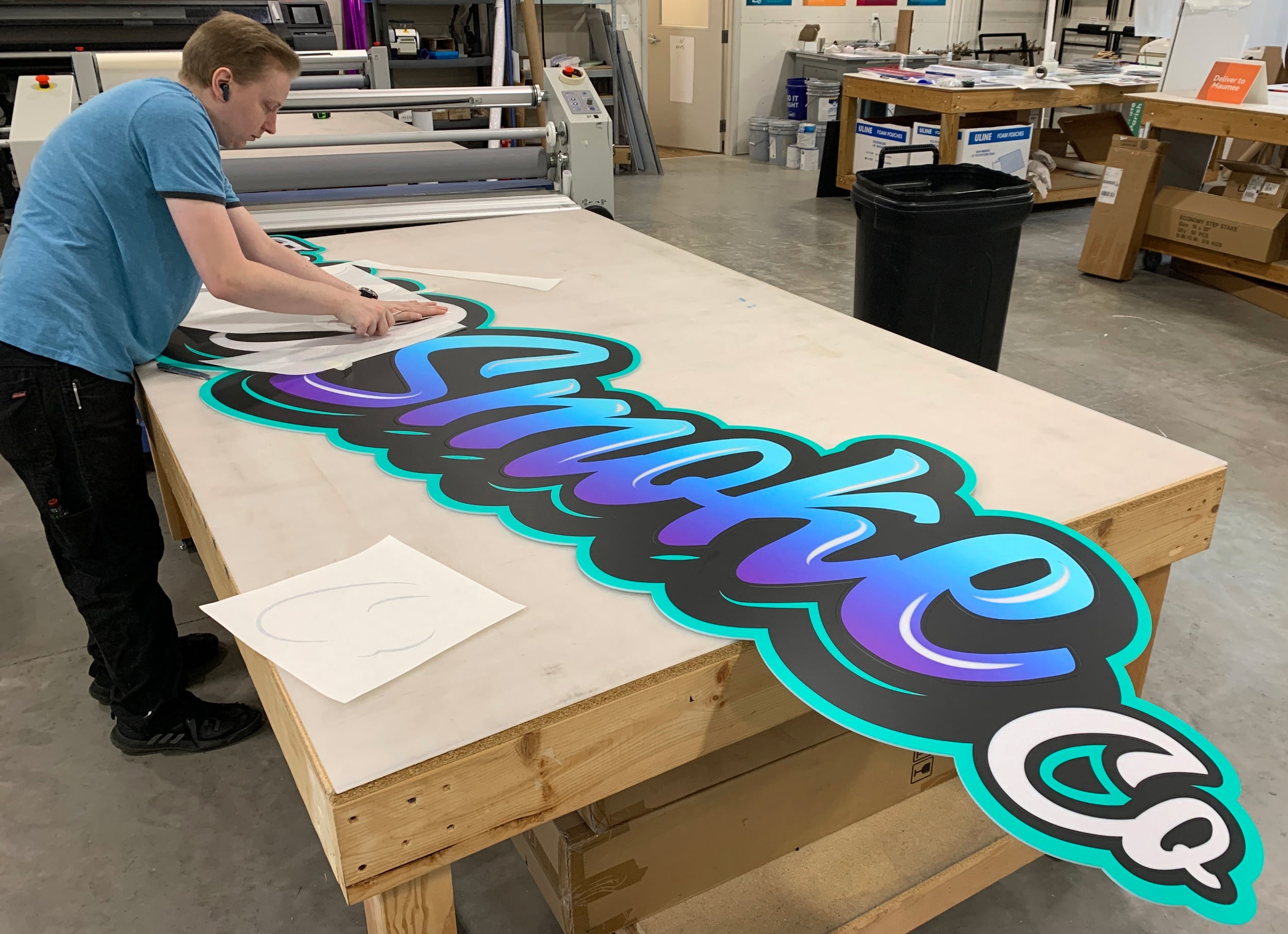 Gradual design changes led to gradient text.
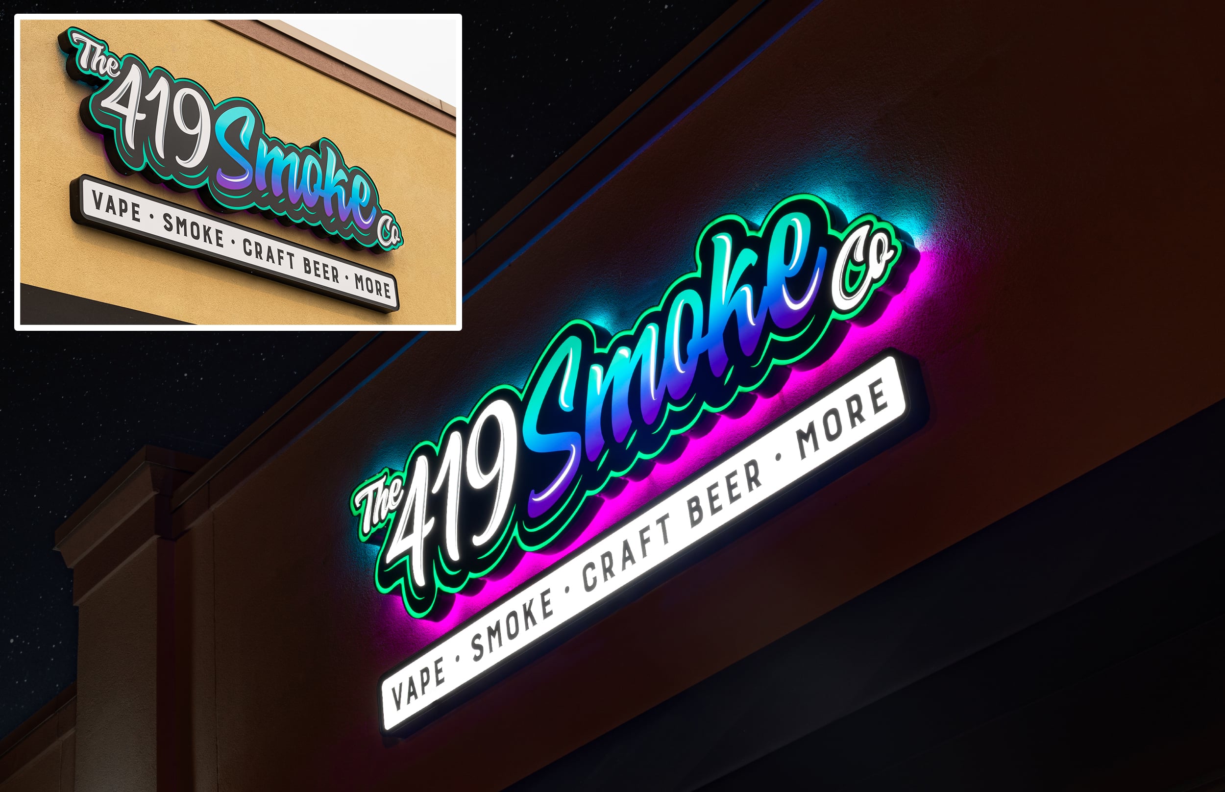
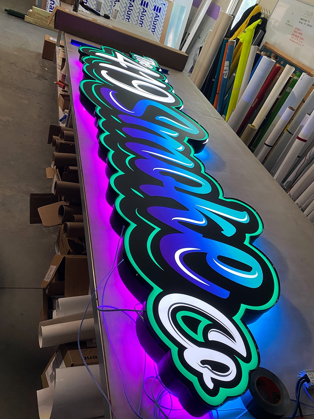
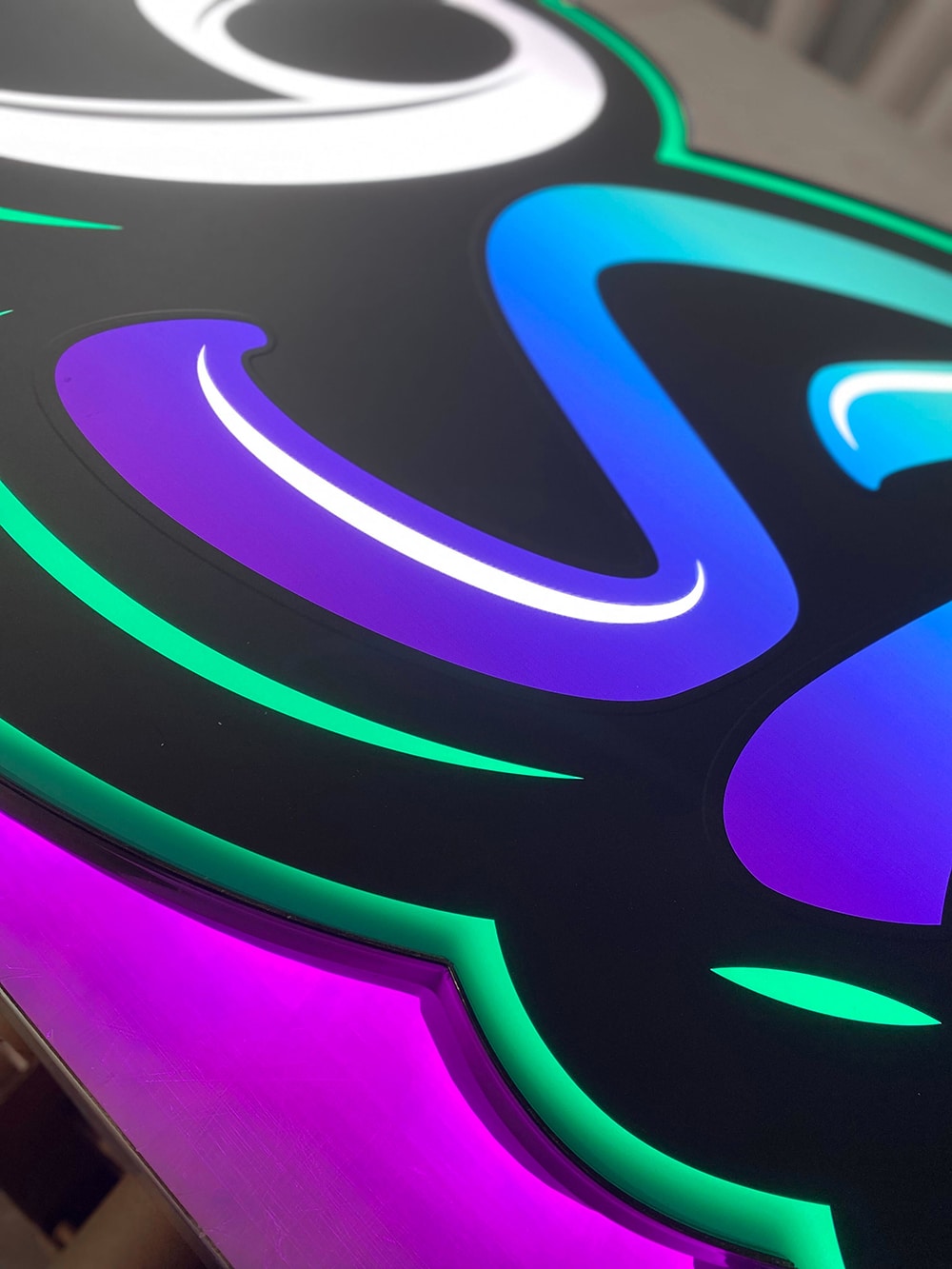
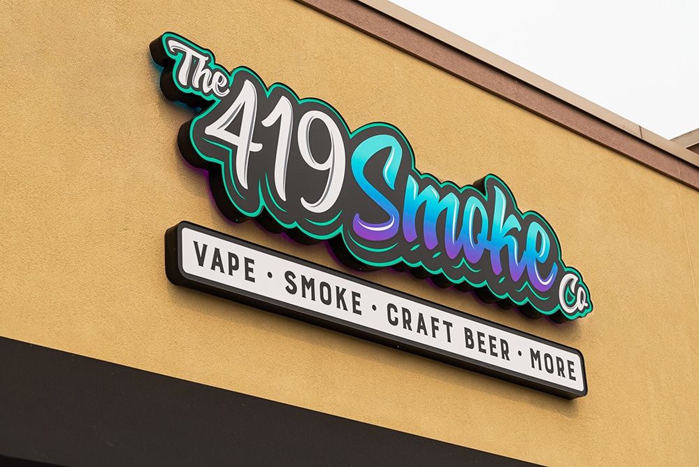
SMOKE SIGNALS
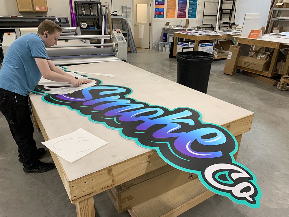
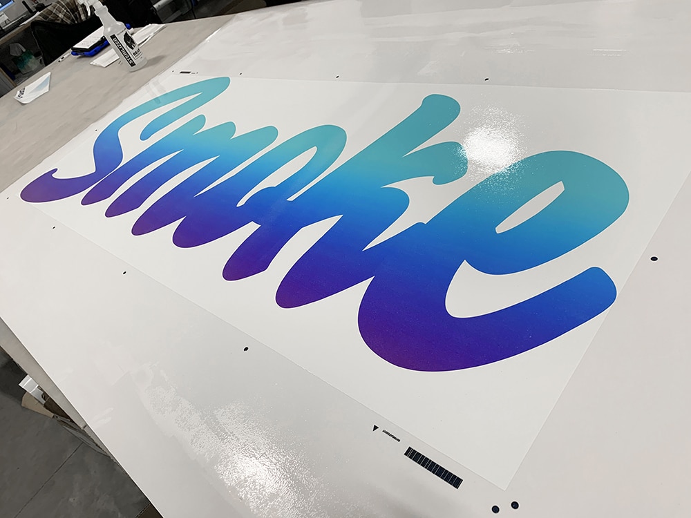
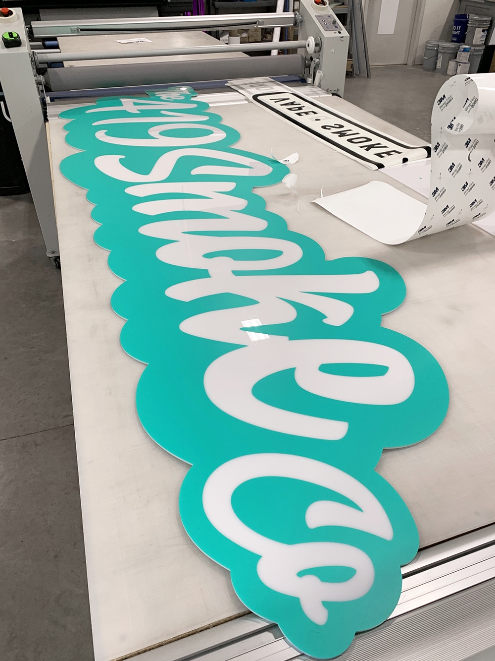
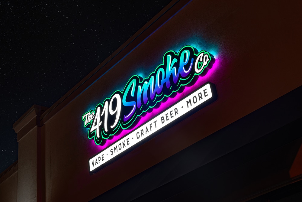
How do you fulfill a client’s expectations for a fun RGB-backlit channel letter sign project with gradient text, half the sign lighting one color and the other half another? And then take into account that the client was rebranding and changing their vision during the process… That was the task faced by Karrie Brock and her team at Fastsigns of Toledo and Maumee (Toledo, OH) as they fashioned a new 10 x 4-ft. sign above The 419 Smoke Co’s entry door this past May.
The Toledo tobacco and vape shop, which was replacing traditional channel letters on a raceway, wanted to maximize the sign’s size and see its creativity come to life. “The smoke shop owners originally started with a different design but updated their name and logo midway through the estimating process,” Brock recalls. “While they did provide vector art, the challenge became properly lighting and producing the sign to match their expectations.”
These included a dark black ‘cloud’ with a multicolor gradient on the face as well as solid translucent highlights. But then the client “piped up” with a new idea to backlight the sign’s top with one color and the bottom with another.
The more difficult areas of this project were the multiple colors with the gradient and oversized face for production, along with the limited availability of some 3M 3630 Scotchcal Film colors, Brock recalls. “In the end, our in-house fabrication/production and installation team were key to executing the final project as the designer created,” she says.
During the two-week project, Fastsigns used its Computerized Cutters Accu-Bend Freedom channel letter bender, an Esko Kongsberg XP24 cutter and a Epson SureColor V7000 UV flatbed printer for the gradient ‘smoke’ production. Materials included .040 aluminum returns, 3/16-in. polycarbonate faces, HanleyLED Kestrel KS-2100 modules and power supplies, 3M translucent vinyl and clear vinyl with 3M overlaminate.
Once completed, Fastsigns enlisted a bucket truck to raise the signage above the entry door and used a bracket method to stand the cloud off the fascia of the building. “The client loves the completed project,” says Brock. “It is exactly what they were looking for.”
PHOTO GALLERY (25 IMAGES)
? Albrecht Sign | Archetype | Fastigns Toledo & Maumee

Secrets of Lead Generation
Boost your sales by generating more leads! In this light and lively webinar featuring Maggie Harlow, CEO of Signarama Louisville Downtown (Louisville, KY) and the “Business of Signs” columnist for Signs of the Times, learn the secrets of how leads are generated, where they come from and how you can cultivate better (not just more) leads.


Bulletins
Get the most important news and business ideas from Signs of the Times magazine's news bulletin.
-

 Buzz Session2 weeks ago
These 14 Sign Pros Prefer Their Good Old Days to Now
-
 Ask Signs of the Times2 weeks ago
How Soon Should Signshops Follow Up on Estimates?
-

 Ask Signs of the Times1 week ago
How Much Sign Companies Charge to Convert Logos
-
 Heidi Tillmanns1 week ago
Sign Legibility is Not a Style
-
 News2 weeks ago
New 130-ft. Marquee on Las Vegas Blvd.
-
 News2 weeks ago
Creative Sign Designs Celebrates Four Decades
-
 Paul Ingle5 days ago
120 Years of Signs, and I’ve Seen 41 (Mostly)
-
 Dale Salamacha1 week ago
A Gen Z’er Ready for Work