
4 Fantastic Wall and Window Graphics
Plus, lessons learned from experience earned.
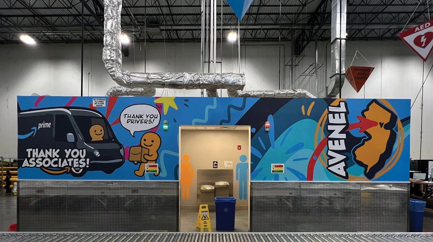
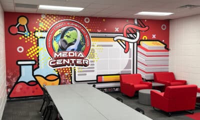
ABOVE PHOTO: A wraparound wall graphic for Amazon’s DJZ8 fulfillment center.
WHILE THE LETTERHEADS’ 50th Anniversary at the American Sign Museum (Cincinnati) back in June celebrated the art and craft of classic signpainting in wall murals and more (see page 34), contemporary shops still exercise plenty of creativity and problem solving with printed wallcoverings. From an Amazon fulfillment center to a museum window project to a pediatric dentist and a Spanish restaurant, these murals achieve the purposes their clients demand.
These graphics show appreciation for associates and drivers.
Prime Mover
1 Inertia informs us that a big thing at rest is hard to get going. And Amazon fulfillment centers are big things — very big — not only in size but in administrative complexity.
The idea of doing wall murals at Amazon’s DJZ8 fulfillment center in Woodbridge, NJ first came up in a 2021 conversation with Fastsigns of Maple Shade (Maple Shade, NJ), say co-owners Jeffrey and Kimberly Chudoff.
“At the time we walked the warehouse and the white walls felt extremely prison-like,” Kimberly recalls, but the funding wasn’t approved. The shop revisited the site in 2023 and the funding still wasn’t there. Finally in 2025, Fastsigns of Maple Shade got the call from Mo Ghorab, delivery operations manager III at Amazon, to say the project was finally getting funded. “That’s how it happened,” she says.
The project began in the warehouse and it grew from there, Kimberly relates. Mo had admired the hallway project the shop had done at an Amazon warehouse 20 miles north in the Garden State, in Newark. “He wanted to decorate the enter/exit hallway to create a similar immersive vibe,” she says.

The mural reinforces company ideals as well as adding interest to the wall.
Fastsigns of Maple Shade assigned Ashley McFarland to manage the project. “Our team pretty much had nothing to go off of for the designs for the projects we did at DJZ8,” she says. Multiple people involved all had differing opinions, which made it challenging to please everyone. “Ultimately, we took the ideas from everyone and created a theme that utilized a little part of everyone’s ideas,” McFarland says.
The shop uses SAi Flexi Design, Adobe Illustrator and Photoshop. The design process spanned about three months until proof approval, “going back and forth with the client and trying different ideas and taking in everyone’s input and change requests,” she says. Fastsigns of Maple Shade used their Canon Colorado 1630 UVgel Printer on 3M Controltac Print Film 40C with ORAFOL ORAGUARD 210 Matte laminate applied thanks to their KALA Mistral.
Installation for all of the graphics and signage was spread out over a couple of days for two installers. Most of the installation challenges involved working around the massive amount of traffic that an Amazon warehouse has and trying not to interfere with their operations, McFarland says.
“Having the perseverance to keep pushing forward even with a client that is difficult to work with (because of so many different opinions and people not liking the same thing) and who can be indecisive with what they want, it can be easy to get frustrated or impatient,” she adds, “but having the patience to see the client through and guide them to the best of your abilities really is worth it.”
Fastsigns of Maple Shade’s patience and perseverance in getting this literally big customer moving is paying dividends: The client and his team were so impressed with the new wall graphics even as they were being installed, they began to share pictures with other Amazon warehouses. The main contact McFarland worked with on this project told her that at least 4-5 other Amazons were interested in getting the same signage done at their locations.
Advertisement
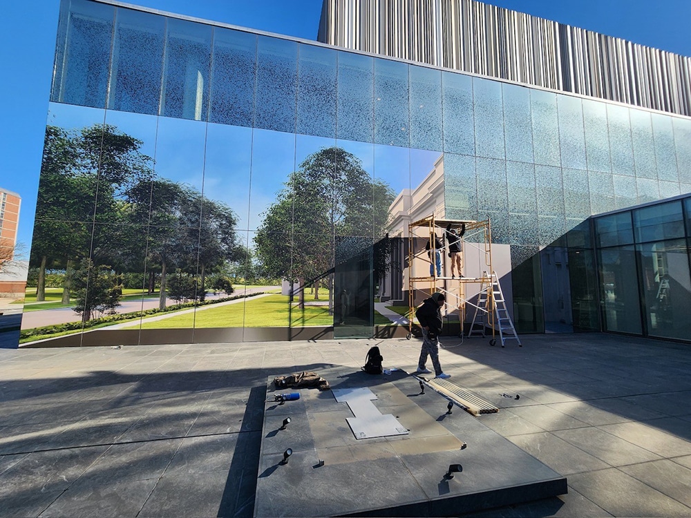
Isn’t this view from the interior better than a lot of construction?
Glass All Full
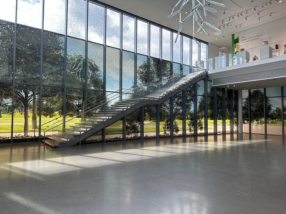
2 The Speed Art Museum in Louisville, KY faced a temporary but undesirable problem. They had recently broken ground on an exterior renovation for a new sculpture garden and upgrades to their existing landscaping, recalls Sarah Dixon, president of Bluegrass State hometown Unified Sign and Design, for whom this was a return customer.
“The museum has a large glass atrium that hosts events like weddings and the construction was going to be highly visible,” she says. They wanted help developing a solution for the windows that would block the construction without completely eliminating the natural light in the space, while also showcasing the future view of the gardens. “We proposed doing a graphic on optically clear vinyl that would be visible from the exterior for passersby and the interior to block construction,” Dixon says.

This “before” photo shows the plain windows and the start of construction outside.
Reed Hilderbrand Landscape Architecture (Cambridge, MA), working alongside local K Norman Berry Associates Architects, provided a high-resolution architectural rendering of the future outdoor space. Unified Sign’s design team used Illustrator to set up the graphic and ONYX Thrive as the RIP. “We had the layout from day one but printed four or five rounds of test windows to show different media options and various white opacities to get the desired light-filtering result,” Dixon says.
Unified Sign chose 3M Scotchcal Graphic Film IJ3650 for the window murals, imaged on the shop’s Canon Colorado M Series printer. They did not apply overlaminate as the graphics were only going to be up for about nine months through construction.
Four Unified Sign installers did their thing for four days. “We had to erect scaffolding in lieu of using a lift due to the weight restrictions on the sidewalk adjacent to the windows, so the project took a little longer than anticipated,” Dixon explains.
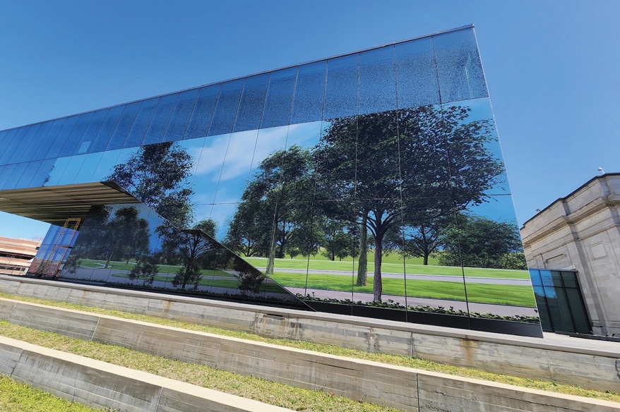
The installation seen from the museum’s exterior.
Another brief delay was caused when wind caught a panel on the last day of install, so it had to be reprinted, leaving one lower window without a graphic panel for a day or two while Unified Sign reprinted and got the install rescheduled.
“During this time visitors to the museum were apparently fooled by the graphics to the point that they believed the clear panel to be a door to the sculpture garden and would try to use it as a door until they saw the construction on the other side,” Dixon says.

Installing the printed optically clear vinyl showing the completed sculpture garden.
Finding creative solutions for your client’s problems instead of just taking an order is the lesson Dixon feels signshops would value most about this project. “While the client was originally thinking that an interior installation of opaque vinyl would be fine, we were able to show them samples of other options, including the one we landed on which was the exterior installation of optically clear vinyl printed color, white, color to showcase the graphics on both surfaces and achieve a more realistic and elevated look from the interior of the space for visitors to the museum and wedding parties taking photos,” Dixon adds.

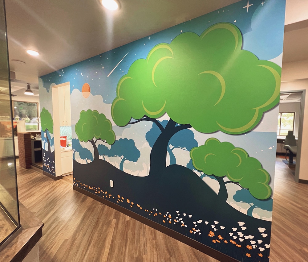
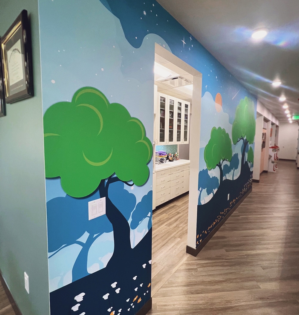
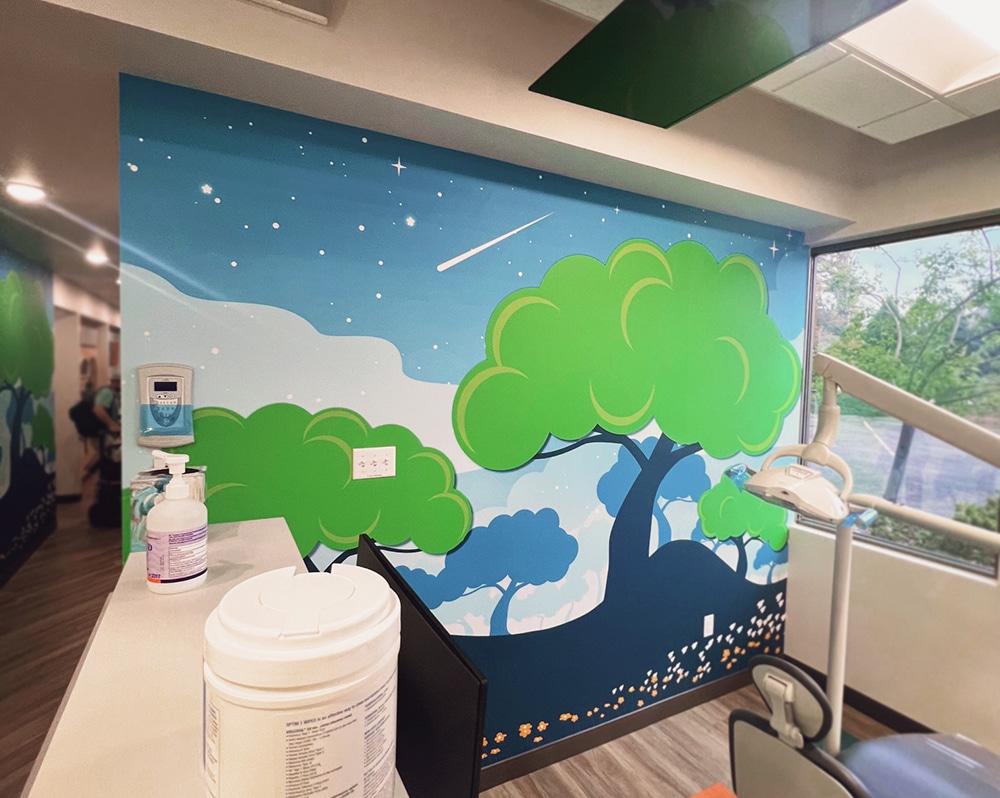
The starry forest theme goes right down the wall of this hallway.
Friendly Forest
3 For many years now, wall murals have provided very specific means by which health care facilities have attempted to foster a calm interior environment, especially those serving children. High up in the Centennial State, Signarama Brighton (Brighton, CO) works closely with a general contractor whose primary focus is dental offices.
When Lone Tree Pediatric Dentistry (Lone Pine, CO) needed a sign for their new office, the GC referred them to Signarama Brighton, says Mallory Lynn, the shop’s marketing manager (and a 2025 Women in Signs Award winner). What started as a rebrand of the exterior evolved quickly and the shop was pulled into their interior rebranding projects, Lynn says.
“For Lone Tree Pediatric Dentistry, we transformed two walls using DreamScape textured wall graphics, creating an immersive ‘forest’ atmosphere designed to calm and delight young patients,” she says. “The vivid colors and whimsical starry sky design evoke a sense of wonder, effectively creating a light-hearted and tranquil environment that helps ease children’s anxieties during their dental visits.”
Advertisement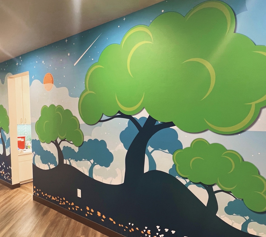
This wallcovering adapted the “Lone Tree” logo and other customer input.
Lynn, also an accomplished designer, created the original illustration by adapting the client’s existing tree logo into an entire forest. “The client’s input was instrumental as they requested a moon and stars skyline to complement their forest and provide a calming atmosphere,” Lynn says. She designed the original concept in Illustrator and went through five rounds of revisions over a few months to achieve the final look.
Signarama Brighton uses SAi Flexi Sign to lay out all of their projects for fabrication. After an ill-fated first print, the shop turned to a textured DreamScape Caviar wall wrap vinyl — printed by their Epson SureColor S80600 with no lamination because of the textured finish.
“We used different textured wall vinyl for the first installation, and the client was not happy with the outcome due to some buckling,” Lynn says. “So we removed and researched a new product, eventually landing on textured Dreamscape.”
The learning experience carried into technique in addition to material: “We also learned that with textured wall graphic vinyl, it is best to butt-cut the seams instead of overlapping,” Lynn reports. Each installation took one installer about a day.
But there were more lessons learned. During the printing process for textured wall graphics, they discovered a critical issue: To maintain color consistency across panels, one must alternate the print direction, Lynn explains, because the textured vinyl absorbs ink differently throughout the roll. “Therefore, if the first panel prints bottom-to-top, the next panel must be flipped and printed top-to-bottom,” she says. “Unfortunately, this issue led to a significant number of reprints.”
Despite the downsides, often it’s the hard-fought lessons that make the end result more satisfying. Plus, the Lone Tree has some friends now.

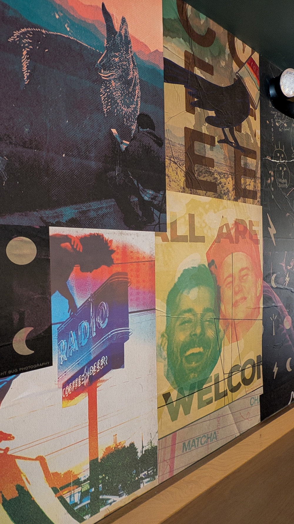
In Radio’s bar, which do you think is the most interesting part of the back wall?
Wheatpaste and Duplicate
4 Throw something against the wall and see if it sticks. I’ve never witnessed spaghetti as that something, but one thing many of us of every age can relate to, from school hallway billboards to college campus poles stapled full of flyers, is the sense of character, of place and authenticity that layers of posters provide.
Down the Lone Star State’s way in Austin, TX, Spanish restaurant El Raval had previously reached out to local Studio Dzo to design their exterior sign. Now they were back for a wall mural. Inspired by the wheatpaste posters he saw during his travels to Europe, Sudio Dzo Creative Director Russell Toynes notes that this style of poster is also a common sight in the neighborhood of El Raval in Barcelona, Spain, which the restaurant is named after.
“We combined elements of the restaurant’s brand image along with colors, imagery, words, people and art that celebrated El Raval’s diversity, vibrancy and bold street art scene, with a touch of a grunge aesthetic,” Toynes says. “The designs, paired with the wheatpaste poster application, created a beautiful texture with layers and intentional tears, as well as a sense of realism, as if a wall had been plucked from the streets of Barcelona and placed inside the restaurant.”
Studio Dzo turned to Photoshop and Illustrator as their primary software for this project. They were also able to present the client with an accurate proof of what the final product would look like. They accomplished this by creating realistic mockups using survey photos of the wall with the flat digital poster designs layered on top, and finished with simulated texture and tears, Toynes recounts.
With the design approved, the firm worked with hometown Prisma Austin (formerly Capital Printing), who printed the posters on thin 26 x 38-in. paper using large format digital printers. “The entire installation process with two of us on deck, including setup, wall preparation, poster application and cleanup took a few hours,” Toynes says. “The main challenge we encountered was cutting and forming the posters to fit around existing fixtures on the wall, as well as the booths that were attached to the wall.”

The haphazard-looking arrangement in El Raval is actually carefully considered.
However, like an evening Spanish meal, more was to follow in the state capital. Radio Coffee & Beer has been an ongoing branding and marketing assets partner of Studio Dzo. “The owners of Radio went to El Raval and saw the wheatpaste mural and asked ‘who did it?’” Toynes says. When they found out it was Studio Dzo, Radio Coffee emailed the next day about doing something similar at their new location.
Here, a similar concept to El Raval was used, except in this case the focus fell on showcasing the space, the Radio Coffee & Beer brand and the overall vibe from the live music, drinks and welcoming atmosphere.
After a similar design approval process, Prisma Austin printed the posters on 80# opaque text stock. The “wheatpaste” is actually interior wallpaper glue that can be purchased at any big box hardware store, Toynes says. It can leave your hands fairly covered and sticky, he laughs.
“The use of unique and original poster designs paired with the wheatpaste application created a bold and exciting way to approach murals, offering a more innovative approach beyond traditional paint, vinyl or print methods,” Toynes says. “Wheatpaste is also really hard to mess up, and is supposed to be quick, easy and imperfect!”
PHOTO GALLERY (16 IMAGES)


Secrets of Lead Generation
Boost your sales by generating more leads! In this light and lively webinar featuring Maggie Harlow, CEO of Signarama Louisville Downtown (Louisville, KY) and the “Business of Signs” columnist for Signs of the Times, learn the secrets of how leads are generated, where they come from and how you can cultivate better (not just more) leads.


Bulletins
Get the most important news and business ideas from Signs of the Times magazine's news bulletin.
-

 Business Management1 week ago
Alternative Management Advice for Sign Companies
-
 Fabrication + Installation7 days ago
Small Signshop, Big Fabrication
-
 Paul Ingle2 weeks ago
120 Years of Signs, and I’ve Seen 41 (Mostly)
-

 Real Deal3 days ago
Sign Company and Customer Clash on “Minimum 2 Hours”
-
 True Tales2 weeks ago
My Shirt Says “Signs”
-
 Mildred Nguyen2 weeks ago
Interior Reimage Transforms Georgia School
-
 Maggie Harlow1 week ago
3 Steps for Performance Appraisal Preparation
-
 Tip Sheet2 days ago
Workflow Automation, Budget Discussion and More Signshop Tips