
4 Inventive Dimensional Sign Projects
Blending established techniques with new applications.
DIMENSIONAL SIGNAGE QUITE literally stands out. Whether through raised channel letters, carved designs or intentional layering, dimensional signs pack a range of depth and design possibilities. Here four signmakers share how they’re embracing new creative approaches to dimensional signs — while taking dimensionality into new directions by blending old and new signmaking techniques.
 OLD IS NEW AGAIN: Plaques, one of the oldest forms of signs, are getting new treatments.
Beyond the Traditional
SHOP: Signs From Mars | LOCATION: Culver City, CA | URL: signsfrommars.com
The word “plaque” likely brings to mind something very traditional: a small but informative sign near a museum exhibit or perhaps a rectangular title on someone’s office desk or door.
But Mars Bravo’s recent work has set out to reframe the notion of plaques as limited to the realm of the staid, conventional or boring. Working in partnership with Gemini, Bravo created a series of innovative and artistic plaques for ISA Sign Expo 2024 that prove the craft of plaque-making can be as creative as any other sign form — no right angles required.
“It feels like new sign designers are not really thinking about plaques anymore,” says Bravo, who owns California-based signshop Signs From Mars. Hoping to change that, Bravo experimented with Gemini’s rich mix of available plaque and plate materials, playing with how she might add new energy and direction to a style that’s been a staple of signmaking for hundreds of years.
“I approached it as, ‘How can we use the same equipment or the same materials to make plaques feel new and exciting?’” she says.
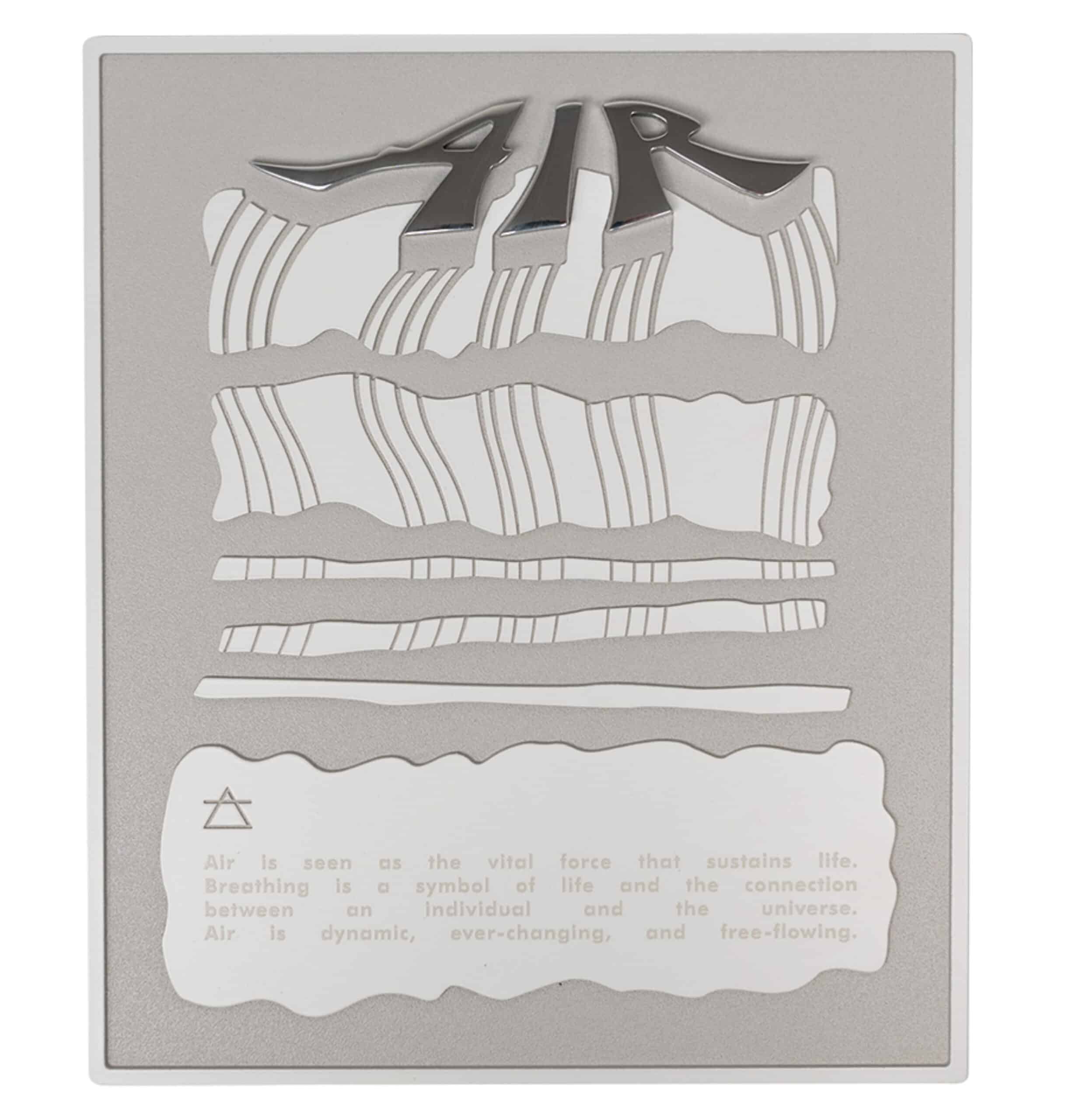 ELEMENTARY: Bravo’s plaque depicting the “air” element, one of a set of four.
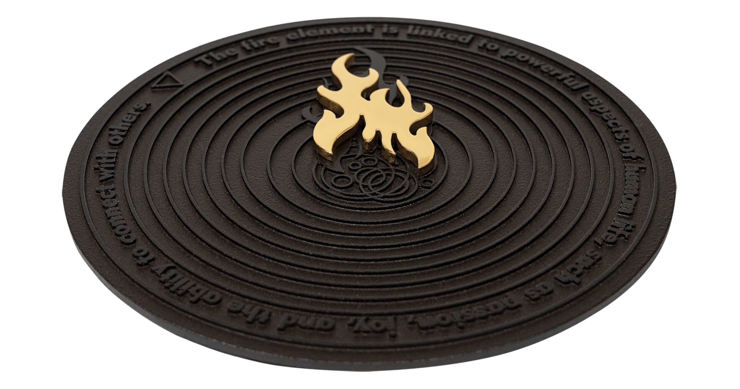 FIERY: A flat cut polished brass flame tops the “fire” plaque.
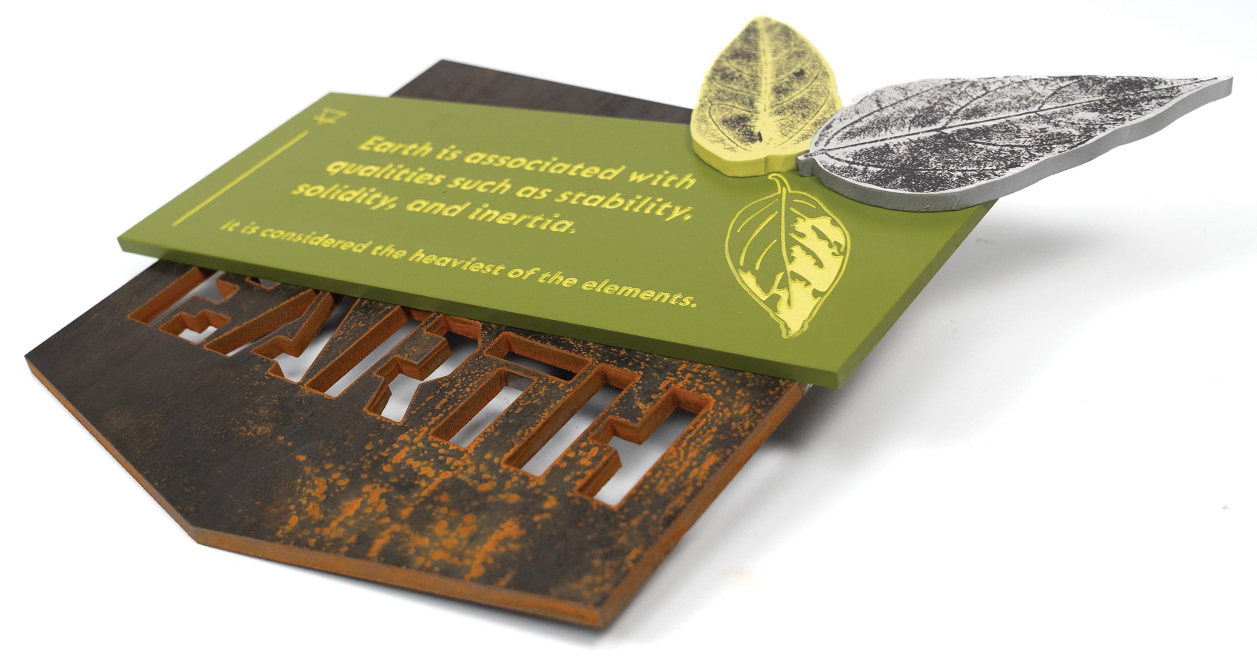 LEAFY: Real leaves were painted and stamped for the “earth” element.
Bravo designed her plaques to capture the concept of the four essential elements — earth, water, air and fire. She carefully selected Gemini materials to convey each element, opting for the mirror-finish of polished aluminum to represent water and the dark, charred look of oxidized bronze for the base of the fire plaque, for example.
She also played with styles and techniques, drawing on Gemini’s ability to flat cut or print designs and to mix fabrication styles. To create designs for the leaves on the earth plaque, Bravo collected real leaves, painted them, and stamped out designs that she then scanned for digital reprint. The metal leaves were placed on top of a green-painted metal sheet, which was affixed atop a raw piece of Corten steel, giving the plaque an impression of 3D relief and an appealing juxtaposition of various brown and green “earthy” elements.
Bravo’s fire plaque mixed precision tooling on the base with flat cutting of the flame, which was made of polished brass. The shape of the water plaque mimicked the shape of a water bottle. By playing with new shapes, new angles and new mixes of materials, Bravo’s work demonstrates plaques are primed for new directions of dimensionality.
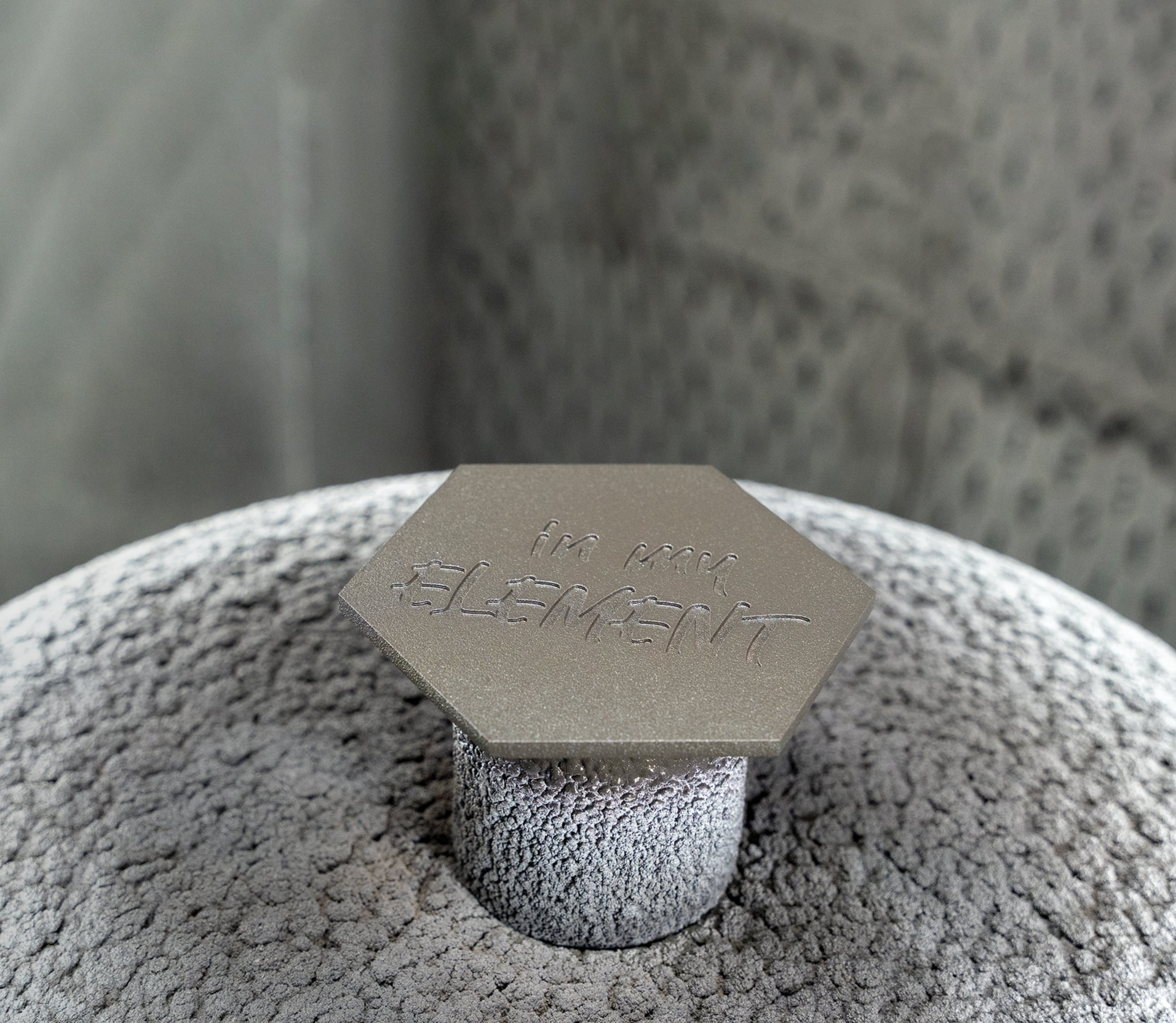
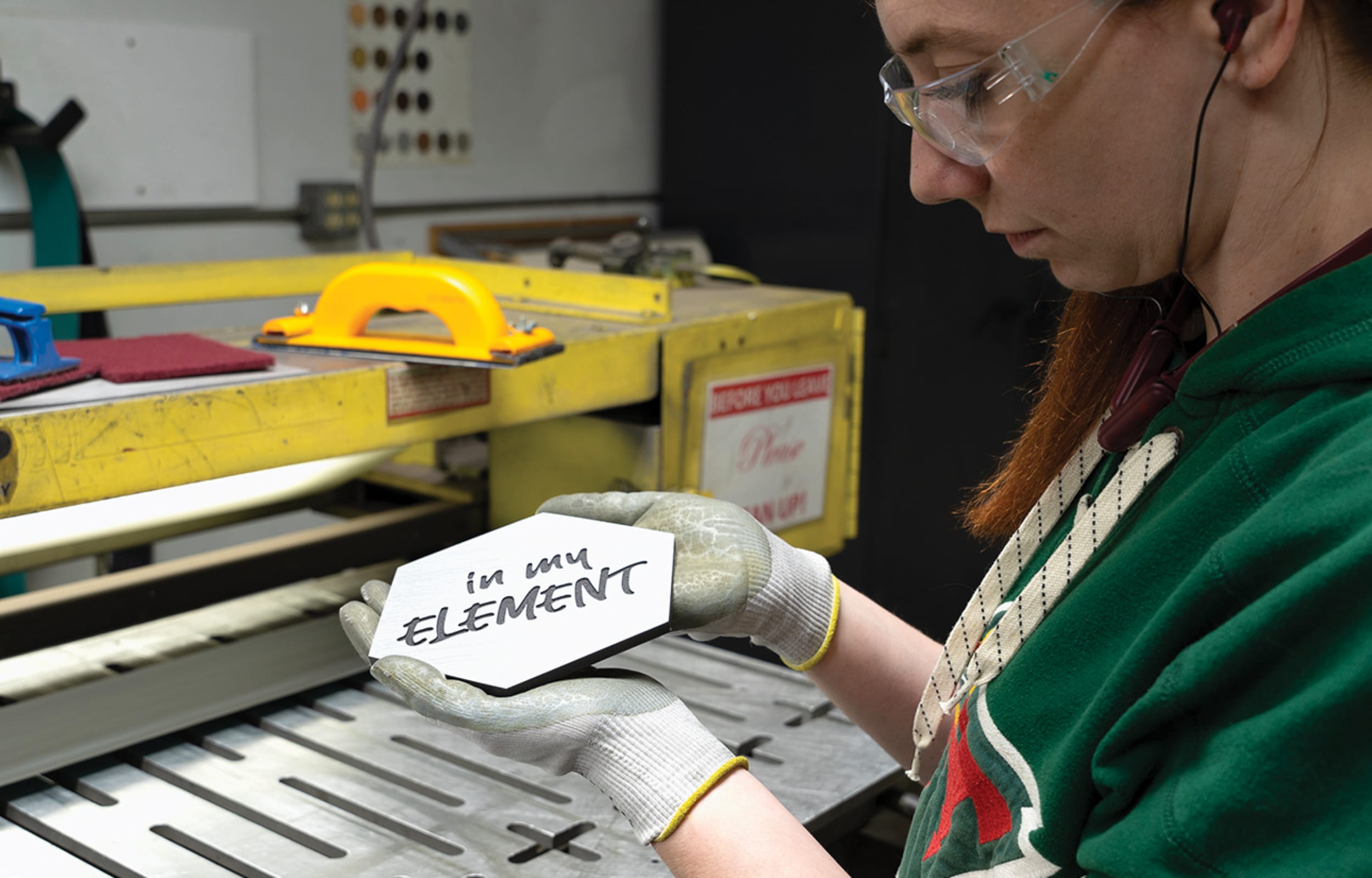 ARTIST AT WORK: The material, shape and font combine for a modern feel and effect.
“I had so much fun with this project,” says Bravo, who’s made a name for herself as a specialist in dimensional signage, including custom neon pieces. Since working on the collaboration with Gemini, Bravo has begun to suggest plaques for her own clients.
Recently, she created a metal plaque for a restaurant in Culver City, CA, which includes the business’s logo and an embedded QR code that patrons can scan to see the latest seasonal menu.
“I think there’s room [in plaque making] for people to dive into their creativity a bit more,” she says. “There’s an opportunity there to create some really cool stuff that feels modern, and that people are going to be very receptive to.”
Advertisement 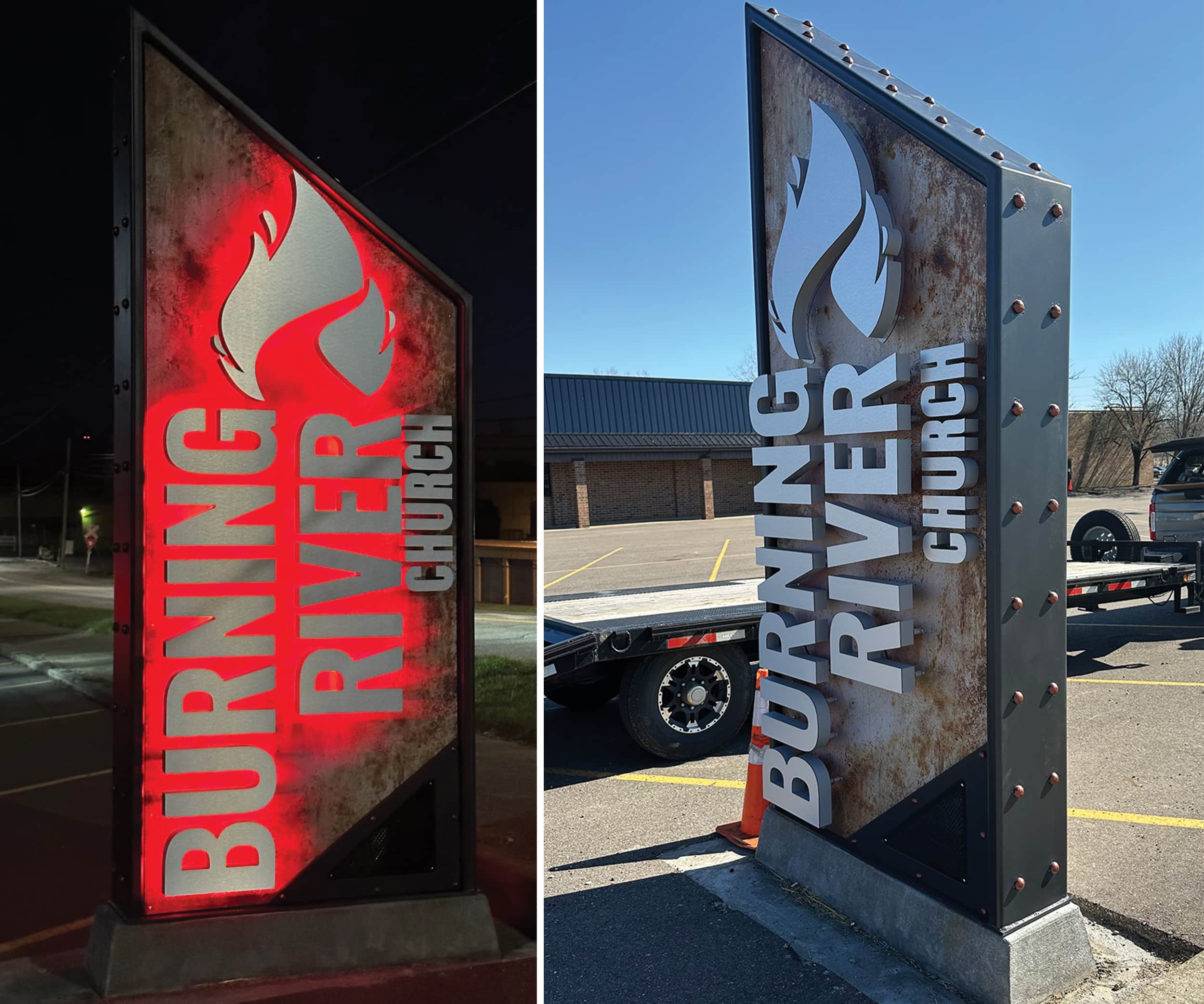 TRUE GRIT: Synergy’s signs often feature an industrial design, including this one for a church.
Precision Creativity
SHOP: Synergy Sign & Graphics | LOCATION: Strasburg, OH | URL: synergysign.com
Synergy Sign & Graphics owner Jim Dawson wanted to create a truly eye-catching sign for Dover, OH’s Burning River Church — one that could capitalize on its high-traffic location and stand out from all the other signs on the road.
“I knew I didn’t want to just put a rectangle up, and I didn’t want there to be wording running left to right,” Dawson says. “We were just thinking of how many different things we could do to that sign, without going overboard, to make it jump out and stop traffic on that road.”
Dawson settled on a vertical pylon design with a downward-slanting top and lettering oriented at a 90-degree angle from the base. Synergy Sign & Graphics is known for its unique, gritty sign aesthetic, but for this project, Dawson wanted to juxtapose that “dirty” look against crisp, clean channel letters.
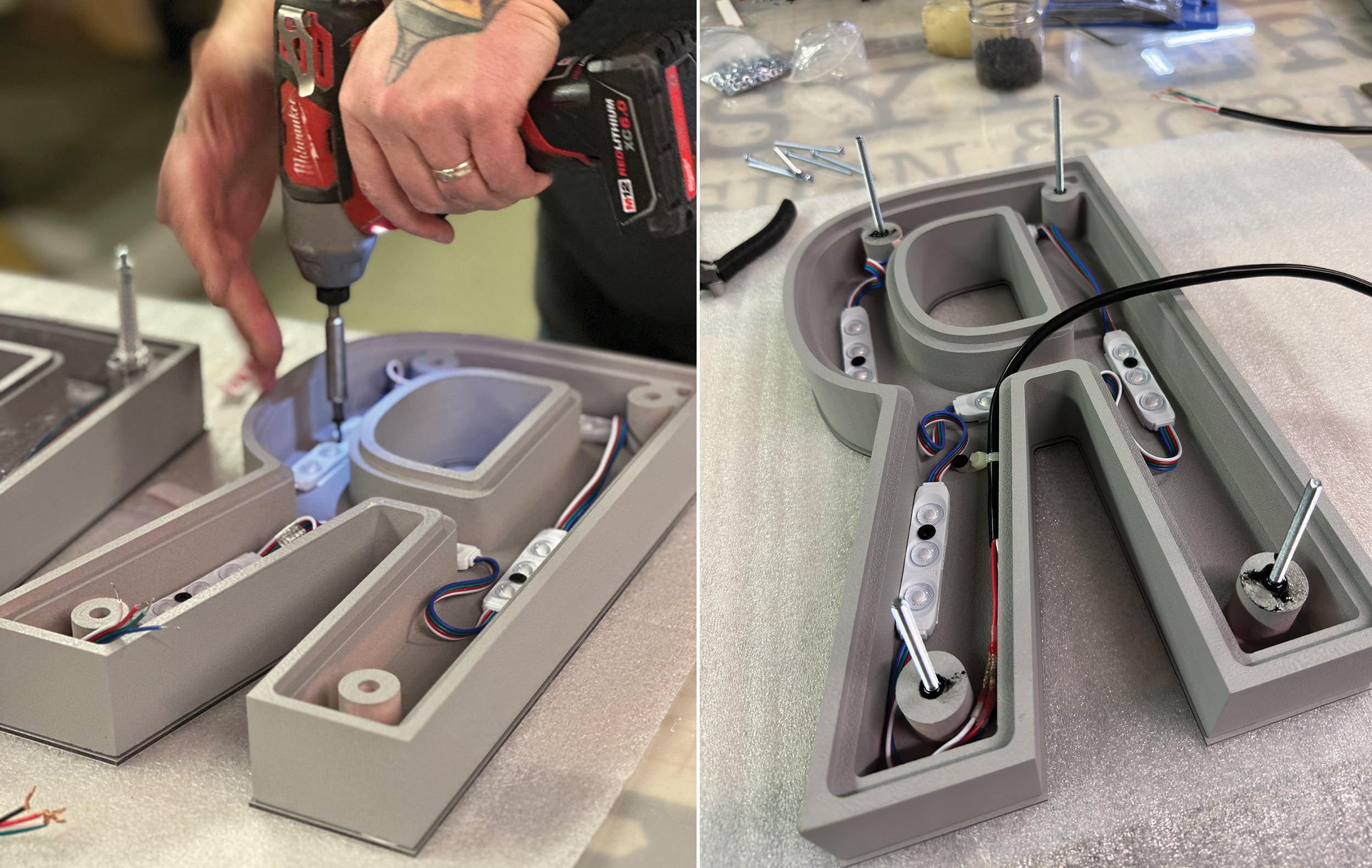 LED LOADED: Dawson installing color-changing LED modules.
“We kept the flame [the church’s provided logo] going vertical while the rest of the letters are horizontal — so we kind of flipped everything on its side and mixed and matched,” he says.
The surround of the sign and the base plate were formed from fabricated steel coated with automotive epoxy primer. The base was seamlessly secured to a poured-concrete foundation using J-bolt anchors embedded inside the sign.
The base for the channel letters is aluminum sheeting with multiple layers of paints and glazes, including Nova Color artists’ acrylics and Sherwin-Williams exterior grade paints, to provide a faux rust finish that was gritty but still controlled.
“If we had used oxidized steel there, it would have kept changing over the years. We wanted to be able to control the contrast from the letters to the background and have that not change over time,” Dawson explains.
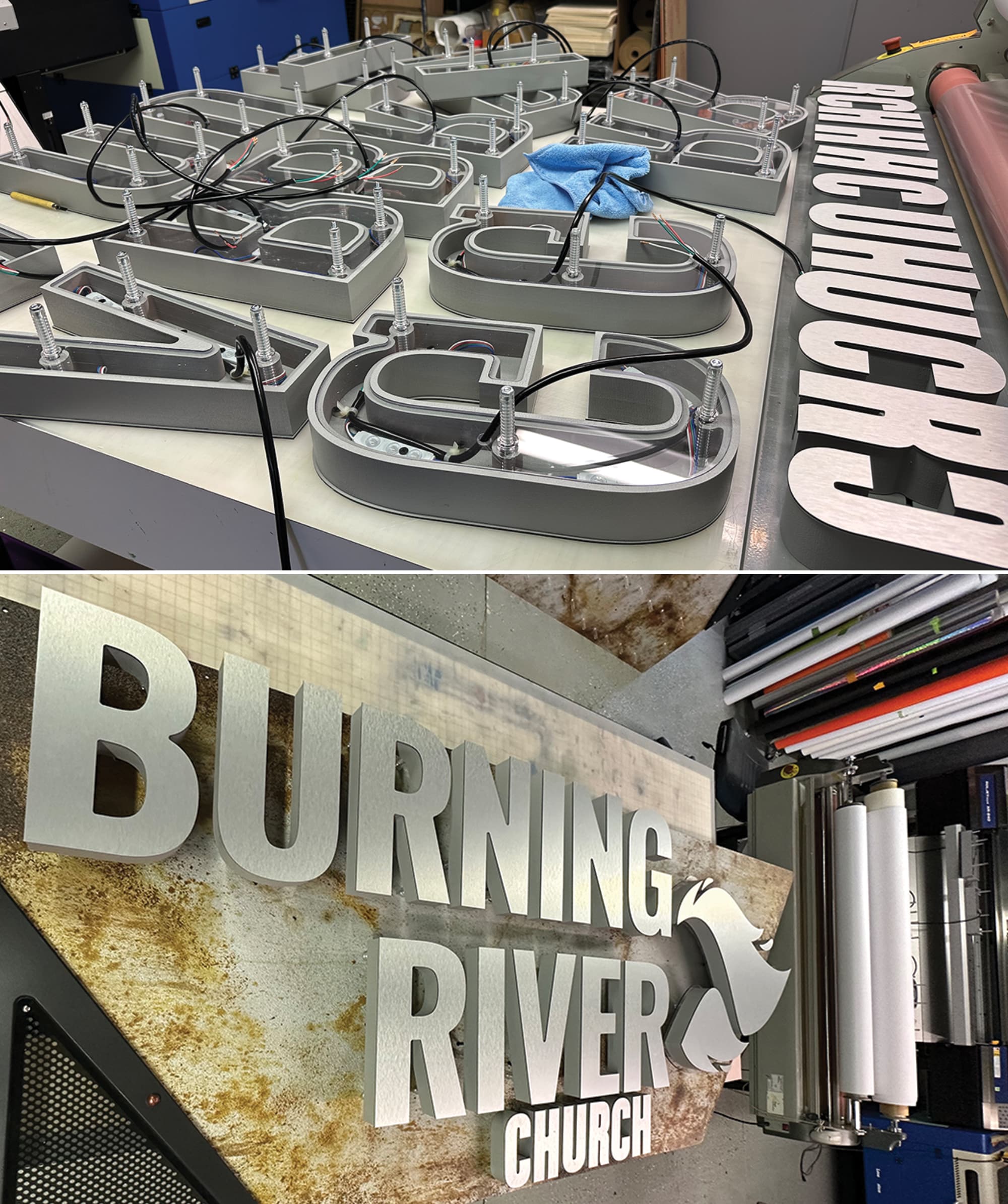 DIFFERENT LOOK: In the shop, the assembled sign sits on its side. When installed, the flames point up.
Dawson and his team used a MultiCam 3000 Series CNC router and 2-in.-thick, 30-lb.-density HDU sourced from Coastal Enterprises to create the channel letters. For the finishing touches, each letter was outfitted with a polycarbonate backer lens, HanleyLED color-changing lighting, painted gray returns, and glued-on, brushed aluminum faces. The letters were then affixed to the sign face using adjustable-depth MBS standoffs.
To receive installation approval, Dawson cooperated with the district’s architectural review board to receive a code variance, since the sign technically stands one foot taller than sign height limits for that area.
“The wording of the sign stayed below code, and the lower side of the sign stays below code. It’s just the triangular piece that juts up above it,” Dawson explains.
Always on the hunt for new dimensional sign ideas, Dawson routinely scours Google Images for inspiration and draws on his previous work experiences as a 3D designer and head engineer at a cabinet manufacturer to discover new ways to approach signmaking.
“I don’t come at this from the standpoint of, ‘My family has been in business for 50 years, and this is how we’ve always built channel letters,’’’ Dawson says. “I look at it from the standpoint of how many different ways can I build a channel letter and … [possibly make it] more interesting.”
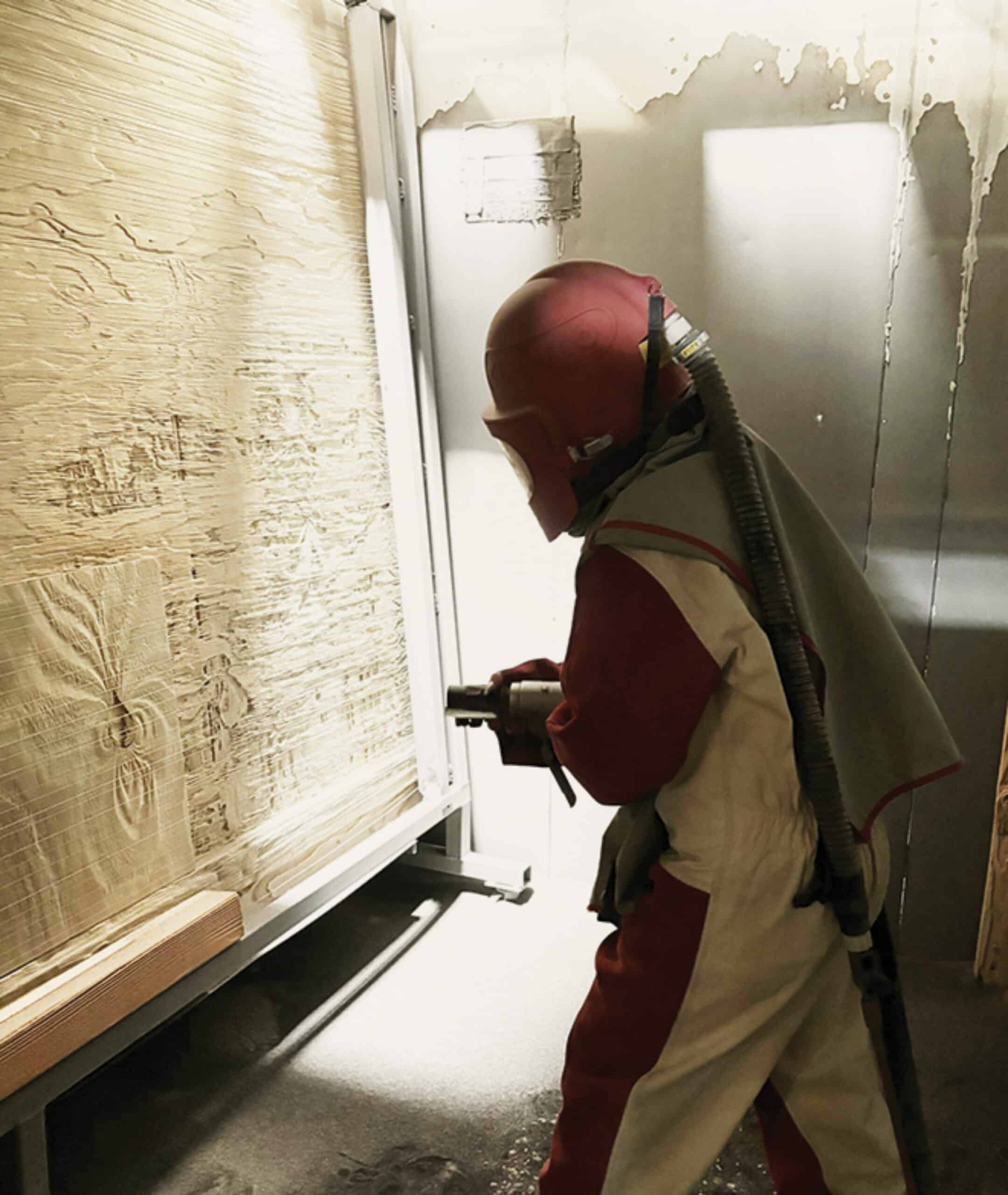
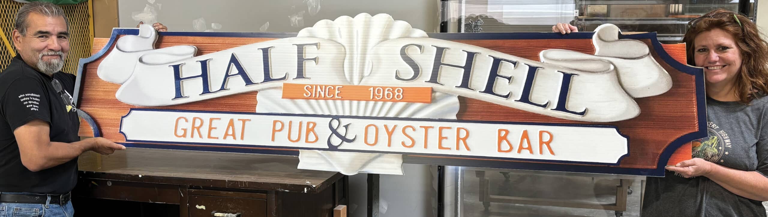 GET BLASTED: Art Sign Works sandblasted the redwood base for this sign.
Mixed Media
SHOP: Art Sign Works Inc. | LOCATION: Murrieta, CA | URL: artsignworks.com
Paul Williamson started Art Sign Works in his garage 19 years ago and has grown the company into a leading supplier of 3D bas-relief, artist-painted signs. The company specializes in carved, dimensional wood and HDU signs as well as metal-plated 3D plaques — and their signs are used by national parks, legislative and governmental offices and private companies across the country and beyond.
When it came time to create a new sign for Chicago’s Half Shell oyster bar, Williamson and his team opted for a dual creative approach: a sandblasted piece of redwood as the base, topped by a carved, handpainted HDU element to capture the restaurant’s name and logo.
“If the client wants to do a painted, carved 3D piece, it makes no sense at all to do that out of wood, because the HDU can be carved very cleanly since there’s no woodgrain, and it’s about half the price of wood,” Williamson explains.
To give the base the rustic look the client wanted, the Art Sign Works team first sandblasted a redwood panel supplied by Forest Plywood and Lumber Co. to embellish its natural graining. They then stained and clear-coated it with two layers of Totalboat Gleam Marine-Spar Varnish.
To fabricate the HDU layer, Williamson’s staff designers developed a computer-assisted design mockup. After the client approved the design, the team fabricated it using a ShopBot CNC Router to cut a piece of 20-lb. HDU Precision Board made by Coastal Enterprises.
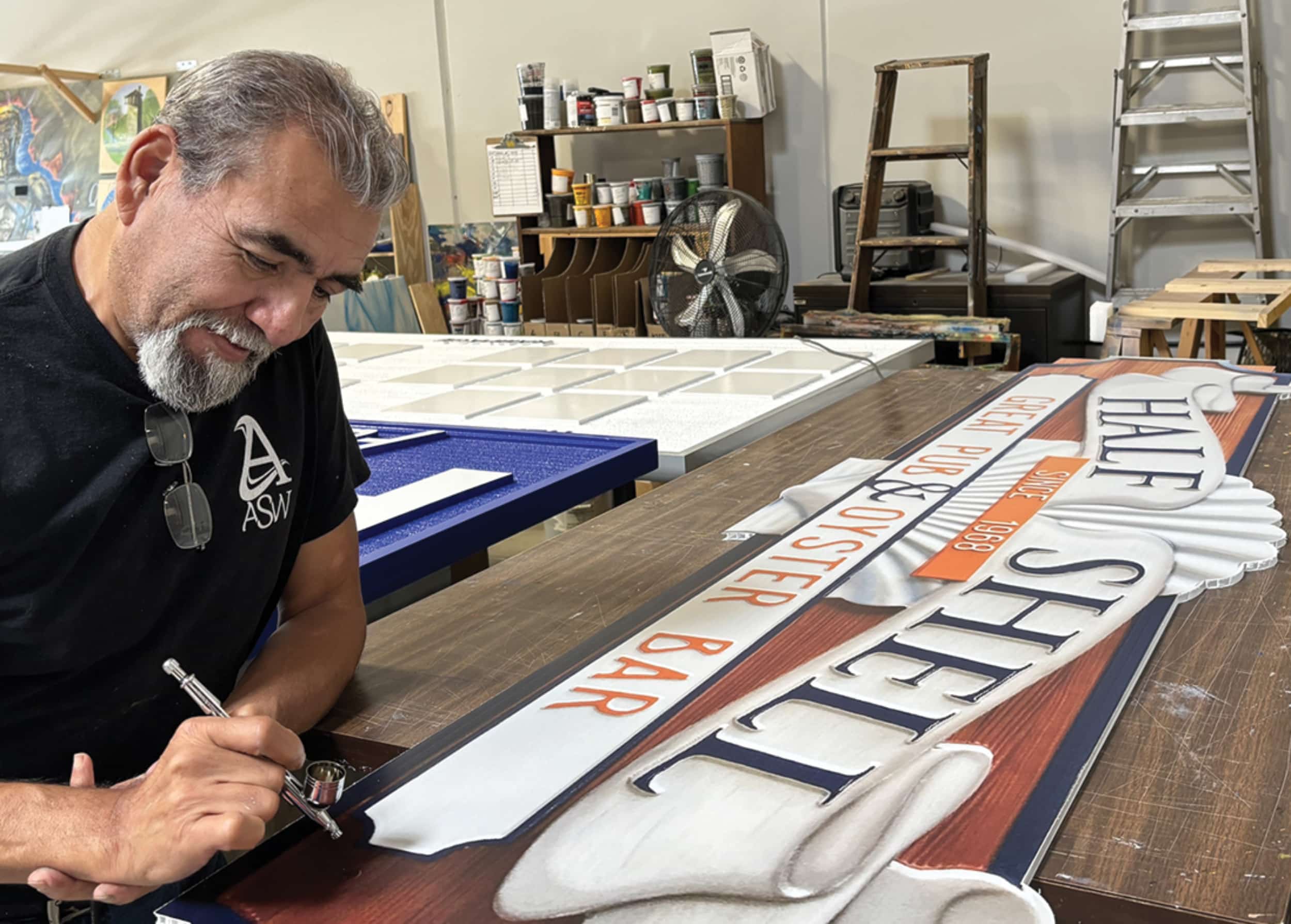 FINE ARTS: An Art Sign Works team member painting the carved HDU.
The sign, like all Art Sign Works signs, was then hand-sanded for an hour or more to smooth and perfect all its edges before heading to the spray-coat booth. There, it achieved its final look thanks to Matthews MPC Ultra-Low VOC paints for the main coat and 1-Shot Sign Enamels for lettering and finer touches. The two halves of the sign were joined together with screws and epoxy before being shipped to the client for installation.
“We’re not a full-service sign company. We’re a niche manufacturer. We do a few things, and we do them well,” Williamson says, noting that his crew of 23 employees manufacture some 10,000 signs a year — many of these on a wholesale basis to other sign companies.
“We’ve found areas with very little competition in the United States. As far as I’m aware, there are only one or two other companies [besides Art Works] doing 3D bas-relief, artist painted signs. National and state governments and the National Park Service are our biggest customers.”
Advertisement 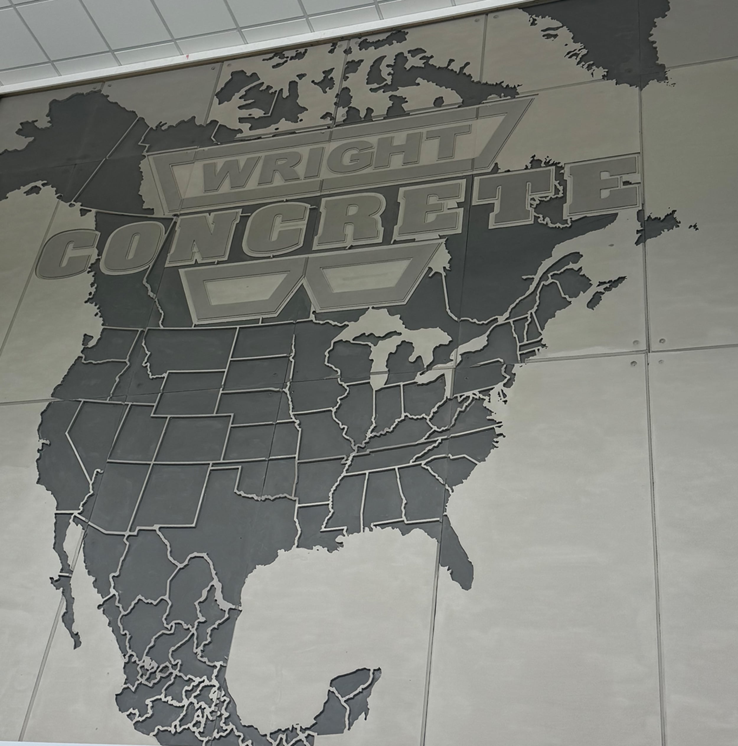 CONCRETE BELIEF: Grace Custom Signs mixed HDU and faux-concrete for this very convincing sign.
New Directions for HDU
SHOP: Grace Custom Signs | LOCATION: Pikeville, KY | URL: gracecustomsigns.com
Grace Custom Signs owner Sean Cochran was well-versed in the versatility of high-density urethane (HDU) boards as a sign material. But even he wasn’t sure, initially, if it could mimic the look of real concrete, particularly for a large-scale design.
Turns out, it can — especially when coated with a proprietary acrylic paint product embedded with rock dust and limestone. The paint was developed and provided by Wright Concrete & Construction, which commissioned the sign from Cochran for the lobby of their Pikeville, KY headquarters.
Cochran worked with Wright’s staff graphic designer to develop the concept of a paneled map emblazoned with the company’s logo to highlight its reach to clients throughout the US, Canada and Mexico. Initially, Wright wanted to build the wall mural with actual cast concrete panels, but the projected weight of each panel, naturally, was a prohibiting factor.
Right away, Cochran suggested HDU as an ideal alternative.
“HDU was the perfect material. It’s lightweight and durable. We can carve it on the CNC however we want, and it can easily be screwed into the wall,” he says. By beveling the edges of each panel and using Wright’s own faux-concrete paint product, Cochran was able to achieve the look of authentic concrete the client wanted.
“It touches and feels like concrete, and because each edge is beveled, it looks like it actually came out of a concrete form,” he says.
The sheer size of the project — the mural measures 24 x 20 ft. and includes 16 separate panels — and the familiarity of the subject matter both created challenges, Cochran says. “With the lines on the boundaries of the states, for example, if those were off even 1/8th of an inch where the panels match up, you’re going to notice it.”
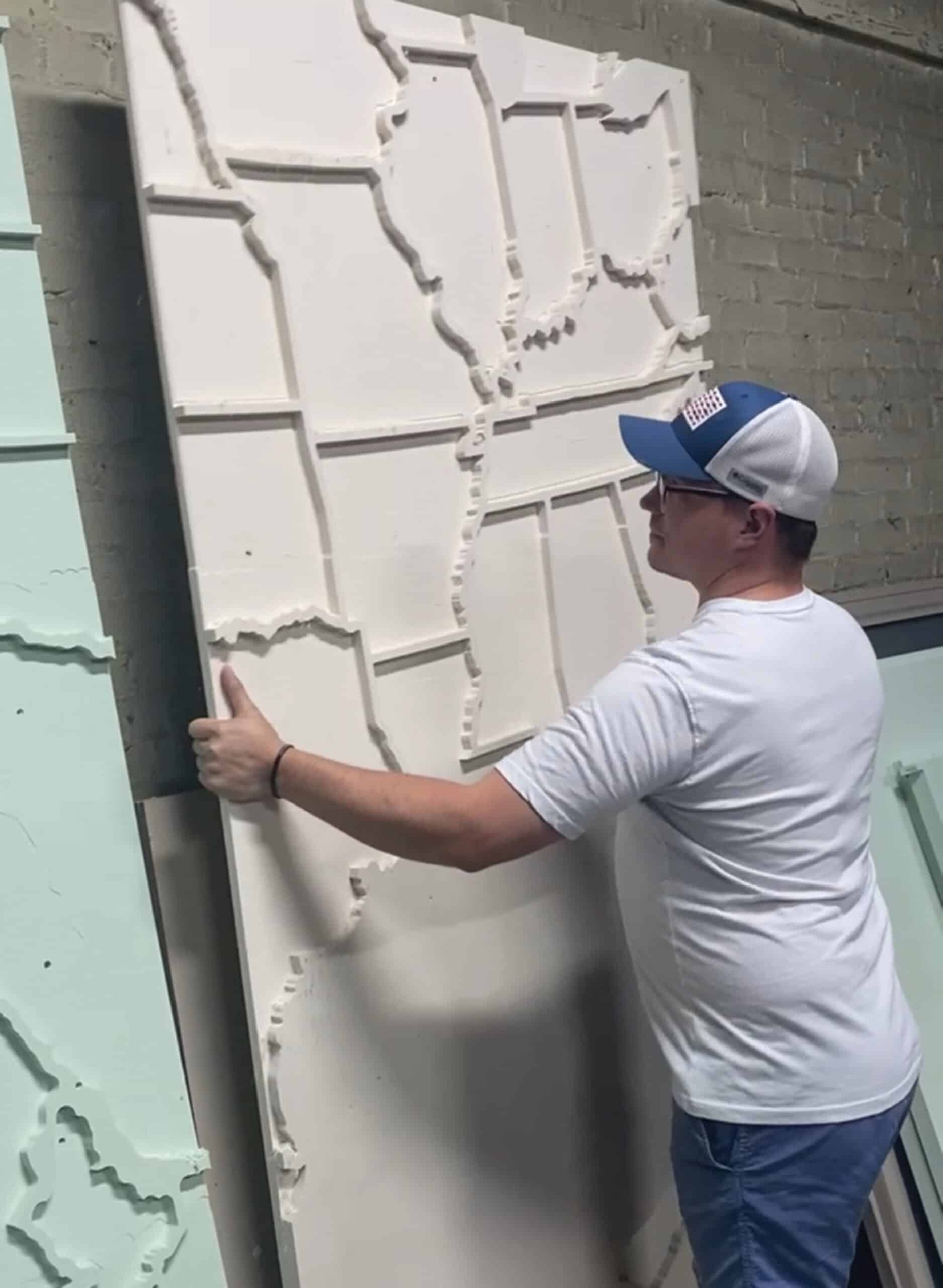
As a result, the CAD/CAM work to vectorize the image and create workable toolpaths to achieve a close fit between panels was particularly painstaking for this project. To fabricate the panels, Cochran used a CNC router he built himself, using his favorite features from various commercially available models. He typically sources his HDU panels from both Sign•Foam (Sign Arts Products) and DUNA-USA.
“We were creating a 500-sq.-ft. puzzle, basically,” says Cochran, who co-owns and runs his signshop with his wife, Jennifer.
The bulk of Grace Custom Signs’ work focuses on channel letter signs and dimensional signage, and they’re seeing a real boom in demand for HDU-based, dimensional projects. In addition to the Wright mural, Cochran and his team recently fabricated several HDU signs in the iconic Coca-Cola bottle shape for PNC Park, home of the Pittsburgh Pirates.
“I am a huge proponent of HDU. You can really get any look that you want from it. I’m excited to see where we can take it,” Cochran says. “With HDU, we can deliver something truly customizable and unique for our customers — something that’s creative and that stands out from everything else that’s out there.”
PHOTO GALLERY (43 IMAGES)
📷 Signs From Mars – Gemini | Synergy Sign & Graphics | Art Sign Works | Grace Custom Signs


Secrets of Lead Generation
Boost your sales by generating more leads! In this light and lively webinar featuring Maggie Harlow, CEO of Signarama Louisville Downtown (Louisville, KY) and the “Business of Signs” columnist for Signs of the Times, learn the secrets of how leads are generated, where they come from and how you can cultivate better (not just more) leads.


Bulletins
Get the most important news and business ideas from Signs of the Times magazine's news bulletin.
-
 Heidi Tillmanns2 weeks ago
Sign Legibility is Not a Style
-

 Business Management5 days ago
Alternative Management Advice for Sign Companies
-
 Fabrication + Installation3 days ago
Small Signshop, Big Fabrication
-
 Paul Ingle1 week ago
120 Years of Signs, and I’ve Seen 41 (Mostly)
-

 Dale Salamacha2 weeks ago
A Gen Z’er Ready for Work
-
 Mildred Nguyen1 week ago
Interior Reimage Transforms Georgia School
-
 True Tales1 week ago
My Shirt Says “Signs”
-
 Maggie Harlow6 days ago
3 Steps for Performance Appraisal Preparation