A Contrasting View on ICC Ratio Changes for Signs and ADA
Counterpoints to reductions announced last fall.
EDITOR’S NOTE: In Sept. 2024, Signs of the Times posted news on our website that the International Sign Association (ISA) and The Society for Experiential Graphic Design (SEGD) announced that proposed changes in the upcoming International Code Council’s (ICC) standards, A117.1, positively impact the sign, graphics and visual communications industry by establishing the color contrast ratio for visual characters at 65%. This new 65% contrast ratio rule improves upon the 70% suggested guidelines that were included in the 1991 version of the International Building Code (IBC), according to a press release from ISA. For the full “ISA and SEGD Achieve Positive Change to ICC Contrast Ratio” news post, see signsofthetimes.com/022507.
Sharon Toji, “the ADA Sign Lady” and owner of H Toji & Co. (Lakewood, CA), took issue with the changes, especially their description as “positive.” Toji contacted us in October and offered to write an article rebutting the proposed changes. Her article was completed in late December and, in the interest of this important aspect of the sign industry, follows.
 LIGHT REFLECTANCE VALUE: In this example, we can see how just changing 10% at a time alters the percentage of contrast to a very high percentage, even though we are still comparing two dark shades. All three of these combinations would comply with the requirement of 65% or higher according to the Weber Formula. Credit: Lori Sawaya, The Land of Color.
THE CHALLENGE
If we want our signs to be seen, when we think of color we think of contrast. Last year, color talk was all about red and blue, but of course there were also Halloween — black and orange — as well as the Christmas season where red and green are everywhere.
The problem is, to some, including our ever-growing number of older people, those popular pairs don’t always contrast. While our red and blue political groups may seem to contrast too much, for some folks, these color pairs blend together to the point they are barely distinguishable.
When the ADA standards were first written, the writers didn’t want to dictate certain colors. They were happy to leave that up to sign artists, but they did want to make sure that the words, numbers and symbols in signs that were important to site access and use contrasted with their backgrounds, so people with low vision could read them.
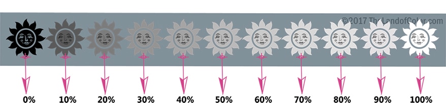
It seemed the best way to do that was to use simple-to-understand terms, and so they chose “light” and “dark,” defined in regard to colors in the dictionary. If you make a scale of 100 points with black at one end and white at the other, you will see a progression where the pure black quickly turns to gray, the gray gets lighter and lighter — first rapidly then more gradually — until it is no longer noticeable and you go from off-white to bright white.
Of course, you can do something similar with all the primary colors and mixtures of those colors. The dictionary tells us that dark colors are those closest to black, zero on the scale of 100 points, while light colors are closest to white or 100. It seems obvious that for text or symbols that are either a light color on a dark background or a dark color on a light background, we must choose colors quite far apart on the scale. There are beautiful “medium” colors as well, but also plenty of opportunities for signs to include them outside the message area.
 The formula to determine the light reflectance value, or LRV.
CONTRAST BY NUMBERS
Unfortunately, simplicity did not win the day. Code inspectors do not like to make decisions about how light is “light.” They like numbers! And designers seeking subtlety as well as architects who prefer no distraction from their buildings want signs that interfere as little as possible. Light and dark often became “lighter” and “darker,” sometimes by just a few shades.
So how do we measure contrast? How do we determine what is “light” and what is “dark?” And just how much contrast is enough? Can red and blue ever just get along? It all comes down to something we can measure called LRV, or light reflectance value.
LRV, a numerical expression of the amount of light reflected or absorbed by colors, is not at all difficult to obtain for materials including paints, inks, vinyl, plastic and even wood and metals used in sign fabrication. In the United Kingdom, where the importance of contrast in architecture has been studied for many years, the British Standards Institution or BSI, their counterpart to the American National Standards Institute or ANSI, long ago developed ways to measure the LRV of materials like four-color prints and even carpeting.
Available to anyone is a very accurate and affordable colorimeter that can measure a narrow character stroke and provide an LRV that usually varies no more than two points from the LRV provided by the supplier. A tiny enclosed light peeks through an aperture that is held close to the sign surface. It detects the reflected value of that stroke or background color no matter the available light in the room.
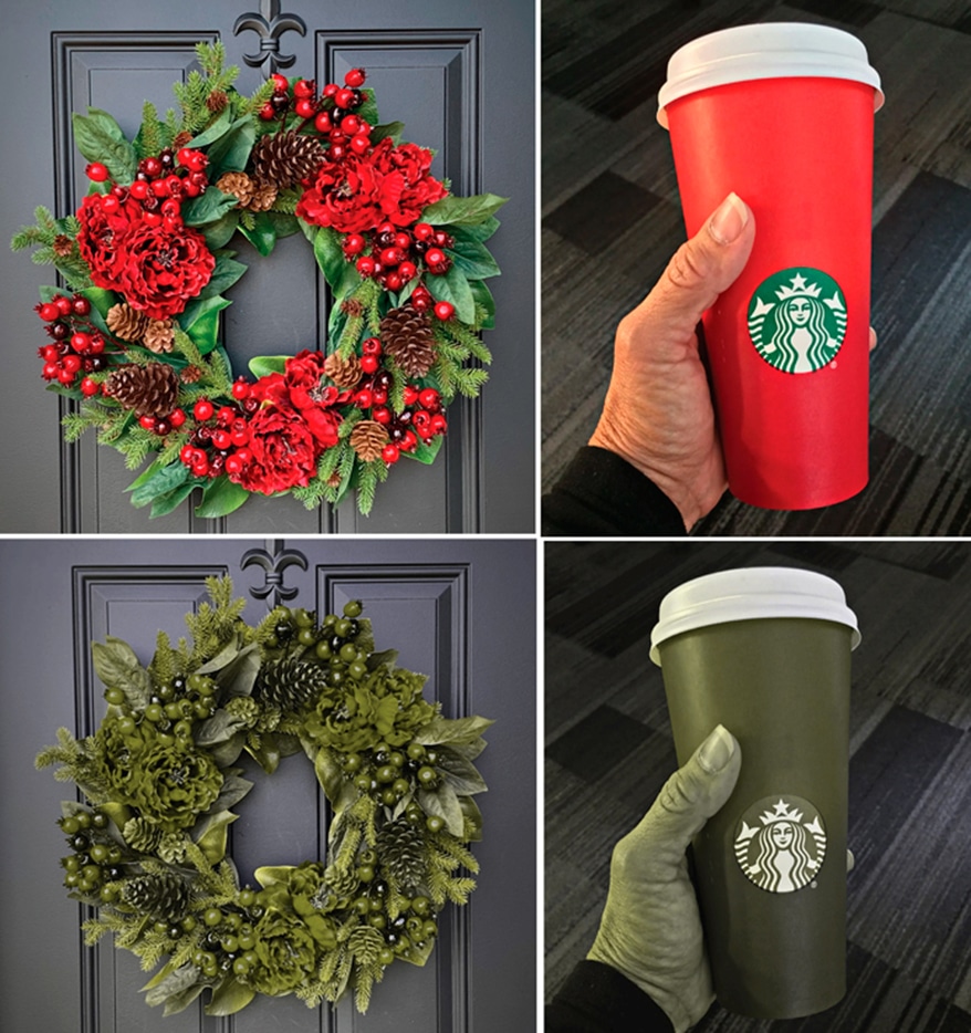 A good example of how Christmas colors appear to people — about 8% — with common red/green color blindness. If you have the rare form, where red and black cannot be distinguished, you lose even more of the “spirit of Christmas.”
The BSI has also made it very easy to find good contrast without forcing people to work with complicated formulas. You simply find two colors with LRVs that are 70 points or more apart. In reality, that translates to 75% or greater contrast for signs, which is also the minimum sign contrast required by the International Standards Organization or ISO. (The US is a member.)
For many years, the US — in some scattered documents and standards including the original Appendix of the first set of ADA Standards (usually referred to as ADAAG) — has listed a minimum contrast of 70%. Some architects routinely require it. The 70% minimum has been used in other countries as well, and has been long supported by organizations representing people who are blind and have low vision. With more people living longer active lives, along with more awareness of “color blindness” and diseases that cause loss of contrast sensitivity, interest has grown in requiring even greater contrast for important architectural wayfinding signage.
 Example of dark on dark sign bid request. (This is an actual recent bid request.) In this case they are using the “error” of the formula to prove that this sign, with very little contrast, would have 70% or more contrast. This very clearly shows the problem of relyiang on the Weber Formula without setting up a boundary for the light color. A boundary for the light color of 70 LRV would provide adequate minimum contrast.
WEBER FORMULA LIMITATIONS
Of course, formulas were developed to find the contrast ratio of two light reflectance values. The one most often used (and one of two choices cited by the ISO) is the Weber Formula. Weber developed his formula to explore the whole visual and light reflectance spectrum and did not consider that comparing the LRVs of two very dark colors would result in a misleading percentage in respect to signs. The Weber formula can only be used if you divide the spectrum by setting the lowest level for the light colors. The ISO requires the lighter color to have an LRV of at least 70 points or higher. Color scientists throughout the world have long recognized that without such a boundary, the Weber Formula cannot be used for sign contrast.
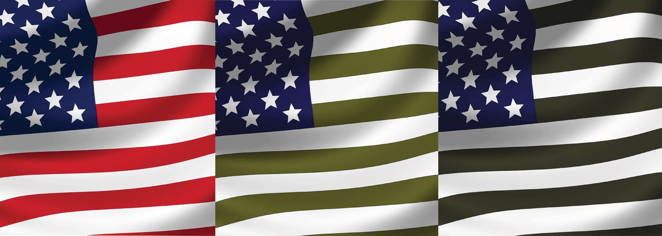
Let’s return to some of our famous color pairs, beginning with red and blue. How would they fare with our contrast formula? The red and blue that symbolize our political opinions are our flag colors. Benjamin Moore Patriot Blue is LRV 7.11. Old Glory Red is LRV 12.5. Contrast is only 43%. Maybe we are not as far apart as we think! However, the designers of our flag understood how important a highly visible flag would be. The red and blue seldom touch, and the stripes are separated with bright white, as close to 100 LRV as possible. Almost as if they had a message for today, no states are designated either blue or red! Each is represented by a shining white star.
 Although people with some forms of color blindness can certainly distinguish the pumpkin and its features even when they do not see red, it is obviously more difficult, and becomes more difficult in poor lighting. The dark green appears much closer to the black than the orange-red does.
Moving back to October and Halloween, what about orange and black? I found a black with an LRV of 2.67 and a Pumpkin Orange with an LRV of 30.36. I’d call orange a “medium” color, certainly not light. Weber nevertheless gives us a whopping contrast figure of 91%. Orange and black have another problem as well. When a color has a lot of red, for a large number of men with red/green color blindness that color tends to look like a dark greenish gray. You can install a free program called Color Oracle on your computer to see what your signs look like to people with red/green or more rare forms of color blindness.
I don’t even have to remind you that red and green “holly-berry” colors are no fun for the significant percentage of men who have the most common form of color blindness. Advertisers should be careful about putting red directly on green if they want to attract about 8% of the population who cannot tell those colors apart. Some NFL fans might remember the fiasco in 2015 when designers outfitted two opposing teams in identical uniforms, one in red and the other in green. Colorblind football fans, not to speak of players, coaches and officials called “foul” when it was difficult to tell one team from the other. If you can’t separate red and green on your signs, try to at least vary the darkness. Pair bright red with a much lighter shade of green if the two colors are going to be right up against each other. Let the LRVs guide you.
 Although people with some forms of color blindness can certainly distinguish the pumpkin and its features even when they do not see red, it is obviously more difficult, and becomes more difficult in poor lighting. The dark green appears much closer to the black than the orange-red does.
GREATER CONTRAST
Now that you know a little more about the science behind color contrast, how it affects signs and those who need them to access public buildings, you may have been surprised, as I was, to see a recent color contrast example on the website of the International Sign Association. They explain how they worked together to convince two members of the ANSI Committee who represent the American Council of the Blind to lower their minimum standard from 70% to 65%. That puts the US now 10% lower than the ISO and the United Kingdom in its minimum contrast requirement for signs.
In addition to lowering the contrast minimum, they added a requirement for using the Weber Formula but did not include the all-important lower boundary for the light color. That is how they are able to switch a medium color to either “light” or “dark” so even more low contrast signs will meet the new 65% requirement. I call this the “magic color switch!” By using medium colors along with the Weber formula, use the same color as either light or dark, and like magic, you meet the proposed new standard!
It would save us a lot of math anxiety if we used the British method: require a certain number of points between the two numbers. Don’t like math? Just separate the two LRVs you use by 65 points and you will achieve the minimum 70% contrast many architects now require (and make a lot of elderly people, people with vision loss and colorblind people happy at the same time).
If you are serious about creating signs that can be read by those with low vision, check the LRVs for the materials you use and separate them widely — at least 65 points. If you print color signs, get your own colorimeter. The British require that for all multicolored materials, you take a number of measurements over a large swatch of material and then average the results.
So yes, bright red and dark blue can get along, but for signs, we need to keep a little distance between them just as Old Glory does!
PHOTO GALLERY (11 IMAGES)


Secrets of Lead Generation
Boost your sales by generating more leads! In this light and lively webinar featuring Maggie Harlow, CEO of Signarama Louisville Downtown (Louisville, KY) and the “Business of Signs” columnist for Signs of the Times, learn the secrets of how leads are generated, where they come from and how you can cultivate better (not just more) leads.


Bulletins
Get the most important news and business ideas from Signs of the Times magazine's news bulletin.
-

 Business Management2 weeks ago
Alternative Management Advice for Sign Companies
-
 Fabrication + Installation1 week ago
Small Signshop, Big Fabrication
-
 Real Deal5 days ago
Sign Company and Customer Clash on “Minimum 2 Hours”
-
 Paul Ingle3 days ago
120 Years of Signs, and I’ve Seen 41 (Mostly)
-

 Benchmarks2 days ago
5 High-Performance Vehicle Graphics Projects
-

 Tip Sheet5 days ago
Workflow Automation, Budget Discussion and More Signshop Tips
-
 True Tales2 weeks ago
My Shirt Says “Signs”
-
 Mildred Nguyen2 weeks ago
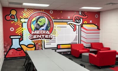
Interior Reimage Transforms Georgia School