On March 15, updated Americans with Disabilities Act Accessibility Guidelines (ADAAG) took effect. These govern the construction, alteration and identification of ADA-covered facilities – commercial facilities, state- and- local-government buildings and other entities that provide public accommodations. The regulations occurred through a joint consensus reached by the American National Standards Institute (ANSI), the International Building Code and the ADA Advisory Council.
Currently, facilities may observe either new or previous ADAAG requirements. However, on March 15, 2012, all facilities must comply with the new standards. Transportation facilities (airports, train and bus depots), which are administered by the Department of Transportation, and federal property, which the General Services Administration or the Department of Defense oversees, already comply with ADAAG standards.
Recently, I attended a workshop that pertained to ADA regulations at Cincinnati’s Michael Shuster Architects. Craig Berger, the Society for Environmental Graphic Design’s (SEGD) director of education and a member of the ANSI board that dev- eloped the standard, and Dixie Graphics’ sales executive Matt Williams led the program. The following is a summary of the key ADA regulations Berger out-lined, as well as common ADA-sign materials and production processes.
To read the DOJ regulations’ entire treatment of ADA signs, go to www.ada.gov/2010ADAstandards_index.htm and read Chapter 7, “Communication Elements and Features.”
Typography requirements
According to Department of Justice (DOJ) statistics, approximately 2.5 million Americans are legally blind. This means, even with corrective lenses, the person’s visual acuity is less than 20/200, or line of vision measures less than 20°. Millions more suffer with limited vision brought on by such conditions as glaucoma and macular degeneration.
Although braille has historically been perceived as a visually impaired person’s means of receiving information, the DOJ reports only 5% of visually impaired people use it to read. Rather, most read tactile copy.
Advertisement
Therefore, the typeface, character width and color contrast, among other factors, represent key elements that ADAAG regulations address. Here’s a summary of some of the new rules’ key components.
1. All tactile copy must be raised at least 1⁄32 in. above the substrate’s surface. Also, these characters must be sans serif, not italic or decorative. The stroke’s width on the typeface’s uppercase “I” must not exceed 15% of the letter’s height. Roughly, that equates to a ratio of 1 in. wide for every 6.5 in. tall. Also, the width of the font’s “O” (generally the widest letter) must measure 55 to 110% of height in relation to the typeface’s “I.” Thus, several fonts popular with environmental-graphic projects, such as Times Roman, Garamond and Goudy, which include significant serifs, aren’t permissible under new ADAAG guidelines. Berger noted the considerable number of effective sans-serif fonts, such as Helvetica, Fruitger and Arial – with more constantly being developed or adapted.
2. To ensure uniform character spacing that doesn’t confuse or frustrate the visually impaired, characters must be at least 1⁄8 in. apart, but not more than four times the characters’ stroke width, at the closest points between adjacent characters. Copy height must range from 5⁄8 to 2 in.
3. However, when ADA signage incorporates a separate set of characters, designed to create visual contrast that makes the sign recognizable to those with limited vision, tactile characters may only vary from ½ to ¾ in. tall, with no contrast requirement.
4. Signs with multiple lines of raised copy must have a space between lines that’s at least 35%, but not more than 70%, of the height of the typeface’s letter “I,” from the top of the lower line to the bottom of the upper line.
5. The distance from the floor to the bottom of a sign’s tactile characters must be at least 4 ft., but can’t exceed 5 ft.
Advertisement
6. Braille characters (Grade II Braille is required) must be placed below tactile components, and they must be rounded in shape and raised 0.025 to 0.037 in. above the sign’s surface.
7. Overhead signs (designated as those that are perpendicular to a wall, and ceiling-mounted or cantilvered off a wall, and more than 80 in. above the ground) less than 10 ft. above the ground must have characters at least 2 in. tall. Those more than 10 ft. overhead require characters more than 3 in. tall.
One discarded proposal would’ve required a color-contrast ratio of 70%, as proposed by some advocates for the visually impaired. The ratio is measured by subtracting the numeric light reflective value (LRV) of the color from the higher-LRV color, and dividing it by the higher value.
“We fought hard to keep this from becoming law,” Berger said. “This would have greatly limited the number of colors ADA-sign designers and fabricators could use. And, this requirement does not have a real correlation with visual perception and could pose very serious implications for the design of interior signage for public buildings.”
He acknowledged that, unfortunately, many handicapped-accessibility projects skirt, if not outright flout, ADA guidelines. For legal protection, Berger advised that any party involved get a letter in writing that the client, designer or fabricator intends to disregard ADA regulations.
“If someone sues over ADA non-compliance, it’s not likely that the instituion will be found liable,” he said. “Blame will roll downhill.”
Advertisement
Materials and methods
1. Raster™ Braille, which works with other engraving and routing machines and software to insert Raster spherical dots into the desired location. Plastics don’t require adhesives because friction secures the characters in place; metals and other materials require clear adhesives. Because Raster Braille is fabricated within such minute tolerances, coatings aren’t recommended for this process because they’re likely to make the Braille dots too shallow or misshapen, and therefore non-compliant.
2. Chemical etching entails printing graphics and braille on metal sheets – according to Berger,
any metal except aluminum accommodates the process – with a powerful UV light that’s filtered through a film negative. The flat sheet is then placed into a caustic bath of nitric acid, water and an oil-based additive. Imaged areas remain raised while the bath eats the remaining panel portion. The process creates copy and Braille dots with a slight angle, and the tops of the Braille dots are sanded. The fabricator uses a special pen tool to dome the dots to make the surface ADA-compliant.
Berger emphasized the importance of buying from an established vendor instead of attempting the process in-shop: “A signshop in Manhattan suffered an explosion because they used the wrong proportions of volatile chemicals. Don’t take that chance.”
3. Photopolymer panels comprise a light-sensitive, synthetic compound. A clear, high-resolution photopolymer sheet may be applied to various base surfaces. Computer-generated artwork is printed on a film negative and placed on the sheet. Exposure to ultraviolet light hardens the raised area. Braille-translation software designed for photopolymer may be used to create ADA-compliant characters. A 2mm-thick, satin-finish clearcoat or acrylic-polyurethane paint is required to protect the surface.
4. Sandblasting etches braille characters or raised letters into a glass panel using a non-silicate abrasive.
5. Encapsulated polycarbonate (PC) is manufactured using a multi-layer process that covers it with a 1⁄32-in.-thick, non-glare sheet. Tactile copy and graphics, raised 1⁄31 in., include Grade II Braille. All letters, numerals and graphics must contrast with the background. The PC layer may be applied to acrylic, metals, glass or wood, among other materials.
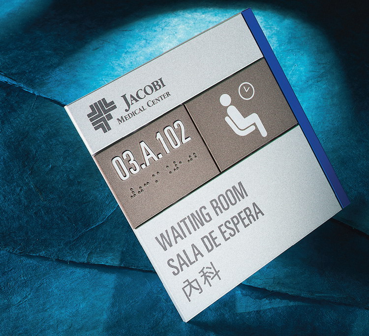


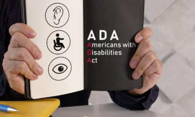


 Photo Gallery2 weeks ago
 Ask Signs of the Times2 weeks ago
 Paula Fargo1 week ago
 Real Deal6 days ago
 Photo Gallery1 week ago
 Women in Signs2 weeks ago
 Projects6 days ago
 Women in Signs2 weeks ago