Best Practices
Fonts of Wisdom
Timeless design endures for a reason.
Secrets of Lead Generation
Boost your sales by generating more leads! In this light and lively webinar featuring Maggie Harlow, CEO of Signarama Louisville Downtown (Louisville, KY) and the “Business of Signs” columnist for Signs of the Times, learn the secrets of how leads are generated, where they come from and how you can cultivate better (not just more) leads.


Bulletins
Get the most important news and business ideas from Signs of the Times magazine's news bulletin.
-
 Big Survey1 week ago
How Much Are Sign Companies Charging in 2026?
-

 Big Survey2 weeks ago
How Much Are Sign Companies Paying for Materials in 2026?
-

 Photo Gallery7 days ago
125 Years of Federal Heath in 16 Images
-

 News1 week ago
Federal Heath Sign Co. Celebrates 125 Years
-

 Heidi Tillmanns1 day ago
Sign Designers Should Plan Like Builders
-

 Editor's Note4 days ago
Follow the Signs to the 2026 Big Survey
-
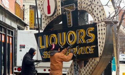
 News6 days ago
Chicago’s Foremost Liquors Sign Removed
-

 News3 days ago
LC Sign Launches The Touchpoint Initiative