Rob Ivers owns Rob Ivers Inc. (Raymore, MO), a vehicle graphics and installation company. He’s installed vinyl since 1978 and taught vinyl-graphics installation since 1993. For more information, visit www.robivers.com
I needed a new sign for my shop’s storefront. The old sign, which stood for seven years, had started to fade. Although many of you have been making vinyl signage for years, others may be new to the business. In this article, I’ll explain the steps I used to design and create a multi-color, computer-cut, vinyl-clad sign to hang over my front door. If you’re new to the sign business, my explanation of the process should prove quite helpful. I hope that even veteran signmakers will discover a tip or two.
Design
I wanted a simple, yet attractive sign that uses an effective layout and color scheme. A well-designed sign draws the viewer’s eye to the most important information first, then to secondary components. In my case, I emphasize the name of my business first, and then the work I do.
Clutter overloads many signs with too much information. Empty space amplifies your message. My rule of thumb calls for devoting half of a sign’s height to content, and the other half to negative space. I strongly suggest situating your sign’s primary focus towards the center, and making it larger than other components.
Advertisement
Avoid using too many different typefaces; it looks unprofessional. I chose Helvetica Black Italic Con-densed and Helvetica Bold Con-densed. The heavier, italic typeface helps emphasize the name. The condensed version allows me to make the name taller without appearing too wide.
Heavier fonts also work better for chiseled effects. Using the same font family for descriptive text main- tains good design. The lack of italics helps distinguish it as a separate component, and a lighter text weight clearly indicates secondary importance.
I used such graphic elements as the chiseled font, the border and the gold diamond bullets between the services to enhance the eye appeal. Whatever design you choose, make it memorable. People are inundated with so many visual stimuli; they tend to ignore the ordinary.
I chose a black background to contrast with the building and differentiated it from the majority of signs with white backgrounds. I used silver (instead of white and gold), to add some class. For the chiseled text’s accent color, I used a mirror-finish gold to add some pop.
Production
Advertisement
Graphics that comprise multi-color, plotter-cut vinyl pose registration issues. I’ve used many registration marks and strategies with varying degrees of success. Initially, I used the most common registration mark, a circle with crosshairs. I discovered this mark, although very good for printing, helps vinyl cutting very little. It requires intricate cutting and weeding, which wastes time and doesn’t provide better alignment than other shapes. I realized a triangle, with only three lines to cut, would provide the simplest shape.
However, I had difficulty seeing registration marks through the premask. Lighter colors proved especially difficult. I had an idea: I situated the triangles with the graphic’s base-color components, but cut the triangle out of the upper layers’ colors. I could see the installed triangle through the holes. Because these triangles were usually small, I could perform the jobs freehand. SignLab® software users can choose the triangle setting with the software’s automatic-registration tools. I worked closely with CADlink programmers for years and convinced them to add that feature.
Rectangular weed borders offer another alternative to marks. Strategically place rectangles relative to multi-colored content or the sign’s edges. After weeding, leave the extra vinyl until after you premask. Then, trim the rectangular shape. Now, you can use the entire outer edge for positioning. Most installers use weed borders because they subdivide graphics into sections, which simplifies weeding. For this sign, I placed a weed border around the mirror gold that matched the outside dimensions of the text, “Rob Ivers, Inc.”
After weeding and premasking the mirror gold, I simply cut it to that rectangle’s exact shape. To line it up, I just match up the outer edge with the previously applied text. To save time when fabricating most small signs, make the weed border the same size as the sign. You can position and apply the graphics quickly without a tape measure.
To achieve a smooth application, premask the graphic properly. If the premask gets bubbles and wrinkles when you apply it to your graphic, you’ll have little chance of applying the vinyl smoothly.
I suggest building or purchasing a device that mounts to your table that holds the premask roll. Mounting-device functions differ, but most cost around $200. Unless you have unique installation needs, or just enjoy MacGyver solutions, I recommend purchasing a unit. The goal is to prevent the premask from touching or sticking to the vinyl prematurely. Premasking will be easier and only require one person.
Advertisement
How high the premask sits above the table makes a big difference, and it becomes more critical when masking larger pieces. Your device should hold two rolls, one above the other. Use the lower one for smaller items, and the higher one for the bigger, longer panels. Apply the premask to the vinyl the same way you would apply the vinyl – smoothly and bubble-free. For more details, please read “Squeegeeing with a Purpose” (see ST, March 2010, page 28).
Next month, Rob will discuss proper vinyl-graphic application techniques.

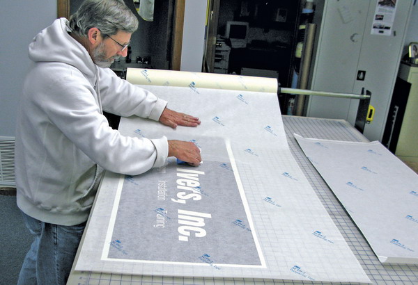
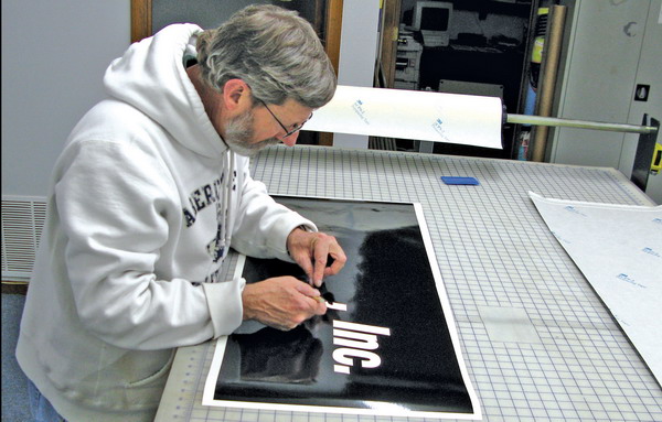
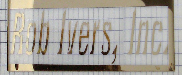
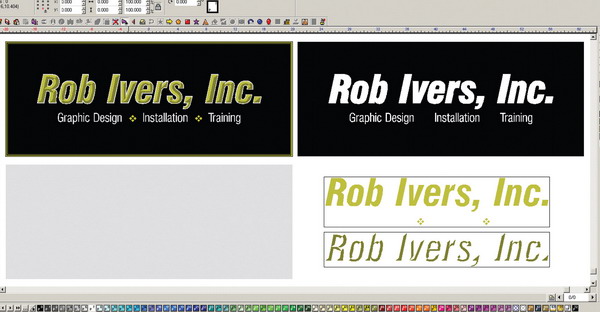


 Photo Gallery2 weeks ago
 Ask Signs of the Times2 weeks ago
 Paula Fargo1 week ago
 Real Deal5 days ago
 Photo Gallery1 week ago
 Women in Signs2 weeks ago
 Projects5 days ago
 Women in Signs2 weeks ago