Digital Printing
Large-Format Graphics
The search for those elusive pixels
Published
15 years agoon
To print or not to print, that is the question. Touching the start-print button is based upon knowing if the file image is ready to print, meaning that it’s been through your series of prechecks – preflight, proof, custom settings, media and ink profile, and surely more. Before this, however, you’ve had to determine if the image has the number of pixels – resolution – needed to produce a print that will satisfy your customer (because customer choices often differ from those of the print producer).
In many occurrences, it’s not viewing distance that determines the final resolution/pixel count, but a customer’s concept of what is acceptable.
The viewing-distance line of reasoning must have begun with George Eastman’s first photo enlargement, but, in the digital age, an enlargement process is often accompanied by the digital printmaker’s arch-enemy: a desaturated and grainy image.
Lack of color saturation can cause an originally brilliant graphic to appear colorless. Further, such an enlarged, but thinned-out image may also produce stair-stepped jaggies, artifacts and more.
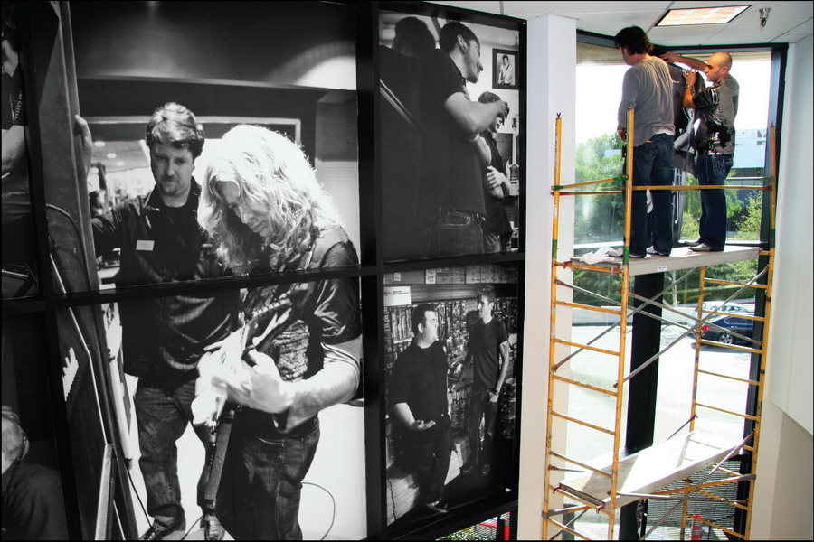
The following paragraphs discuss this one area of large-format graphics: how to get more pixels – saturation and, therefore, color – when the original file lacks the necessary pixels.
The best way, of course, is to create the original file at the final image size, with your desired pixel count selected. Unfortunately, not all software will do this. A second method is to calculate and select an original ppi count that matches your desired output. Method three is potluck – take what your print-buying customer sends, and try to make it work.
Vector art is the easy stuff. Put a dot here, another there and draw (or imagine) a line in between. In ancient times, ship navigators, working with Greek mathematicians’ plane-triangle theories, determined that simple trig vectors and rhumb-lines could help them traverse the globe. Today’s ship and air navigators use computers to do the same thing, that is, finding and driving to a theoretical point that you can’t see.
See navigational vectors as definable turning points: a1, b2, c3 and so on. In computer graphics, a vector point is an addressable one, meaning, an engineer or programmer – and you – can define the point by its numerical x,y coordinates, an address, that is.
It wasn’t long before more savvy navigators discovered that rhumb-line routes, meaning straight lines that cross all longitudal meridians at one angle, are actually longer than great-circle routes, which include slight, in-route revisions that account for the earth’s curvature. Today, your San Francisco to Tokyo airplane pilot changes the flight track often to pass over earth-curvature-correcting vector points, “waypoints,” and, therefore, travel the shortest route. This was the first occurrence of computer-based, “fuzzy logic” systems, those that interpret the requirements of a moving object and act accordingly, rather than reacting to actions as they occur.
Experienced pool players act similarly when they set up for a following shot.
A navigation waypoint is a numerical coordinate that’s located by a longitude and latitude description, or other methods (the military’s Universal Transverse Mercator systems, for example). Waypoints are a series of confirmation (dead-reckoning) turning points along a planned route; the final waypoint is the end target.
Essentially, a waypoint is a navigational reference point. See it, also, as the reconfigure point for a cutting plotter’s blade or the addressable location for an upcoming, digitally printed ink dot, meaning the address where a digital printer will deposit its ink drop.
Fuzzy-logic-equipped cutting plotters use a system comparable to the navigators – the plotter’s computer reads ahead, to determine the projected plot. It then forecasts a route that’s based upon the proposed pathway reading and recorded, past experiences.
Knowing where to go diminishes turning-point decisions; the waypoint actions help you get there faster.
See it as the difference between knowing your way to the grocery, or driving in a strange town and not knowing.
Too much theory? Bear with me, because, knowing the underlying theories helps one understand digital-print machines and the accompanying software processes.
Known addresses
A digital, print machine places each ink dot at a software-determined address, that is, a navigation-placed waypoint. Interestingly, similar software instructs the display-based LED lamps in electronic-digital signage and the illuminated, LCD pixels on your computer screen.
Keep this in mind: Vector points can be inestimably expandable, but raster-based images, the supply resource for bitmapped images, aren’t easily expanded. On a map, you can “x” one vector-located dot in your front yard and another at Kennedy Airport and draw a flight-navigable line between. You can then print a mile-wide copy, and the vector line, formed by one dot defining the route to another, will, in theory, remain intact.
Vector images are more easily scalable because they define shapes (and sometimes colors) in relation to mathematical values.
Signmaking-software engineers use this same principle to create the algorithms that will expand an inch-high, vector-based, letter or graphic to almost any size. Use the signmaking software to enlarge the half-inch letter to 3 ft. tall, and it will remain sharp. Not so easy with a raster-based letter image.
A “raster” image is a bitmap image, one in which each pixel’s color value is exactingly fixed.
Raster-based images, bitmaps, come with a defined supply of pixels. You can expand the image size by moving the pixels further apart, but this action creates a negative space in between. Thus, unless you’re producing Andy Warhol-type prints, you want to avoid this type action.
Remember Walhol’s famous 1970s prints of Marilyn Monroe and Campbell soup cans, with exaggerated dot sizes and intense colors?
Colorless prints
Too much negative space between ink dots is one cause of desaturated – soft and colorless – prints. It’s most often caused by excessive negative space between ink dots, which affects the color intensity. A desaturated print lacks color; it may have noticeable white, black or grays zones.
Saturated is the opposite, of course, that is, a print with strong hues, colors.
I have to be careful with these definitions, because color-theory purists tend to write letters to the editor. Colorcube.com says chromaticity is about a color’s purity, its hue. It says a high-chroma color won’t have any white, black or gray; instead, it will be vivid and pure. Colorcube further says that saturation is related to chromaticity, but to think about it in terms or pale and weak, or pure and strong.
Expanding the space between pixels (pixel-pitch) adds negative space, most often white negative space.
Another source says “… terms such as chroma, saturation, purity, and intensity are often used without great precision and , even when well-defined, depend greatly on the specific color model in use.”
How to avoid color-intensity loss is both an engineering (printhead and ink) and graphic-design problem. As I said earlier, whenever possible, the designer should create the to-be-printed image at 100% size or something close. Thinking designers create most large-format graphics at a smaller ppi count, but one that will satisfy the specified, final print size.
Unfortunately, most jobs aren’t designed in-house, which sometimes leaves the print producer with an original that doesn’t have enough pixels to create a sharp print, or, at least one as sharp as they’d like.
Image resolution (detail) gains as you add pixels. If everything else works (camera focus, for example), the pixel count determines the amount of detail within the image. For example, 300-dpi resolution printed as a 4 x 6-in. image provides sharp detail, whereas, 72 dpi printed on a 4 x 6 sheet will produce a soft, lackluster image.
To get the true resolution of an image, multiply the pixel width by the pixel height, which gives the number of pixels in the image. A megapixel is approximately one million pixels.
Field views
I asked the following question on several of LinkedIn’s digital-print web group sites, to bring other’s insights into this examination.
The question: “All bitmapped files for making digital, large-format prints – a billboard or magazine cover, for example – are pixel relative, meaning, the pixel count needs to meet or exceed the requirements of the final image size, to be visually acceptable. However, even in this day of 10-megapixel pocket cameras and hi-res design programs, the ‘not enough original pixels’ problem still plagues designers and prepress-type staffs. What do you do if the original file resolution is too low for the planned print or the desired print size is too large for the received, image file – and an additional, high-res file isn’t available?”
Meaning, where does one get additional print pixels when the original just doesn’t have enough?”
I said I was after resampling information, that is, increasing the number of pixels in an image, not resizing, which merely changes the overall size. Don’t confuse resizing and resampling – the first changes the image size, but doesn’t add pixels; the latter does.
Numerous software exists for up-scaling bitmapped images – Genuine Fractal, plx SmartScale and Adobe Photoshop’s bicubic resampling process, for example – but I was curious to see what real-world users thought was the best method, or software, to boost a print file’s pixel count. I acquired several interesting answers.
Balazs Vegh, the chief technical officer at OSG Hungary Ltd., using the example of 25 still frames per second in the TV or movie screen, said our eyes are easy to fool. That said, he noted the digital-print, printhead industry applies – and inventories – ink dots in various fashions, meaning, apparent resolution is one method of saying less ink dots look like more.
I once attended a digital-print workshop where the instructor asked attendees to judge variously printed banners’ sharpnesses from the back of the room, some 30 ft. away. Until we moved closer, we couldn’t see the difference between the numerous print samples, but, upon closer examination, saw the lower resolution images lacked the color strength of the higher-resolution ones.
Vegh said apparent resolution also depends on the nature of the image. A landscape with clouds requires less resolution than, say, a Porsche 911 Carrera poster image.
If a higher resolution file isn’t available, Vegh said, the printmaker should expect to produce a compromised print, because, irrespective of the resampling method, the print will have softer details and contours.
Chris Lynn, VP, sales and marketing for Xaar Americas Inc., said a printmaker that starts with
a few million pixels could make almost any-size image look satisfactory – for its likely viewing distance.
Chris once worked for the company that developed the fractal-scaling technology used in the Genuine Fractals product. He said fractal scaling is typically better than bicubic interpolation on sharp edges, but that Photoshop’s bicubic also works well.
Remember to charge extra for such work.
Interpolation
Interpolation is a method of forming new data points from a set of discrete data points; it’s an algorithm system that creates new pixels or eliminates pixels in an image as it’s sized up or down. Interpolation systems are segmented into digital-print resampling programs. In the end, all use mathematical formulae to “guesstimate” the missing pixels’ location, image and type.
Fractal scaling uses a fractal geometrical algorithm to scale a bitmapped image. It surveys the image’s fractal geometry and is said to produce a higher scaling factor than other methods.
Bicubic resampling evaluates the colors of each pixel’s neighbors and creates new pixels based on an average of those colors. Users caution, on larger up scales, a bicubic system produces a soft image. Incremental enlargement processing may help.
Some Photoshop users recommend you upscale the image incrementally, say 10 to 15% at a time,
to allow the algorithms to calculate smaller numbers and, therefore, reduce the chance of artifacts. Chris explained that any scaling algorithm will invent new information, based on some kind of “best-guess” system that uses the surrounding pixels.
Chris also said you should consider the screening/printing method before upsizing. For example, greyscale (variable-sized) ink drops will give the effect of a higher resolution (than the same image printed with a fixed drop size); thus, you need less enlargement. It may be a better system for working with small-pixel files. Other systems create similar results.
A new print-machine buyer should think about this added benefit when choosing a new printer.
Also, Chris said to make a careful RIP-resolution choice, because “…you can undo all the good by not using a high-quality scaling method.”
Starting off with enough clean data is crucial, he said.
No lousy prints
I contacted Mark Rugen, the president of givemehelp.com, to see what he recommended as a pixel-gain system. Mark has more than 20 years’ experience in the sign and graphics market and has traveled the world teaching CASmate, Inspire, FlexiSIGN and color-management principles.
I’ve taken Mark’s workshops – he’s an excellent teacher.
Mark agreed that image resolution at final print size is a difficult issue. He recommended PhotoZoom Pro 2, a Ben Vista product, because it has features that are simple for beginners, but also includes advanced features for more difficult bitmap projects. Mark said he’s taken 100 ppi images, as small as 3 x 5 in., and blown them up to 10 ft. at 50 ppi, with excellent results.
Again, think viewing distance. Most billboards are printed at 50 to 100 dpi.
Additionally, PhotoZoom Pro2 allows you to store files in all common formats, so it’s compatible with all design software. He cautions to watch for slight color changes, which are due to the resampling.
Mark also said to not expect acceptable results if you begin with a super-low-resolution image, but confirmed that he’s tested PhotoZoom with 2 to 4 in., 72-dpi, Internet-transmitted images and produced acceptable results.
Vegh said the best practice is either showing the client what the result will look like if they accept the contract, or asking for a higher-res image file. Don’t risk manipulating an image (even improving it) until the customer is aware of the risks, he said.
And, because no one likes a lousy print, the final choice for an incoming, super-low-res image is to decline the job.
Just say “No.”

SPONSORED VIDEO
Introducing the Sign Industry Podcast
The Sign Industry Podcast is a platform for every sign person out there — from the old-timers who bent neon and hand-lettered boats to those venturing into new technologies — we want to get their stories out for everyone to hear. Come join us and listen to stories, learn tricks or techniques, and get insights of what’s to come. We are the world’s second oldest profession. The folks who started the world’s oldest profession needed a sign.
You may like


Advertisement
Subscribe

Magazine
Get the most important news
and business ideas from Signsofthetimes Magazine.
Advertisement
Most Popular
-

 Photo Gallery2 weeks ago
30 Snapshots of the 2024 ISA Sign Expo
-

 Ask Signs of the Times2 weeks ago
Why Are Signs from Canva so Overloaded and Similar?
-

 Paula Fargo1 week ago
5 Reasons to Sell a Sign Company Plus 6 Options
-

 Real Deal5 days ago
A Woman Sign Company Owner Confronts a Sexist Wholesaler
-

 Photo Gallery1 week ago
21 Larry Albright Plasma Globes, Crackle Tubes and More
-

 Women in Signs2 weeks ago
2024 Women in Signs: Brandi Pulliam Blanton
-

 Women in Signs2 weeks ago
2024 Women in Signs: Alicia Brothers
-

 Projects5 days ago
Graphics Turn an Eyesore Cooler Into a Showpiece Promo in Historic Plaza