By definition, a luminary and an illuminated sign primarily differ because the former replaces or assists daylight in a defined space to aid human vision, while an illuminated sign strives to gain attention with light’s assistance, and then transmits a message.
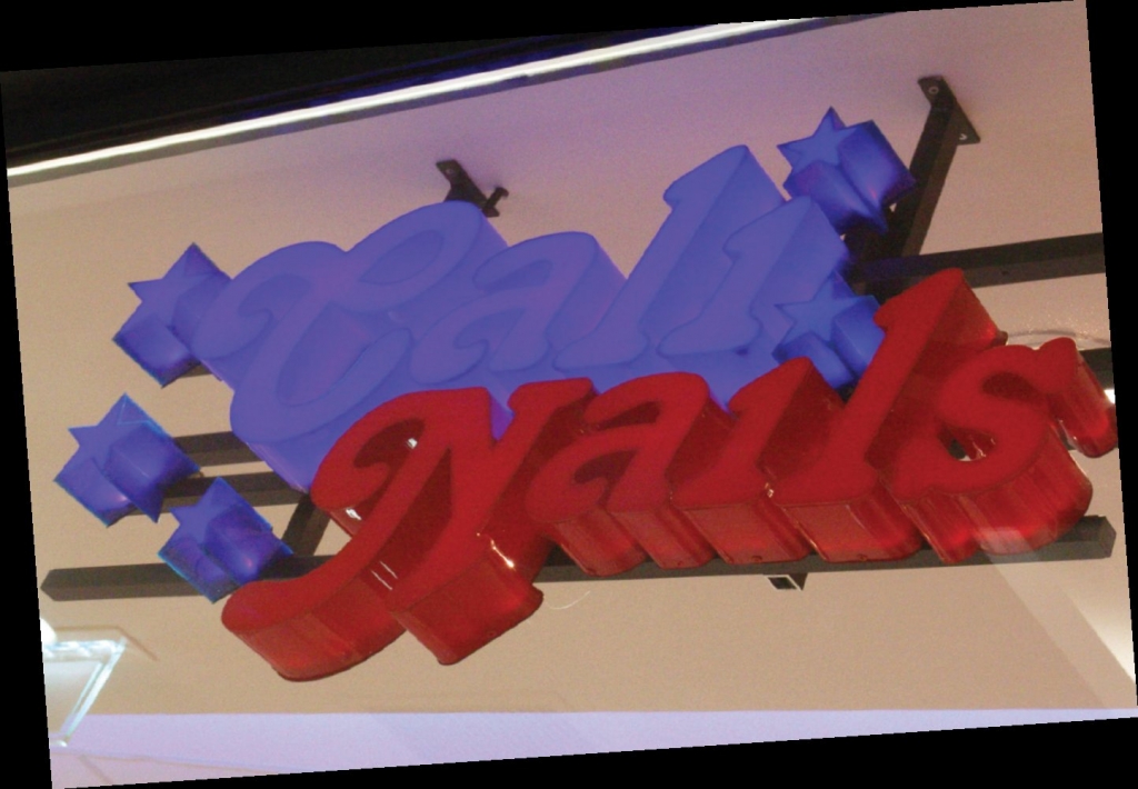
As lightsources, particularly LEDs, get smaller and brighter, many signshops seemingly neglect the sign’s main purpose; many current channel-letter signs are barely readable because their character properties don’t match the illumination level (Photo 1).
So what makes a sign readable? The yardstick is human ocular anatomy. At an optimum contrast level, the human eye can see two objects as separate if they reach the eye at an angle spacing of 1 arc-minute (1/60 of a degree). That equals a 1-in. separation at a distance of roughly 420 ft. If the object is too bright or dim, the eye resolution is easily reduced by a factor of 10 or more.
If the surrounding environment is too bright, the human eye can’t focus well on intense lightsources, which causes a blurred impression. Fig. 1 shows the irradiating effect of blurring starts at different surface-brightness levels, depending on the environmental brightness level to which the eye is adapted. With characters, unfocused/blurred characters start at much lower levels than for plain lightsources. The contrast, including color contrast, of the characters to the background influences the readability from a distance too; some examples are given in Fig. 2.
Character shape is another important parameter. Who hasn’t complained about their physician’s handwriting? (Sadly, proper handwriting isn’t taught at many schools anymore.) The more intricate and artistic the fonts are, the more difficult it is for the eye to decipher the message (Fig. 3). Usually, serif fonts’ varying stroke widths (like the widely used computer font “Times New Roman”) impair readability. However, some serif fonts, such as Courier, simplify character shapes and enhance the baseline, which leads the eye along the line of text (see Fig. 4 for dimensions of a line of text).
The simpler the character shape, the faster the eye can recognize it; thus, sans-serif block letters are good, but, for best readability, use capital block letters only. Capital characters of the same total height give much better character recognition at a distance than lower-case characters, because no space is wasted above lower-case characters or undercuts. Also, the stroke width plays an important role. Strokes that are too thin or fat (strokes much wider than the gaps) don’t read well. At best, the line width should be roughly 1/6 to 1/5 the height of the capital letters (Fig. 2).
Advertisement
Character spacing, aka kerning, is roughly as important as stroke width in lit characters (Fig. 5). Proportional spacing (space width proportional to the width of both adjacent characters) saves space, but takes longer to read compared to constantly spaced fonts. If we put characters too closely together, the eye can’t distinguish in-character stroke separations from character separations.
Thisisthesameaswhenyoudontseparatewordsproperly.
For legibility, here’s how to estimate a font’s minimum required character height, based on a height/width ratio:
Min. Height (in in.) = distance (in ft.)/ (600 * h-to-w-ratio * contrast factor). The contrast factor varies between 2.0 (for black on yellow) and 0.2 (for yellow on red).
In most local sign codes, sign sizes for illuminated signs are limited, depending on the city zones. So, the space permitted or available must be used effectively; less text is more. With the first electric signs (incandescents), irradiation/blurring posed problems. Although the light spots transformed into a more or less continuous blob of light, the shape of the characters disappeared. Frosted (or colored) lightbulbs helped reduce each individual spot’s brightness. Now, because modern LEDs are even smaller than an incandescent filament, the problem with too-small, too-bright spots persists (Photo 2). Even a standard, 20mA LED yields a local brightness of more than 10-15 million ft.-lamberts at the semiconductor crystal. Consequently, this lowers the local lightsource’s brightness below the level stated in Fig. 1, which implies great losses of light normally.
Because the environmental brightness of the sign must be considered, for signs installed inside shops and malls, the environmental light levels often can be assumed to be constant throughout the sign’s operation. Thus, for indoor signs, before estimating/quoting, measure the environmental light level to dimension the lighting system properly.
For outdoor signs, measure the sign’s environmental light levels at dusk and during average night conditions. Then, position the sign brightness for optimum readability at the highest brightness level, and employ a smart-dimming system that reduces the sign brightness with decreasing surrounding light levels (and switch off the sign during no-traffic nighttime). Optimum readability in all shades of dusk is guaranteed, but this also provides the largest possible energy savings. Of course, the signface material’s transparency should be as high as possible. This, even with the higher investment cost, and the use of numerous small-power LEDs (compared to a few high-power ones per sign surface, which need heavier scattering and, thus, higher losses) — click the related article here — will yield the most economical solution in the long run.
Advertisement


 Tip Sheet1 week ago
 Photo Gallery3 days ago
 Ask Signs of the Times5 days ago
 Real Deal2 weeks ago
 Benchmarks1 week ago
 Photo Gallery2 hours ago
 Women in Signs2 weeks ago
 Women in Signs1 week ago