Design
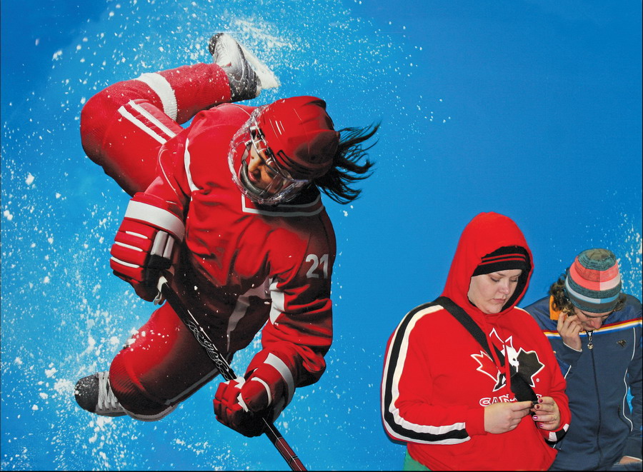
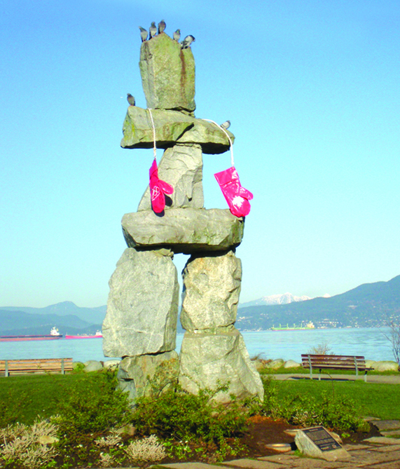
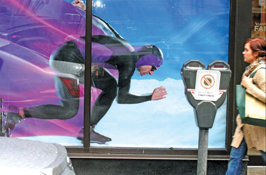
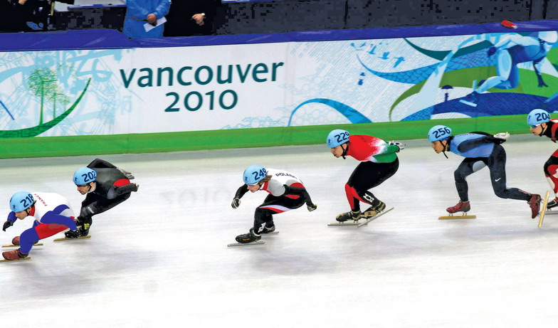
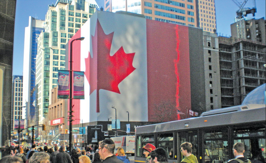
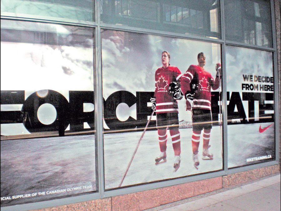
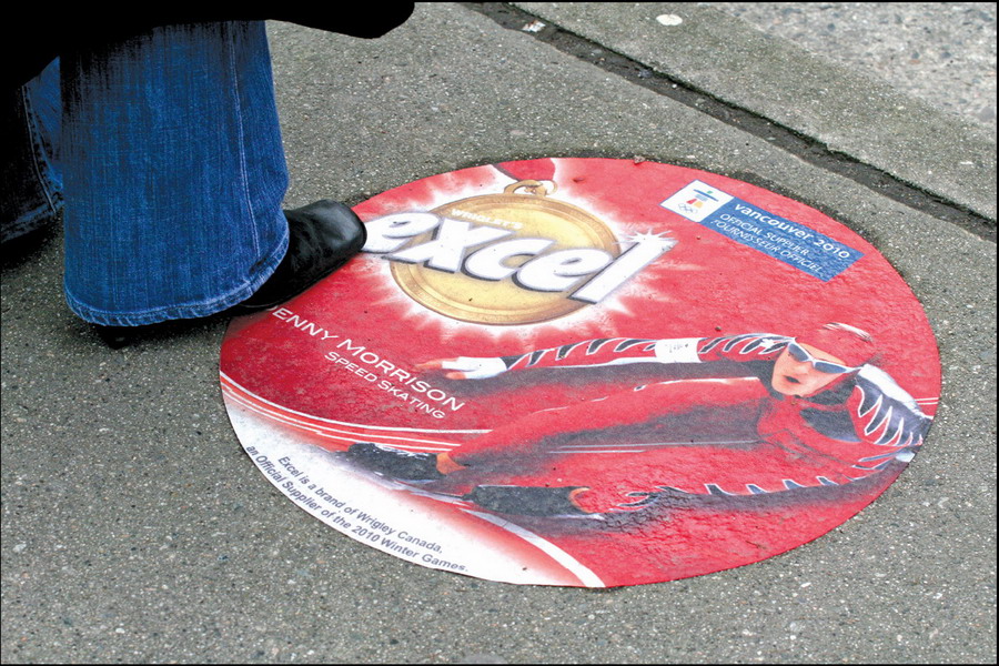
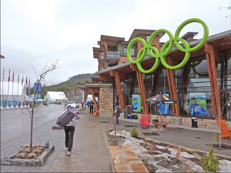
O Canada!
In an exclusive ST gallery, photographer Barry Allen captured how Vancouver’s Olympic Games and Olympic signage captivated the world.

Introducing the Sign Industry Podcast
The Sign Industry Podcast is a platform for every sign person out there — from the old-timers who bent neon and hand-lettered boats to those venturing into new technologies — we want to get their stories out for everyone to hear. Come join us and listen to stories, learn tricks or techniques, and get insights of what’s to come. We are the world’s second oldest profession. The folks who started the world’s oldest profession needed a sign.


Michigan Residents Make Parodies of Viral Detroit City Sign

What Makes the Perfect Sign Business Partnership

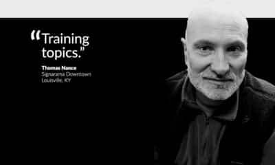
Marketing Signs to Schools, Tradeshow and Quote Follow-up Make May’s List


Bulletins
Get the most important news and business ideas from Signs of the Times magazine's news bulletin.
-

 Photo Gallery1 week ago
30 Snapshots of the 2024 ISA Sign Expo
-

 Ask Signs of the Times2 weeks ago
Why Are Signs from Canva so Overloaded and Similar?
-

 Paula Fargo1 week ago
5 Reasons to Sell a Sign Company Plus 6 Options
-

 Real Deal5 days ago
A Woman Sign Company Owner Confronts a Sexist Wholesaler
-

 Photo Gallery1 week ago
21 Larry Albright Plasma Globes, Crackle Tubes and More
-

 Women in Signs2 weeks ago
2024 Women in Signs: Brandi Pulliam Blanton
-

 Women in Signs2 weeks ago
2024 Women in Signs: Alicia Brothers
-
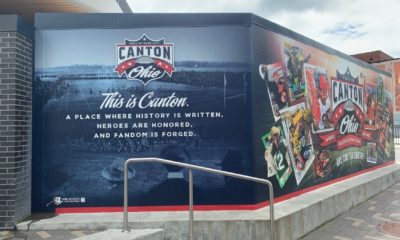
 Projects5 days ago
Graphics Turn an Eyesore Cooler Into a Showpiece Promo in Historic Plaza