Coast To Coast
From West to East to Down Under, these wayfinding systems will keep you on track.
NO MATTER THE PART of the country — or world — you’re in, the need to know where you are is universal. And it is more than simply not getting lost; it’s more about being found, or rather, finding what you’re looking for.
Altitude Design Office (Santa Monica, CA) Principal/Founder Greg Nelson guides his company by a similar principle, that all who wander are not lost, at least so long as someone has made them signs along the way.
“Our work is motivated by our understanding that finding and navigating new places and large spaces can be daunting, so one of our primary goals is always to anticipate wayfinding needs with a sophisticated, yet reassuring approach to design,” Nelson says.
Only by the planning and anticipation of wayfinding needs all along the way have these three companies discovered how to make even the most winding trails make sense.

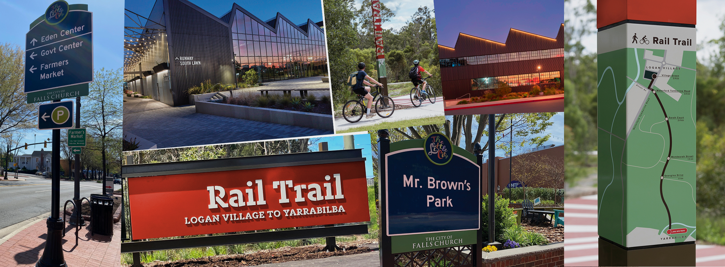
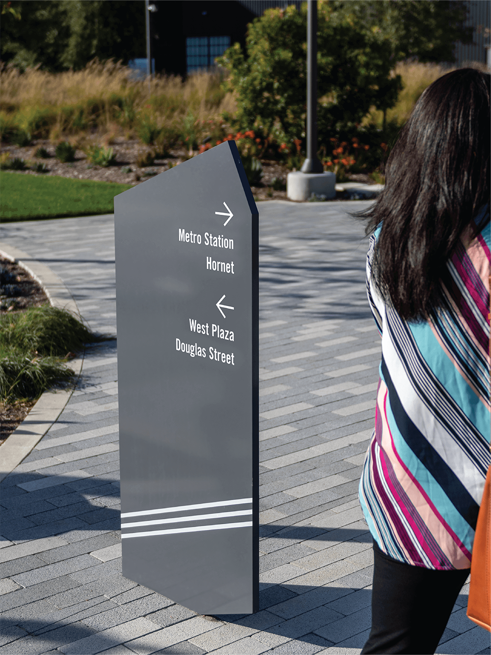
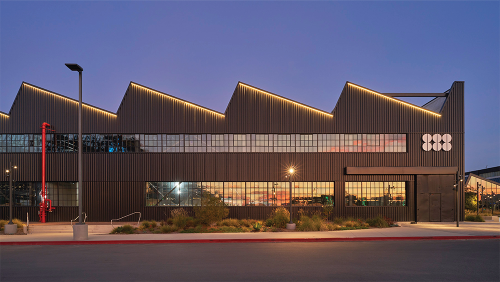
FLIGHT 888 Altitude Design Office used a cool gray and metallic palette to create a unified system of branding, architectural signage and wayfinding solutions, helping transform the 1930’s, 30-acre site.
INDUSTRIAL EVOLUTION
COMPANY: Altitude Design Office | LOCATION: Santa Monica, CA
principal/founder: Greg Nelson | URL: altitudedesignoffice.com
W hen Altitude Design Office was approached by longtime collaborator and owner/developer of the former transportation and aerospace manufacturing space at 888 North Douglas (El Segundo, CA) to again work with them, saying “yes” was easy.
“They are a company we admire for their visionary approach to real estate development and for their successful track record in transforming aging urban properties into creative offices and communities,” Altitude’s Nelson says.
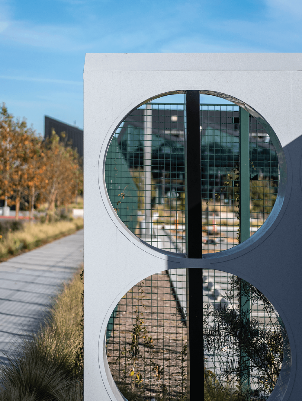
Altitude was tasked with creating a unifying system of branding, architectural signage and wayfinding that would help transform the 1930’s buildings and surrounding 30-acre site into a modern creative campus fit for 21st-century companies. Historical architectural details (50-ft. ceilings, sawtooth skylights, catwalks, bridges, railway corridors and more) were to be preserved while updating the indoor-outdoor space with new amenities.
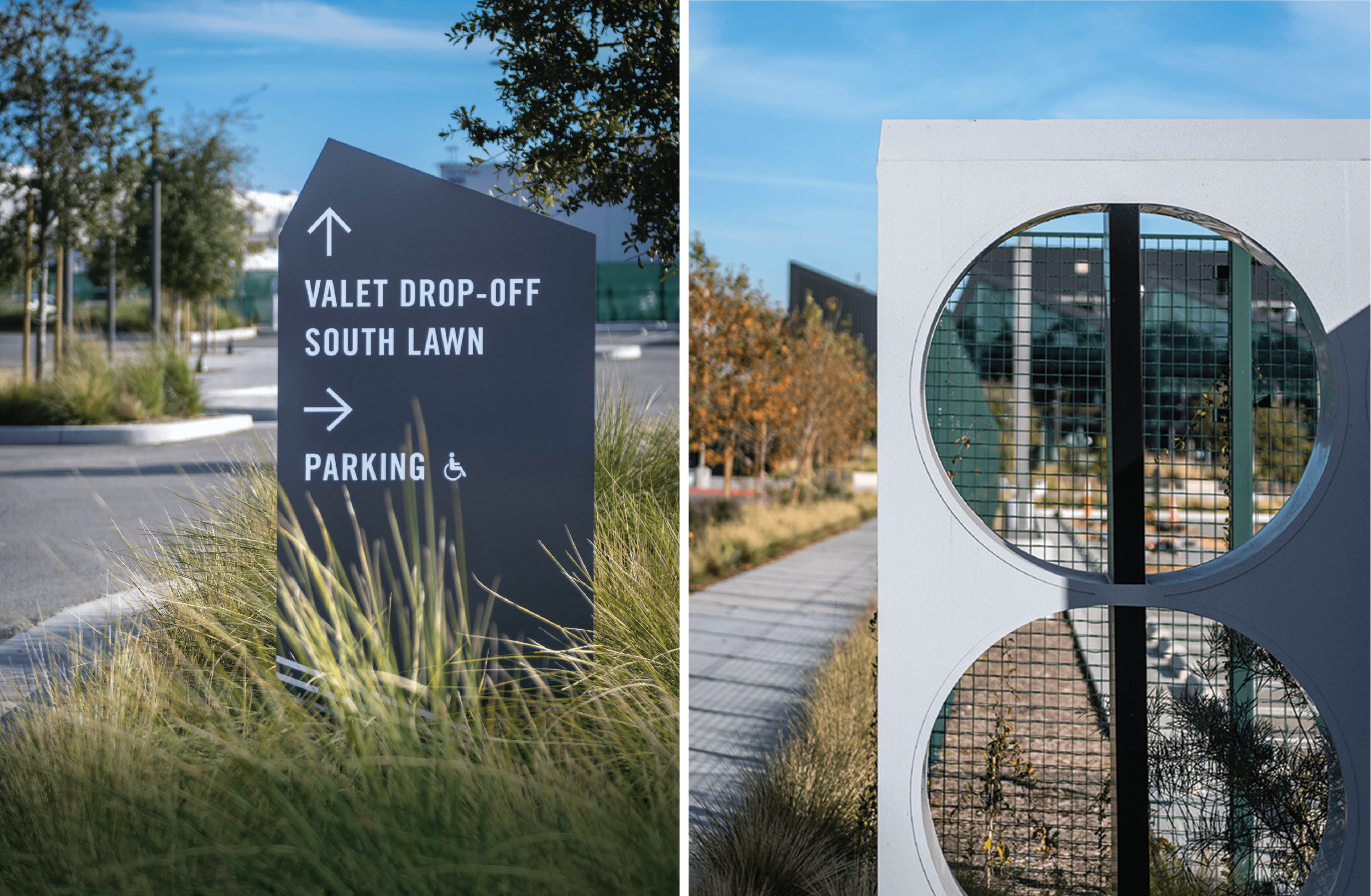
To that end, Altitude designed and developed North Douglas’ brand, visual identity and signage to include site, building and tenant identification signage; entry monuments; graphic murals and installations at each property entrance, the four buildings’ entrances and other primary points of navigation; and campus-wide wayfinding signage of varying types.
The team didn’t have to look too far for design inspiration. “The site and its history as a manufacturing facility (as well as its 888 address) offered [ample] design cues, from typical flight patterns and propeller designs to the symmetry of the number ‘8,’” Nelson says. “All of these sources of information and input were merged with the existing architectural aesthetic and the client’s vision for a new community hub.”
The graphics were concepted, developed and programmed using Adobe Illustrator, Adobe InDesign, CADtools, Astute Graphics, SignAgent and PlanGrid. Altitude chose a cool gray and metallic color palette, while angular, overlapping graphics and other design details took their cues from the historic buildings’ unique geometry and from designs and patterns coming from the site’s landscape designers, Nelson explains.
To create a cohesive, branded experience, this new visual identity informed the design of every onsite touchpoint ranging from large monument signs to smaller directories.
Materials used were primarily concrete and a mix of anodized, painted and powder-coated metals. Most of the signage was specified to be ¼- or ½-in.-thick painted aluminum, due to its weather resistance and because it reflected the corrugated metal, architectural windows and other historic site materials.
The ground-mounted directional signage was manufactured out of 1-in.-thick, black-anodized or painted aluminum, often with white stenciled lettering as well as dimensional graphics and/or push-through acrylic graphics applied to metal panels, Nelson says. For all paint applications, Altitude requested Matthews Paint for its ability to hold up well in exterior environments.
As Nelson explains, Altitude’s attention to detail at the North Douglas site has begun to pay off. “The redevelopment and rebranding of this unique property has already attracted multiple tenants to sign long-term leases, including Beyond Meat for their global headquarters and L’Oreal for their second company headquarters,” Nelson says.
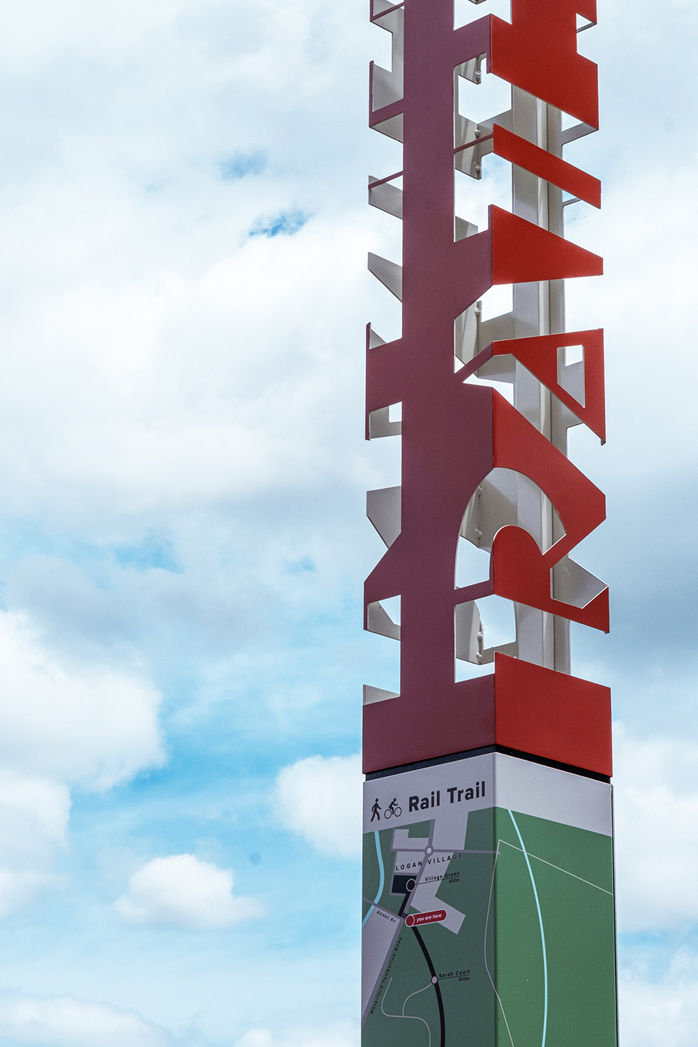
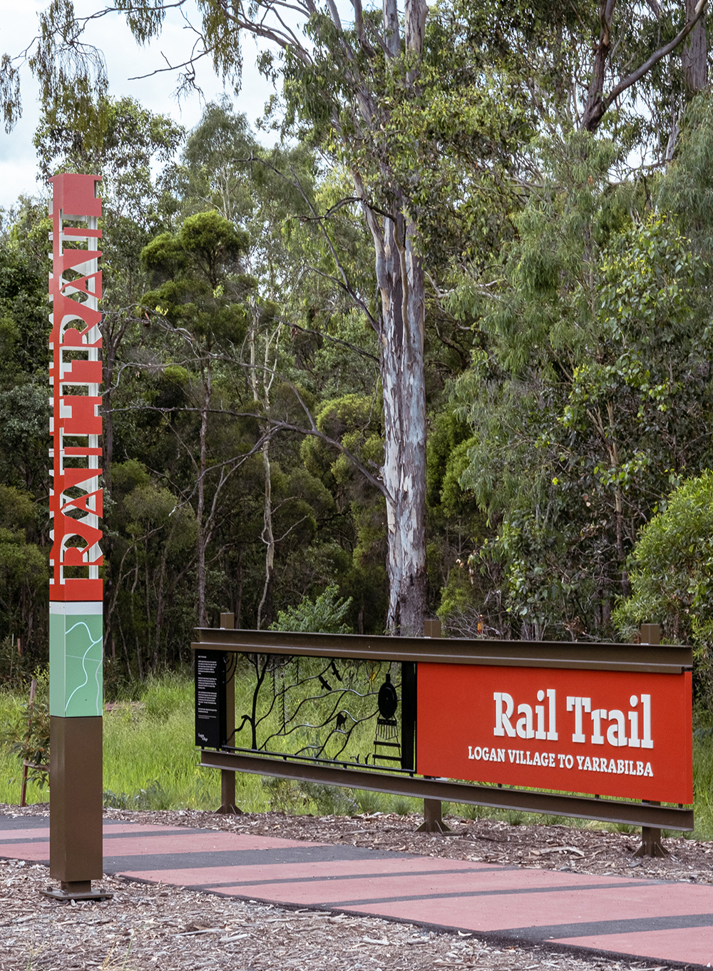
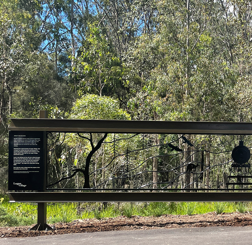
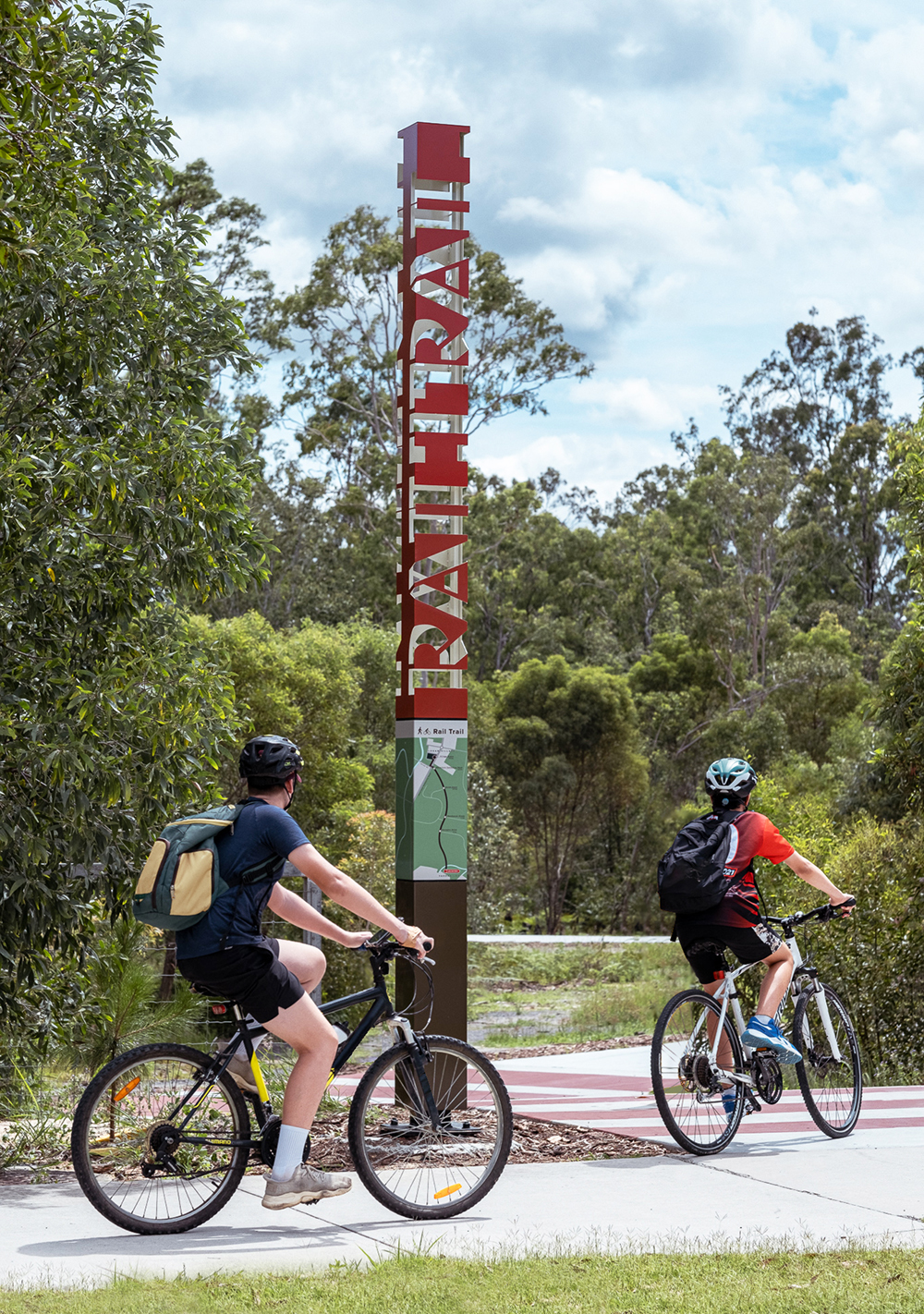
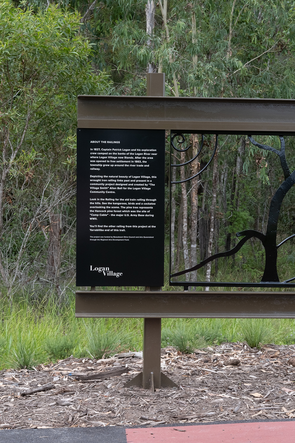
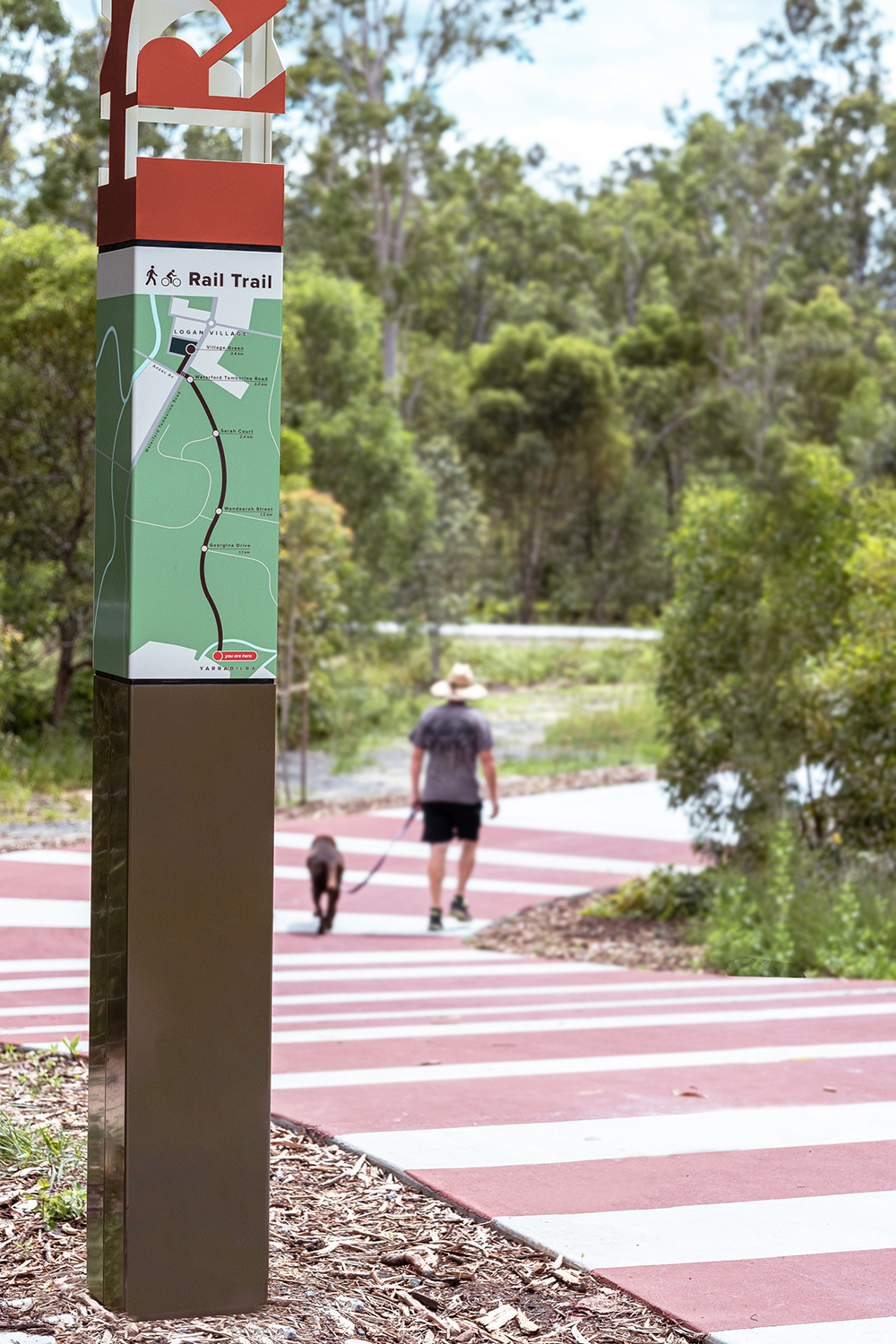
TRAIL MIX Dotdash created wayfinding elements such as trailhead totems featuring maps, trailhead identification signs with interpretive content and local artwork, and directional signage.
CONNECTING PAST & PRESENT
COMPANY: DOTDASH | LOCATION: Brisbane City, QLD, Australia
SENIOR DIRECTOR: Dominic Nastasi | URL: dotdash.com.au
When two roads diverged in a wood, Dotdash (Brisbane City, QLD, Australia) took both, then added a third for good measure. And no, it wasn’t out of greed but, rather, out of need — to connect three public sites for the betterment of the City of Logan’s community.
Dotdash secured a bid from the city council to create an identity for the overall Logan Village project: the wayfinding strategy, concept design, developed design and documentation (as well as a minimal amount of consultative services during construction) for the Rail Trail and two other connected public realm projects, Logan Village Green and River Link.
“We were interested in taking on the project as it was purposeful work,” Senior Director Domenic Nastasi says. “The Rail Trail is part of a broader strategy about connections between community and place. The work is one of three connected projects that celebrate people and place through placemaking and enhancing community experience.”
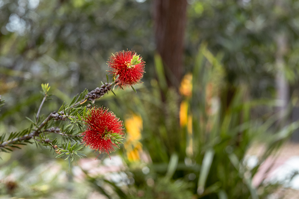
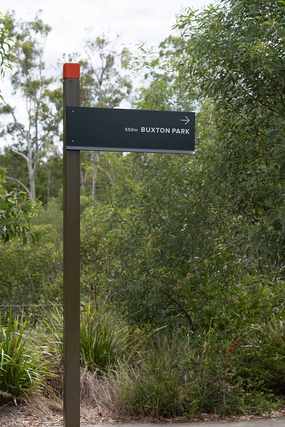
The overall Rail Trail project was created as a regional destination to foster an authentic and cohesive identity by celebrating historical stories, rural connections and local creativity. The client’s vision included placemaking and elevating community spaces in a way that’s aligned with those values, guiding visitors through wayfinding that explores and celebrates history and community, Nastasi says.
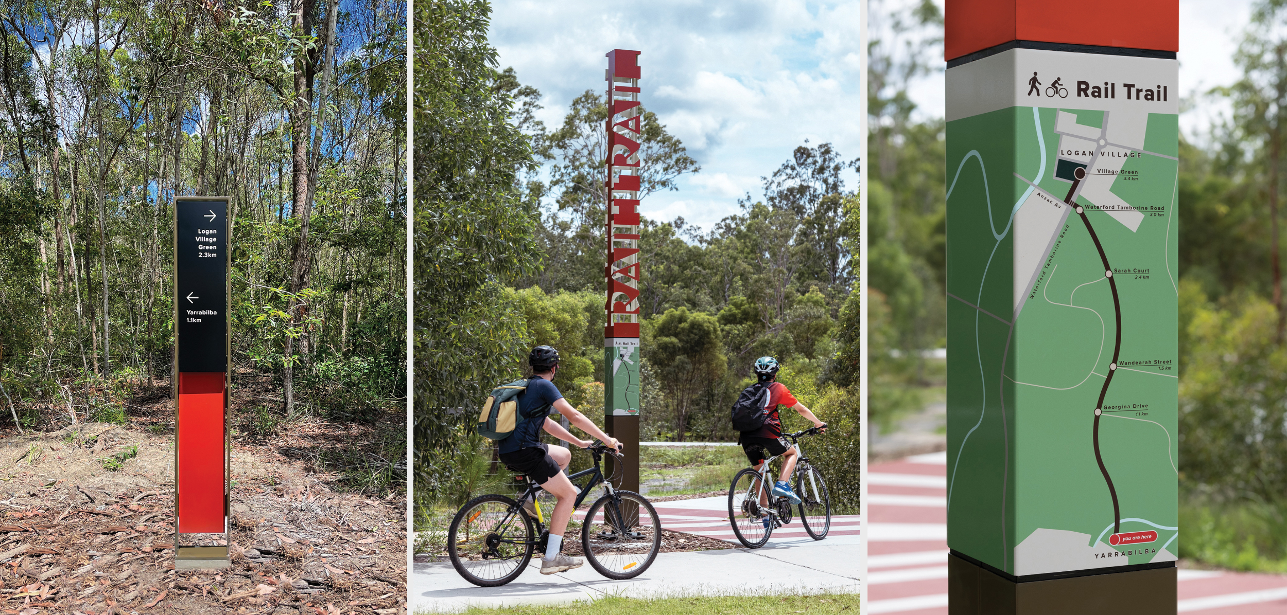
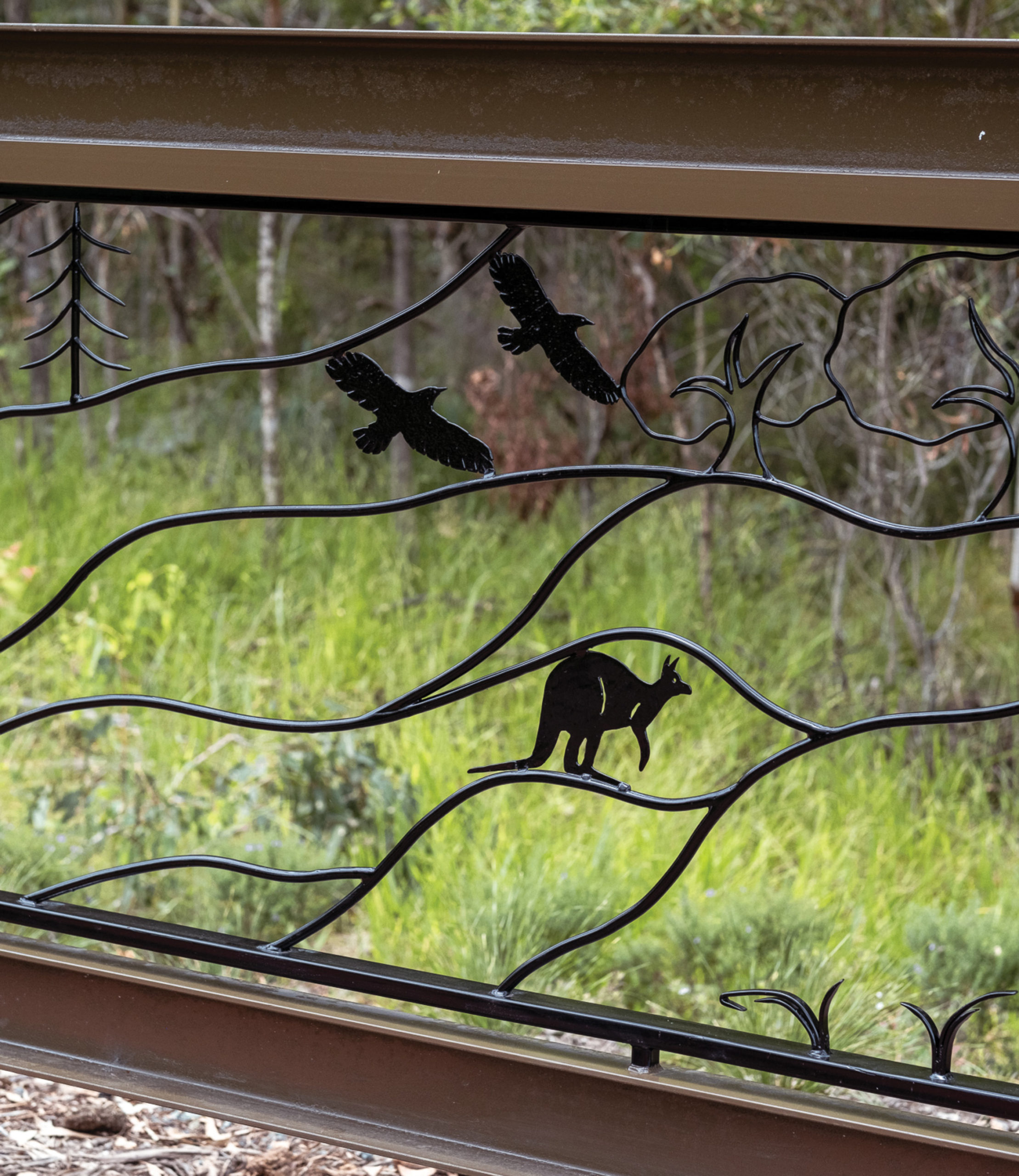
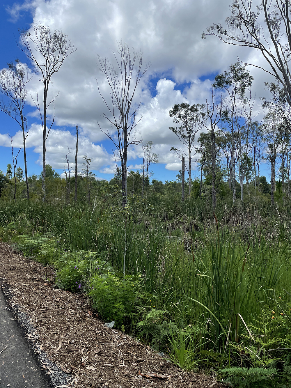
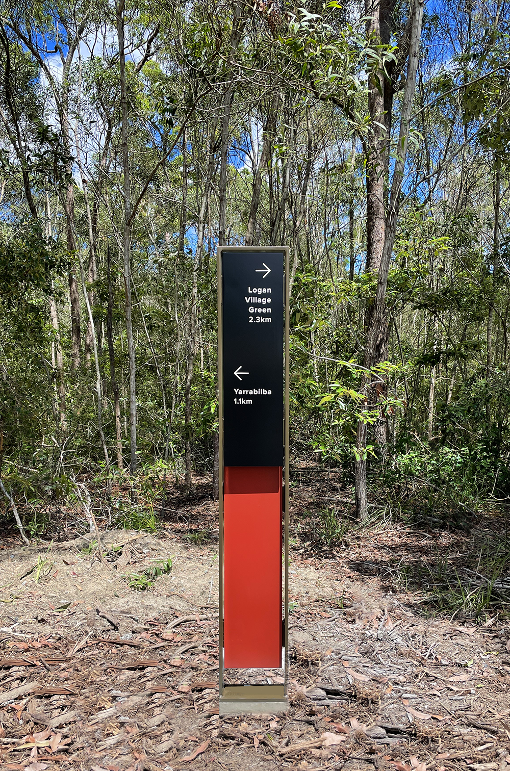
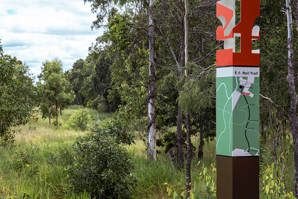
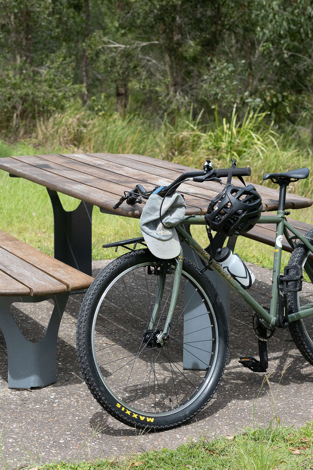
The trail has allowed for both picturesque and history-rich exploration along a more than two-mile pathway between Logan Village and the Yarrabilba Rail Trail section. The trail includes elements such as trailhead totems or markers featuring maps, trailhead identification signs with interpretive content and local artwork, and directional signage.
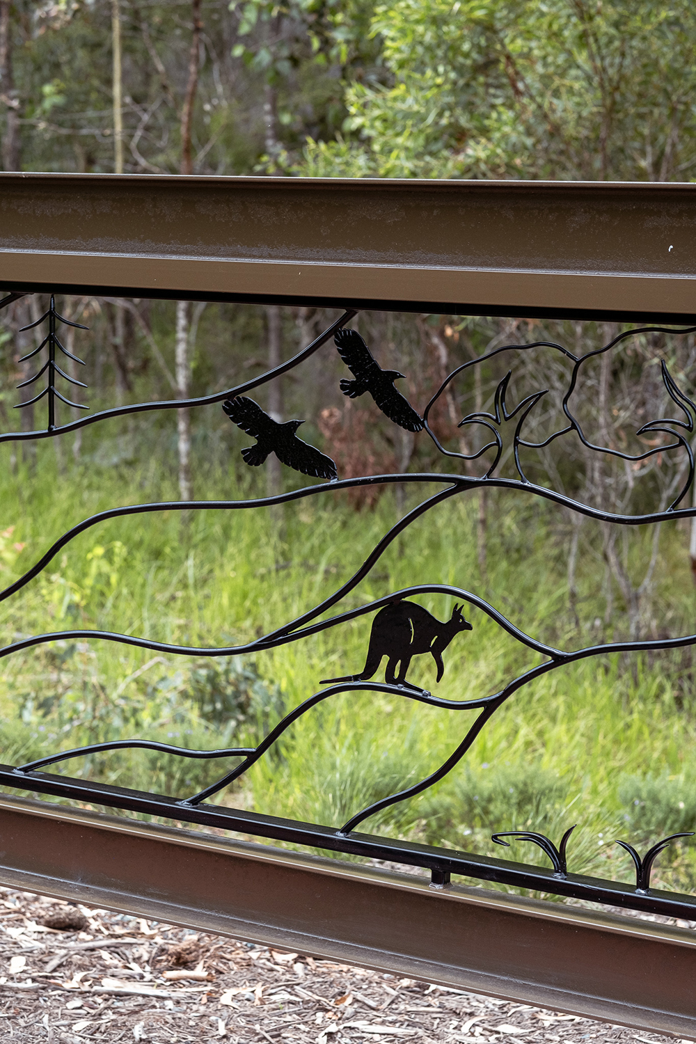
For example, upon entering the trail, you are welcomed by trailhead identification signs showcasing integrated balustrade artworks (a nod to the trail’s former function as a railway) by renowned local wrought iron artisan Alan Ball.
Next, a trailhead totem featuring a map helps to orient visitors and allows them to learn about placemarkers and points of interest that lie ahead. On the path hikers are guided by a suite of directional signs that also provide context into the historical landmarks and events that occurred along the way.
Dotdash focuses on using materials that are sustainable for the environment and the appropriate weather conditions. In this instance, they chose ones that could handle a sub-tropical climate with strong UV light, heavy rains and high humidity — and also could be maintained easily by local authorities.
To accomplish this, they had the signs constructed of powder-coated and two-pack-painted aluminum, hardwood timbers and wrought iron, while the interpretive work included UV digital printing.
“[Our work is designed] for longevity and ease of maintenance; it’s always evidence-based and true to form,” Nastasi says. “We use the materials for the materials’ sake and don’t use materials purely for aesthetic or add faux finishes.”
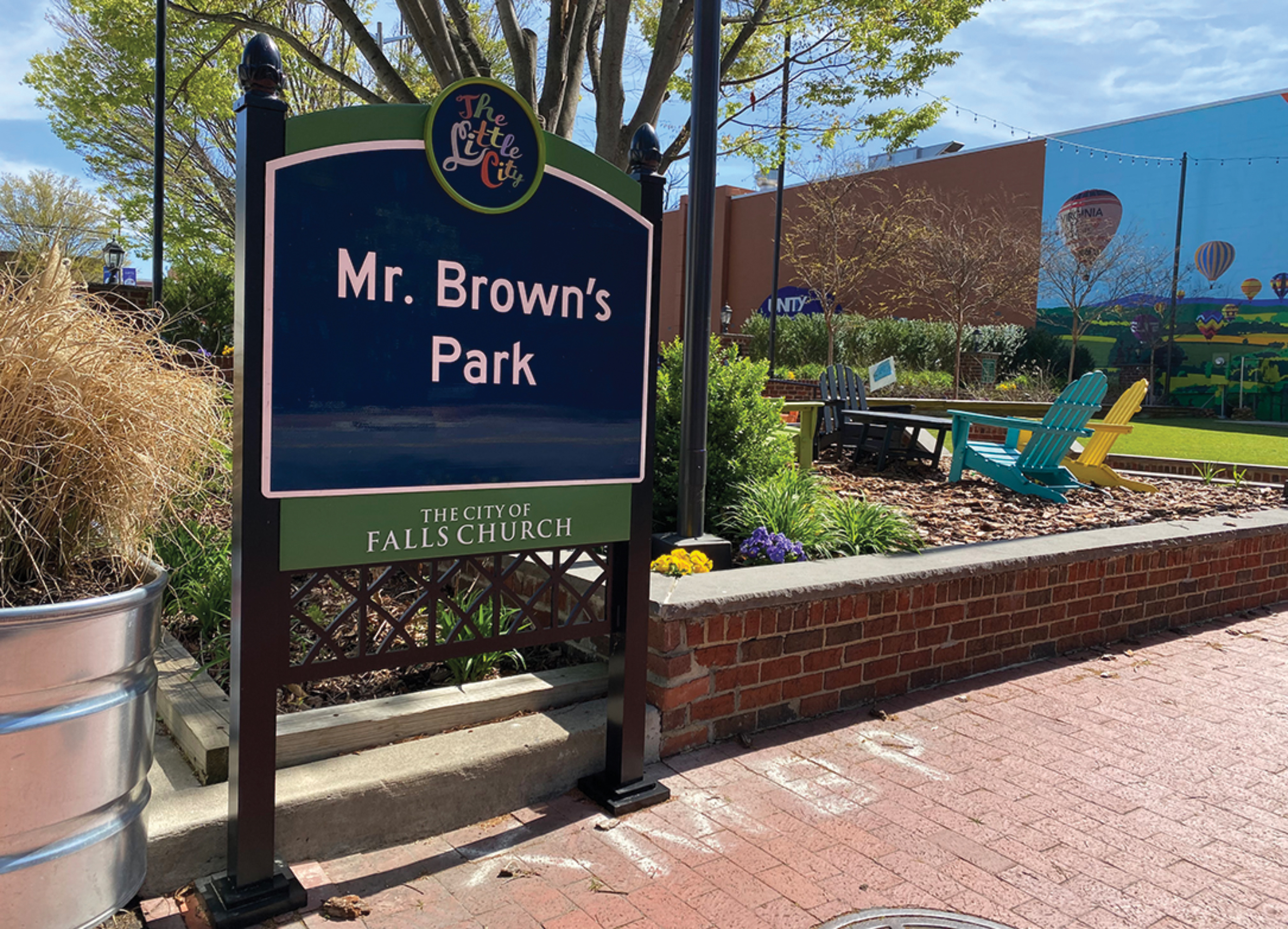
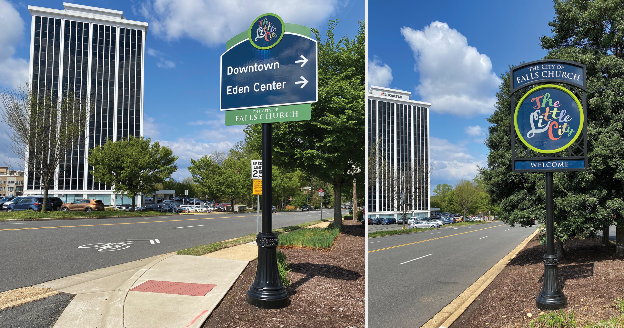
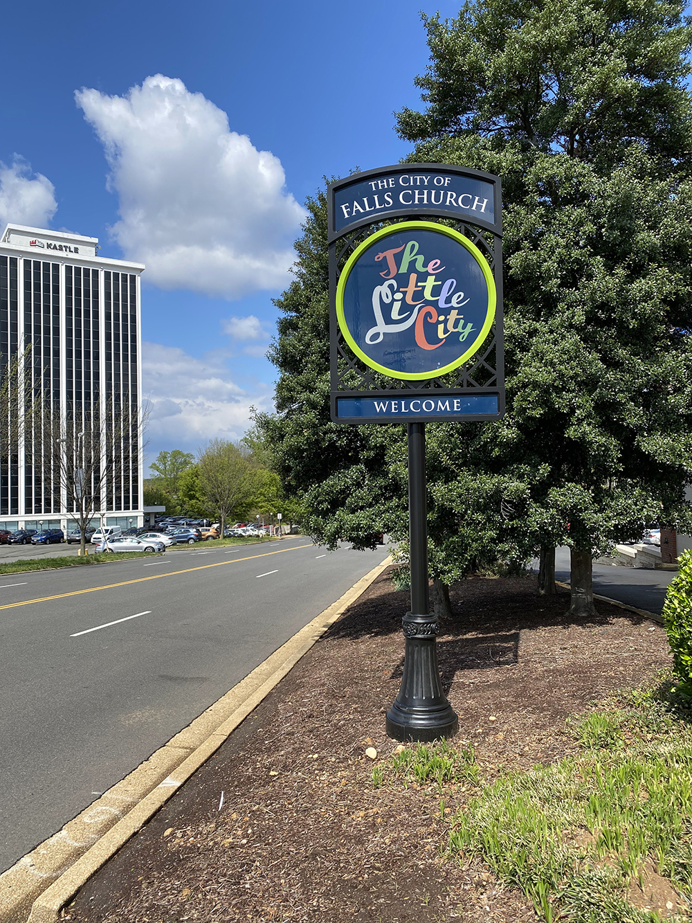
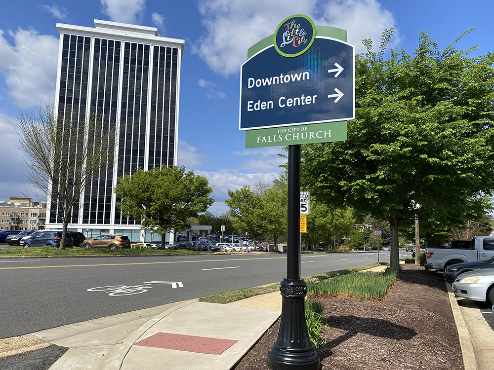
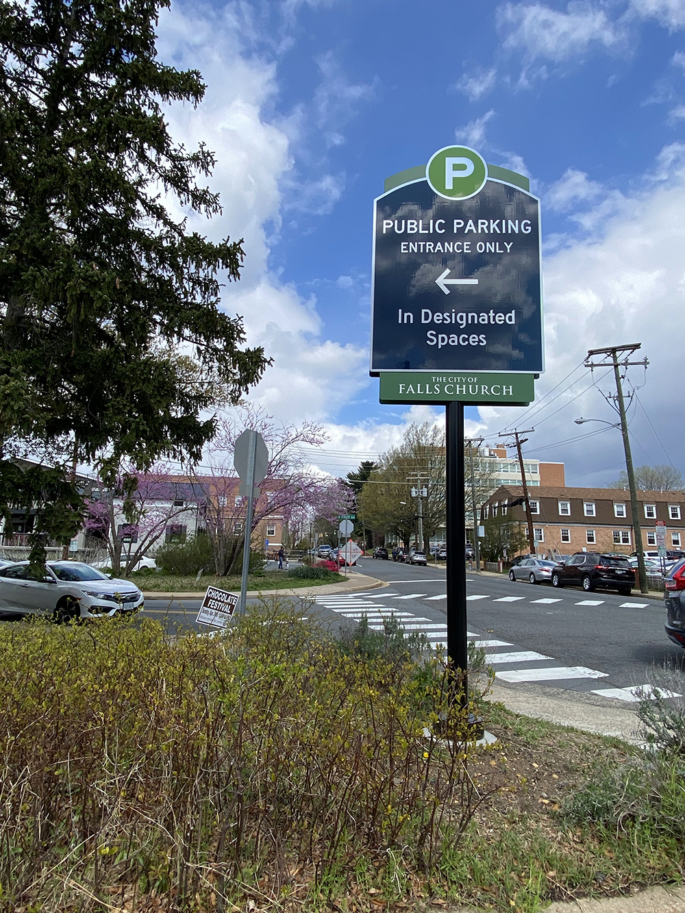
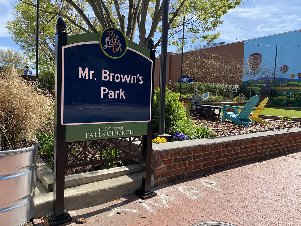
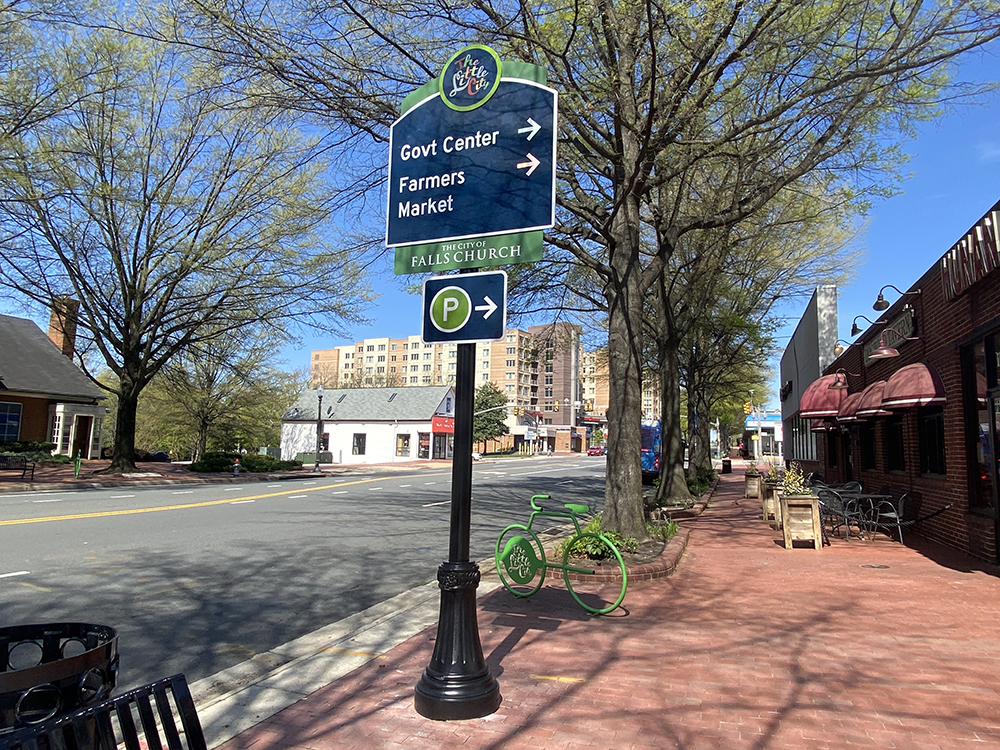
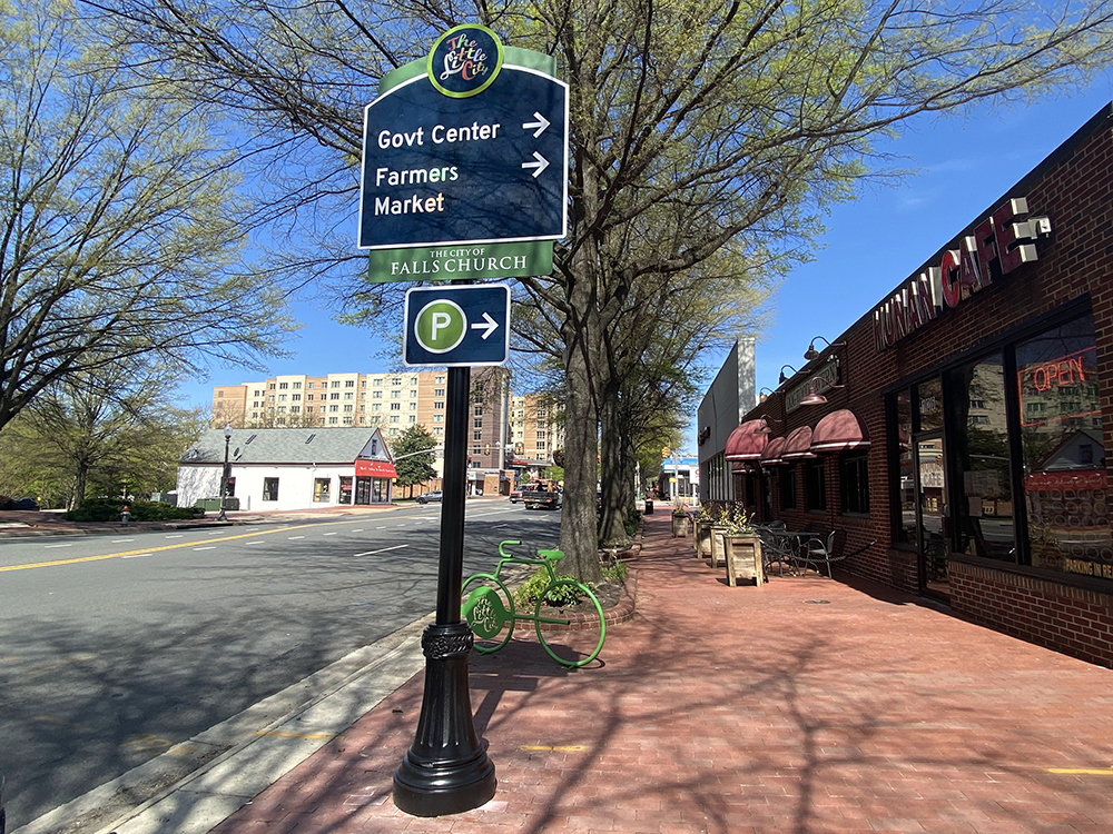
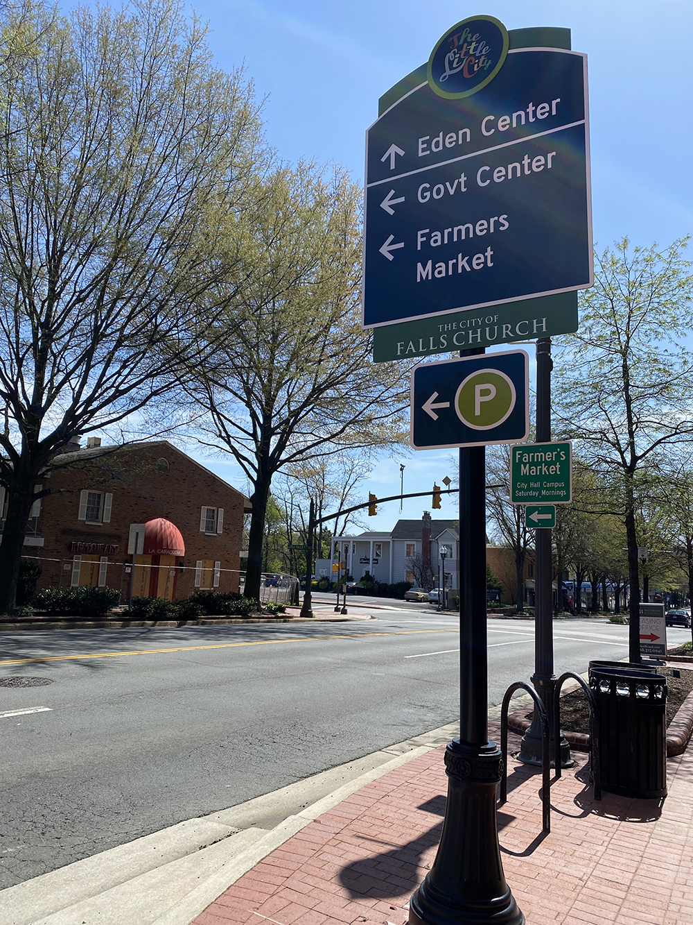
LITTLE CITY, BIG SIGNS Frazier Associates designed gateway entrance, trailblazer, vehicular directional, parking directional/identification and pedestrian information signage for the City of Falls Church.
TAKE ME TO CHURCH
COMPANY: Frazier Associates | LOCATION: Staunton, VA
principal: Kathleen O. Frazier | URL: frazierassociates.com
Frazier Associates’ (Staunton, VA) mission is simple: to strengthen Virginia’s historic communities through design. Over the years they’ve carried out this mission throughout the state, literally leading residents and visitors alike through communities and cities, developing systems that reflect an area’s character while also directing people toward their destinations.
When they were approached by the City of Falls Church and its local Economic Development Authority (EDA) to create a city-wide custom wayfinding sign system, Frazier Associates were all in.
The ask from Falls Church was clear, to “leverage an inviting and welcoming wayfinding design to promote the city’s economic development, achieved by emphasizing the city’s unique character and orienting visitors toward the city’s main attractions,” Deputy Economic Development Department Chief of the City of Falls Church Valerie Weiner says. “The signs also help strengthen the city’s branding as a welcoming environment for visitors.”
Since Falls Church is located in northern Virginia (just outside of Washington), it is often challenging for visitors to know where communities begin and end. Wayfinding can help define community boundaries and sense of place. The new Falls Church brand was exciting and lent itself to a colorful and engaging design that could accomplish those goals,” firm Principal Kathleen O. Frazier, FAIA, explains.
Frazier Associates provided full design services and construction-intent documents for the sign system and assisted with the bid process, while RiteLite Signs Inc. (Concord, NC) handled the implementation phase and coordination with the city.
The goals of the Falls Church wayfinding system were to clearly delineate the perimeter of the city and guide visitors to key destinations both from a vehicular and pedestrian perspective. To accomplish this, Frazier Associates designed gateway entrance, trailblazer, vehicular directional, parking directional/identification and pedestrian information signage.
Falls Church provided a new logo and color palette for the project and Frazier’s Environmental Graphic Designer Sandra Hanger, also a member of the Society for Experiential Graphic Design (SEGD), developed designs for the signs, selecting additional complementary colors and incorporating community architectural features to complete the design using Adobe Illustrator, InDesign and Photoshop, as well as ArchiCAD.
Frazier then gained insight on schematic options from the wayfinding task force and input from the public solicited by the city to develop the final design for the signs. “Final designs are often a combination of elements from several of the schematic options [and] this evolution of the design process brings together the best features and best reflection of community character,” Frazier says.
The signage itself was crafted from 3M Diamond Grade DG3 Reflective Sheeting with digital printing, custom laser-cut aluminum panels, Visionaire Lighting’s clamshell base for posts, Hapco cast aluminum finials, Metalcraft Industustries acorn finials, Gemini anodized letters and Matthews Paint in various colors.
“Visitors can now spend less time trying to navigate the city and more time enjoying their favorite places in Falls Church,” Weiner says. “The wayfinding signs have been a great addition and help encourage exploration of the city’s vibrant business community.”
PHOTO GALLERY (37 IMAGES)
?: Altitude Design Office | DOTDASH | Frazier Associates


Secrets of Lead Generation
Boost your sales by generating more leads! In this light and lively webinar featuring Maggie Harlow, CEO of Signarama Louisville Downtown (Louisville, KY) and the “Business of Signs” columnist for Signs of the Times, learn the secrets of how leads are generated, where they come from and how you can cultivate better (not just more) leads.


Bulletins
Get the most important news and business ideas from Signs of the Times magazine's news bulletin.
-

 Business Management1 week ago
Alternative Management Advice for Sign Companies
-
 Fabrication + Installation1 week ago
Small Signshop, Big Fabrication
-
 Paul Ingle1 day ago
120 Years of Signs, and I’ve Seen 41 (Mostly)
-
 Real Deal4 days ago
Sign Company and Customer Clash on “Minimum 2 Hours”
-
 Benchmarks1 day ago
5 High-Performance Vehicle Graphics Projects
-
 True Tales2 weeks ago
My Shirt Says “Signs”
-
 Mildred Nguyen2 weeks ago
Interior Reimage Transforms Georgia School
-
 Maggie Harlow2 weeks ago
3 Steps for Performance Appraisal Preparation