This article originally appeared at our sister publication, Big Picture.
WINDOW GRAPHICS TEND to be “deceptively simple” says Wade Neff of Strategic Factory, and the same might be said of anything printed in white. In fact, difficulty with managing white ink leads some, including Tami Napolitano of Awesome Graphics, to find alternatives when possible. Conversely, recent work by Rob Matthews and the crew at M3 demonstrates how white-ink capability can present new opportunities for improved efficiency and more impressive prints. Check out the application examples below for a glimpse into these three PSPs’ respective approaches to windows, white, and windows that call for white.

M3
Greensboro, North Carolina
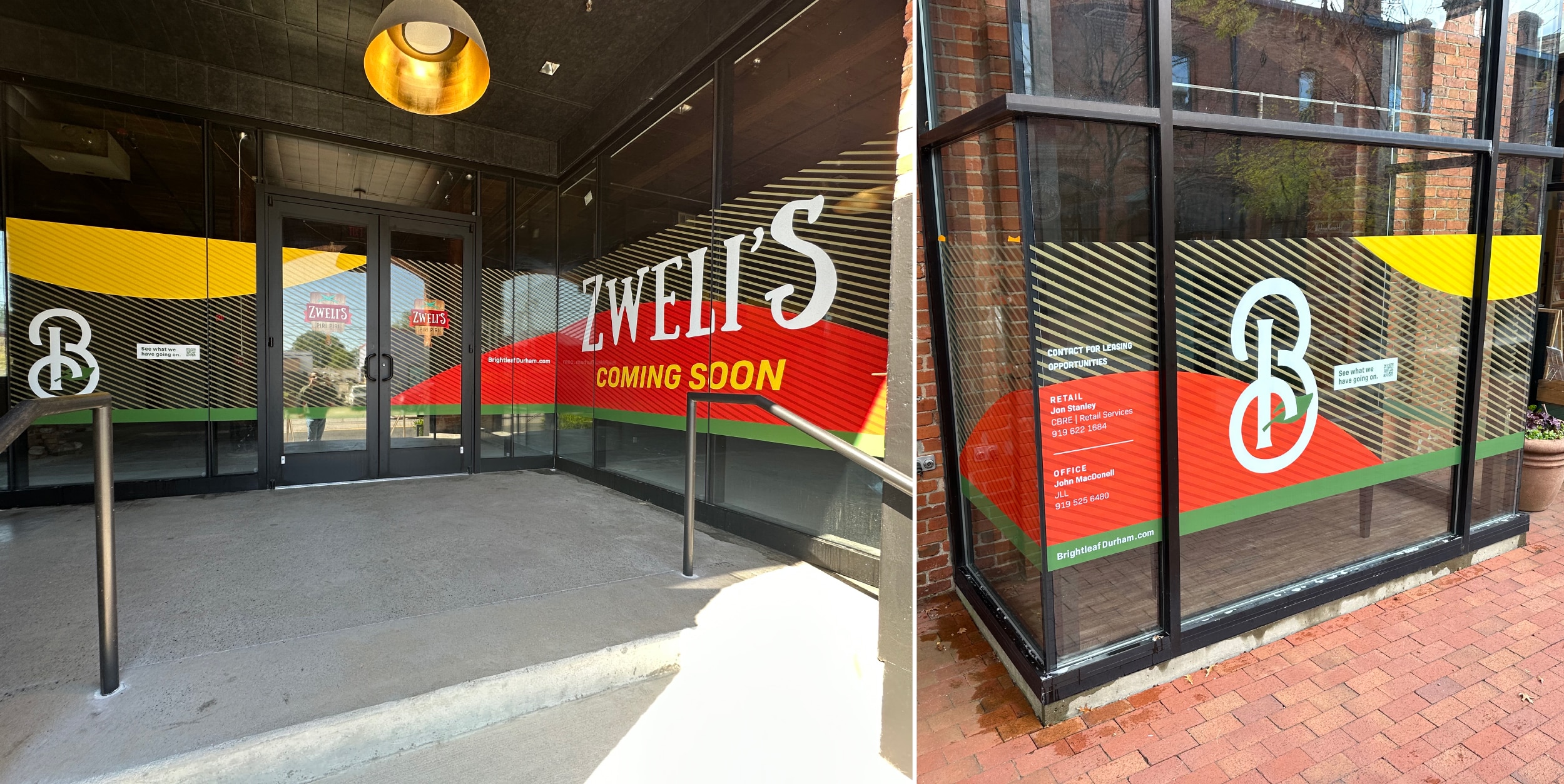
Rob Matthews and his team at M3 consider white ink to be a competitive edge, particularly for efficiently producing full-coverage window graphics on optically clear film. “Without white we could achieve a similar look, but the finishing time would be exponentially more,” he says.
In this case, a repeat client that manages mixed-use properties asked for contour-cut elements to brand various storefronts. However, M3 steered them toward clear, full-cover panels that provide color on both sides of the glass. Opting for only a first-surface application speeds turnaround by limiting installers to exterior work that can be done at odd hours, Matthews says. “With our HP R2000, we’re able to produce an updated package and remove/install within two to three days of receiving the new order. We keep a scaled version of the colors in our flat file to ensure the colors are always accurate.”
The company chose clear, removable General Formulations 255 Optimark high gloss flexible calendared PVC film to make graphics easy to change out for new tenants or promotions. Driven by Caldera RIP software, the HP Latex R2000 Plus printer has so far run off more than 600 square feet of window graphics, all finished on a Zünd cutter and a GFP laminator. However, the right equipment isn’t enough to make white work. “We always choke the white ink in a few pixels when we aren’t doing a full flood coat,” Matthews says. “This eliminates even the tiniest white stroke, which can occur if the white alignment is off the slightest bit. We leaned heavily on HP support to learn about white.”
Tip: Need to apply panels wet? Try M3’s approach: using a backpack landscape sprayer to quickly coat both film and window with application fluid.
Advertisement

Strategic Factory
Owings Mills, Maryland
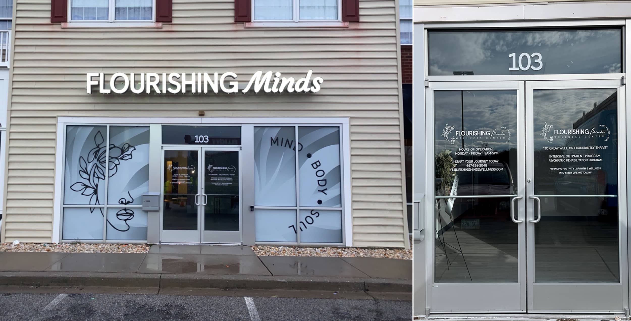
“Playing with different opacity and transparency levels” is Wade Neff’s short version of how Strategic Factory decorated this storefront for the Flourishing Minds wellness center. Here, white ink is not just a base layer, but an essential element of an elegantly (if deceptively) simple design consisting of “a lot of soft values and gradients of white,” he says. “It was important that those overlapping elements show the right amount of opacity to imply the depth of design needed. It was also important that no one element overpower the other.”
With no good way to visualize how the white ink would interact with the frosted substrate (General Formulations Concept 790AE Light Etch Air-Egress), sampling and testing was essential. In addition to “experienced graphic designers and operators” and an “excellent install team,” Neff credits the white-ink capabilities of the press (an HP Latex R2000 Plus printer) as well as the layering tools in Adobe Illustrator for achieving right balance. “Those capabilities along with the excellence of the GF substrate, which doesn’t often get employed as a printable substrate, was a winning combination,” he says. “The varying degrees and opacities of white ink on clear window film was a bit of a challenge, but [it] came together beautifully.”
Tip: One reason window graphics are “deceptively simple” is because windows aren’t always perfect, Wade Neff says. Think carefully about whether you should really pre-cut panels to size in the name of efficient installation. “You may want to oversize that window graphic a bit and cut it into the window in the field,” he explains. “No window ever has a perfectly straight weatherproofing gasket around the edges, and you want to avoid light leak or gaps that may distract from the final product.”

Awesome Graphics
Rutland, Vermont
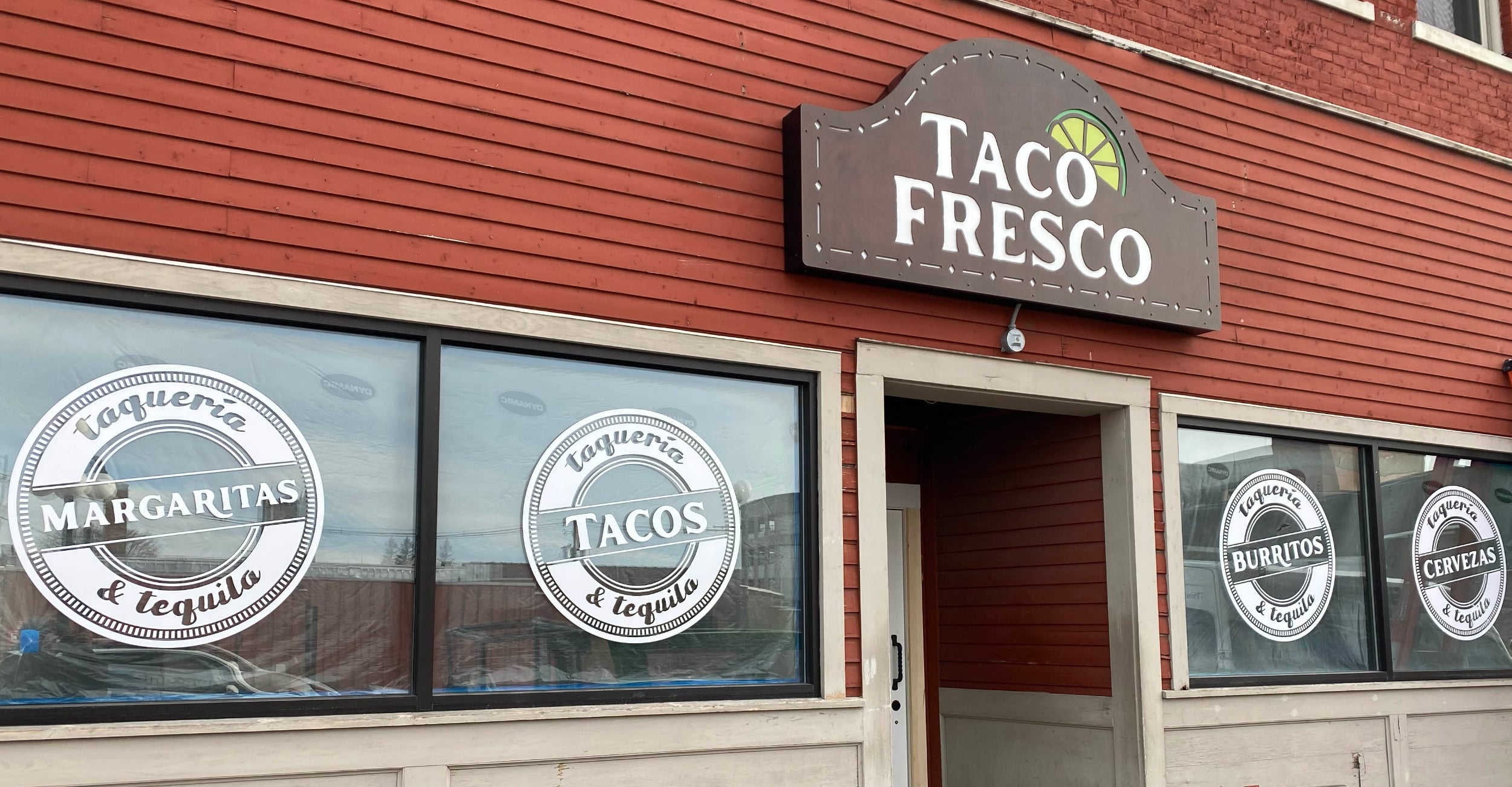
In this recent project for Taco Fresco, the main exterior sign is perhaps the best showcase of Awesome Graphics’ creativity and skill. However, there’s also a lesson in the 36- x 36-in. window displays: White graphics don’t always require white ink, which can be more difficult to manage than other colors. “It is easy to print on white film and then die-cut to whatever shape you want,” says, Tami Napolitano, co-founder/CEO. “When clients want the graphic on the inside of the glass facing out, we can use a clear film and then laminate in white, so the graphic still pops.”
Media made specifically for glass (3M Scotchcal Graphic Film IJ40) “really made these window graphics stand out,” Napolitano says. She also credits Eric Briere, operations manager, for taking the lead in helping the client create the right “look and feel” for signage throughout the inside and outside of the restaurant, beginning with only a logo. Now, the company prints Taco Fresco logos on clothing, menus, pens, and more.
Tip: Don’t despair; get creative. For the backlit main sign, weathering steel provides the rustic look the client desired, but time was too short for natural weathering to be an option. Chemistry offered an answer. “We found a few compounds that would create the look we were going for within a week,” Napolitano recalls.
Advertisement

 Tip Sheet2 weeks ago
 Photo Gallery4 days ago
 Ask Signs of the Times6 days ago
 Real Deal2 weeks ago
 Paula Fargo1 day ago

 Benchmarks1 week ago

 Photo Gallery1 day ago
 Women in Signs2 weeks ago
